1. lucas.leigneil@gmail.com
+33 6 25 37 43 88
French (native)
COLORPRINT WEBILLUSTRATION COMMUNICATIONLAYOUT
English
Italian
Chinese
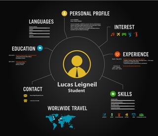
Lucas Leigneil
Student
Adobe Suite
MS Office Suite
Corporate design
Visual Communication
March - May 2018
Summers of
(June - August)
2016 - 2017 - 2018
Graphic intern in communication agency
- Graphic creation (logo, flyer, frontage store, ...) for many
compagnies in different fields
- Corporate graphics (photoshoot, assistance)
Various professional experiences
INTEREST
EXPERIENCE
SKILLS
CONTACT
EDUCATION
LANGUAGES
WORLWIDE TRAVEL
PERSONAL PROFILE
Lucas LEIGNEIL
Cusy, 74540, FRANCE
I am an energetic, ambitious person who has developed a
mature and responsible approach to any task that I under-
take, or situation that I am presented with.
I am a creative, adaptable and bright individual with an
excellent eye for detail and design.
2016-2019 Bachelor Hypermedia / Communication
- Université Savoie Mont Blanc
Chambéry, France
2012-2016 Highschool diploma
- Lycée Berthollet
Annecy, France
2. DESIGN
GRAPHIC
LEIGNEIL Lucas
Université Savoie Mont-Blanc
Département hypermédia
Lience infocom
Tel : +33 6 25 37 43 88
E-mail : lucas.leigneil@gmail.com
Adress : 55 route des plattets,
74540, Cusy, France
3. I have chosen to use the baseline «Maître Fromager depuis 1936»
in a circular way in order not to be too linear and to correspond
to the dimensions and shape of the logo which includes the word
CHABERT written in bold. Thus the baseline does not take up
more space than the company name, which is an advantage of
enhancing the logo, rather than creating a break.
This is one of my first work in a professional way, the goal was to
make a cover page for the Fruitères Chabert brochure. I had
to make several proposals. I show this proposal because it was the
first to be liked by the whole graphic team and by the agency’s
director herself.
IMAGE RESEARCH AND TRUCK WRAPPING
FRUITIÈRES CHABERT
4. Here is another proposal for the cover of the Fruitières Chabert brochure. I used this
geometric aspect with a touch of modernity. This images representing the company’s
products and landscapes of Savoie as well as the typical cows of the region.
Then, I had the mission to make a dressing for their future delivery/transport truck.
It was the first time I had ever done this kind of task. It was to dress a template and I
found it really interesting. I made several designs but there is one that stood out. It is
the one I am most satisfied with. Indeed, it perfectly evokes to the territory of Savoy.
5. I made a flyer for Tendance Nautic, a company who rents boats on the
shores of Lake Annecy. They had given us their logo and also a graphic
charter to respect. In addition, the agency’s copywriter had written the
texts and designed a table to include. My role was only to look at the graphics
part but it was very interesting to work on another format. It was necessary to
produce a flyer respecting a brief but with great freedom on the form. To
make the flyer, knowing that it was a company that rented boats on Lake Annecy,
I used a photo that showed a pontoon and at the same time Lake Annecy.
FLYERTENDANCE NAUTIC
6. Here are the banners I made above: I had to adapt myself
according to the measurements and the cutting lines. Except for
the graphic charter and logo which were mandatory, the rest
was entirely free to create.
The same company asked us to make a banner for them. I had to dress a template. Having
to adapt to a certain format and at the same time succeed in conveying a message is a
bit of a challenge, which is why I found it interesting: you have to adapt to directives and
constraints, while maintaining a certain freedomof expression. For the banners I made,
I used Tendance Nautic’s graphic charter, which I adapted to the template.
B A N N E R S
12 cm
197cm
60,5 cm
2,5 cm
2,5 cm12 cm
Coupe Droite
Echelle 1:10
A vérifier :
- Mode CMJN ou Pantone (à spécifier)
- Polices vectorisées
- Images incorporées (et non liées aux fichiers)
Fond perdu
Découpe (format fini)
12 cm
197cm
60,5 cm
2,5 cm
2,5 cm12 cm
Coupe Droite
12 cm
197cm
60,5 cm
2,5 cm
2,5 cm12 cm
Coupe Droite
CAP SUR
LE NAUTISME
ET LA
PLAISANCE !
7. BEFORE
AFTER
I had to retouch, for the real estate agency Axium, a set that was used in an advertising
clip. In addition to the photo retouching, I also illustrated a storyboard that was
used to make this advertising clip. The instruction was to take a bright room, with a neat
interior decoration. The choice of image was important because it conditioned the work
of the cameramen during the shooting of the clip. Then, on request, I modified the room.
However, it was complicated with this photo because the perspective made the floor
more or less big and more or less inclined, it was very difficult to adapt. I applied a
new floor by creating a vector mask above it that allows me to keep the sofas, etc.
PHOTO RETOUCHINGAXIUM
8. On this logo, I used one of Le Chalet de Christian that I clipped to be as close
as possible to reality and to ensure that his logo best represents the company. In
addition, I have put the mountain and the path to suggest that it is a mountain lodge
and that there are some superb walks to do in the area.
Not being satisfied I opted for something different, softer. Although the area in which
the cottage is located is not well known, it is located near Tamié Abbey. So I used
the bell tower of this abbey to insert it into the new logo I created. I have chosen to
work around the initials CC of Chalet Christian. I have gone from a «simple» logo to
a much more meaningful and refined logo.
I had to designtheidentity of a new company specializing in the rental of mountain
cottages in the Savoie region. However, this company did not have a name, so in
addition to creating its visual identity, it had to find a name. So according to
the owner’s name I chose the name Le Chalet de Christian. So I created several logos
related to this name. For this purpose, I had several photos of the manager of the
company that he had taken during an outing. So I started by working around his chalet
and created the following logos:
L O G O D E S I G NL E C H A L E T D E C H R I S T I A N
9. Then, I studied other name ideas and created other logos that were more appropriate
and aesthetic. I presented my different logos to the agency director, she chose some
of them and grouped them on the same page to show them more simply to the client.
For this same brand, the agency’s director came back to me and told me that the final
result I had produced for Les Fruitères Chabert brochure had much more to offer and
she asked me to take up this background by changing the images and the logo
to adapt it to the cottage rental company. For example, I modified and replaced
the original logo and printed different versions for the agency director to
present directly to the client.
10. For this work I had to make a blanket highlighting meat. So I started with
something that inspired me.
So I made 3 other covers on which I tried as best I could to highlight the meat and
find puns to make the cover more attractive and punchy.
ThisisthefirstprojectIhaddonefortheProcared
group. However, they wanted something that
would enhance the meat more, so I tried to
make other covers.
P O S T E R S
P R O C A R E D
11. I had to dress a fruit and vegetable department in a Provencia group store. It is a
communication tool that we see all the time when we go shopping and that is much
more complicated than it seems. It is a kind of banner that makes people want
to buy the product and communicates a certain message to customers. I had to
adapt my creation to the number of bicycles (bins with fruit). So I created several
atmospheres that I directly staged on the shelf. After having restarted some
bicycles to adapt to Provencia’s expectations, I finalised various models which, for
me, managed to stand out from the crowd. The message addressed to customers
was clearer, more attractive and more impactful.
I chose to show these two models because in my opinion it is the ones that really
speak to customers who could buy in the Provencia group’s supermarkets, that make
them want to buy the product. To do this, I made a basic image in a 210 x 210 mm
square format. Then, I expanded my work area to be able to duplicate it in length
and put 8, which corresponds to the number of bicycles in the standard image and
gives the following result before adapting it to the store’s departments.
BICYCLES DRESSING
PROVENCIA