
Empfohlen
Weitere ähnliche Inhalte
Was ist angesagt?
Was ist angesagt? (19)
Ähnlich wie Poster ta cloverfield (b)
Ähnlich wie Poster ta cloverfield (b) (20)
Poster ta cloverfield (b)
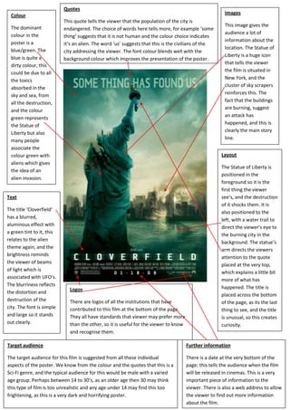
- 1. Further informationThere is a date at the very bottom of the page; this tells the audience when the film will be released in cinemas. This is a very important piece of information to the viewer. There is also a web address to allow the viewer to find out more information about the film.LogosThere are logos of all the institutions that have contributed to this film at the bottom of the page. They all have standards that viewer may prefer more than the other, so it is useful for the viewer to know and recognise them.QuotesThis quote tells the viewer that the population of the city is endangered. The choice of words here tells more, for example ‘some thing’ suggests that it is not human and the colour choice indicates it’s an alien. The word ‘us’ suggests that this is the civilians of the city addressing the viewer. The font colour blends well with the background colour which improves the presentation of the poster.Target audienceThe target audience for this film is suggested from all these individual aspects of the poster. We know from the colour and the quotes that this is a Sci-Fi genre, and the typical audience for this would be male with a varied age group. Perhaps between 14 to 30’s, as an older age then 30 may think this type of film is too unrealistic and any age under 14 may find this too frightening, as this is a very dark and horrifying poster.TextThe title ‘Cloverfield’ has a blurred, aluminous effect with a green tint to it, this relates to the alien theme again, and the brightness reminds the viewer of beams of light which is associated with UFO’s. The blurriness reflects the distortion and destruction of the city. The font is simple and large so it stands out clearly.LayoutThe Statue of Liberty is positioned in the foreground so it is the first thing the viewer see’s, and the destruction of it shocks them. It is also positioned to the left, with a water trail to direct the viewer’s eye to the burning city in the background. The statue’s arm directs the viewers attention to the quote placed at the very top, which explains a little bit more of what has happened. The title is placed across the bottom of the page, as its the last thing to see, and the title is unusual, so this creates curiosity.ImagesThis image gives the audience a lot of information about the location. The Statue of Liberty is a huge icon that tells the viewer the film is situated in New York, and the cluster of sky scrapers reinforces this. The fact that the buildings are burning, suggest an attack has happened, and this is clearly the main story line.ColourThe dominant colour in the poster is a blue/green. The blue is quite a dirty colour, this could be due to all the toxics absorbed in the sky and sea, from all the destruction, and the colour green represents the Statue of Liberty but also many people associate the colour green with aliens which gives the idea of an alien invasion.736979887104<br />