A look at how the The Young Turks Network might better utilize principles of task orientation and attentional focus to inform UX Design decision making.
Abortion pill for sale in Muscat (+918761049707)) Get Cytotec Cash on deliver...
Task Orientation and Attentional Focus - Informing UX Design
1. Task Orientation and Attentional Focus
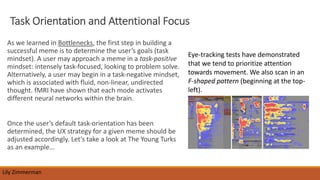
As we learned in Bottlenecks, the first step in building a
successful meme is to determine the user’s goals (task
mindset). A user may approach a meme in a task-positive
mindset: intensely task-focused, looking to problem solve.
Alternatively, a user may begin in a task-negative mindset,
which is associated with fluid, non-linear, undirected
thought. fMRI have shown that each mode activates
different neural networks within the brain.
Once the user’s default task-orientation has been
determined, the UX strategy for a given meme should be
adjusted accordingly. Let’s take a look at The Young Turks
as an example…
Lily Zimmerman
Eye-tracking tests have demonstrated
that we tend to prioritize attention
towards movement. We also scan in an
F-shaped pattern (beginning at the top-
left).
2. Case Study – The Young Turks (TYT)
https://tytnetwork.com/
The Young Turks is a progressive online news network
aimed at millennials. TYT has displayed “cambrian”
growth in the past several years releasing YouTube
content (to be migrated to other platforms) at a
prolific rate. TYT should leverage this momentum and
take a closer look at their users’ task orientations.
An important distinguishing element of the TYT
brand image is its use of a membership subscription
business model so as to avoid the traditional
corporate-controlled media dynamic. In light of this,
the TYT website must be optimized to entice and
enable users to join and donate.
Lily Zimmerman
3. Lily Zimmerman
Currently, the “JOIN TYT TODAY!” button sits at the top right of the page right along with the
other main menu options, in the same font size and color. The “Donate” button sits in an
attentional blind spot at the bottom right of the page. If you collapse the window inward,
the “Donate” button shifts to the very bottom of the site.
Recommendation:
Bring the “JOIN TYT TODAY!” button to the top left of the page. TYT should cater to
ask-positive users who have already determined they would like to subscribe by
moving this button to the top left of the page. Additionally, or alternatively, adding
engaging animation to the text buttons, “Join” and “Donate” would take advantage
of our natural tendency to attend to movement.
TYT Case Study Cont. &
Recommendation
4. Measuring Recommendation
Success
The success of my recommendation can be determined by looking at the click rates for
the “join” button along with the number of actual completed TYT subscriptions for the
original website & button layout and comparing this with the same measurements
gathered after the recommendation is implemented.
Thank you!
Sources: Evans, D. (2017). Bottlenecks. Kenmore, WA: Apress.
Lily Zimmerman