
Empfohlen
Weitere ähnliche Inhalte
Was ist angesagt?
Was ist angesagt? (20)
Ähnlich wie Modern Art Movements (by Ar Kush Jee Kamal)
Ähnlich wie Modern Art Movements (by Ar Kush Jee Kamal) (20)
Kürzlich hochgeladen
Kürzlich hochgeladen (20)
Modern Art Movements (by Ar Kush Jee Kamal)
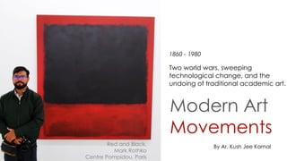
- 1. Modern Art Movements Red and Black, Mark Rothko Centre Pompidou, Paris By Ar. Kush Jee Kamal Two world wars, sweeping technological change, and the undoing of traditional academic art. 1860 - 1980
- 2. Claude Monet, Meules, 1890, sold for $110.7 million. 1867-1886
- 4. Impressionism was an art movement in France at the end of the 19th century. The Impressionists were a group of artists renowned for their innovative painting techniques and approach to using color in art. The most conspicuous characteristic of Impressionism in painting was an attempt to accurately and objectively record visual reality in terms of transient effects of light and colour. The bold designs of Japanese woodblock prints, popular in France at the time, were another influence on the Impressionists. Their asymmetrical arrangements, contrasting large areas of flat color with patches of intricate pattern, offered a compositional format that the Impressionists could use to develop their ideas about color Sometimes, even the most avant-garde artists need the security of knowing that the path they have chosen to follow has some roots in tradition.
- 5. In 1874, a group of artists called the Anonymous Society of Painters, Sculptors, Printmakers, etc. organized an exhibition in Paris that launched the movement called Impressionism. The group was unified only by its independence from the official annual Salon, for which a jury of artists from the Académie des Beaux-Arts selected artworks and awarded medals. The independent artists, despite their diverse approaches to painting, appeared to contemporaries as a group. While conservative critics panned their work for its unfinished, sketch like appearance, more progressive writers praised it for its depiction of modern life. Pierre Auguste Renoir Edgar Degas Raymond de Toulouse-Lautrec Four Dancers, Edgar Degas, c. 1899 Anonymous Society of Painters, Sculptors, Printmakers, etc. (1874)
- 6. The name 'Impressionism' comes from a sarcastic review of Monet's painting, 'Impression, Sunrise' (1873), written by Louis Leroy in the satirical magazine 'Le Charivari'. Impressionism was a style of painting that used a more scientific analysis of color to capture the effects of light in nature. The main artists associated with Impressionism were Claude Monet, Pierre Auguste Renoir, Camille Pissarro, Edgar Degas, Alfred Sisley and Henri Marie Raymond de Toulouse-Lautrec. Pierre Auguste Renoir Edgar Degas Raymond de Toulouse-Lautrec
- 7. The Impressionists were excited by contemporary developments in color theory which helped their search for a more exact analysis of the effects of color and light in nature. They abandoned the conventional idea that the shadow of an object was made up from its color with some brown or black added. Instead, they enriched their colours with the idea that the shadow of an object is broken up with dashes of its complementary color For example, in an Impressionist painting the shadow on an orange may have some strokes of blue painted into it to increase its vitality.. Camille PissarroAlfred SisleyEdouard Manet
- 8. MICHEL EUGÈNE CHEVREUL: THE PRINCIPLES OF HARMONY AND CONTRAST OF COLOURS, AND THEIR APPLICATIONS TO THE ARTS Through observing a series of colour combination, Chevreul offers new principles of colour on visual perceptual. The law of simultaneous colour contrast suggests that the contrast of colours will ―affect the optical composition of each juxtaposed colour.‖ discovery of margaric acid, and invention of soap
- 9. This painting depicts a woman sitting outside alone and reading a book under shade. Like many other artists did before him, the impressionist painter Claude Monet uses color to create a focal point. While all of the woman's surroundings are differing shades of green, she stands out in brilliant white and draws the viewer's attention to her. Springtime, Claude Monet, 1872,
- 10. This painting shows four ballerinas adjusting their cloths, perhaps in preparation for an upcoming performance. Yet again, we see an impressionist artist making use of complementary colors. Degas uses green to form the background of his work and a contrasting red for the focal point, but also uses these contrasting colors to create shadow. A common practice amongst the impressionist. Four Dancers, Edgar Degas, c. 1899
- 11. This painting depicts an ornate, large building in a city. The colors used in this work are primary. There are bright swaths of blue, red, and patches of yellow. While the painting is mostly white, the colors grow bright near the focal point of the work and are used to create form and depth. The Piazza San Marco, Venice, Pierre Auguste Renoir, 1881
- 12. Arrival of the Normandy depicts a train pulling into station. The colors used in this work are primarily cool and of varying shades of blue. In this way, the artist is able to create an atmosphere of solidarity and perhaps give the impression of an early morning. Arrival of the Normandy Train, Gare Saint-Lazare, Claude Monet 1877
- 13. A painting by Ladislav Mednyanszky that depicts a fisherman's boat at harbor. Contrasting or complementary colors were often used in impressionist works, and in this painting the primary colors that the artists uses are complementary shades blue and orange. Cargo Ship on the Bank of the River Danube, Ladislav Mednyánszky, 1890 - 1900
- 14. The Impressionists had to paint quickly to capture the atmosphere of a particular time of day or the effects of different weather conditions on the landscape. The speed of the Impressionists' painting technique forced them to sacrifice accurate line and detail in favour of atmospheric effect. The subject most suited to the Impressionist technique was landscape, but they also painted portraits, still lifes and figure compositions. Impressionist compositions were strongly influenced by the development of photography and the discovery of Japanese woodcuts. Impressionism is now seen as the first movement in modern art, and had a huge influence on the development of art in the 20th century. The Impressionists painted with small strokes of pure colours which mixed in the eye of the spectator when viewed from a distance. The Impressionists were the first group of artists to embrace painting 'en plein air' (painting outside).
- 15. Le bec du Hoc, Grandcamp, Georges Seurat, 1885 Mid-1880s
- 16. Pointillism was a revolutionary painting technique pioneered by Georges Seurat and Paul Signac in Paris in the mid-1880s. It was a reaction against the prevailing movement of Impressionism, which was based on the subjective responses of individual artists. Points of pure colour: Pointillism involved the application of paint in carefully placed dots of pure, unmixed colour. According to Seurat and Signac, these would be blended by the viewer‘s eye to create a more striking image than any made after mixing colours conventionally on a palette. 'Painting by dots': The movement's name derives from a review of Seurat's work by the French art critic, Félix Fénéon, who used the expression peinture au point (―painting by dots‖). Seurat actually preferred the label "Divisionism" – or, for that matter, Chromoluminarism – but it was Pointillism that stuck. Meticulous technique: Pointillism is regarded as a Neo-Impressionist movement. Which is to say, it grew out of – and beyond – Impressionism. Pointillists wished to render optical phenomena. However, they renounced fluid, spontaneous strokes in favour of a measured, meticulous technique. From Pointillism to Fauvism: With its strident colour combinations, Pointillism was a clear influence on Fauvism, among other movements: Henri Matisse's Luxe, Calme et Volupté (1904) is often cited as an important work of transition between the two.
- 17. Henri-Edmond Cross Maximilien LucePaul SignacGeorges Seurat Some say they see Poetry in my paintings; I see only science. Georges Seurat
- 18. Sunday Afternoon on the Island of La Grande Jatte (1884–86) Georges Seurat
- 19. Bathers at Asnières (1884) Georges Seurat
- 20. The Lake in the Bois de Boulogne (oil on canvas, 1899) Henri Edmond-Cross,
- 21. Portrait of Félix Fénéon, 1890 Paul Signac
- 22. Picking Peas (1887) Camille Pissaro
- 23. The Card Players, 1894–95 Paul Cezanne Sold for $250 Million to Qatar‘s royal 1885 - 1940
- 24. Post Impressionism was not a formal movement or style. The Post Impressionists were a few independent artists at the end of the 19th century who rebelled against the limitations of Impressionism. They developed a range of personal styles that focused on the emotional, structural, symbolic and spiritual elements that they felt were missing from Impressionism. Their combined contributions form the artistic roots of modern art for the next eighty years. Impressionism was the first movement in the canon of modern art. Like most revolutionary styles it was gradually absorbed into the mainstream and its limitations became frustrating to the succeeding generation. Artists such as Vincent Van Gogh, Paul Cézanne, Paul Gauguin and Georges Seurat, although steeped in the traditions of Impressionism, pushed the boundaries of the style in different creative directions and in doing so laid the foundations for the art of the 20th century.
- 25. Their name was derived from the title of the exhibition 'Manet and the Post-Impressionists' which was organized in London by the English artist and critic Roger Fry in the winter of 1910-11. For historical convenience these artists have been labeled as Post Impressionists but, apart from their Impressionist influence, they don't have that much in common.
- 26. ―I dream my painting and I paint my dream.‖ Vincent van Gogh Paul GauguinPaul Cézanne Vincent van Gogh
- 28. ―When I judge art, I take my painting and put it next to a God made object like a tree or flower. If it clashes, it is not art.‖ Paul Cezanne Paul Cézanne believed that the Impressionists had lost one of the classical hallmarks of great art: a structured composition where the visual elements are carefully refined and balanced to work in harmony with one another. He felt that the Impressionists' technique was naturally limited, principally because they had to work so quickly to capture the fleeting effects of atmospheric conditions. Cézanne wanted to make paintings whose compositions were more tightly organized and "make of Impressionism something solid and durable, like the art of the museums ". He called his pictures 'constructions after nature' in which elements from the three-dimensional world were translated into patterns of shapes and colors arranged on a flat canvas. The way that Cézanne structured and abstracted his paintings with carefully modulated color pushed art towards the revolutionary style that was Cubism. Paul Cézanne used heavy brush strokes during his early years and thickly layered paint onto the canvas. The texture of the compositions is tangible and the marks of his palette brush can be obviously discerned.
- 29. The Fishermen (Fantastic Scene) ca. 1875 Paul Cézanne
- 30. The Gulf of Marseilles Seen from L'Estaque ca. 1885 Paul Cézanne
- 32. Still Life with Apples and a Pot of Primroses ca. 1890 Paul Cézanne
- 33. Vincent Van Gogh Wheatfield with Crows, 1890,
- 34. ―Love many things, for therein lies the true strength, and whosoever loves much performs much, and can accomplish much, and what is done in love is done well..‖ Vincent Van Gogh Vincent Van Gogh embraced the vivid color of Impressionism but discarded any Impressionist ideas about the careful analysis and effects of color and light in nature. This was far too scientific an approach for this temperamental Dutchman whose gut instincts were tuned to the expressive power of color. When Impressionism was filtered through the heightened perception of Van Gogh's vision, the results pushed art towards Expressionism, an exploration of the spiritual and emotional side of art. Vincent van Gogh was a unique artist who worked with a sense of urgency which often caused him a great deal of stress. He was famed for his bold, dramatic brush strokes which expressed emotion and added a feeling of movement to his works. It´s thought that he often used paint straight from the tube (impasto) and in the 70 days leading up to his death, he averaged one painting per day.
- 35. The Starry Night, 1888 Vincent van Gogh ―This morning I saw the countryside from my window a long time before sunrise, with nothing but the morning star, which looked very big,‖ wrote van Gogh to his brother Theo, describing his inspiration for the painting. The window was in the Saint- Paul asylum in Saint-Rémy, in southern France, where he sought respite from his emotional suffering.
- 36. The Starry Night Looking beyond his soft landscape, serene atmosphere and dotted sky, there is a deeper sense of distress. Looking beyond his soft landscape, serene atmosphere and dotted sky, there is a deeper sense of distress. Van Gogh appreciates the nocturnal glow as it brings the sky to life in a monochrome of blues that is both grandiose and awe-inspiring. In sharp contrast to the deep blue hues are the eleven golden- yellow stars that make up the Saint-Rémois sky. The massive spiral seems to be propelling the spinning motion. Was this perhaps symbolic of his illness? Something that kept his artistic wheels spinning while also driving him mad? The question as to whether we are witnessing one of Van Gogh‘s episodes or a creative outburst still remains unanswered. Perhaps it‘s a cathartic mix of the two. Typical of the southern French landscape, the cypress tree‘s branches sway and move like waves. Van Gogh‘s, however, is seized by lethargy. Serpent-like in appearance, it serves as an echo of the tortured and twisted environment in which Van Gogh found himself. Upon further exploration of the view from his cell, it was found that the trees were a fictitious addition by the artist. Despite the late hour, dim yet welcoming lights appear in the windows of homes. Next to the houses is a church whose bell tower seems to have been pulled into the celestial scrolls. Beyond the village of Saint-Rémy-de-Provence are the Alpilles, a mountainous region that he could see from his window.
- 37. Irises, 1889 Vincent van Gogh ―It strikes the eye from afar. It is a beautiful study full of air and life.‖ For van Gogh, the painting was ―the lightning conductor for the illness‖ because he felt that he could keep himself from going insane by continuing to paint. Observing his continued ability to paint, he felt sure that he was not really a madman.
- 38. The Bedroom 1888 Vincent van Gogh While he was in Arles, Van Gogh made this painting of his bedroom in the Yellow House. He prepared the room himself with simple furniture and with his own work on the wall. The bright colours were meant to express absolute ‗repose‘ or ‗sleep‘. The rules of perspective seem not to have been accurately applied throughout the painting, but this was a deliberate choice.
- 39. Almond Blossom 1890 Vincent van Gogh Almond trees flower early in the spring making them a symbol of new life. Van Gogh borrowed the subject, the bold outlines and the positioning of the tree in the picture plane from Japanese printmaking. The painting was a gift for his brother Theo and sister-in-law Jo, who had just had a baby son, Vincent Willem.
- 40. Sunflowers, 1888-1889 Vincent painted a total of five large canvases with sunflowers in a vase, with three shades of yellow ‗and nothing else‘. In this way, he demonstrated that it was possible to create an image with numerous variations of a single colour, without any loss of eloquence. The sunflower paintings had a special significance for Van Gogh: they communicated ‗gratitude‘, he wrote. It was painted during a rare period of excited optimism, while Van Gogh awaited the arrival of his hero, the avant-garde painter Paul Gauguin.
- 41. Self-Portraits / Vincent van Gogh
- 42. Paul Gauguin Self-Portrait with a Yellow Christ, 1891
- 43. The Yellow Christ 1889 Paul Gauguin The Yellow Christ shows the crucifixion of Christ taking place in nineteenth-century northern France as Breton women are gathered in prayer. The bold outlines and flatness of the forms in this painting are typical of the cloisonnist style. Gauguin said he chose yellow to convey how he felt about the isolated life and piety of the peasants, several of whom are pictured here dressed in their distinctive regional costume and kneeling at the foot of the cross during the evening hour
- 44. The Red Cow, 1889 Paul Gauguin Self-Portrait with Portrait of Émile Bernard (Les misérables), 1888 Paul Gauguin,
- 45. Where do we come from? What are we? Where are we going? 1897-98 Paul Gauguin, huge, brilliantly colored but enigmatic work painted on rough, heavy sackcloth. It contains numerous human, animal, and symbolic figures arranged across an island landscape. The sea and Tahiti‘s volcanic mountains are visible in the background.
- 46. Cubism Atelier de la modiste, 1933 Pablo Picasso Centre Pompidou, Paris 1907 - 1939 @kushjeekamal
- 47. Cubism, highly influential visual arts style of the 20th century that was created principally by the artists Pablo Picasso and Georges Braque in Paris between 1907 and 1914. The Cubist style emphasized the flat, two-dimensional surface of the picture plane, rejecting the traditional techniques of perspective, foreshortening, modeling, and chiaroscuro, and refuting time-honoured theories that art should imitate nature. Cubist painters were not bound to copying form, texture, colour, and space; instead, they presented a new reality in paintings that depicted radically fragmented objects. In 1907, Picasso and Braque attended a retrospective of Cézanne‘s work. His paintings gave them a whole new perspective, especially in regards to the treatment of space and form. Picasso abode by a sentence Cézanne once wrote when he recommended that nature be ―treated by the cylinder, sphere and cone.‖ Cubism developed in three phases: First there was the Cezanian Cubism(1907), then came Analytical Cubism (1910-1912) and finally there was Synthetic Cubism (After 1912). Each phase had its own defining characteristics wherein the artists would study subjects in a reductive manner or in contrast, they would add new materials to the work to give it an element of depth and dimension.
- 49. In 1907, Picasso unveiled one of his most famous works of art. It was not only overwhelming in style but also in its subject matter. Les Demoiselles d‘Avignon features five naked women in a madly unstructured atmosphere, full of geometric shapes and strange angles. The absence of shadows and perspective and the flatness of the picture plane are all done to strike the viewers. The lack of realism is continued with the asymmetry in the other faces. While some are less dramatic than others, they all demonstrate Picasso‘s interest in the reconfiguration of features. A basket of fruit sure these ―demoiselles d‘Avignon‖ are actually prostitutes in a brothel. Les Demoiselles d‘Avignon, 1907, Pablo PiCasso
- 50. In 1937, Picasso expressed his outrage against war with Guernica, his enormous mural-sized painting displayed to millions of visitors at the Paris World‘s Fair. It has since become the twentieth century‘s most powerful indictment against war, a painting that still feels intensely relevant today. Giernica, 1937
- 51. What can we see? This painting is not easy to decipher. Everywhere there seems to be death and dying. As our eyes adjust to the frenetic action, figures begin to emerge. On the far left is a woman, head back, screaming in pain and grief, holding the lifeless body of her dead child. This is one of the most devastating and unforgettable images in the painting. To her right is the head and partial body of a large white bull, the only unharmed and calm figure amidst the chaos. Beneath her, a dead or wounded man with a severed arm and mutilated hand clutches a broken sword. Only his head and arms are visible; the rest of his body is obscured by the overlapping and scattered parts of other figures. In the center stands a terrified horse, mouth open screaming in pain, its side pierced by a spear. On the right are three more women. One rushes in, looking up at the stark light bulb at the top of the scene. Another leans out of the window of a burning house, her long extended arm holding a lamp, while the third woman appears trapped in the burning building, screaming in fear and horror. All their faces are distorted in agony. Eyes are dislocated, mouths are open, tongues are shaped like daggers. Picasso chose to paint Guernica in a stark monochromatic palette of gray, black and white. This may reflect his initial encounter with the original newspaper reports and photographs in black and white. Picasso balances the composition by organizing the figures into three vertical groupings moving left to right, while the center figures are stabilized within a large triangle of light. ‖In the panel on which I am working, which I call Guernica, I clearly express my abhorrence of the military caste which has sunk Spain into an ocean of pain and death.‖
- 52. Woman Ironing, 1904 Early work of Picasso Family of Saltimbanques, 1905Self Portrait - Paris, 1906
- 53. Three Women, 1907-8 Girl with a Mandolin, 1910Portrait of Daniel-Henry Kahnweiler, 1910
- 54. 'Weeping Woman', 1937 Woman‘s Head (Fernande), 1909 Guitar, 1914
- 55. Portrait of Fernande Olivier, 1909 Head of Woman (Dora Maar), 1939 The Dream (Marie-Thérèse Walter )1932 Pablo Picasso And His Women
- 57. The Portuguese, 1911–12 Georges Braque, The Portuguese and Ma Jolie are well-known examples of late Analytic Cubism, sometimes called High Analytic Cubism or Hermetic Cubism. The latter name refers directly to the mysterious and difficult qualities of these paintings‘ abstraction. The two paintings are very similar in overall appearance. At the time, Braque and Picasso were using the same pictorial language and had stopped signing the front of their paintings, sometimes making it difficult to distinguish authorship of individual works. Ma Jolie, 1911–12 Pablo Picasso,
- 58. The Portuguese, 1911–12 Georges Braque, Cubist portraits and figure paintings typically follow the traditional format of placing the figure in the center of the canvas. In The Portuguese, darker shadowed planes suggest the upper body in the center. There are also suggestions of cylindrical forms representing the upper arms on the sides of this area, and half circles above them indicate shoulders. On top of the dark torso area rises a long lighter triangle outlining a collection of smaller forms surrounding another dark cylinder. This is the area of the man‘s neck and head.
- 59. Pitcher and Violin, 1909–10 Georges Braque, Still Life with Clarinet (Bottle and Clarinet), 1911, Georges Braque, Houses at l‘Estaque, 1908 Georges Braque
- 60. Salon Cubism Today, most people associate Cubism with Picasso and Braque, but in the early 1910s when the style was new, the works of many other Cubist artists, including Jean Metzinger, Albert Gleizes, Henri Le Fauconnier, and Fernand Léger, were better known. These artists are often called the Salon Cubists because they participated in the large annual public exhibitions in Paris known as Salons. Like Picasso and Braque, the Salon Cubists extended Cézanne‘s exploration of the tensions and ambiguities of depicting three-dimensional objects in space on the flat surface of the picture plane. Salon Cubist paintings were, however, notably different from Picasso‘s and Braque‘s. Picasso and Braque painted mostly still lifes and single figures in portrait format, while the Salon Cubists addressed grand themes and painted multi-figure compositions, landscapes, and cityscapes. While Picasso and Braque never provided any explanation of their Cubist work, some Salon Cubists were more forthcoming.
- 61. Abundance, 1910 Henri Le Fauconnier The Bathers, 1912, Albert Gleizes,
- 62. Le Goûter, 1911 Jean Metzinger, The Path (Meudon), 1911 Albert Gleizes,
- 63. Le Goûter, 1911, Jean Metzinger, The City, 1919, Fernand Léger,
- 64. Dadaism A book about the Dada movement 1951 Paul Rand c. 1913 - 1920
- 65. Dadaism or Dada was a form of artistic anarchy born out of disgust for the social, political and cultural values of the time. It embraced elements of art, music, poetry, theatre, dance and politics. Dada was not so much a style of art like Cubism or Fauvism; it was more a protest movement with an anti-establishment manifesto. Dada, nihilistic and anti-aesthetic movement in the arts that flourished primarily in Zürich, Switzerland; New York City; Berlin, Cologne, and Hannover, Germany; and Paris in the early 20th century. Dada's weapons of choice in their war with the establishment were confrontation and provocation. They attacked traditional artistic values with irrational attitudes and provoked conservative complacency with outrageous statements and actions. They also launched a full scale assault on the art world which they saw as part of the system. It was considered equally culpable and consequently had to be toppled. Dada questioned the value of all art and whether its existence was simply an indulgence of the bourgeoisie. The great paradox of Dada is that they claimed to be anti-art, yet here we are discussing their artworks. Even their most negative attacks on the establishment resulted in positive artworks that opened a door to future developments in 20th century art. The effect of Dada was to create a climate in which art was alive to the moment and not paralysed by the traditions and restrictions of established values.
- 66. Dada artists, group photograph, 1920, Paris. From left to right, Back row: Louis Aragon, Theodore Fraenkel, Paul Eluard, Clément Pansaers, Emmanuel Fay (cut off). Second row: Paul Dermée, Philippe Soupault, Georges Ribemont-Dessaignes. Front row: Tristan Tzara (with monocle), Celine Arnauld, Francis Picabia, André Breton.
- 67. „Spirit of Our Time‟ is a sculptural metaphor for the inability of the establishment to inspire the changes necessary to rebuild a better Germany. It is a satirical illustration of Raoul Hausmann‘s statement that the average supporter of what he considered to be a corrupt society ―has no more capabilities than those which chance has glued to the outside of his skull; his brain remains empty‖. This blockhead of a hat maker‘s dummy can only experience that which can be measured by the range of mechanical equipment attached to the outside of his head - a ruler and tape rule, the movement of a pocket watch, a jewelry box containing a typewriter wheel, some brass knobs from a camera, a leaky telescopic beaker of the kind that was issued to German soldiers during the World War 1, and an old purse nailed to the back of his head. With his eyes deliberately left blank, the ‗Spirit of Our Time‘ is a blind automaton whose blinkered attitude excludes any possibility of creative thought. 'The Spirit of Our Time', 1920 Raoul Hausmann
- 68. Dada Readymades The term was coined by Dada artist Marcel Duchamp to describe ordinary, prefabricated objects selected by an artist and presented as art. Sometimes the object is altered, such as by combining it with another object to make an ―assisted readymade.‘‖ The first readymade consisted of a bicycle wheel mounted upside-down on the seat of a stool. For his most notorious readymade, Duchamp took an ordinary men‘s urinal, flipped it ninety degrees, titled it Fountain, and submitted it to an art exhibition under the pseudonym ―R. Mutt.‖ Although the exhibition was non-juried, meaning that it would theoretically accept any submitted work, Fountain was rejected, and Duchamp published a defense of it: ―Whether Mr. Mutt with his own hands made the fountain or not has no importance. He CHOSE it. He took an ordinary article of life, and placed it so that its useful significance disappeared under the new title and point of view — created a new thought for that object.‖ Marcel Duchamp (anonymously) Fountain ,1917 Marcel Duchamp
- 69. Duchamp‘s deliberately anti-art readymades is a postcard reproducing one of the world‘s most famous and revered works of art, Leonardo‘s Mona Lisa, adorned with a mustache and goatee. Not only did Duchamp deface what is commonly regarded as a work of transcendent technical skill with a bit of crude graffiti, he violated gender norms as well by adding facial hair to a woman‘s portrait. Beneath the image is more Duchampian wordplay: the initials L.H.O.O.Q., which read aloud in French sounds like ―Elle a chaud au cul‖ — ―she‘s got a hot ass.‖ L.H.O.O.Q., 1919 Marcel Duchamp,
- 70. The Beautiful Girl, photomontage and collage 1919-20, Hannah Höch, Cut with the Dada Kitchen Knife through the Last Weimar Beer-Belly Cultural Epoch in Germany, 1919, Hannah Höch,
- 71. The Beautiful Girl, photomontage and collage 1919-20, Hannah Höch, Cut with the Dada Kitchen Knife through the Last Weimar Beer-Belly Cultural Epoch in Germany, 1919, Hannah Höch,
- 72. Surrealism Bleu III 1961 Joan Miro Centre Pompidou, Paris 1924
- 73. Surrealism was the 20th century art movement that explored the hidden depths of the 'unconscious mind'. The Surrealists rejected the rational world as 'it only allows for the consideration of those facts relevant to our experience'. [1] They sought a new kind of reality, a heightened reality that they called 'surreality', which was found in the world of images drawn from their dreams and imagination. Surrealism was founded in Paris where many of the Dadaists had settled after the Great War. It was originally a literary movement but its unusual imagery was more suited to the visual arts and to those artists who were searching for a more consistent approach to art as an antidote to the chaos of Dada. Surrealism was similar in character to Dadaism as both were hostile to the traditions of academic art and the values that it stood for. The main difference between the two movements was in their method of opposition. While the Dadaists were content to blast the establishment with a scattergun of negativity, the Surrealists were in search of a more creative and positive philosophy. Surrealism was a means of reuniting conscious and unconscious realms of experience so completely that the world of dream and fantasy would be joined to the everyday rational world in ―an absolute reality, a surreality.‖ André Breton Major spokesman of the movement
- 74. Salvador DalíJoan Miró Max Ernst René Magritte The major Surrealist painters were Jean Arp, Max Ernst, André Masson, René Magritte, Yves Tanguy, Salvador Dalí, Pierre Roy, Paul Delvaux, and Joan Miró.
- 75. Back row: Man Ray, Jean Arp, Yves Tanguy and André Breton. Front row: Tristan Tzara, Salvador Dalí, Paul Éluard, Max Ernst and Rene Crevel.
- 76. Salvador Dalí Self-Portrait ―I am the first to be surprised and often terrified by the images I see appear upon my canvas. I register without choice and with all possible exactitude the dictates of my subconscious, my dreams….‖
- 77. With its uncanny, otherworldly feel, and its melting pocket watches and mollusk-like central figure strewn about a barren landscape, Salvador Dalí‘s The Persistence of Memory seems wholly imaginary. In fact, it sprang not only from the artist‘s imagination, but also from his memories of the coastline of his native Catalonia, Spain Dalí frequently described his works as ―hand-painted dream photographs.‖ He applied the methods of Surrealism, tapping deep into the non-rational mechanisms of his mind—dreams, the imagination, and the subconscious—to generate the unreal forms that populate The Persistence of Memory. These blend seamlessly with features based on the real world, including the rocky ridge in the painting‘s upper- right-hand corner, which describes the cliffs of the Cap de Creus peninsula. Utilizing what he called ―the usual paralyzing tricks of eye-fooling,‖ Dalí claimed that he made this painting with ―the most imperialist fury of precision,‖ but only ―to systematize confusion and thus to help discredit completely the world of reality.‖ The Persistence of Memory,1931
- 78. Metamorphosis of Narcissus (1937) Swans Reflecting Elephants (1937)
- 79. Salvador Dali painted this masterpiece six months before the Spanish Civil War began. He claimed to have been aware of the war due to ―the prophetic power of his subconscious mind‖. The painting reflects his anxiety during the time and predicts the horror and violence in the war. It portrays two bodies, one darker than the other, in a gruesome fight where neither appears to be a victor. The monstrous creature is self-destructive just as a civil war is. Dali made sure the painting looked very realistic despite the fantastical creature it depicts. The boiled beans in the painting, which are also mentioned in the title, are perhaps a reference to the simple stew that was eaten by the poor citizens living through a difficult time in Spain. Soft Construction with Boiled Beans is considered one of Dali‘s greatest masterpieces and is renowned for brilliant use of surrealism to depict the horrors of war.Soft Construction with Boiled Beans (1936)
- 80. The Dream Caused by the Flight of a Bee (1944) Tuna Fishing (1967)
- 81. René Magritte The Son of Man, 1964 ―My painting is visible images which conceal nothing; they evoke mystery and, indeed, when one sees one of my pictures, one asks oneself this simple question, ‗What does that mean?‘ It does not mean anything, because mystery means nothing, it is unknowable.‖
- 82. René Magritte's paintings explore the 'unconscious' gaps between the communication and interpretation of the words and images that we use to describe reality. He paints commonplace images that set a trap for our rational faculties with their visual and verbal tripwires. The interplay between the titles and the content of his paintings adds another level of disorientation to these philosophical conundrums. 'The Human Condition' (1933) portrays a canvas on an easel in front of a window. The image on the canvas is a landscape painting which exactly registers with the view through the window. This immediately makes us pause and think, 'How do we know that the landscape behind the painting is what we see on the canvas? Is the image on the canvas revealing or concealing a view of reality?' The answer is that we simply don't know because we cannot move the painting to find out. Therefore, the reality of what exists is either accepted as an act of faith or becomes a construct of the mind, both philosophical perspectives of the human condition. The Human Condition, 1933, René Magritte
- 83. Les fleurs de l‘abîme, 1928 Empire of Light, 1950 What is represented in a picture is what is visible to the eye, it is the thing or the things that had to be thought of. Thus, what is represented in the picture are the things I thought of, to be precise, a nocturnal landscape and a skyscape such as can be seen in broad daylight. The landscape suggests night and the skyscape day. This evocation of night and day seems to me to have the power to surprise and delight us. I call this power: poetry" ‖
- 84. The Treachery of Images presents the disjunctions between the written phrase ―Ceci n‘est pas une pipe‖ (This is not a pipe) and the depiction of a pipe above it. Representation is not reality, although it may look like it; nor is language to be trusted as a source of truth about what is real. The painting of a pipe is not a pipe; but the word ―pipe‖ is not a pipe either. By undermining comfortable assumptions about the human ability to understand reality through language and representation, Magritte‘s works demonstrate that we make the world we think we know. Everything is, in the end, a question of representation (in words or images) in which we choose to believe, or not. The Treachery of Images, 1929, René Magritte
- 85. The Lovers I (1928), The Lovers II (1928),
- 86. Joan Miró Birth of the World, 1925 ―Rather than setting out to paint something I began painting and as I paint the picture begins to assert itself, or suggest itself under my brush.… The first stage is free, unconscious. The second stage is carefully calculated.‖
- 87. The hunter, a key figure in the work, stands in the left of the composition. He is reduced to small attributes and represented by geometric shapes. These are very characteristic of Miró‘s painting. He has a stick body and a triangle head. With a heart that seems to be floating in mid-air, he smokes a pipe and brandishes a smoking gun. We are led to believe that he has just shot a rabbit. Miró‘s reductive representation of the human body is perhaps a commentary on his views of humankind itself. The Hunter (Catalan Landscape) 1923–1924, Joan Miró,
- 88. Harlequin's Carnival, 1924-25The Farm, 1922
- 89. The anti-painting of Joan Miró is not an actual technique as it is more of a statement. He didn‘t mean to violate or to deconstruct the norms and traditions of painting, but rather to remove all sacred qualities and status of the artistic work. Miró tortured the canvas with unconventional methods: he burnt it, wounded it and perforated it in order to create a grotesque disfigurement. The anti-painting of Joan Miró proved that he was an artist of violence and resistance who never ceased to be a painter. ―I want to assassinate painting.‖ Burnt Canvas 4, 1970s
- 90. Bleu I, 1960s Bleu II, 1960s
- 91. Fauvism The Dessert (Harmony in Red), 1908 Henri Matisse 1905 - 1910
- 92. Fauvism developed in France to become the first new artistic style of the 20th century. In contrast to the dark, vaguely disturbing nature of much fin-de-siècle, or turn-of-the- century, Symbolist art, the Fauves produced bright cheery landscapes and figure paintings, characterized by pure vivid color and bold distinctive brushwork. When shown at the 1905 Salon d‘Automne (an exhibition organized by artists in response to the conservative policies of the official exhibitions, or salons) in Paris, the contrast to traditional art was so striking it led critic Louis Vauxcelles to describe the artists as ―Les Fauves‖ or ―wild beasts,‖ and thus the name was born. One of several Expressionist movements to emerge in the early 20th century, Fauvism was short lived, and by 1910, artists in the group had diverged toward more individual interests. Nevertheless, Fauvism remains significant for it demonstrated modern art‘s ability to evoke intensely emotional reactions through radical visual form. ―In the centre of the room, was a child‘s torso and a small marble bust by Albert Marque, whose work is a delicate science. The shock of seeing the sculptures stuck in between an orgy of bright tones was like seeing a Donatello among wild beasts.‖ Art critic, Louis Vauxcelles
- 93. Albert MarquetHenri Matisse André Derain Maurice de Vlaminck
- 94. The Joy of Life, 1905 Henri Matisse. It is a large-scale painting depicting an Arcadian landscape filled with brilliantly colored forest, meadow, sea, and sky and populated by nude figures both at rest and in motion. As with the earlier Fauve canvases, color is responsive only to emotional expression and the formal needs of the canvas, not the realities of nature. The references are many, but in form and date, Bonheur de Vivre is closest to Cézanne‘s last great image of bathers.
- 95. The Dance, 1910 Henri Matisse. the viewer‘s gaze is drawn in by their circular characteristics: the figures on top are folded, in the act of arching their backs, while those on the bottom are extended. Their curves dominate the composition and by joining hands, their circular shape gives the painting a feeling of movement and motion.
- 96. L‘Estaque, the Turning Road, 1906 André Derain, In a Fauvist painting, the colours are bright and and exacerbated but above all, pure. They should barely touch once on the canvas and should not be mixed with other pigments prior to application. This technique was well beyond unconventional for its time. Moreover, in the Fauvist doctrine, the painter has no obligation to respect and thus depict his observable reality. The choice of colour could be completely arbitrary or something that the artist sees in his mind‘s eye. Trees can be red or blue and people can be green. Either way, it doesn‘t really matter because you‘re not bound by the rules of academic painting.
- 97. Red Trees, 1905 Maurice de Vlaminck Unlike Impressionism, which focused mainly on the landscape genre, Fauvist paintings feature numerous subjects. Nevertheless, nature remains a favourite. Particularly fond of landscapes in the South of France, the artists appreciated well-lit atmospheres.
- 98. Portrait of Madame Matisse1905 Henri Matisse Henri Matisse1905 André Derain
- 99. Expressionism Number 26 A (Black and white), 1948 Jackson Pollock Centre Pompidou, Paris From 1910 @kushjeekamal
- 100. Expressionism, artistic style in which the artist seeks to depict not objective reality but rather the subjective emotions and responses that objects and events arouse within a person. The artist accomplishes this aim through distortion, exaggeration, primitivism, and fantasy and through the vivid, jarring, violent, or dynamic application of formal elements. In a broader sense Expressionism is one of the main currents of art in the later 19th and the 20th centuries, and its qualities of highly subjective, personal, spontaneous self-expression are typical of a wide range of modern artists and art movements. Expressionism was not a name coined by artists themselves. It first emerged around 1910 as a way to classify art that shared common stylistic traits and seemed to emphasize emotional impact over descriptive accuracy. For this reason, artists like Edvard Munch straddle the line between Post-Impressionist developments in late 19th century painting and early 20th century Expressionism. Likewise, the Fauves in France exhibited similar characteristics in their work and are often linked to Expressionism.
- 101. Munch‟s painting of ‘The Scream’ (1893) was equally influential. It provides us with a psychological blueprint for Expressionist art: distorted shapes and exaggerated colors that amplify a sense of anxiety and alienation. ‗The Scream‘ is Munch‘s own voice crying in the wilderness, a prophetic voice that declares the Expressionist message, fifteen years before the term was invented. 'The Scream' 1893 Edvard Munch "I was walking along the road with two friends. The sun set. I felt a tinge of melancholy. Suddenly the sky became a bloody red. I stopped, leaned against the railing, dead tired. And I looked at the flaming clouds that hung like blood and a sword over the blue-black fjord and city. My friends walked on. I stood there, trembling with fright. And I felt a loud, unending scream piercing nature."
- 102. German Expressionism The German Expressionists soon developed a style notable for its harshness, boldness, and visual intensity. They used jagged, distorted lines; crude, rapid brushwork; and jarring colours to depict urban street scenes and other contemporary subjects in crowded, agitated compositions notable for their instability and their emotionally charged atmosphere. Many of their works express frustration, anxiety, disgust, discontent, violence, and generally a sort of frenetic intensity of feeling in response to the ugliness, the crude banality, and the possibilities and contradictions that they discerned in modern life. Woodcuts, with their thick jagged lined and harsh tonal contrasts, were one of the favourite media of the German Expressionists. The German Expressionists soon developed a style notable for its harshness, boldness, and visual intensity. They used jagged, distorted lines; crude, rapid brushwork; and jarring colours to depict urban street scenes and other contemporary subjects in crowded, agitated compositions notable for their instability and their emotionally charged atmosphere. Many of their works express frustration, anxiety, disgust, discontent, violence, and generally a sort of frenetic intensity of feeling in response to the ugliness, the crude banality, and the possibilities and contradictions that they discerned in modern life. Woodcuts, with their thick jagged lined and harsh tonal contrasts, were one of the favourite media of the German Expressionists. Though many artists of the early twentieth century can accurately be called Expressionists, two groups that developed in Germany, Die Brücke (The Bridge) and Der Blaue Reiter (The Blue Rider), are among the best known and help to define the style.
- 103. Die Brücke (The Bridge) In 1905, four young artists working in Dresden and Berlin, joined together, calling themselves Die Brücke (The Bridge). Led by Ernst Ludwig Kirchner, the group wanted to create a radical art that could speak to modern audiences, which they characterized as young, vital, and urban. T he name ―Die Brücke‖ describes their desire to serve as a bridge from the present to the future. While each artist had his own personal style, Die Brücke art is characterized by bright, often arbitrary colors and a ―primitive‖ aesthetic, inspired by both African and European medieval art. Their work often addressed modern urban themes of alienation and anxiety, and sexually charged themes in their depictions of the female nude. ―With faith in progress and in a new generation of creators and spectators we call together all youth. As youth, we carry the future and want to create for ourselves freedom of life and of movement against the long established older forces.‖ - Ernst Ludwig Kirchner Manifesto, 1906, Ernst Ludwig Kirchner,
- 104. Die Brücke (The Bridge): Its leading members were Emile Nolde, Erich Heckel, Ernst Ludwig Kirchner, Max Pechstein, and Karl Schmidt-Rottluff. Street Dresden, 1908, Ernst Ludwig Kirchner,Self-Portrait with Model, 1907
- 105. Die Brücke (The Bridge): Its leading members were Emile Nolde, Erich Heckel, Ernst Ludwig Kirchner, Max Pechstein, and Karl Schmidt-Rottluff. ‗Madchen aus Kowno‘, 1918 , Karl Schmidt-Rottluff Fränzi Reclining (Fränzi liegend), 1910, Erich Heckel
- 106. Die Brücke (The Bridge): Its leading members were Emile Nolde, Erich Heckel, Ernst Ludwig Kirchner, Max Pechstein, and Karl Schmidt-Rottluff. Indian and Woman, 1910 Max Pechstein, ‗Crucifixion', 1912 Emile Nolde Mother (Mutter) 1918 Max Pechstein
- 107. Der Blaue Reiter (The Blue Rider) Der Blaue Reiter was formed in 1911 in Munich as a loose association of painters led by Vasily Kandinsky and Franz Marc. They shared an interest in abstracted forms and prismatic colors, which, they felt, had spiritual values that could counteract the corruption and materialism of their age. The flattened perspective and reductive forms of woodcut helped put the artists, especially Kandinsky, on the path toward abstraction in their painting. The name Blaue Reiter (―blue rider‖) refers to a key motif in Kandinsky‘s work: the horse and rider, which was for him a symbol for moving beyond realistic representation. The horse was also a prominent subject in Marc‘s work, which centered on animals as symbols of rebirth. ―'We do not seek to propagate any precise or particular form; our object is to show, in the variety of the forms represented, how the inner desire of artists realises itself in multiple fashion.' Cover of Der Blaue Reiter Almanac , 1912 Vasily Kandinsky
- 108. Der Blaue Reiter (The Blue Rider): Its leading associated artists were Vasily Kandinsky, Paul Klee, August Macke, Franz Marc, Alexei Jawlensky, Gabriele Münter . On White II, 1923 , Vasily Kandinsky Der Blaue Reiter ,1903 Vasily Kandinsky)
- 109. Der Blaue Reiter (The Blue Rider): Its leading associated artists were Vasily Kandinsky, Paul Klee, August Macke, Franz Marc, Alexei Jawlensky, Gabriele Münter . Lady in a Green Jacket, 1913 August Macke, Rehe im Walde (Deer in Woods), 1914 Franz Marc,
- 110. Der Blaue Reiter (The Blue Rider): Its leading associated artists were Vasily Kandinsky, Paul Klee, August Macke, Franz Marc, Alexei Jawlensky, Gabriele Münter . Interior (Das Interieur), 1908 Gabriele Münter 'Ad Parnassum', 1932 Paul Klee
- 111. Austrian Expressionism Expressionism in Austria is principally represented by two major figures: Oskar Kokoschka and Egon Schiele. Although they were essentially rivals, they both concentrated on portraiture and the nude, using sexually or psychologically charged body language to bore into the human psyche and challenge the facade of complacency and conformity that dominated Viennese culture. For the Austrian Expressionists it was drawing—Schiele's taut lines and Kokoschka‘s nervous draftsmanship— rather than printmaking that helped them develop their highly personal and emotional styles. Egan Schiele Oskar Kokoschka Gustav Klimt Max Oppenheimer (MOPP)
- 112. ‗Portrait of Wally‘,1912 Egon Schiele Self-Portrait with Chinese Lantern Plant, 1912 Egon Schiele
- 113. Self-Portrait, Hand on Chest, 1912 Oskar Kokoschka The Girl Li and I (Das Mädchen Li und ich)- 1907 Oskar Kokoschka
- 114. Tree of Life, 1909, Gustav Klimt,
- 115. The World War, 1916, Max Oppenheimer Moderne Galerie Theatiner, 1911, Max Oppenheimer
- 116. New Objectivity The New Objectivity (Neue Sachlichkeit) emerged as a style in Germany in the 1920s as a challenge to Expressionism. As its name suggests, it offered a return to unsentimental reality and a focus on the objective world, as opposed to the more abstract, romantic, or idealistic tendencies of Expressionism. The style is most often associated with portraiture, and its leading practitioners included Max Beckmann, Otto Dix, and George Grosz. Their mercilessly naturalistic depictions, sometimes reminiscent of the meticulous processes of the Old Masters, frequently portrayed Weimar society in a caustically satirical manner. Max Beckmann Otto Dix George Grosz Alexander Kanoldt Jeanne Mammen Georg Scholz
- 117. Self-Portrait With Trumpet, 1938 Self-Portrait with a Cigarette 1923Self-Portrait in Tuxedo 1927 Max Beckmann
- 118. Portrait of Sylvia Von Harden,1926 Self-portrait, 1912Self-Portrait 1922 Otto Dix
- 119. Portrait of Sylvia Von Harden,1926 Suicide, 1916The Eclipse of the Sun, 1926 George Grosz
- 120. Abstract Expressionism Number 26 A (Black and white), 1948 Jackson Pollock Centre Pompidou, Paris From late 1940s @kushjeekamal
- 121. ―We felt the moral crisis of a world in shambles, a world destroyed by a great depression and a fierce World War, and it was impossible at that time to paint the kind of paintings that we were doing—flowers, reclining nudes, and people playing the cello.‖ Barnet Newman
- 122. Front row: Theodoros Stamos, Jimmy Ernst, Barnett Newman, James Brooks, Mark Rothko; Middle row: Richard Pousette-Dart, William Baziotes, Jackson Pollock, Clyfford Still, Robert Motherwell, Bradley Walker Tomlin; Back row: Willem de Kooning, Adolph Gottlieb, Ad Reinhardt, Hedda Sterne [Photographer - Nina Leen, November 24,1950 ]
- 123. Abstract Expressionism is a term applied to a movement in American painting that flourished in New York City after World War II, sometimes referred to as the New York School or, more narrowly, as action painting. The varied work produced by the Abstract Expressionists resists definition as a cohesive style; instead, these artists shared an interest in using abstraction to convey strong emotional or expressive content. Abstract Expressionism is best known for large-scale paintings that break away from traditional processes, often taking the canvas off of the easel and using unconventional materials such as house paint. While Abstract Expressionism is often considered for its advancements in painting, its ideas had deep resonance in many mediums, including drawing and sculpture. Abstract Expressionists insisted their subjects were not ―abstract,‖ but rather primal images, deeply rooted in society‘s collective unconscious. Their paintings did not express mere emotion. They communicated universal truths about the human condition. The most prominent American Abstract Expressionist painters were Jackson Pollock, Willem de Kooning, Franz Kline, and Mark Rothko. Others included Clyfford Still, Philip Guston, Helen Frankenthaler, Barnett Newman, Adolph Gottlieb, Robert Motherwell, Lee Krasner, Bradley Walker Tomlin, William Baziotes, Ad Reinhardt, Richard Pousette-Dart, Elaine de Kooning, and Jack Tworkov.
- 124. Jackson Pollock Photograph by Hans Namuth, July 1950 ―On the floor, I am more at ease. I feel nearer, more a part of the painting, since this way I can walk around it, work from the four sides and literally be in the painting. I prefer sticks, trowels, knives, and dripping fluid paint….When I am in my painting, I‘m not aware of what I‘m doing….there is pure harmony, an easy give and take, and the painting comes out well.‖
- 125. ―When I am in my painting, I‘m not aware of what I‘m doing. It is only after a sort of ‗get acquainted‘ period that I see what I have been about. I have no fear of making changes, destroying the image, etc., because the painting has a life of its own. I try to let it come through. It is only when I lose contact with the painting that the result is a mess. Otherwise there is pure harmony, an easy give and take, and the painting comes out well.‖ Jackson Pollock
- 126. Full Fathom Five (1947), Jackson Pollock
- 127. Full Fathom Five is a metaphor for the human mind: whilst it appears to shine and glitter in the light, beneath the surface, the assortment and randomness of the composition show the anxious and dark mind of humanity. The ‗accidental nature‘ of the 'painting' process meant that Pollock combined layers of paint with contents of his trouser-pocket paraphernalia to create a unique, optical pattern. Embedding everyday materials and textures into the painting provides a three-dimensional element. Pollock embedded these textural agents (matches, keys, screws, paint-tube tops, nails, buttons, a torn cigarette and coins) into the surface of Full Fathom Five and covered them with layers and layers of paint, so they appear almost invisible in reproductions of the painting. However, when your fingertips touch the surface, or the light shines onto surface, the undulations and textures amplify the potential and simplicity of the image. "Full fathom five thy father lies Of his bones are coral made Those are pearls that were his eyes.". The Tempest William Shakespeare
- 128. it is a field of densely interlaced threads of paint offset by pools and splashes of color. Pollock began by laying canvas on the floor and pouring, dribbling, and flicking enamel paint onto its surface, sometimes straight from the can or with sticks and stiffened brushes. He would also convey paint onto his canvases by punching holes in the bottom of paint cans, squeezing it directly from tubes, and even using a turkey baster. Although he was not the first to explore liquid enamels, Pollock harnessed their physical properties more dramatically than ever before. One: Number 31, 1950
- 129. Number 11 (Blue Poles), 1952, Jackson Pollock
- 130. Willem de Kooning Photograph by Rudy Burckhardt, 1950 ―The attitude that nature is chaotic and that the artist puts order into it is a very absurd point of view, I think. All that we can hope for is to put some order into ourselves‖
- 131. ―Flesh is the reason oil paint was invented,‖ de Kooning once remarked, and although he painted many abstractions he continually returned to the figure. Woman I took him an unusually long time to complete: he made numerous preliminary studies, then repainted the canvas repeatedly, eventually arriving at this figure of a woman, the first of a series. Some saw the painting as a betrayal, a regression to an outmoded figurative tradition. Others have called it misogynistic, understanding it as objectifying and violent. De Kooning himself said, however, ―Beauty becomes petulant to me. I like the grotesque. It‘s more joyous.‖ Woman I 1950–52 Willem de Kooning
- 132. Interchange speaks to a technical change in the way de Kooning painted. It was painted during a time when he worked closely with Franz Kline. Both painters had iconic personal styles. Kline was known for intuitive, quick brush strokes and a black and white palette. De Kooning was known for violently attacking his canvases, thrusting his brushes so dramatically against them that he would often puncture their surfaces. He would also work his paintings repeatedly, over long spans of time, scraping the paint away and adding more layers, giving them a sense that they were simultaneously overworked and yet never finished. . Interchange, 1955 Willem de Kooning $300 million (2nd Highest auctioned Art work)
- 133. Pink Angels marked an important stage in de Kooning's evolution from figuration towards abstraction in the 1940s. The fleshy pink biomorphs of his earlier work - shapes that evoke eyes and other anatomical forms - are violently torn apart in a painting that was reportedly inspired by the carnage of World War II, and the figurative elements are barely distinguishable from the mustard yellow background. This thorough blurring of figure and ground was an important step in de Kooning's development towards the black and white paintings of the later part of the decade. Pink Angels, 1945 Willem de Kooning
- 134. Mark Rothko In front of his painting ―No.7‖, 1960 ―I'm not an abstractionist. I'm not interested in the relationship of color or form or anything else. I'm interested only in expressing basic human emotions: tragedy, ecstasy, doom, and so on.‖
- 135. Orange and Yellow reflects Mark Rothko‘s mature style, in which two or three rectangles are set within a background that surrounds them all, but divides them gently from one another. The edges of the rectangles are never distinct, avoiding an optical break and allowing viewers‘ eyes to move quietly from other area to another in a contemplative way. Rothko did not want us to think about him when looking at his paintings, so he tried to remove all evidence of the creation process. To accomplish this, he applied numerous layers of thin paint with a brush or rag to unprepared canvas, which absorbed the colors into its fabric. The many thin washes help to give his paintings a lightness and brightness, as if they glow from within. Orange and Yellow was considered quite large in the 1950s, and Rothko asked viewers to stand close in order to be visually surrounded by the colors. Orange and Yellow 1956 Mark Rothko
- 136. Rothko using multiform, with several blocks of layered, complimentary colour. The top half are analogous colours of yellow/orange, orange and orange/red mixed with a complimentary bottom with yellow and pink, then with a black strip across the middle. The piece top to bottom is a yellow horizontal rectangle with the black horizontal strip, then the narrow white rectangular band white mixes in both colour schemes and a lavender bottom half. The top half of the rose ground is deeper in colour and the bottom half is paler adding value. Overall the artist used a variety of colour schemes mixed into one painting that creates a warm, bright and even happy feel to the viewer mixing between the complimentary, analogous with the primary and tertiary colours. White Center (Yellow, Pink and Lavender on Rose),1950 Mark Rothko
- 137. ―…I paint very large pictures. I realize that historically the function of painting large pictures is painting something very grandiose and pompous. The reason I paint them, however — I think it applies to other painters I know — is precisely because I went to be very intimate and human. To paint a small picture is to place yourself outside your experience, to look upon an experience as a stereopticon view a reducing glass. However you paint larger picture, you are in it. It isn‘t something you command.‖ No. 6 (Violet, Green and Red), 1951, Mark Rothko Sold for $153 Million in an auction
- 138. Untitled (Yellow and Blue) in 1954Blue, green, and brown, 1952
- 139. Black on Maroon, 1959 ―I hope to ruin the appetite of every son of a bitch who ever eats in that room.‖
- 140. Barnett Newman Photograph by Irving Penn 1966 ―I hope that my painting has the impact of giving someone, as it did me, the feeling of his own totality, of his own separateness, of his own individuality,‖
- 141. Throughout the 1930s and early 1940s Newman was endlessly dissatisfied with his own efforts as a painter. He had the heart of a poet and philosopher and was seeking a way to communicate his inner nature through his art. He found solace writing about art, as he wrote exhibition catalogue essays for various other artists, thanks to his association with Betty Parsons. Those writings, along with his varied life experiences and personal struggles, led him gradually to develop a profound theory about the nature of humanity and the purpose of art. Midnight Blue, 1970 Barnett Newman
- 142. He spelled that philosophy out in two essays he wrote in 1947 and 1948, respectively. The first essay was titled The First Man Was an Artist. In it, Newman argued that the poetic, or artistic instinct has always preceded the utilitarian instinct in humans, since the beginning of time. He argued that mud sculptures of gods had predated pottery, and that poetic grunts and screams expressive of the most primal emotions predated so-called civilized utterances. ―Pottery is the product of civilization,‖ Newman wrote. ―The artistic act is man's personal birthright.‖ The Third, 1964 Barnett Newman
- 143. Vir Heroicus Sublimis .1950, Barnett Newman
- 144. Franz Kline, Clyfford Still, Philip Guston, Helen Frankenthaler,, Adolph Gottlieb, Robert Motherwell, Lee Krasner, Bradley Walker Tomlin, William Baziotes, Ad Reinhardt, Richard Pousette-Dart, Elaine de Kooning, and Jack Tworkov.
- 145. As with many of his contemporaries, Kline was originally trained as a figurative painter. His early artworks show an excellent grasp of formal technique and an advanced talent for drawing. He transitioned into abstraction after befriending members of the New York School, such as Willem de Kooning, Jackson Pollock, Robert Motherwell, Hans Hoffman and Philip Guston. Through their influence, Kline narrowed his focus, exploring the nature of brush strokes in large-scale action paintings that consisted of a simplified, black and white palette. But a look at his earlier works, although figurative in nature, such as Puppet in the Paint Box, reveals some of the same brushstrokes and raw grasp of composition and color that defined the abstract style that ultimately made him famous. ―unrelated to any entity but that of their own existence.‖ Untitled II, 1952 Franz Kline Franz Kline
- 146. Even though he was friends with, and is still today associated with the founding members of the Abstract Expressionist New York School painters, Kline‘s oeuvre is different from theirs in a specific and important way. While the other Abstract Expressionists were mining their own feelings, intuitions and subconscious emotions and using them to create works that were deeply personal and rife with hidden meaning, Kline made work that was about the formal qualities of painting, such as paint, brush stroke, composition and color. ―I paint the white as well as the black, and the white is just as important.‖ Untitled – Locomotive, Franz Kline
- 147. Rather than explaining or analyzing the content of his works, Kline encouraged viewers to simply interact with the marks and compositions themselves, not seeking symbolism or meaning but simply interacting with the formal qualities of the art. These works were all about the singular aesthetic appreciation of his signature brush strokes and the surrounding negative space. Kline felt that the emotional impact of the work could be experienced entirely through an appreciation of these formal qualities, and insisted that that was the most important thing on which to focus. Through this personal style he became a sort of link between the mysticism of the Abstract Expressionists and the formalism embraced by the Minimalists.Chief, 1950, Franz Kline
- 148. At first glance, Abstract Painting may appear to be a monochromatic black canvas, but a careful look reveals that this painting is a three-by-three grid with squares in varying shades of black. Ad Reinhardt once said, ―There is a black which is old and a black which is fresh. Lustrous black and dull black, black in sunlight and black in shadow.‖1 To create the work, Reinhardt mixed black oil paint with small amounts of red, green, or blue and allowed the paint to sit for several weeks in order to separate the pigment from the solvent. He would then pour out the solvent and use the remaining concentrated paint to apply a completely smooth, matte surface that left no trace of the artist‘s brush. Reinhardt explained that he hoped to achieve ―a pure, abstract, non-objective, timeless, spaceless, changeless, relationless, disinterested painting—an object that is self- conscious (no unconsciousness), ideal, transcendent, aware of no thing but art.‖ ―Art is Art. Everything else is everything else..‖ Abstract Painting, 1960,Ad Reinhardt Ad Reinhardt
- 149. For the last ten years of his life, between 1957 and 1967, the abstract expressionist painter Ad Reinhardt focused exclusively on the colour black, creating austere, square, pictures he described as 'ultimate paintings'. ―These were the culmination of what he construed as a negative progression of modern art, in which modernism was ever more defined by an art form‘s essential attributes," writes art historian Stella Paul For Reinhardt, these essential attributes were a process of negation, or subtraction, of all extraneous elements, including referential imagery, narrative, emotion, gestural incident and superfluous high colour. Reinhardt looked beyond his own milieu to Eastern art, particularly closely toned Chinese and Japanese landscapes. His study of Eastern religions also informed his asceticism, according to Stella Paul. . ―Artists who peddle wiggly lines and colours as representing emotion should be run off the streets.‖ Abstract Painting (Black 1), 1963, Ad Reinhardt Ad Reinhardt
- 150. Abstract Painting (Blue), 1952, Ad Reinhardt Abstract Painting (Red), 1952, Ad Reinhardt
- 151. Gothic Landscape, 1961, Lee Krasner Lee Krasner ―It‘s too bad that women‘s liberation didn‘t occur 30 years earlier in my life, I couldn‘t run out and do a one-woman job on the sexist aspects of the art world, continue my painting, and stay in the role I was in as Mrs. Pollock.‖ Lee Krasner found herself in a male dominated group of Abstract Expressionists where macho individuality and ego over-shadowed her desire to explore the duality and ambivalence of the human experience laid bare on canvas.
- 152. Untitled, 1949, Lee Krasner Lee Krasner Combat, 1965, Lee Krasner,
- 153. Mountains and Sea, 1956, Helen Frankenthaler Mauve District,1966
- 154. POP ART 'Gala 1965' Peter Stämpfli Centre Pompidou, Paris Late 1950s and ‘60s @kushjeekamal @kushjeekamal
- 155. Pop Art was the art of popular culture. It was the visual art movement that characterized a sense of optimism during the post war consumer boom of the 1950's and 1960's. It coincided with the globalization of pop music and youth culture, personified by Elvis and the Beatles. Pop Art was brash, young and fun and hostile to the artistic establishment. It included different styles of painting and sculpture from various countries, but what they all had in common was an interest in mass-media, mass-production and mass-culture. @kushjeekamal '100 Sources of Pop Art', 2014 (silkscreen print with diamond dust, glitter and glazes) Sir Peter Blake
- 156. The word 'POP' was first coined in 1954, by the British art critic Lawrence Alloway, to describe a new type of art that was inspired by the imagery of popular culture. Alloway, alongside the artists Richard Hamilton and Eduardo Paolozzi, was among the founding members of the Independent Group, a collective of artists, architects, and writers who explored radical approaches to contemporary visual culture during their meetings at ICA in London between 1952 and 1955. They became the forerunners to British Pop art. @kushjeekamal 'I was a Rich Man's Plaything' , 1947 Eduardo Paolozzi
- 157. Richard Hamilton‘s collage of 1956, ‗Just What Is It That Makes Today‘s Homes So Different, So Appealing?‘ is the ultimate catalogue of pop art imagery: comics, newspapers, advertising, cars, food, packaging, appliances, celebrity, sex, the space age, television and the movies. A black and white version of this collage was used as the cover for the catalogue of the 'This Is Tomorrow' exhibition at the Whitechapel Gallery in 1956. This show heralded a widening of our understanding of what culture is and inspired a new generation of young British artists that included Eduardo Paolozzi, Peter Blake, David Hockney, Allen Jones, Joe Tilson, Derek Boshier, Richard Smith and R.B Kitaj. @kushjeekamal 'Just what is it that makes today's homes so different, so appealing?' 1956 (collage) Richard Hamilton
- 158. Pop art in America evolved in a slightly differently way to its British counterpart. American Pop Art was both a development of and a reaction against Abstract Expressionist painting. Abstract Expressionism was the first American art movement to achieve global acclaim but, by the mid-1950's, many felt it had become too introspective and elitist. American Pop Art evolved as an attempt to reverse this trend by reintroducing the image as a structural device in painting, to pull art back from the obscurity of abstraction into the real world again. Around 1955, two remarkable artists emerged who would lay the foundations of a bridge between Abstract Expressionism and Pop Art. They were Jasper Johns and Robert Rauschenberg, the forerunners of American Pop Art. @kushjeekamal Flag 1954-55 Jasper Johns
- 159. Popular culture, “popular” art At first glance, Pop Art might seem to glorify popular culture by elevating soup cans, comic strips and hamburgers to the status of fine art on the walls of museums. But, then again, a second look may suggest a critique of the mass marketing practices and consumer culture that emerged in the United States after World War II. Andy Warhol‘s Gold Marilyn Monroe (1962) clearly reflects this inherent irony of Pop. The central image on a gold background evokes a religious tradition of painted icons, transforming the Hollywood starlet into a Byzantine Madonna that reflects our obsession with celebrity. Notably, Warhol‘s spiritual reference was especially poignant given Monroe‘s suicide a few months earlier. Like religious fanatics, the actress‘s fans worshipped their idol; yet, Warhol‘s sloppy silk-screening calls attention to the artifice of Marilyn‘s glamorous façade and places her alongside other mass- marketed commodities like a can of soup or a box of Brillo pads.@kushjeekamal Gold Marilyn Monroe, 1962,Andy Warhol
- 160. Post-War Consumer Culture Grabs Hold (and Never Lets Go) The years following World War II saw enormous growth in the American economy, which, combined with innovations in technology and the media, spawned a consumer culture with more leisure time and expendable income than ever before. The manufacturing industry that had expanded during the war now began to mass-produce everything from hairspray and washing machines to shiny new convertibles, which advertisers claimed all would bring ultimate joy to their owners. Significantly, the development of television, as well as changes in print advertising, placed new emphasis on graphic images and recognizable brand logos—something that we now take for granted in our visually saturated world. It was in this artistic and cultural context that Pop artists developed their distinctive style of the early 1960s. Characterized by clearly rendered images of popular subject matter, it seemed to assault the standards of modern painting, which had embraced abstraction as a reflection of universal truths and individual expression. @kushjeekamal
- 161. Appropriation is the intentional borrowing, copying, and alteration of existing images and objects. A strategy that has been used by artists for millennia, it took on new significance in the mid-20th century with the rise of consumerism and the proliferation of images through mass media outlets from magazines to television. Pop artists reveled in reproducing, juxtaposing, and repeating everyday images from popular culture in their wide-ranging work. In doing so, they both mirrored and critiqued the ideas, desires, and cultural trends of their time. Today, appropriating, sampling, and remixing elements of popular culture is common practice for artists working in many different mediums, but such strategies continue to challenge notions of originality and authorship, and to push the boundaries of what it means to be an artist. @kushjeekamal Jewish Jackie, 1992, Deborah Kass
- 162. @kushjeekamal Emerging in the mid 1950s in Britain and late 1950s in America, pop art reached its peak in the 1960s. It began as a revolt against the dominant approaches to art and culture and traditional views on what art should be. Young artists felt that what they were taught at art school and what they saw in museums did not have anything to do with their lives or the things they saw around them every day. Instead they turned to sources such as Hollywood movies, advertising, product packaging, pop music and comic books for their imagery. In 1957 pop artist Richard Hamilton listed the ‗characteristics of pop art‘ in a letter to his friends the architects Peter and Alison Smithson: Pop Art is: Popular (designed for a mass audience), Transient (short-term solution), Expendable (easily forgotten), Low cost, Mass produced, Young (aimed at youth), Witty, Sexy, Gimmicky, Glamorous, Big business Modernist critics were horrified by the pop artists‘ use of such ‗low‘ subject matter and by their apparently uncritical treatment of it. In fact pop both took art into new areas of subject matter and developed new ways of presenting it in art and can be seen as one of the first manifestations of postmodernism.
- 163. Jasper Johns Photograph by Irving Penn 1983 ―I assumed that everything would lead to complete failure, but I decided that didn't matter – that would be my life. ‖
- 164. @kushjeekamal White Flag -1955 Three Flags -1958 ―The painting of a flag is always about a flag, but it is no more about a flag than about a brushstroke, or about the physicality of paint.‖
- 165. @kushjeekamal Flags Johns painted his first Flag paintings in 1954, the same year the Army-McCarthy hearings were held in the US Senate. It was a time when every American was under pressure to declare their patriotism. The American flag was at the height of its objective meaning and its power as an aesthetic object. To those who loved America and saw the flag as something to be revered it could have been seen as blasphemy to paint an image of the flag, especially one that was incorrectly positioned. Or to those sympathetic to the citizens who were being harassed by the House Un-American Activities Committee, Johns‘ flags could have been interpreted as a revolutionary political statement. Johns made no explanation of the meaning of his flag paintings whatsoever. He simply appropriated the most potent symbol in the American visual lexicon and used it in his work. By painting it a variety of different ways and in a variety of different contexts he neutralized its inherent meaning and turned it into a symbolic form, no different than a triangle or a square. He proved that a white painting of an American flag form, such as his White Flag, painted in 1955, isn‘t definitively an American flag any more than a silver circle over a horizon line is definitively the sun or the moon. Johns turned the flag into an abstract symbol devoid of intrinsic value and invited viewers to complete the flag artworks in their own minds.
- 166. @kushjeekamalFlags I -1973 Flags II -1973 Johns has created more than 100 flags in various media, in a variety of sizes, as a single flag or in multiples, and depicted it in black & white, greys, in oranges and greens and in the traditional red, white and blue.
- 167. @kushjeekamal False Start-1959 Semiotic Relationships Semiotics is the study of symbols and their meaning. Integral to this branch of thought is the act of interpretation. When it comes to verbal languages, we see interpretation as an objective thing. To interpret a sentence from one verbal language to another requires that we all accept that each language has an objective basis of meaning. Jasper Johns turned the world of semiotics on its head. By appropriating imagery from the mass culture he began with symbols that were already familiar, or as he called them, ―things the mind already knows.‖ In his 1959 painting False Start, Johns incorporated the familiar symbols of the English language onto the surface. He inserted text related to colors but the words were painted in unrelated colors and were surrounded by other colors still.
- 168. Robert Rauschenberg Photograph by Seidner David 1992 ―Painting is more like the real world if it's made out the real world‖.
- 169. @kushjeekamal Inspired by Schwitters who created collages from the refuse he picked up on the street, Rauschenberg combined real objects that he found in his New York neighborhood with collage and painting techniques. He said, ―I actually had a house rule. If I walked completely round the block and didn't have enough to work with, I could take one other block and walk around it in any direction – but that was it.‖ He called these multi-media assemblages ‗combines‘, which ―had to look at least as interesting as anything that was going on outside the window‖. ―Combine‖ is a term Rauschenberg invented to describe a series of works that combine aspects of painting and sculpture. Virtually eliminating all distinctions between these artistic categories, the Combines either hang on the wall or are freestanding. With the Combine series, Rauschenberg endowed new significance to ordinary objects by placing them in the context of art.
- 170. Erased de Kooning Drawing, 1953 Robert Rauschenberg Canyon, 1959
- 171. 'Retroactive 1', 1964 In 'Retroactive 1', Rauschenberg plays with the way we have read paintings since the early Renaissance. The composition recalls early religious icons where the central figure of Christ or a saint would have been surrounded by some smaller narrative panels. An iconic image of the venerated President Kennedy, the most powerful man in the world who was assassinated in the previous year, holds the central position as he forcefully issues a warning. He points to the red image on his right which looks deceptively like Masaccio's 'Expulsion of Adam and Eve from the Garden of Eden'. With the symbolic association of 'red' and the mushroom-shaped cloud hovering above the president's head, this could easily be interpreted as a cold war reference to the Cuban Missile Crisis, ironically using a creation allegory to represent the Doomsday scenario. However, Rauschenberg is not that simple. If you look more closely you discover that the red image is not a section of Masaccio's fresco, but a stroboscopic flash photograph (Life Magazine, 10/10/1952 by Gjon Mili) of a real life reconstruction of the painting 'Nude Descending a Staircase, No 2' (1912) by Rauschenberg's mentor Marcel Duchamp.
- 172. Andy Warhol Self-Portrait in Fright Wig, 1986 ―Pop artists did images that anyone walking down the street would recognize in a split second—comics, picnic tables, men‘s pants, celebrities, refrigerators, Coke bottles.‖
- 173. @kushjeekamal‗32 Campbell's Soup Cans‘, 1962
- 174. @kushjeekamal If there was one artist who personified Pop Art it was Andy Warhol. He originally worked as a 'commercial artist' and his subject matter was derived from the imagery of mass-culture: advertising, comics, newspapers, TV and the movies. Warhol embodied the spirit of American popular culture and elevated its imagery to the status of museum art. He used second-hand images of celebrities and consumer products which he believed had an intrinsic banality that made them more interesting. He felt that they had been stripped of their meaning and emotional presence through their mass-exposure. Typically subverting the values of the art establishment, Warhol was fascinated by this banality which he celebrated in a series of subjects ranging from soup cans to celebrities. Whether it was a painting of 'Campbell's Chicken Noodle' or a 'Car Crash', a portrait of 'Elizabeth Taylor' or the 'Electric Chair', Warhol's detached approach was always the same: "I think every painting should be the same size and the same color so they're all interchangeable and nobody thinks they have a better or worse painting.― As Cubism stands on the shoulders of Cézanne, Warhol's art is dependant on Duchamp's 'readymades. He was really a Dadaist in spirit - an 'agent provocateur'. His many whimsical proclamations about art were deliberately enigmatic and contrary, avoiding clarification and forcing his audience to speculate on their meaning: "I'd prefer to remain a mystery. I never like to give my background and, anyway, I make it all up different every time I'm asked."
- 175. @kushjeekamal Marilyn Diptych, 1962 Andy Warhol "art should be meaningful in the most shallow way"
- 176. @kushjeekamal ―Marlon,‖ 1966 ―Marilyn,‖ 1967
- 178. @kushjeekamal Mao (1973) Coca Cola (3) (1962) Mickey Mouse (1981)
- 179. Roy Lichtenstein "It was hard to get a painting that was despicable enough so that no one would hang it.......everybody was hanging everything. It was almost acceptable to hang a dripping paint rag, everybody was accustomed to this. The one thing everyone hated was commercial art; apparently they didn't hate that enough, either." Photograph by Robert Mapplethorpe 1985
- 180. @kushjeekamal Whaam! 1963, Roy Lichtenstein
- 181. @kushjeekamal Roy Lichtenstein developed a pop art style that was based on the visual vernacular of mass- communication: the comic strip. It was a style that was fixed in its format: black outlines, bold colors and tones rendered by Benday dots (a method of printing tones in comic books from the 1950's and 60's). What actually changed through the development of Lichtenstein's art was his subject matter which evolved from comic strips to an exploration of modernist art styles. The hard-edged commercial style of Lichtenstein's comic book paintings was an antidote to the incoherent splashes of late Abstract Expressionism, but it was not simply intended as an act of Pop/Dada protest, "I don't think that Pop would have existed without Dada having existed before it, but I don't really think that Pop is Dada. I don't think that I look on my work as being anti-art or anything that's different from the mainstream of painting since the Renaissance." Although there is an element of irony and humor in Lichtenstein's style, his work lies within the classical tradition of control in the use of line, shape, tone and color as compositional elements. The discipline of the work is cerebral with little left to impulse or emotion or what he calls 'the character of art'. "My work sanitizes it (emotion) but it is also symbolic of commercial art sanitizing human feelings. I think it can be read that way........People mistake the character of line for the character of art. But it‘s really the position of line that‘s important, or the position of anything, any contrast, not the character of it."
- 182. @kushjeekamal Pablo Picasso was Lichtenstein's hero, Lichtenstein painted his Picasso-inspired Cubist Still Life in 1974. 'The Artist's Studio No. 1 (Look Mickey)', 1973
- 183. @kushjeekamal ‗Ohhh ... Alright ..' 1964 Lichtenstein's 1960s works were comic-inspired — they're angsty frames, often featuring ladies in distress. In one iconic image, a beautiful, fraught woman with a furrowed brow grasps a telephone in both hands as she says "Ohh ... Alright ..." You just know she's talking to a fellow. "What I like about it is the way she's holding the phone, She's caressing the phone, and I think in a way she would rather have a relationship with the receiver than with whoever is on the other end of the line.―
- 184. @kushjeekamal "I don't care! I'd rather sink — than call Brad for help!" - Drowning Girl., 1963 Brushstroke 1965
- 185. Claes Oldenburg Photograph by Jack Mitchell 1970 ―I like to take a subject and deprive it of its function completely."
- 186. @kushjeekamal Claes Oldenburg was the Pop Artist who gravitated towards sculpture more than any of his contemporaries. At the start of 1960's he was involved in various 'Happenings': spontaneous, improvised, artistic events where the experience of the participants was more important than an end product - a kind of consumer art encounter for a consumer culture. Oldenburg found his inspiration in the imagery of consumer merchandise, "I am for Kool-art, 7-UP art, Pepsi-art, Sunshine art, 39 cents art, 15 cents art, Vatronol Art, Dro-bomb art, Vam art, Menthol art, L & M art, Ex-lax art, Venida art, Heaven Hill art, Pamryl art, San-o-med art, Rx art, 9.99 art, Now art, New art, How art, Fire sale art, Last Chance art, Only art, Diamond art, Tomorrow art, Franks art, Ducks art, Meat-o-rama art." In 1961 he opened 'the Store' where he sold plaster replicas of fast foodstuff and junk merchandise whose crudely painted surfaces were an obvious parody of Abstract Expressionism. He used the front shop of 'The Store' as a gallery while he replenished his stock from his studio in the back shop. Oldenburg's work is full of humorous irony and contradiction: on one hand he makes hard objects like a bathroom sink out soft sagging vinyl, while on the other he makes soft objects like a cheeseburger out of hard painted plaster. He also subverts the relative size of objects by taking small items like the spoon and cherry above and recreating them on an architectural scale. By undermining the form, scale and function of an object Oldenburg contradicts its meaning and forces the spectator to reassess its presence. When you see his large scale public works in their environmental settings, they have a powerful surrealist quality like Gulliver at Brobdingnag.
- 187. @kushjeekamal Spoonbridge and Cherry, 1985–88, Claes Oldenburg
- 189. Lipstick (Ascending) on Caterpillar Tracks, 1969Clothespin, 1976
- 190. David Hockney Photograph by Godfrey Argent 1969 ―The moment you cheat for the sake of beauty, you know you're an artist.‖
- 191. @kushjeekamal David Hockney is one of the most popular and widely recognised artists of our time. For over sixty years he has enchanted audiences with his bold, colourful, and innovative art. In the 1950s and 1960s when Hockney was just starting out, lots of artists were experimenting with abstraction. For example abstract expressionist artists such as Jackson Pollock were making paintings using only colour and gestural marks. Although Hockney explored abstraction at art college – simplifying and abstracting people and using expressive marks – he has always been interested in representing the places and people around him. ―To me painting is picture making. I am not that interested in painting that doesn‘t depict the visible world. I mean, it might be perfectly good art it just doesn‘t interest me that much.‖ David Hockney, Audio Arts 1978
- 192. @kushjeekamal ―When you photograph a splash, you‘re freezing a moment and it becomes something else. I realise that a splash could never be seen this way in real life, it happens too quickly. And I was amused by this, so I painted it in a very, very slow way.‖ Painted in 1967, A Bigger Splash is perhaps David Hockney's best-known artwork. What is it that makes this painting so iconic and seductive – and still very modern-looking.? The painting depicts a sun-drenched swimming pool in Los Angeles. Behind the pool is a pink modernist building and an empty chair. The silhouettes of neighbouring buildings are reflected in the building‘s large window. Two spindly palm trees and a neat border of grass suggest carefully manicured gardens. Unusually for Hockney's paintings from this time, there is no-one in sight and the scene is almost entirely still … apart from the splash.
- 193. @kushjeekamal One of the most iconic images in the artist‘s oeuvre, David Hockney‘s Portrait of an Artist (Pool with Two Figures) is a story of two compositions. The first, started in 1971, was inspired by the serendipitous juxtaposition of two photographs on the artist‘s studio floor. ‗One was of a figure swimming underwater and therefore quite distorted… the other was a boy gazing at something on the ground,‘ Hockney would later recall. ‗The idea of painting two figures in different styles appealed so much that I began the painting immediately.‘ Portrait of an Artist (Pool with Two Figures), painted in 1972
- 194. @kushjeekamal Mr and Mrs Clark and Percy, 1970–71My Parents, 1977
- 195. Peter Blake Photograph by Drew Farrell People say, "Why do you paint?" and I say, to make magic.
- 196. @kushjeekamal Peter Blake is a contemporary British artist known for his association with the Pop Art movement. Alongside David Hockney, Patrick Caulfield, and Richard Hamilton, Blake sourced imagery from popular culture to produce colorful and distinctly graphic works. He is perhaps best known for creating the album cover for The Beatles‘s Sgt Pepper‘s Lonely Hearts Club Band in 1967. ―I wanted to make an art that was the visual equivalent of pop music,‖ he reflected. Born on June 25, 1932 in Dartford, United Kingdom, Blake studied at the Gravesend School of Art and the Royal College of Art. On The Balcony (1955) and Self Portrait with Badges (1962) are two important works reflective of his transition into Pop Art. ‗The Meeting‘ or ‗Have a Nice Day, Mr Hockney‘ 1981–3
- 197. On the Balcony, 1955–57Self-Portrait with Badges,1961
- 198. Portrait of Sammy Davis Jnr 1960mal The Fine Art Bit, 1959
- 199. 'The Beatles - Sgt Pepper's Album Cover, 1967 (record sleeve) The Beatles 1963–68
- 200. MINIMALISM Untitled (to Donna) 5a, 1971 Dan Flavin Centre Pompidou, Paris 1960s @kushjeekamal @kushjeekamal
- 201. Minimalism emerged in New York in the early 1960s among artists who were self-consciously renouncing recent art they thought had become stale and academic. A wave of new influences and rediscovered styles led younger artists to question conventional boundaries between various media. The new art favored the cool over the "dramatic": their sculptures were frequently fabricated from industrial materials and emphasized anonymity over the expressive excess of Abstract Expressionism. Painters and sculptors avoided overt symbolism and emotional content, but instead called attention to the materiality of the works. Minimalists distanced themselves from the Abstract Expressionists by removing suggestions of biography from their art or, indeed, metaphors of any kind. This denial of expression coupled with an interest in making objects that avoided the appearance of fine art led to the creation of sleek, geometric works that purposefully and radically eschew conventional aesthetic appeal. The use of prefabricated industrial materials and simple, often repeated geometric forms together with the emphasis placed on the physical space occupied by the artwork led to some works that forced the viewer to confront the arrangement and scale of the forms. Viewers also were led to experience qualities of weight, height, gravity, agility or even the appearance of light as a material presence. They were often faced with artworks that demanded a physical as well as a visual response. Minimalists sought to break down traditional notions of sculpture and to erase distinctions between painting and sculpture. @kushjeekamal @kushjeekamal
- 202. The Marriage of Reason and Squalor, II. 1959 Frank Stella @kushjeekamal @kushjeekamal
- 203. The primary structures of the Minimalist sculptors Donald Judd, Carl Andre, Dan Flavin, Tony Smith, Anthony Caro, Sol LeWitt, John McCracken, Craig Kaufman, Robert Duran, and Robert Morris and the hard-edge painting of Jack Youngerman, Ellsworth Kelly, Frank Stella, Kenneth Noland, Al Held, and Gene Davis @kushjeekamal @kushjeekamal "All I want anyone to get out of my [works] and all I ever get out of them is the fact that you can see the whole idea without any confusion. What you see is what you see." Frank Stella, 1964
- 204. @kushjeekamal @kushjeekamal Geometric single or repeated forms: Minimalism is characterised by single or repeated geometric forms. It is usually three- dimensional, taking the form of sculpture or installation, though there are a number of minimalist painters as well such as Agnes Martin and Frank Stella Deliberate lack of expression: With no trace of emotion or intuitive decision making, little about the artist is revealed in the work. Minimalist artists rejected the notion of the artwork as a unique creation reflecting the personal expression of a gifted individual, seeing this as a distraction from the art object itself. Instead they created objects that were as impersonal and neutral as possible. Two Open Modular Cubes/Half-Off 1972 Sol LeWitt
- 205. @kushjeekamal @kushjeekamal Self-referential: Minimalist art does not refer to anything beyond its literal presence. The materials used are not worked to suggest something else; colour (if used) is also non-referential, i.e if a dark colour is used, this does not mean the artist is trying to suggest a sombre mood. Factory-manufactured or shop-bought materials: Carl Andre frequently used bricks or tiles as the medium for his sculpture; Dan Flavin created his works from fluorescent bulbs purchased from a hardware store; Judd's sculptures are built by skilled workers following the artist's instructions Hyena Stomp 1962 Frank Stella
- 206. @kushjeekamal @kushjeekamal Space-aware: Carl Andre said 'I'm not a studio artist, I'm a location artist'. Minimalist art directly engages with the space it occupies. The sculpture is carefully arranged to emphasise and reveal the architecture of the gallery, often being presented on walls, in corners, or directly onto the floor, encouraging the viewer to be conscious of the space Untitled 1972 Donald JuddEquivalent VIII 1966 Carl Andre
- 207. @kushjeekamal @kushjeekamal Morris‘s Minimalist sculptures of the mid-1960s consist of rigorously pared down geometric forms. He typically arranged these into ‗situations‘ where ‗one is aware of one‘s own body at the same time that one is aware of the piece‘. This work demonstrates the principle. As the viewer walks around the four cubes, their mirrored surfaces produce complex and shifting interactions between gallery and spectator. The cubes were originally installed in the garden at Tate for Morris‘s 1971 exhibition, but were put on show in the galleries when the exhibition had to be re-made with substitute works. Untitled 1965, reconstructed 1971 Robert Morris