Chelsea // Nicholas Kriegler
•
0 gefällt mir•392 views

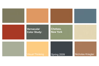
Created as a design proposal that featured urban-surfaces and street-furniture derived from vernacular color studies of the Chelsea District of NYC. Done in Kevin Byrne’s Visual Thinking course at the Minneapolis College of Art and Design, 2008-2010

Empfohlen
Empfohlen
Weitere ähnliche Inhalte
Mehr von J. Kevin Byrne
Mehr von J. Kevin Byrne (16)
Kürzlich hochgeladen
Kürzlich hochgeladen (20)
Chelsea // Nicholas Kriegler
- 1. Vernacular Chelsea, Color Study: New York Visual Thinking Spring 2009 Nicholas Kriegler
- 6. Corner on 8th Ave
- 7. 144 8th Ave
- 8. 74 8th Ave
- 9. Corner on 8th Ave 144 8th Ave 74 8th Ave
- 10. Kobayashi Connotations Natural Youthful
- 12. The yellow has a natural connotation; It lines the interior of the stop frame so it isn’t as visable as the outside blue. This keeps the bus stop from being jarring against the frequent red buildings, or blending in with the frequent yellow. The gray of the metal frame gives the design a modern feel, while framing the blue and yellow which echo the original colors of many of the older buildings in Chelsea. The blue has a casual, youthful connotation; Chelsea is known for being the home of the most dense young homosexual population in Manhattan. I used only two colors with gray because I wanted to sort of metaphor the neighborhood’s old architecture, but make it look modernized; From expirimentation with colors, three or four different colors made it look overly youthful; almost like a children’s bedroom.
- 13. Chelsea, New York is natural, youthful, and casual. The bus shelter i’ve designed reflects this, and references some of the past architecture from Chelsea, while maintaining a modern aesthetic. This assingment furthered my knowledge in color theory, and also forced me to think about presentation and reason in color choices. I think it was a good excersice in presenting personal design while reflecting purpose and reason.