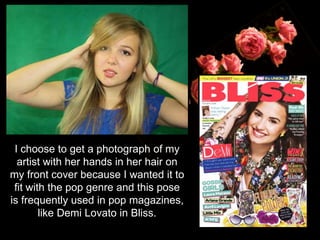
1. I choose to get a photograph of my
artist with her hands in her hair on
my front cover because I wanted it to
fit with the pop genre and this pose
is frequently used in pop magazines,
like Demi Lovato in Bliss.
2. I choose to get a
photograph of my artist
with a guitar as this could
be used to anchor my text
on my double page spread
because my text says
about my artist playing the
guitar. Additionally, the
photograph maintains the
idea that my magazine is a
pop magazine and not just
a teenage girls fashion
magazine.
3. I wanted to get some photographs of my artist
with bubbles for my double page spread as
they look quite fun and young, which appeals to
my readers. I really liked the way the light
reflected in the bubble.
I needed to get some
photographs from other
distances for my contents
page. I liked the lighting in
this photograph but I didn't
think it really connoted the
pop genre.
4. I didn’t like this photo as it looks very posed.
I liked the lighting in the photograph but I
don’t think it connotes the pop genre. I think
my artist does not look happy enough for a
young girls pop magazine.
I used a tiara because it
fits with the genre and
‘pop princess’ look, which
appeals to my target
audience.