SlideShare ist ein Scribd-Unternehmen logo
1 von 3
This is the main image of the double page spread. It is taking up the
majority of the double page, showing that it is important. The
image has been styled to monochrome colours which makes it look
quite old but classy at the same time. The people in the image are
also wearing quite classy, smart clothes which connects to the
colours. It gives you a feel that this photo is from the 80’s.

The three main colours used on this double
page are white, blue and black. These colours
make the page look professional as they are
quite gentle and not too colourful. The colours
are quite calm and relaxing which also matches
the images as they are also not that vibrant.

In the top, left
side of the double
page, the small
box has the title
name of the
magazine, ‘NME’.
It is written in a
bright yellow
colours, this
makes it stand
out against the
black background
and the greyscale,
main photo. It
needs to stand
out as it is the
logo of the
magazine and
because the font
is very small.

This is the main title of the page.
This is eye catching because the
Awards list interested many
people who enjoy music and want
to know who got the awards. A
bold font is used for the title
which makes it stand out against
everything on the page.

The beginning of the
word in the articles uses a
large letter, informing
where to start reading
front.

There is an image of three girls, band called ‘Haim’. They look
like the stereotypical teenage/young girls with their ‘rock’
pose. They are also wearing clothes that show they're ‘cool’
with their leather jacket, yellow sweater with stamps on and
their long, styled hair. This attracts teenage boys and it also
makes attracts girls as they might want to be like them. The
title above include their names and a title saying ‘new girls’.

This box has
also been
made to stand
out, by having
a brick block
colour of blue,
in the double
page spread
with the main
image. This
informs the
audience that
it has
important
information,
so they don’t
skip or miss it.
The
information is
also
interesting
because it lets
the audience
know who the
‘best albums’
and ‘best
singers’ are at
the moment.
‘’I won’t pretend
to have heard of
Haim’’
MICK JAGGER
Here I have taken a piece of the double page spread about Mick Jagger. This section of information stands out in the magazine as it has a black
boarder around the article, separating it from the writing and information around it, making the reader focus on this section. The text ‘Rolling stones’
also stands out as it used a bold font in large size. The reader attracts to it because Rolling Stones are the best band and musicians of all time. They are
seem as ‘the legend’ in the magazine, which is mentioned in a black box above his name. There is also an image of the singer which might of been
taken of him from one of his performances on stage. He is wearing the usual rock costume e.g. Hat, skinny jeans, blazer and the colours of the outfit.
Mick Jagger also mentions the girls band Haim that are also one of the main stories on the double page.
‘I wont pretend to have heard of Haim’ quoted of Mick Jagger. The quote is written in the largest text in
the article of the rolling stones and also in n Italic font. This makes the girl group Haim stand out even
more as they have been mentioned by one of the best, most known singer of all time. This also
promotes them.
This shows that the stories in the articles on the double page spread all connect in some way.
This large ‘sticker’ on the page also stands out a lot. It informs the
audience with important information. It also uses a golden music
trophy that points at the sticker which is a smart idea. It includes the
website of where to go and vote for the next best musicians.
The text of the article inn the background has been fitted to go
around the sticker, also making the page look creative and intending
that the information in the sticker is important. The sticker has also
been placed into the article about the winning and upcoming artists,
this message connects to the text in the sticker.

Weitere ähnliche Inhalte

Andere mochten auch

My first day - A narorative
My first day - A narorative My first day - A narorative
My first day - A narorative BenjaminKarki
 
Exploiting Wikipedia for Information Retrieval Tasks, SIGIR Tutorial
Exploiting Wikipedia for Information Retrieval Tasks, SIGIR TutorialExploiting Wikipedia for Information Retrieval Tasks, SIGIR Tutorial
Exploiting Wikipedia for Information Retrieval Tasks, SIGIR TutorialVictor Makarenkov
 
Smely- Dáng đẹp eo thon
Smely- Dáng đẹp eo thonSmely- Dáng đẹp eo thon
Smely- Dáng đẹp eo thonLinh Linh
 
Onato - Bảo vệ bộ não toàn diện
Onato - Bảo vệ bộ não toàn diệnOnato - Bảo vệ bộ não toàn diện
Onato - Bảo vệ bộ não toàn diệnLinh Linh
 
Furnir ( vrste i upotreba )
Furnir ( vrste i upotreba )Furnir ( vrste i upotreba )
Furnir ( vrste i upotreba )arminalomerovic
 
Mi power point flores
Mi power point floresMi power point flores
Mi power point floresAilinTomas
 
Result of persona with o gcdp
Result of  persona with o gcdpResult of  persona with o gcdp
Result of persona with o gcdpCansu Demirtaş
 

Andere mochten auch (15)

TIPOS O NIVELES DE PREVENCION
TIPOS O NIVELES DE PREVENCIONTIPOS O NIVELES DE PREVENCION
TIPOS O NIVELES DE PREVENCION
 
My first day - A narorative
My first day - A narorative My first day - A narorative
My first day - A narorative
 
Exploiting Wikipedia for Information Retrieval Tasks, SIGIR Tutorial
Exploiting Wikipedia for Information Retrieval Tasks, SIGIR TutorialExploiting Wikipedia for Information Retrieval Tasks, SIGIR Tutorial
Exploiting Wikipedia for Information Retrieval Tasks, SIGIR Tutorial
 
Smely- Dáng đẹp eo thon
Smely- Dáng đẹp eo thonSmely- Dáng đẹp eo thon
Smely- Dáng đẹp eo thon
 
Onato - Bảo vệ bộ não toàn diện
Onato - Bảo vệ bộ não toàn diệnOnato - Bảo vệ bộ não toàn diện
Onato - Bảo vệ bộ não toàn diện
 
Talleres de FEP
Talleres de FEPTalleres de FEP
Talleres de FEP
 
TIPOS O NIVELES DE PREVENCION
TIPOS O NIVELES DE PREVENCIONTIPOS O NIVELES DE PREVENCION
TIPOS O NIVELES DE PREVENCION
 
Student Marketing 101
Student Marketing 101Student Marketing 101
Student Marketing 101
 
Ppt ionic formulae
Ppt ionic formulaePpt ionic formulae
Ppt ionic formulae
 
Furnir ( vrste i upotreba )
Furnir ( vrste i upotreba )Furnir ( vrste i upotreba )
Furnir ( vrste i upotreba )
 
Storms
StormsStorms
Storms
 
Mi power point flores
Mi power point floresMi power point flores
Mi power point flores
 
Result of persona with o gcdp
Result of  persona with o gcdpResult of  persona with o gcdp
Result of persona with o gcdp
 
Day2 mkt rev
Day2 mkt revDay2 mkt rev
Day2 mkt rev
 
TIPOS O NIVELES DE PREVENCION
TIPOS O NIVELES DE PREVENCIONTIPOS O NIVELES DE PREVENCION
TIPOS O NIVELES DE PREVENCION
 

Analysis of double page spread

  • 1.
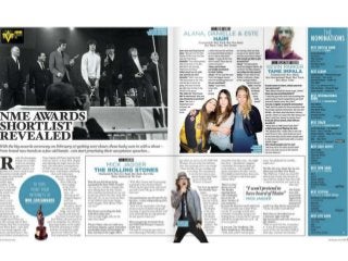
  • 2. This is the main image of the double page spread. It is taking up the majority of the double page, showing that it is important. The image has been styled to monochrome colours which makes it look quite old but classy at the same time. The people in the image are also wearing quite classy, smart clothes which connects to the colours. It gives you a feel that this photo is from the 80’s. The three main colours used on this double page are white, blue and black. These colours make the page look professional as they are quite gentle and not too colourful. The colours are quite calm and relaxing which also matches the images as they are also not that vibrant. In the top, left side of the double page, the small box has the title name of the magazine, ‘NME’. It is written in a bright yellow colours, this makes it stand out against the black background and the greyscale, main photo. It needs to stand out as it is the logo of the magazine and because the font is very small. This is the main title of the page. This is eye catching because the Awards list interested many people who enjoy music and want to know who got the awards. A bold font is used for the title which makes it stand out against everything on the page. The beginning of the word in the articles uses a large letter, informing where to start reading front. There is an image of three girls, band called ‘Haim’. They look like the stereotypical teenage/young girls with their ‘rock’ pose. They are also wearing clothes that show they're ‘cool’ with their leather jacket, yellow sweater with stamps on and their long, styled hair. This attracts teenage boys and it also makes attracts girls as they might want to be like them. The title above include their names and a title saying ‘new girls’. This box has also been made to stand out, by having a brick block colour of blue, in the double page spread with the main image. This informs the audience that it has important information, so they don’t skip or miss it. The information is also interesting because it lets the audience know who the ‘best albums’ and ‘best singers’ are at the moment.
  • 3. ‘’I won’t pretend to have heard of Haim’’ MICK JAGGER Here I have taken a piece of the double page spread about Mick Jagger. This section of information stands out in the magazine as it has a black boarder around the article, separating it from the writing and information around it, making the reader focus on this section. The text ‘Rolling stones’ also stands out as it used a bold font in large size. The reader attracts to it because Rolling Stones are the best band and musicians of all time. They are seem as ‘the legend’ in the magazine, which is mentioned in a black box above his name. There is also an image of the singer which might of been taken of him from one of his performances on stage. He is wearing the usual rock costume e.g. Hat, skinny jeans, blazer and the colours of the outfit. Mick Jagger also mentions the girls band Haim that are also one of the main stories on the double page. ‘I wont pretend to have heard of Haim’ quoted of Mick Jagger. The quote is written in the largest text in the article of the rolling stones and also in n Italic font. This makes the girl group Haim stand out even more as they have been mentioned by one of the best, most known singer of all time. This also promotes them. This shows that the stories in the articles on the double page spread all connect in some way. This large ‘sticker’ on the page also stands out a lot. It informs the audience with important information. It also uses a golden music trophy that points at the sticker which is a smart idea. It includes the website of where to go and vote for the next best musicians. The text of the article inn the background has been fitted to go around the sticker, also making the page look creative and intending that the information in the sticker is important. The sticker has also been placed into the article about the winning and upcoming artists, this message connects to the text in the sticker.