
Empfohlen
Weitere ähnliche Inhalte
Ähnlich wie Design principles
Ähnlich wie Design principles (20)
Kürzlich hochgeladen
Kürzlich hochgeladen (20)
Design principles
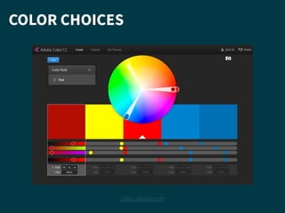
- 2. COLOR CHOICES Try to use color sparingly! An option is to use different transparencies of the same color. 60% 40% 25% 15%
- 3. COLOR CHOICES Color is part of branding, so make sure to use appropriate colors:
- 4. BALANCE — determines how weighted a design is to a certain area
- 5. BALANCE — determines how weighted a design is to a certain area
- 6. BALANCE
- 7. BALANCE
- 8. BALANCE
- 9. BALANCE
- 10. BALANCE — think as grids Grids can help us see the balance clearer, and also understand negative space.
- 11. BALANCE — think as grids Grids can help us see the balance clearer, and also understand negative space. Don’t be afraid of the empty space on the page. Digitally, we have access to lots of it.
- 12. REPETITION — but avoid monotony How is monotony avoided here? How is repetition used here?
- 13. VISUAL PRIORITY highest priority top left …following eye… top right …scanning down… top right …further down… down left edge least priority bottom right
- 14. VISUAL PRIORITY — can also be controlled Contrasts—in size (we call this visual dominance), weight, and style—can all be used to control visual priority or hierarchy.
- 15. VISUAL PRIORITY — can also be controlled Contrasts—in size (we call this visual dominance), weight, and style—can all be used to control visual priority or hierarchy. Example: dominance.
- 16. VISUAL PRIORITY — can also be controlled Contrasts—in size (we call this visual dominance), weight, and style—can all be used to control visual priority or hierarchy. Example: style.
- 17. VISUAL PRIORITY — can also be controlled Contrasts—in size (we call this visual dominance), weight, and style—can all be used to control visual priority or hierarchy. Example: dominance and style.
- 18. VISUAL PRIORITY — can also be controlled Contrasts—in size (we call this visual dominance), weight, and style—can all be used to control visual priority or hierarchy. 1 2 3
- 19. VISUAL PRIORITY — can also be controlled Contrasts—in size (we call this visual dominance), weight, and style—can all be used to control visual priority or hierarchy. 1 2 3 Example: weight.
- 20. VISUAL PRIORITY — can also be controlled Contrasts—in size (we call this visual dominance), weight, and style—can all be used to control visual priority or hierarchy. 1 2 3 Example: dominance and weight.
- 21. Typography is the art of using black to expose whiteness of the page. — which is to say that typography is a system of contrasts.
- 22. WHICH FONT SHOULD I USE? Sans Serif Serif DECORATIVE Handwriting Typefaces (fonts) are not neutral but have character and communicate.
- 24. SPACING: WORD SPACING Borrowed from Paul Kahn & Krzysztof Lenk, “Principles of Typography for User Interface Design,” p. 20.
- 25. SPACING: KERNING Borrowed from Paul Kahn & Krzysztof Lenk, “Principles of Typography for User Interface Design,” p. 19.
- 26. SPACING: LEADING Borrowed from Paul Kahn & Krzysztof Lenk, “Principles of Typography for User Interface Design,” p. 20.
- 27. USING ALL CAPS FOR TOO LONG MAKES TEXT HARD TO READ AS OUR EYES ARE SEARCHING FOR THE CONTOURS OF LETTERS WITH THE SAME HEIGHT. DON’T USE ALL CAPS
- 28. This sentence is easier to read ! …than this one is because our eye looks to height. DON’T USE ALL CAPS Why?
- 29. This sentence is easier to read ! …than this one is because our eye looks to height. DON’T USE ALL CAPS
- 30. But: ALL CAPS can be useful for reducing the focus on text. Where do you focus? DON’T USE ALL CAPS ABOUT MORE INFORMATION NEXT PAGE “If today were the last day of your life, would you want to do what you are about to do today?” ! — Steve Jobs
- 31. “ ” ≠ " " CORRECT QUOTATION MARKS Remember smartquotesforsmartpeople.com. ’ ≠ '
- 32. CORRECT DASHES Remember quotesandaccents.com. Hyphen: - - “I love me some hand-lettering.” (breaking or joining single words into parts) ! en dash: – ⌥ + - “I was in jail from 1976–1978.” (replaces “to” and “and”) “I have a love–hate relationship with stretchy denim.” (illustrates relationship) ! em dash: — ⌥ + ⇧ + - “I once had to use the bus station bathroom—horrifying.” (break of thought)