2. Kerrang! magazine is published by the Bauer Media Group which is a large
German publishing company based in Hamburg. It operates in 15 countries
worldwide including USA, Europe and China and publishes over 300
magazines a month.
Bauer Media Group is a mass media institution as it not only focuses on
magazines but:
• Radio
• TV
• online
• mobile.
In the magazine the radio station Kerrang! (105.2) is advertised. This is an
example of synergy.
Website: http://www.bauermedia.co.uk/
Bauer Media Group
3. Some of Bauer Media Brands
• Magic
• Kiss
• Cool FM
• 4 Music
• Smash Hits
• The Hits
• The Box
• Closer
• Heat
• GRAZIA
• FHM
• Q
• Mojo
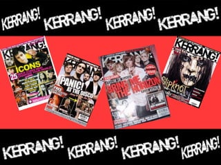
4. Kerrang Information
Kerrang! is a weekly published rock music magazine. Its name is
onomatopoeic and is the sound when playing a power cord on an electric
guitar.
Kerrang focuses on heavy metal/rock music and is linked to Goth subgenre. It
is mostly aimed at 13-19 year old male and females (its reader profile is made
up of 60% male and 40% female) who are into rock music but there are a lot of
older people with similar interests in music who still enjoy reading this
magazine.
• Regular Content: Reviews of CD’s, Radio, TV and gigs, new album releases, up-
coming gig information and tour dates, letters from readers.
• Feature Content: Article on ‘Bring me the Horizon’, interviews with Ozzy
Osbourne on his private jet and with Pete Wentz about life after ‘Fall Out Boy’,
A poster special on muse, green day, Metallic and more. And further articles or
gossip on Deftones, Your Demise, Jimmy Eat World, Korn and many more.
• Kerrang is sold weekly at the price of £2.20
• Issue Size: Approx 70 pages
• Website: http://www.kerrang.com/
5. Masthead
Bar Code and Date Line
Main Image
Primary Lead
Cover Line
Secondary Leads
Secondary Leads
6. Mast-head is behind the
picture showing that the
picture is more important
but also that the title is so
recognisable that it doesn't
not need to be on full view
on the page.
House style: red, white and black.
Main Image is posed and
complies with the house
style with the band all in
red, white and black
coloured clothing.
Distant shot, with all of the
band having eye contact with
the reader to engage them.
Magazine Cover is quite busy, showing the reader the main
things the magazine is offering this week.
Bold block capitals used
for cover lines and
masthead create
empathasis, use of
exclamation marks helps
achieve this too.
Pull in quote in red box to
stand out on the page to
attract the reader into
reading his story.
Primary Lead is centred on
the cover and in red. It is
the first thing the reader
takes note of when
looking at the cover.
7. Kept title simple and to the point, putting the issue number
and date underneath for Kerrang collectors.
Numbers are made very
clear by putting them in a
red font.
Sub-headings split contents
into sections . They are very
clear to see as they are in
yellow fonts in black boxes
which highlights them for the
reader and makes it easier to
find what they are looking for
quickly.
Editors note makes
the magazine a little
bit more personal and
updates the reader on
what she had been up
to, and what parts of
the magazine she
likes and recommends
you read .
Images, numbered so
reader can identify which
page it is on.
Put in boxes to stand out from the page and make the
reader notice them.
House Style remains,
but adds yellow to it
8. Drop Capitals.
Quote to draw
the reader in.
House Style is Black. And then white and
blue to give the article a dark hospital
appearance.
The article Contrasts how
a hospital acts, they are
there to help people and
bring them back to
health, these pictures
give off the opposite
approach and make the
article look very sinister.
The layout is mostly focused around the images, the text looks second
priority on the page as the images are large and centred.
The bands make-up
links to the cover
page.
Text is in a small
font that is
consistent
throughout the
magazine. It is in
white to contrast
the black
background.
The language is kept informal to appeal
to the reader ‘It’s stuff the rest of the
world doesn’t even know about.
9. Technologies
On the Kerrang website there is:
• A merchandise shop ‘Kerrang Store’
• Links to websites where you can purchase gig/concert/festival tickets
• A podcast page
• A page to watch music videos and listen to playlists
• A page to get news and an ‘access all areas’ page to view new music
videos
In the magazine the Kerrang website is advertised as well as many ticket
websites. There is also a small catalogue inside the magazine promoting
‘LOUDclothing.com’ a band clothing online store with a 10% discount code
for all Kerrang readers.
10. There are 64 pages in the magazine, 20 of them being
adverts. They type of things being advertised are:
• Deals on CD’s (HMV)
•Festivals
•Band Tours
•Gigs
•Band/Artist Clothing
These adverts suit the magazine because they will interest
the reader in the same way the magazine does. For
example, Rock music fans will be interested in their
favourite type of bands gigs and concerts and they will be
interested in deals on Rock CD’s in HMV stores.
Adverts
11. Positive & Negative
• I think the best thing about Kerrang is its variety of contents. It features
articles with very current bands, interviews with relevant artists/band
members, information about up-coming gigs and reviews on past gigs and
festivals, lots of posters and a chance for the reader to have his/her say on
their feedback page. I think with all this variety there is bound to be
everyone's favourite aspect in there. It is also well written and often very
witty.
• The thing I would change about Kerrang is to maybe have less adverts as
when I read a magazine I very rarely take much notice of the adverts
unless they really grab my attention. Its fine to have about 10 adverts in a
magazine the size of Kerrang. But with 20 I guarantee that the reader will
not even look at half and may think its a waste of their limited amount of
money each week. But obviously taking adverts out would make the
magazine cost more money.