
Empfohlen
Weitere ähnliche Inhalte
Ähnlich wie gallery36Vol5No22013
Ähnlich wie gallery36Vol5No22013 (20)
gallery36Vol5No22013
- 2. 2 / Gallery36 Vol 5. No. 2. 2013 / 3 8 MAY - 26 MAY 2013 Opens 5-7pm Tuesday 7 May ARTSTATION ANNA SHARMAN JEREMY HANSEN MELANIE DEACON PRISCILLA HUNTER SEARCH FOR OVER AND OVER EXHIBITION ARTSTATION GALLERY Upstairs, 1 Ponsonby Road, Newton, Auckland 1011 Gallery Hours: Mon-Fri 9am-5pm Sat 10am-4pm 09 376 3221 artstation@aucklandcouncil.govt.nz www.aucklandcouncil.govt.nz/artstation OVER AND OVER Recreate, reuse, renew, recycle, reimagine. Fishing around for some space? Check out our very competitive prices www.gallery36.co.nz/advertising/ Call Selene on 021 169 9084 or email editor@gallery36.co.nz
- 3. 4 / Gallery36 Vol 5. No. 2. 2013 / 5 MicheleGardner ArtSwappers You create 12 signatures then receive 10+ back to assemble into a wonderfully unique art journal of 80+ pages www.artswappers.com
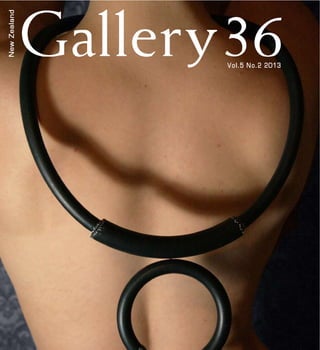
- 4. 6 / Gallery36 Vol 5. No. 2. 2013 / 7 Take time, look & listen Do you know what it takes to really understand someone else’s’ artwork? Of course there is a sliding scale of complexity. And those most complex is what I am talking about. And yet this is only my point of view. Someone could come along and say ‘that painting is all about jumping off a bridge and the green means she is going to do it’. And this could be true. So I might only be safe arguing that I take the more complex road towards things. My head doesn’t work out the easy path, or think the best and most effective way. Instead, I seem to approach everything as if I am looking at an artwork. As if I am attempting to understand the artwork as well as the artist. I don’t know why this is. But there are alot of positive things that come out of a more complex journey. Such as asking questions. The more you ask, the more you understand, the more information you are. And asking questions is what needs to be done when we look at an artwork. When we are trying to understand it; read it. You can’t assume everything, and all assumptions should come from informed contextualisation: from what you have learnt, tried and tested. If you can, talk with the artist. Make them a coffee and sit down and talk about their work, their practice and what drives them. It is only then that you may get a more clearer insight to someone’s artwork. This issue of Gallery36 is pleased to bring you another jeweller/designer who is expanding the boundaries of jewellery. A exciting pleasing sight in New Zealand indeed. And we also have winter coming. It seems to have set in here in the hills. And then there is the wind.... Sigh. Don’t get me started! Editorial included in this publication contributing authors and does not necessarily represent the views of Gallery36. Copyright for submissions belong to the contributors unless Gallery36 © Auckland, New Zealand ISSN 1179-8319 www.gallery36.co.nz Editor: Selene Simcox Ph: 021 169 9084 E: editor@gallery36.co.nz Executive Director: Selene Simcox Editorial Assistant: Margaux Wong Contributors: Hana Aoake and Katie Osborne-Tueton Cover image: Tineke Jansen Untitled (Rubber Ring) 2012 Rubber, thread 380 x 280mm approximate
- 5. 8 / Gallery36 Vol 5. No. 2. 2013 / 9 Contents Artists & Photographers 10 Tineke Jansen 16 Jessie Allen 20 Natalie Tozer 24 Andrew Peterson 28 Angie Ogilvy 32 Vincent Ward’s Exhibition Inhale 34 Research = Inspiration 40 smARTips 44 Underwater Apocalypse Adventure Vacation - Nymphets 2013 Collection Articles 12 32 10 20 28 44
- 6. 10 / Gallery36 Vol 5. No. 2. 2013 / 11 Emerging Auckland designer Tineke Jansen is looking to make her mark on the contemporary jewellery scene, with a simple but striking series contrasting masculine materials with the feminine form. Jansen is currently exhibiting her latest work at Lopdell House Gallery in New Lynn, her third show since graduating last year from Hungry Creek Jewellery School with an advanced diploma. Her current pieces are largely fabricated from rubber, and Jansen is keen to explore the masculine/feminine contrast. “My work mainly focuses on form and placement on the body, and I enjoy playing on contrasts. Using industrial, masculine materials like rubber to create curiosity and gives my jewellery a touch of playfulness,” she says, “The tactility and movement of rubber lets Jansen’s work with rubber was recently on display in Ponsonby at the Objectspace E: tmaree.jansen@gmail.com W: www.facebook.com/TMJewellery Designer Tineke Jansen Tineke Jansen Untitled (Chain Reaction) 2012 Rubber, thread 850 x 400mm approximate Tineke Jansen Untitled (Merged) 2012 Rubber, sterling silver 280 x 280mm
- 7. 12 / Gallery36 Vol 5. No. 2. 2013 / 13 Tineke Jansen Untitled (wood chip) 2012 Rubber, latex, paint 350 x 200mm approximate Gallery, although her latest pieces, which she describes as having something of a tribal feel, have gone back to basics. “I’ve tried making really intense, elaborate pieces but I found that they were almost most effective, but they can also be the most worth the effort. most striking work.” Contemporary jewellery was an unexpected choice for Jansen, who stumbled upon it in a newspaper article and shortly after found herself enrolled at Hungry Creek. the perfect outlet for her to explore previously undiscovered creative talents. “Contemporary jewellery is a topic that arouses many and confuses most. I often get Tineke Jansen Untitled (Clustered) 2012 Rubber, thread, resin, media gel, polystyrene, beads 300 x 250mm approximate Tineke Jansen Untitled (Spiked) 2012 Rubber, polymer clay, resin 420 x 250mm approximate asked why I became a contemporary jeweller of all things, but for me it was logical,” she says. “Jewellery is something most people adorn themselves with, without thought. I like the idea of challenging people the art we buy, so why not do the same with the jewellery we wear?”
- 8. 14 / Gallery36 Vol 5. No. 2. 2013 / 15 Tineke Jansen Untitled (Rubber Strip) 2012 Rubber 420 x 220mm approximate Tineke Jansen Untitled (Faux pearls) 2012 Rubber, copper, plastic, fake pearls 350 x 250mm approximate
- 9. 16 / Gallery36 Vol 5. No. 2. 2013 / 17 Since I can remember, I’ve aspired to captivate viewers with the same awe and amazement of the human form that I see as I study or draw it. expressions and silhouettes, with their ability to take on multiple moods – soft, harsh, natural, uncomfortable, simply by focusing on a certain aspect, highlighting one part of the body, a muscle, a vein, an eye. I vary from wanting to show authenticity and rawness with a simply charcoal, ink or pencil portrait, to wanting to convey movement, life, trials and triumphs with colours, mixed mediums and slight contortions of proportion. Primarily I work with portraits but not solely, I enjoy experimenting with landscapes and trying to evoke a feeling of movement, mood or emotion. Ultimately I am passionate about art and its interpretation of everyday life. I want to create beautiful works that people enjoy viewing, in which they see something slightly different each time they look. I have studied art and graphic design throughout school, practiced art though university, and worked on commissions as extra work. Now I am trying to further my E: jess.hq1@gmail.com W:penciltopen.blogspot.co.nz Artist Jessie Allen Jessie Allen Behind the Eyes (An interpretation of Steve McCurrys Peshawar, Pakistan) 2010 Graphite, pen and ink on canvas 210 x 297mm Jessie Allen An Unspoken Moment 2006 Pencil on paint. 450 x 900mm
- 10. 18 / Gallery36 Vol 5. No. 2. 2013 / 19 passion through a diploma in interior design, which I study extramurally outside of my day job in advertising. Although I like the advertising world with its creative ideas, its passionate individuals, and its fast pace, I continue to silently practice as an artist in the background of my life. I sell work in the public sphere where I can, update my website www.penciltopen.blogspot.co.nz, create commissions for colleagues and friends, and I am working towards being able to practice art and spatial design full time. I would love nothing more than being able to be creative full time. amazing artists out there, and I wonder does New Zealand have room for one more? Jessie Allen The Figure 2005 Pencil and ink on canvas 297 x 420mm Jessie Allen View From the Shore 2009 Monochromatic pencil, acrylic, ink and metallic paint on canvas 1500 x 750mm Jessie Allen At Dawn 2012 Acrylic on canvas 297 x 420mm
- 11. 20 / Gallery36 Vol 5. No. 2. 2013 / 21 Following on from her cinema entry in Auckland’s Art in the Dark Festival 2012 and Waiheke Island’s Headland Sculpture on the Gulf 2013 (pavilion installation) Natalie Tozer is pleased to present a new body of work currently on show at the Waiheke Community Art Gallery. This show includes video and sculpture pieces as well as a series of painted works on paper. Tozer is occupied with abstract visual communication. In a world dominated increasing subconscious need for us to abstract. She is interested in seeing abstract experiences become increasingly available for the public. Working with repetitive removal processes: glazing, washing and staining, Tozer’s process celebrates what is left behind; the shadows, stains and half forms. She is interested in how we tend to validate the terms of our here and now on sight, and her work queries this. Tozer is fascinated by what is not obvious, what we do not immediately see, what lies E: info@natalietozer.com W: www.natalietozerart.tumblr.com www.natalietozer.com Artist Natalie Tozer Natalie Tozer Film Still 2 2013 Natalie Tozer Film Still 1 2013
- 12. 22 / Gallery36 Vol 5. No. 2. 2013 / 23 Natalie Tozer The Lost Garden (detail) 2013 Direct to substrate print on 3mm clear acrylic Dimensions variable Natalie Tozer Punch + Black 2013 Acrylic on Paper 1000 x 700mm Natalie Tozer Liquid + Light 2013 Acrylic on Paper 1000 x 700mm between the gaps and fractures, the omissions and lost content. The works do not feed the viewer with information, but rather, seek to engage and invite the viewer to participate in new perspectives. Importantly, they do not seek to be located in the can access. Graduating from Elam School of Fine Arts in 2002, her distinct style has seen her recognized as continues to further her practice from her Kingsland studio.
- 13. 24 / Gallery36 Vol 5. No. 2. 2013 / 25 I see the automobile as an art form begging to be explored and showcased. Every car was sculpted by hand in clay before it ever turned a wheel on tarmac. By unlocking and discovering this artistic personality my work centres on exposing the inherent human emotion and E: andyf430@gmail.com W:apphotography.weebly.com Photographer Andrew Peterson mechanical beauty of the automobile through photography. My passion for automotive photography all went to a race meeting at Pukekohe Raceway. AndrewPetersonSunsetRocket(HSVR8)2012Digital Photograph3000x1993px Andrew Peterson Beach Explorer (Audi Q7) 2012 Digital Photograph 3000 x 1993px Andrew Peterson Dockside Bouncer (Lexus Ls460) 2012 Digital Photograph 3000 x 1993px
- 14. 26 / Gallery36 Vol 5. No. 2. 2013 / 27 It was here my appreciation for automotive photography began. Each photograph begins by taking the subject automobile to a carefully chosen location. It is then manoeuvred into place relevant to the surrounding environment. After the camera angles and lighting is setup, I proceed to photograph it at different exposure levels. These are merged My professional journey started with my completion of a Bachelor of Creative Technologies Digital Film & Photography at Wellington Institute of Technology. While studying, I explored my passion for the automobile in a wide range of media. This ranged from various visual arts to seek work experience with a local automotive dealer. This allowed me access to subjects that I Tim Wallace a UK based photographer, has been the base inspiration for my work. I am mesmerised by the way he uses light and shadows playing on the surrounding objects, to create his work. Hiroshi Sugimoto’s mechanisms also reinforced the importance of lighting certain elements to create different sensations. Andrew Peterson Green Wharf Monster (Holden SSV) 2012 Digital Photograph 3000 x 1993px Andrew Peterson Orange Muscle Storm (Chevrolet Camaro SS) 2012 Digital Photograph 3000 x 1983px
- 15. 28 / Gallery36 Vol 5. No. 2. 2013 / 29 Angie grew up in a creative family in the Bay of Plenty. After studying Media Arts at Waikato she moved to Wellington from 1997 – 2006. There she developed an arts and media holiday programme for primary aged students. While achieving a Diploma in Teaching, Angie also produced several successful painting exhibitions. Now living in Auckland, Angie continues teaching art in primary school. She has developed an innovative art curriculum, challenging children’s conceptions of art and motivating their creativity beyond the classroom. Angie has helped her students custom design sneakers, leading to their subsequent manufacture in China; her students have also designed and manufactured large installations occupying Auckland’s waterfront and displayed by the Wallace Arts Trust. Angie’s latest series Her Self, is an exhibition and expressive in large and small format, the works are a combination of acrylic and oil with mixed media. Her Self explores how the subjects desire to be seen by others. Each piece explores vanity, desire and disgust. Each girl strains to present the perfect angle of herself to the viewer, so E: anjibeth@hotmail.com W: www.chrisclark.co.nz/Angie.html Artist Angie Ogilvy she will be found desirable. She would die if anyone knew what she was thinking. Aching to look casual, every hair and bone over thought. faceless, with nothing beyond the desire to be perceived as beautiful. No candid grins, laugh lines or double chins. The hidden battles. Their white skin attempts to shield them from this. Some pieces feature stark white backgrounds, with the display for the world to see. Angie’s Her Self series is currently on display at Crave Café & Gallery until May the 11th. A 15% donation from each painting sold will be given to A Girl Called Hope organisation working with young woman facing life controlling issues such as abuse, addictions and eating disorders. The Her Self paintings can be viewed and purchased by contacting Angie directly through www.chrisclark.co.nz/ Angie.html Right: Angie Ogilvy Strong, & Ready to Tip 2008 Oil & acrylic on canvas 1010 x 1010mm Right: Angie Ogilvy Harrow 2008 Oil & acrylic on canvas 510 x 1520mm
- 16. 30 / Gallery36 Vol 5. No. 2. 2013 / 31 Above: Angie Ogilvy If I Looked at Myself From a Distance is this What I’d Look Like? 2009 Oil, acrylic, PVA & lace on canvas 1020 x 760mm Top Left: Angie Ogilvy Untitled 2010 Oil, acrylic & lace on canvas 910 x 610mm Bottom Left: Angie Ogilvy Is This How They See Me? 2012 Oil, acrylic & charcoal on canvas 1530 x 610mm
- 17. 32 / Gallery36 Vol 5. No. 2. 2013 / 33 A surreal, sensational exploration of the senses, New Zealand director Vincent Ward’s exhibition Inhale, is a seamless, cinematic experience not to be missed at Auckland’s Gus Fisher Gallery. Ward, an acclaimed and celebrated artist, well-known for his dramatic Rain Of The Children (2008) makes a huge contribution to New Zealand art. Surrealism, but his work based on the human psyche has a surreal quality that creates a submerged, transformative world for viewers to enter and explore the concepts of vulnerability and fragility within the human in Auckland’s aquarium, Kelly Tarltons. The helpless nude, female body submerged under strange yet hypnotizing; a surreal play on the transitional space between reality and fantasy. Realistically the woman is drowning, desperately struggling for a breath and survival; it is physically draining – even to body, moving sensuously, is questionably beautiful to watch. Ward ironically titles the exhibition Inhale, when the body is incapable of breath. The haunting music composed by John Gibson, sense of anxiety. The spiritual element relates to concepts of Kaitiaki and also Wehi – ‘fear and awe colliding’. Ward has successfully created a strong sense of place within Vincent Ward’s Exhibition Inhale ArtReview Aotearoa, and as a New Zealander, I found a subconscious connection to the tranquil sound of whales and waves. In terms of portraiture, this exhibition would be a great self portrayal of who Vincent Ward is as an artist. He creatively combines the in an intriguing, moving image, with intense colours, effective materials, textures and sound. Not only does this exhibition highlight identity as a New Zealander and his connection to living in Kaitiaki, Tuhoe. The woman, who is a portrait herself, appears to be in a transitional stage and state of change, an abstract referral and representation towards Ward’s own experiences and as though a foetus is trapped within a womb or a placenta ready to be reborn, and a slight by Maori story telling. Entering the dark exhibition, you are enclosed and surrounded by large screens and serene sound. Similar to an installation, the exhibition is a project that involves the viewer and will take you on a journey. The positioning of the screens contributes to achieving a real sense of an underground experience and successfully forms a relationship with the gallery space, the artwork and essentially the viewer. Together it seems Ward not only captures the essence of the physical body, but also the metaphorical ‘body’ of work that he has progressively By Kate Molineaux ArtReview composed and experienced throughout his life. Inhale is a thought provoking exhibition that creates a distorted, world capturing the intensity of life. It connects with the inner, visceral being of the viewer and explores the body in a state of transformation, submersion and change. The fusion of different artistic elements and media ambiguity. Vincent Ward Born in a Caul 2011 Photograph, pigment inks on archival paper
- 18. 34 / Gallery36 Vol 5. No. 2. 2013 / 35 Research = Inspiration Research plays a vital key in all art practices. Here are some artists I have come across recently. Editor. Carne Griffiths Research=Inspiration Research=Inspiration Working primarily with calligraphy inks, graphite, and liquids such as tea, brandy and vodka, the creation and manipulation of the drawn line. Images explore human, geometric and abstract translation, and in response to images and situations encountered in daily life. Images are recorded in a dreamlike sense onto the page where physical boundaries are unimportant. His work creates a journey of escapism which focuses on scenes of awe and wonder, projecting a sense of abandonment and inviting the viewer to share and explore this inner realm. Since establishing his own studio in 2010, Carne has exhibited in the UK at the London Original Print Fair at the Royal Academy, the London Art Fair in both 2011 and 2012, and overseas at Urban in Ibiza in 2011 and Arts After Dark, New Orleans in 2010. Carne also collaborated with the British photographer Rankin for a feature in the 2nd edition of Hunger Magazine early in 2012. www.gabrielmoreno.com www.gabrielmorenogallery.com Gabriel Moreno Gabriel Moreno is an illustrator, engraver and painter based in Madrid. After working in a variety of design studios and ad agencies, Moreno started showing his portfolio in 2007, where he was selected as one of the 20 new talents of illustration by the London based magazine Computer Arts, which kicks off his successful career as an illustrator. To date, Moreno has worked with virtually every major national design agency, including working with numerous national and international publications. Moreno also does commissions now.
- 19. 36 / Gallery36 Vol 5. No. 2. 2013 / 37 Research=Inspiration Research=Inspiration www.roslynoxley9.com.au/artists/18/Bill_Henson/ www.tolarnogalleries.com/bill-henson/ Bill Henson Bill Henson is a photographer who scratches at the twilight zone; at ambiguous spaces between day and night, nature and civilization, youth and adulthood, male and female. Henson’s subjects walk the line between no man’s land, where androgynous boys and girls drift in the nocturnal turmoil of adolescence, in painterly dreams that continue the tradition of romantic literature and painting in our postmodern age. You might know Henson’s work from the controversial seizure of his photography in 2008, where his work was labeled as child pornography and the age old debate of censorship once There is no such thing as bad publicity. No matter what side of the fence you stand on, Henson’s work has continued to impress the viewer for over 30 years with his exploration shadow, the human form and architecture, making him one of Australia’s most successful photographers both nationally and internationally. Bill Henson Untitled #17, 1998 Type C photograph 104 × 154cm Edition of 5 + 2 A/Ps Bill Henson Untitled #17, 1998 Type C photograph 104 × 154cm Edition of 5 + 2 A/Ps www.ifrancis.co.uk www.joshualinergallery.com Ian Francis I might have introduced you to Ian Francis before. If I did it is purely out of biases that I do so again. Francis draws inspiration from cinema, pornography and street culture, and creates intricate visions of mediated landscapes. Amid high-colour washes and jagged brushwork with a blend of abstraction, painting and drawing, Francis in scenes of intimate and hedonistic abstractions. The often young and beautiful denizens of a particular media fantasy fuelled by sex, death, and celebrity. Top: Ian Francis Le Corbusier’s Dream Falls Apart as the Cliff Beneath Collapses 2012 Mixed media on canvas 1520 x 1520mm Bottom: Ian Francis A Girl Commits (Fake) Suicide with a Raygun 2012 Mixed media on canvas 1370 x 1830mm
- 20. 38 / Gallery36 Vol 5. No. 2. 2013 / 39 Research=Inspiration Research=Inspiration www.sayakaganz.com Sayaka Ganz Giving recycled art a whole new feeling, is Sayaka Ganz’s ‘reclaimed creations’. odd shapes together and a sympathy toward discarded objects, I create animals from thrift store plastics”. (Sayaka Ganz). Part of Ganz’s philosophy is to only select objects that have been used and discarded. “My goal is for each object to transcend its origin by being integrated into an animal/organic form that are alive and in motion. This process of reclamation and regeneration is liberating to me as an artist”. www.sayakaganz.com Grimes Music has always been a huge inspiration to me. I listen to a wide range of genres and often like to use music to inspire me to paint – kind of Kandinsky style. I remember one of my lectures at art school playing a song at the close of a lecture on social theory. The artist was Katy Perry singing ‘You’re So Gay.’ The point that my lecture was making was: 1) you are remembered by what you say/do, 2) fame is available in any genre, and 3) artistic creativity is about originality within the social context that it can be understood. It was only six to eight months from hearing ‘You’re So Gay’, that Katy Perry was riding the wheel of fame, a bit higher than Lady Gaga… depending on whom you are loyal to! Watch out for Grimes: a talented young lady that proves you can do what you believe in, no matter the circumstances.
- 21. 40 / Gallery36 Vol 5. No. 2. 2013 / 41 Ariane of smARTist http://smartistcareerblog.com/about/ smARTist Telesummit http://smartist.com/store smARTips http://smartist.com/live-telesummit/weekly-smartips/ Facebook http://ArianeOnFacebook.com DM me on Twitter http://ArianeOnTwitter.com smARTist Store GRAND OPENING (Round 3) gives you 35% - 68% off April 30 – May 7. Click here to see the Store! http://store.smartist.com/store- round-1/ smARTips by Ariane Goodwin, Ed.D smARTips I’m Ariane of smARTist and I’ve been passionate about artists since I was a toddler tripping out on the cliffs of Big Sur, California while my artist mother held her before she could get to me. These days, I hang out on the smARTist® cliffs, soaking in the sweet salt air of artists who love what they do in the studio, and feel just a bit lost when they come out. For the last seven years I’ve been coaching private clients so they can fast forward their art careers, as well as developing information, inspiration, and insight for artists who want to bridge the gap between making art and making a living. Ah, yes, the scoop on our brand new smARTist Store: GRAND OPENING gives you 35% - 68% off until May 7th! After that the price goes up. I’ve broken out six years of the smARTist Telesummit keynote speaker presentations (from successful artists and leading art- career authorities) so you can pick and choose the right information for your art career right now. GRAND OPENING Round 3 - gives you 35% - 68% off until May 7 Thank you from my soul for having this smARTist Telesummit, for dreaming it, creating it and making it happen. It is wonderful. I came in thinking I don’t do licensing! I paint. Imagine the surprise I felt when Maria Brophy started talking: my energy soared, my enthusiasm not just for her talk but all the possibilities she was calling out in my imagination was sky rocketing. I was glued to my headset.” ~Anneke Newman (from Australia) smARTip #1: Understanding Black Power & the First Law ------------ Artists love black. Love, love, love it. It has class. It engages. It draws you in. ------------ Black is classy. It fairly screams “high end.” It dominates and holds our attention. Let’s face it: black has power. And for years and years and years it has been the color of choice to lay the crown jewels on, as the backdrop for a brochure, in framing… the list goes on. But let me tell you the one place where everything black does, and stands for, works completely against you, and against your art. On your website and blog! I know. It’s so hard to realize that the Old Order has given way to a New Virtual Reality. In fact, it is so hard that a good many of us haven’t caught on to the differences that decide our online fate. Because much of what we put online we Universe are not immediately apparent. And in this case, we are also working against a traditional sacredness of black that is positively trance inducing. Try this question on for size: What is the most important element on my website or blog? smARTips Hi! I’m going to spit right in the Colour God’s eye. (Not kidding). I’m going to take one of the most sacred of all colors and shake off the Old World commandments. And I’m going to do this with a calmness I do not feel when talking about the online, misuse of black. And a sensibility I’m praying you cannot ignore. P.S. Ready to connect? Maybe you’ve been tossing around the idea of zooming your art career forward with private art-career coaching... I have two spots opening up in May. Interested? You can DM me on Twitter - @artcareerdeva Send me a Facebook friend request or email me: ariane@smartist.com
- 22. 42 / Gallery36 Vol 5. No. 2. 2013 / 43 smARTips smARTips A. My domain name B. A picture of me working on my art C. My art D. My artist statement E. The background color Of course, each of these is important in it’s own way. But without C, none of the rest matters, right? Which brings us to the First Law of the Online Universe. Nothing should upstage website and blog. Nothing should detract, draw attention away from, or usurp your viewer’s focus on your art. Period. If black is engaging, dominant, holds our attention and draws us in, doesn’t it go without saying that a black background trumps your art? It seems so simple, so logical. Yet, whenever you tread on sacred ground that is also visually emotional, simple and logical hardly register. “But my art looks so good against a black background,” I can hear the wailing right across the oceans between us. Alongside the obliviousness that what we are responding to is the tremendous power of black, not how good your art looks against it. Think about this…have you ever been in a gallery with black walls? Besides, what do you want people to think is classy? Your website background or your art. You can’t have both. ***** smARTip #2: The Second Law & The Irrefutable Logic for Killing That Black Background ------------ Unlike gallery walls, a website needs words to deepen your viewer’s connection to you and your art because words replace the handshake and eye contact missing on a web page. You also need words to keep your visitor on your website, and moving in the direction of taking action to sign up for something (newsletter, a free offer, a short article, etc.) so you can follow up and stay in touch. But how can you read words on a black background? Ah… yes… thundering in, stage left: the White/Light Font! Which brings us to the Second Law of the Online Universe: Do not make anything hard for your visitor because they… will… leave. And nothing, but nothing, is harder than reading white or light colored words on a black or dark background. Nothing. (Except, maybe, slow loading images.) You can get away with white-on-black In small doses, say a tag line or a headline. It might even be classy. But once you start piling up sentence after sentence, never mind paragraphs, you are asking the human eye to do an inhuman task. It physically hurts…so, naturally, people don’t read, or don’t read much. Or don’t read enough. Me, I just click off as fast as I can. And your art doesn’t stand a chance. I have a theory (this is the Irrefutable Logic part…).Why would something, like black, work so well on paper but not on a computer monitor? I suspect one answer lies in our biology. The human eye is not calibrated for the monotonous, static light of a computer monitor. Human eyes are designed to adjust to incremental, minute changes in light from the minute we open them in the morning until we close them at night. Plunk down in front of the static, unchanging light of a monitor screen, then stare at it for minutes, if not hours, and suddenly you are holding your eyes hostage. A monitor is the gateway into a challenging environment, and anything you do that even the life span of a single visitor staying on your website long enough to engage and enjoy the creative work you so lovingly and passionately share with them. In the 1990s, research said you had only 3 to 9 seconds to engage a visitor on your web page before they clicked off to more engaging sites. That has now shortened to 2 to 5 seconds. Keep a black or dark background and you’ll never know how many people have surfed off in search of more friendly territory. Give up black and you give your visitors a chance to fall in love with your work. ***** I’d love to hear your thoughts about your follow-up strategies or anything else “art” you’d like to tell me. So, please, connect by... tweeting me - @artcareerdeva Sending me a Facebook message. Or emailing me: ariane@smartist.com BTW, check out the new smARTist Store presentations from six years of my annual, professional development, art career conference, the smARTist Telesummit. The artists who came had a lot to say about the individual presentations, like this one … “Once again, you pulled together a fabulous group of speakers – diverse and brilliant. Listening to the presentations and panel discussions was wonderfully informative and inspiring. LOVE that Eden Maxwell!!! As I sift through my notes today, I am myself as an artist are crystallizing into a clear, authentic me. I’m excited to continue on this journey – renewed and reinvigorated by your marvelous conference.” ~ Donna Blair For all the details, click here before- the 35% - 68% “Round 3” Grand Opening Sale is over on May 7, 2013 -> smARTist Store And if you want to check out the brand new smARTist Store click here: http://store. smartist.com/store-round-1/
- 23. 44 / Gallery36 Vol 5. No. 2. 2013 / 45 ArtReview None Gallery 13th-25th March 2013, Dunedin Walking around the Nymphets’ Underwater Apocalypse Adventure Vacation exhibition made one’s senses dither on edge, but all the while invited you to become more and more immersed inside the palpably dynamic environment. Curated by Glue Gallery and hosted by None Gallery in Dunedin as part of iD Fashion Week, Nymphets’ Rose Thomas transformed the space into a candy coloured world for the unconscious. It seemed like a place one drifts into falling asleep. The inner nature of such a place is just as unknown to us as the reality of the external world. The Underwater Apocalypse Adventure Vacation made one’s gaze become embedded into an otherworldly, prismatic and beautiful showcase of Nymphets’ Underwater Apocalypse A/W 2013 collection. Nymphets takes its name from the book Lolita by Vladimir Nabokov, whose title character is a Nymphet. In Lolita, the language of the prose lures the viewer into a state of aesthetic bliss. The prose is enchantingly written and seems to recall the enchantment of fairy tales. The Underwater Apocalypse Adventure Vacation hauntingly reminded one of the domestic interior, but simultaneously it was as though you were entering another world. The gallery space at None Gallery seemed memories of Lolita – the space has endless Underwater Apocalypse Adventure Vacation - Nymphets 2013 Collection By Hana Aoake doors and the exhibition has marked out walkways, which aided in the dislocated feeling of being in a non-space. The exhibition layout was organised into large rectangular squares, where a distortion of domesticity bulbous sculptural forms, fake dollar bills and The jewellery featured in the exhibition, included work by Christian McNab and I Am WoRm’s, Olivia Rowens. Each rectangular square in the space was fraught with objects alluding to domesticity, including a washing line, a bed with a mosquito net and a couch. The clothes dangled ghostly in the air on a clothes line, which stretched out across the centre of the space. Each of the garments seemed to refer to the absence of a body and to the purpose of clothing, to be worn. This was most evident by the singular dress, which dangled from the ceiling on the far left of the room and was isolated from the rest of the garments. During the opening, Thomas organised a performance in which herself and two others followed each other jaggedly, like geishas in a single line. Without any expression and in a continuous movement, each followed a ritual of dressing, undressing and hanging each garment on the clothesline. The performers looped across the room, while Max Trevor Thomas Edmund created a soundscape by collaging a series of samples. Thomas, her nymphets, and Max Edmund had their hair coated in pink paint, while their faces featured ArtReview bold swirls of colour, seemingly referencing the small, yet bulbous sculptures scattered throughout the installation. After dressing and undressing each other, Thomas and her nymphets scooped up and threw fake dollar bills into the sky, while jumping up and down on the bed. It was an action that seemed to be so far removed from the commercialisation of fashion, and it also seemed almost ironic in comparison to other events during iD Fashion Week. Thomas’ Nymphets projects belonging to one or the other. It was a rejection of capitalism, yet simultaneously seemed like a game a child would play. In Lolita, Humbert Humbert describes a number of Nymphetic indexes throughout the book, including a duality in nature; innocence combined with an ‘eerie vulgarity’.1 The Underwater Apocalypse Adventure Vacation nymphet; a childlike precociousness and a vulgarity were etched across the space. This vulgarity is expressed through a number space, Underwater Apocalypse and Exorcism Vacation. Both appeared on a television screen placed on the ground and projected released, including videos in collaboration with Tawahinga Butt, Matt Kofoed, Totems and $noregazZzm. In the Underwater playfully enter the end of existence, by diving into a pool of death and drowning. Exorcism Vacation harboured a feeling of both repulsion and enticement. The viewer’s eye became captivated by the swirls of colour, the scattered movement of the performers, and the beautiful Ophelic undertones of the characters, which alluded to the fatalistic hedonism of youth. Yet at the same time it retained a carnality, which was expressed through a series of the actors’ animalistic gestures, including both performers tumbling over and biting one another. These gestures registered a tension between playfulness, absurdity and uneasiness. It is as though both of the nymphets suddenly became mad spirit animals. The apocalyptic overtones of the show were expressed through the constant referrals to that which is abject, much in the same way that Nabokov uses a rich style of prose to envelope the reader into the brutality of Lolita. This realisation of such aversion is positioned in contrast to the magnetic beauty of the Underwater Apocalypse Adventure Vacation exhibition. A fatality echoes through the room, which is most notable in both of the videos. It’s almost with excitement that each of the nymphets plunges to their deaths; the water swallows them, and all the while makes one want to join them at the beginning of the apocalypse, hand in hand, as though it were a game. 1 Jerold Abrams. The Philosophy of Stanley Kubrick. Lexington, KY: The University Press of Kentucky, 2007, 115.
- 24. 46 / Gallery36 Vol 5. No. 2. 2013 / 47 ArtReview ArtReview Photos taken by Olivia Rowens and Rose Thomas
- 25. 48 / Gallery36