
Empfohlen
Weitere ähnliche Inhalte
Was ist angesagt?
Was ist angesagt? (17)
Andere mochten auch
Andere mochten auch (18)
Ähnlich wie Photoppt
Ähnlich wie Photoppt (20)
Mehr von Jennifermegan93
Kürzlich hochgeladen
Kürzlich hochgeladen (20)
Photoppt
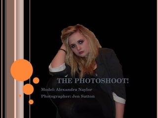
- 1. THE PHOTOSHOOT! Model: Alexandra Naylor Photographer: Jen Sutton
- 4. The use of props, the drumsticks relate to her ‘rock’ character, the fan would be cut later…
- 7. Quirky and fun, however the camera quality was later to be found not good enough…
- 8. Another picture to show the use of props with a guitar, shows her personality…
- 9. Different poses with the guitar…
- 11. A pose to hold eye contact which is a potential for the front cover...
- 12. Draws attention to the outfit…
- 13. Another pose to hold the eye contact and therefore another potential for the front cover…
- 14. A favourite, she is posing in a mirror, another prop, I think it is interesting and is a definite for my magazine…
- 15. A simplistic pose for effect…
- 16. A different angle, with a different pose, gives a full effect on the outfit. A combination of shoes and jacket make her look like a ‘girly girl rocker’.
- 17. To show a more fun side rather than just having pictures of eye contact…
- 19. Using plastic rimmed glasses for a ‘geek sheek’ effect and giving her some individuality…
- 20. Using a combination of props- glasses, drumsticks, and guitar, I like this as it is a natural pose, rather than too forced and different…
- 22. To appear like she is drumming on the mirror…
- 23. I like this pose, it makes her look like she is in a concert, it is fun and cool, relating to her wanted personality…
- 24. Another silly-style pose to show her fun personality, I also did not want the poses to become boring…
- 25. Evidence that I took the pictures…
- 26. The edits…! This was used as the front cover in the end…
- 27. This was used on the contents page…
- 28. This was used in the 2 page spread…
- 29. The main picture in the 2 page spread…
- 30. Also used in the 2 page spread…
- 31. An edit I really liked, although the colours did not work well together and seemed too gothic for my magazine style…
- 32. Another picture where the colours worked well individually but not in the magazine…
- 33. Colours worked, but not on magazine…
- 35. I really liked this pose, it just didn’t work…