
Empfohlen
Weitere ähnliche Inhalte
Ähnlich wie Channel 4 Documentary Print Ad Analysis
Ähnlich wie Channel 4 Documentary Print Ad Analysis (20)
Mehr von Isobelll
Mehr von Isobelll (18)
Channel 4 Documentary Print Ad Analysis
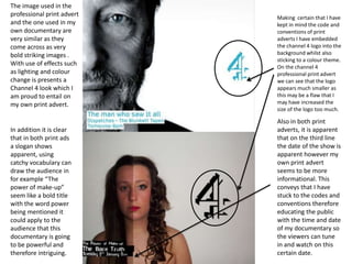
- 1. The image used in the professional print advert Making certain that I have and the one used in my kept in mind the code and own documentary are conventions of print very similar as they adverts I have embedded come across as very the channel 4 logo into the bold striking images . background whilst also sticking to a colour theme. With use of effects such On the channel 4 as lighting and colour professional print advert change is presents a we can see that the logo Channel 4 look which I appears much smaller as am proud to entail on this may be a flaw that I my own print advert. may have increased the size of the logo too much. Also in both print In addition it is clear adverts, it is apparent that in both print ads that on the third line a slogan shows the date of the show is apparent, using apparent however my catchy vocabulary can own print advert draw the audience in seems to be more for example “The informational. This power of make-up” conveys that I have seem like a bold title stuck to the codes and with the word power conventions therefore being mentioned it educating the public could apply to the with the time and date audience that this of my documentary so documentary is going the viewers can tune to be powerful and in and watch on this therefore intriguing. certain date.