SlideShare ist ein Scribd-Unternehmen logo
1 von 6
Downloaden Sie, um offline zu lesen
Run Charts
Adding the element of time will help clarify your understanding of the causes of variation in your
processes. A run chart is a line graph of data points organized in time sequence and centered on the
median data value. The patterns in the run chart can help you find where to look for assignable causes of
variation.


What can it do for you?
Histograms or frequency plots can show you the general distribution or variation among a collection of
data points representing a process, but one histogram or one frequency plot can not show you trends or
help pinpoint unusual events. Sometimes, a normal-looking distribution will hide trends or other unusual
data. To spot those trends, the data must be considered in time order. Plotting data on a run chart can
help you identify trends and relate them to the time they occurred. This will help you in your search for
the special causes that
may be adding variation               Unusual variation can hide in a frequency plot
to your process.

Run charts are especially
valuable in the measure
and analyze phases of
Lean Six Sigma
methodology.
How do you do it?
1. Select a characteristic from one of your processes. This characteristic could be presenting a problem
   because excessive variation often drives it outside of specification limits, or it could be a cause of
   customer complaints.

2. Measure the characteristic over time intervals and record the data. Note the time or the time period
   that is associated with each data point.

3. Find the median data value. To do this, list the data values in numeric order. Include each data point,
   even if it is a repeat value. If the number of data points is odd, the median is the middle value. If the
   number of data points is even, the median is halfway between the two values nearest the middle. For
   example, if the collected data points were: 5, 1, 18, 8, 12, 9, the ordered values would be: 1, 5, 8, 9,
   12, and 18. The middlemost values are 8 and 9. The median is the average of those values, or 8.5.
   (Remember, the numerically-ordered data is only for determining the median. The data must be
   plotted in time order on the run chart to be of any value.)

4. Set up the scales for your run chart. The vertical scale will be the data values, and the horizontal
   scale will be the time. Make the horizontal scale about two to three times the distance of the vertical
   scale.

5. Label the vertical scale so that the values will be centered approximately on the median and so the
   scale is about 1 ½ to 2 times the range of the collected data.

6. Draw a horizontal line representing the median value.

7. Plot the data points in sequence. Connect each point to the next point in the sequence with a line.
                                                   int ta


                                                          ns


                                                          ns

                                                   int ta


                                                          ns


                                                          ns
                                                     of r


                                                     of r
                                                     of r


                                                     of r
                                                er t fo


                                                er t fo
                                                er t fo


                                                er t fo
                                               po f da


                                               po f da
                                                        ru


                                                        ru


                                                        ru


                                                        ru
Some special cause variation reveals
                                                       s


                                                       s
                                              mb mi


                                              mb mi
                                              mb mi


                                              mb mi
                                                      o


                                                      o


itself in unusual run-chart patterns.
                                           nu r li


                                                 r li
                                           nu r li


                                           nu r li
                                                 er


                                                 er


These clues can direct you in your
                                              mb


                                              mb
                                              we


                                              we
                                              pe


                                              pe
                                           Up


                                           Up

search for causes. Count the number
                                           Lo


                                           Lo
                                           Nu


                                           Nu


                                           nu


of runs. Runs are sequences of points       10        3        8        35       13      23
                                            11        3        9        36       13      24
that stay on one side of, either above      12        3       10        37       13      25
or below, the median line. One way          13        4       10        38       14      25
                                            14        4       11        39       14      26
of counting the runs is to circle these     15        4       12        40       15      26
sequences and tally them. Another           16        5       12        41       16      26
                                            17        5       13        42       16      27
way of doing this is to count the           18        6       13        43       17      27
number of times the run-line crosses        19        6       14        44       17      28
                                            20        6       15        45       17      29
the median, and then add one.               21        7       15        46       17      30
                                            22        7       16        47       18      30
                                            23        8       16        48       18      31
Compare the number of runs you              24        8       17        49       19      31
count to the accompanying chart.            25        9       17        50       19      32
                                            26        9       18        60       24      37
                                            27        9       19        70       28      43
Numbers of runs outside the range           28       10       19        80       33      48
shown for the number of data points         29       10       20        90       37      54
                                            30       11       20       100       42      59
are statistically unusual.                  31       11       21       110       46      65
                                            32       11       22       120       51      70
                                            33       11       22
                                            34       12       23
Too few runs (below the lower limit) generally indicate that something cyclic is systematically shifting
the process average.


                             Example of too few runs


Too many runs could point to a problem of consecutive, over-compensating process adjustments or
indicate that the data points actually came from two sources with different process averages.


                            Example of too many runs
Look for sequences of ascending or descending values. Seven or more continuously increasing or
continuously decreasing points indicates a trend that is shifting the process average. When you are
counting points, ignore any points that repeat the previous value. Repeated values neither add to the
length of the run nor break it.


                 Examples of
                seven or more
                ascending and
                 descending
                    points


Search for seven or more consecutive points on the same side of the median line or 10 of 11 points or 12
of 14 or 16 of 20. (Ignore any points that are exactly on the median.) Such a sequence indicates that
something has occurred to shift the process average in that direction.


                                Examples of seven or
                                more ascending and
                                 descending points
A sequence of 14 or more data points alternating up and down suggests a variation related to sampling
(such as one reading early in the day and one reading toward the end) or that the data is coming from
two sources with different process averages (such as from two machines making the same part.) In
looking for up-and-down alternation, ignore any points that are exactly the same as the preceding point.


                                                                        Example of 14 or more
                                                                          alternating points


A sequence of seven or more points with exactly the same value usually should signal you to look for a
special cause. While it is possible that your process has improved to the extent that the existing
measurement technique is no longer sensitive enough to measure variation, it is usually more probable
that a gauge is stuck or broken or that someone is making up the data.


                                                         Example of seven points in a row
                                                              with the same value
Now what?
Run charts can be very valuable in
helping your search for sources of
variation. They are easy to plot and easy
to     interpret.  The     sampling      is
uncomplicated, and there are no statistical
computations to make. They can also be
applied to almost any process or any data.

On the other hand, they are not an instant
indicator. They are best used for spotting
trends; short shifts in the process cannot
always be detected with run charts. In
addition, special causes that produce
general piece-to-piece variation will not
be readily detected on run charts.

Finally, a simple run chart cannot
establish the natural capabilities of a
process, so it isn’t possible to use one to
predict what specifications a process can
actually meet. To do that, you need to
create a control chart, a run chart with
statistical control limits.


                      Steven Bonacorsi is the President of the International Standard for Lean Six
                      Sigma (ISLSS) and Certified Lean Six Sigma Master Black Belt instructor and
                      coach. Steven Bonacorsi has trained hundreds of Master Black Belts, Black
                      Belts, Green Belts, and Project Sponsors and Executive Leaders in Lean Six
                      Sigma DMAIC and Design for Lean Six Sigma process improvement
                      methodologies.
                                                   Author for the Process Excellence Network (PEX
                                                   Network / IQPC).
                                                   FREE Lean Six Sigma and BPM content

                      International Standard for Lean Six Sigma
                      Steven Bonacorsi, President and Lean Six Sigma Master Black Belt
                      47 Seasons Lane, Londonderry, NH 03053, USA
                      Phone: + (1) 603-401-7047
                      Steven Bonacorsi e-mail
                      Steven Bonacorsi LinkedIn
                      Steven Bonacorsi Twitter
                      Lean Six Sigma Group

Weitere ähnliche Inhalte

Mehr von Steven Bonacorsi

Analyze Phase Lean Six Sigma Tollgate Templates
Analyze Phase Lean Six Sigma Tollgate TemplatesAnalyze Phase Lean Six Sigma Tollgate Templates
Analyze Phase Lean Six Sigma Tollgate Templates
Steven Bonacorsi
 
Improve phase lean six sigma tollgate template
Improve phase   lean six sigma tollgate templateImprove phase   lean six sigma tollgate template
Improve phase lean six sigma tollgate template
Steven Bonacorsi
 
Measure phase lean six sigma tollgate template
Measure phase   lean six sigma tollgate templateMeasure phase   lean six sigma tollgate template
Measure phase lean six sigma tollgate template
Steven Bonacorsi
 
Lean six sigma tollgate checklists
Lean six sigma tollgate checklistsLean six sigma tollgate checklists
Lean six sigma tollgate checklists
Steven Bonacorsi
 
Control phase lean six sigma tollgate template
Control phase   lean six sigma tollgate templateControl phase   lean six sigma tollgate template
Control phase lean six sigma tollgate template
Steven Bonacorsi
 
Bringing program excellence to process excellence
Bringing program excellence to process excellenceBringing program excellence to process excellence
Bringing program excellence to process excellence
Steven Bonacorsi
 

Mehr von Steven Bonacorsi (20)

Lean Six Sigma Tollgate Template Videos Only
Lean Six Sigma Tollgate Template Videos OnlyLean Six Sigma Tollgate Template Videos Only
Lean Six Sigma Tollgate Template Videos Only
 
Analyze Phase Lean Six Sigma Tollgate Templates
Analyze Phase Lean Six Sigma Tollgate TemplatesAnalyze Phase Lean Six Sigma Tollgate Templates
Analyze Phase Lean Six Sigma Tollgate Templates
 
Improve phase lean six sigma tollgate template
Improve phase   lean six sigma tollgate templateImprove phase   lean six sigma tollgate template
Improve phase lean six sigma tollgate template
 
Measure phase lean six sigma tollgate template
Measure phase   lean six sigma tollgate templateMeasure phase   lean six sigma tollgate template
Measure phase lean six sigma tollgate template
 
Lean six sigma tollgate checklists
Lean six sigma tollgate checklistsLean six sigma tollgate checklists
Lean six sigma tollgate checklists
 
Control phase lean six sigma tollgate template
Control phase   lean six sigma tollgate templateControl phase   lean six sigma tollgate template
Control phase lean six sigma tollgate template
 
Bringing program excellence to process excellence
Bringing program excellence to process excellenceBringing program excellence to process excellence
Bringing program excellence to process excellence
 
14th Annual Asian Lean Six Sigma And Process Improvement Summit
14th Annual Asian Lean Six Sigma And Process Improvement Summit14th Annual Asian Lean Six Sigma And Process Improvement Summit
14th Annual Asian Lean Six Sigma And Process Improvement Summit
 
Advanced Performance Measurement Workshop Develop Measures That Drive Perform...
Advanced Performance Measurement Workshop Develop Measures That Drive Perform...Advanced Performance Measurement Workshop Develop Measures That Drive Perform...
Advanced Performance Measurement Workshop Develop Measures That Drive Perform...
 
Is There Any Strategy In Your Strategic Plan
Is There Any Strategy In Your Strategic PlanIs There Any Strategy In Your Strategic Plan
Is There Any Strategy In Your Strategic Plan
 
Make Performance Improvement Strategic
Make Performance Improvement StrategicMake Performance Improvement Strategic
Make Performance Improvement Strategic
 
Improve Your Performance News
Improve Your Performance NewsImprove Your Performance News
Improve Your Performance News
 
A Balancing Act
A Balancing ActA Balancing Act
A Balancing Act
 
Bsci Strategic Management Maturity Model
Bsci Strategic Management Maturity ModelBsci Strategic Management Maturity Model
Bsci Strategic Management Maturity Model
 
Using The Balanced Scorecard To Align
Using The Balanced Scorecard To AlignUsing The Balanced Scorecard To Align
Using The Balanced Scorecard To Align
 
Ultimate Bsc Sports Metaphor
Ultimate Bsc Sports MetaphorUltimate Bsc Sports Metaphor
Ultimate Bsc Sports Metaphor
 
Themes Of Confusion
Themes Of ConfusionThemes Of Confusion
Themes Of Confusion
 
Technology Company Balanced Scorecard Systems 06222010 Final
Technology Company Balanced Scorecard Systems 06222010 FinalTechnology Company Balanced Scorecard Systems 06222010 Final
Technology Company Balanced Scorecard Systems 06222010 Final
 
Build Innovation Into Your Strategy
Build Innovation Into Your StrategyBuild Innovation Into Your Strategy
Build Innovation Into Your Strategy
 
IGrafx Performance Management Whitepaper
IGrafx Performance Management WhitepaperIGrafx Performance Management Whitepaper
IGrafx Performance Management Whitepaper
 

Kürzlich hochgeladen

Finding Java's Hidden Performance Traps @ DevoxxUK 2024
Finding Java's Hidden Performance Traps @ DevoxxUK 2024Finding Java's Hidden Performance Traps @ DevoxxUK 2024
Finding Java's Hidden Performance Traps @ DevoxxUK 2024
Victor Rentea
 

Kürzlich hochgeladen (20)

Artificial Intelligence Chap.5 : Uncertainty
Artificial Intelligence Chap.5 : UncertaintyArtificial Intelligence Chap.5 : Uncertainty
Artificial Intelligence Chap.5 : Uncertainty
 
[BuildWithAI] Introduction to Gemini.pdf
[BuildWithAI] Introduction to Gemini.pdf[BuildWithAI] Introduction to Gemini.pdf
[BuildWithAI] Introduction to Gemini.pdf
 
Repurposing LNG terminals for Hydrogen Ammonia: Feasibility and Cost Saving
Repurposing LNG terminals for Hydrogen Ammonia: Feasibility and Cost SavingRepurposing LNG terminals for Hydrogen Ammonia: Feasibility and Cost Saving
Repurposing LNG terminals for Hydrogen Ammonia: Feasibility and Cost Saving
 
Polkadot JAM Slides - Token2049 - By Dr. Gavin Wood
Polkadot JAM Slides - Token2049 - By Dr. Gavin WoodPolkadot JAM Slides - Token2049 - By Dr. Gavin Wood
Polkadot JAM Slides - Token2049 - By Dr. Gavin Wood
 
Elevate Developer Efficiency & build GenAI Application with Amazon Q​
Elevate Developer Efficiency & build GenAI Application with Amazon Q​Elevate Developer Efficiency & build GenAI Application with Amazon Q​
Elevate Developer Efficiency & build GenAI Application with Amazon Q​
 
Exploring Multimodal Embeddings with Milvus
Exploring Multimodal Embeddings with MilvusExploring Multimodal Embeddings with Milvus
Exploring Multimodal Embeddings with Milvus
 
Connector Corner: Accelerate revenue generation using UiPath API-centric busi...
Connector Corner: Accelerate revenue generation using UiPath API-centric busi...Connector Corner: Accelerate revenue generation using UiPath API-centric busi...
Connector Corner: Accelerate revenue generation using UiPath API-centric busi...
 
MS Copilot expands with MS Graph connectors
MS Copilot expands with MS Graph connectorsMS Copilot expands with MS Graph connectors
MS Copilot expands with MS Graph connectors
 
Finding Java's Hidden Performance Traps @ DevoxxUK 2024
Finding Java's Hidden Performance Traps @ DevoxxUK 2024Finding Java's Hidden Performance Traps @ DevoxxUK 2024
Finding Java's Hidden Performance Traps @ DevoxxUK 2024
 
Rising Above_ Dubai Floods and the Fortitude of Dubai International Airport.pdf
Rising Above_ Dubai Floods and the Fortitude of Dubai International Airport.pdfRising Above_ Dubai Floods and the Fortitude of Dubai International Airport.pdf
Rising Above_ Dubai Floods and the Fortitude of Dubai International Airport.pdf
 
Apidays New York 2024 - Passkeys: Developing APIs to enable passwordless auth...
Apidays New York 2024 - Passkeys: Developing APIs to enable passwordless auth...Apidays New York 2024 - Passkeys: Developing APIs to enable passwordless auth...
Apidays New York 2024 - Passkeys: Developing APIs to enable passwordless auth...
 
Understanding the FAA Part 107 License ..
Understanding the FAA Part 107 License ..Understanding the FAA Part 107 License ..
Understanding the FAA Part 107 License ..
 
Platformless Horizons for Digital Adaptability
Platformless Horizons for Digital AdaptabilityPlatformless Horizons for Digital Adaptability
Platformless Horizons for Digital Adaptability
 
Vector Search -An Introduction in Oracle Database 23ai.pptx
Vector Search -An Introduction in Oracle Database 23ai.pptxVector Search -An Introduction in Oracle Database 23ai.pptx
Vector Search -An Introduction in Oracle Database 23ai.pptx
 
Web Form Automation for Bonterra Impact Management (fka Social Solutions Apri...
Web Form Automation for Bonterra Impact Management (fka Social Solutions Apri...Web Form Automation for Bonterra Impact Management (fka Social Solutions Apri...
Web Form Automation for Bonterra Impact Management (fka Social Solutions Apri...
 
MINDCTI Revenue Release Quarter One 2024
MINDCTI Revenue Release Quarter One 2024MINDCTI Revenue Release Quarter One 2024
MINDCTI Revenue Release Quarter One 2024
 
DBX First Quarter 2024 Investor Presentation
DBX First Quarter 2024 Investor PresentationDBX First Quarter 2024 Investor Presentation
DBX First Quarter 2024 Investor Presentation
 
How to Troubleshoot Apps for the Modern Connected Worker
How to Troubleshoot Apps for the Modern Connected WorkerHow to Troubleshoot Apps for the Modern Connected Worker
How to Troubleshoot Apps for the Modern Connected Worker
 
Six Myths about Ontologies: The Basics of Formal Ontology
Six Myths about Ontologies: The Basics of Formal OntologySix Myths about Ontologies: The Basics of Formal Ontology
Six Myths about Ontologies: The Basics of Formal Ontology
 
presentation ICT roal in 21st century education
presentation ICT roal in 21st century educationpresentation ICT roal in 21st century education
presentation ICT roal in 21st century education
 

Run charts

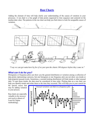
  • 1. Run Charts Adding the element of time will help clarify your understanding of the causes of variation in your processes. A run chart is a line graph of data points organized in time sequence and centered on the median data value. The patterns in the run chart can help you find where to look for assignable causes of variation. What can it do for you? Histograms or frequency plots can show you the general distribution or variation among a collection of data points representing a process, but one histogram or one frequency plot can not show you trends or help pinpoint unusual events. Sometimes, a normal-looking distribution will hide trends or other unusual data. To spot those trends, the data must be considered in time order. Plotting data on a run chart can help you identify trends and relate them to the time they occurred. This will help you in your search for the special causes that may be adding variation Unusual variation can hide in a frequency plot to your process. Run charts are especially valuable in the measure and analyze phases of Lean Six Sigma methodology.
  • 2. How do you do it? 1. Select a characteristic from one of your processes. This characteristic could be presenting a problem because excessive variation often drives it outside of specification limits, or it could be a cause of customer complaints. 2. Measure the characteristic over time intervals and record the data. Note the time or the time period that is associated with each data point. 3. Find the median data value. To do this, list the data values in numeric order. Include each data point, even if it is a repeat value. If the number of data points is odd, the median is the middle value. If the number of data points is even, the median is halfway between the two values nearest the middle. For example, if the collected data points were: 5, 1, 18, 8, 12, 9, the ordered values would be: 1, 5, 8, 9, 12, and 18. The middlemost values are 8 and 9. The median is the average of those values, or 8.5. (Remember, the numerically-ordered data is only for determining the median. The data must be plotted in time order on the run chart to be of any value.) 4. Set up the scales for your run chart. The vertical scale will be the data values, and the horizontal scale will be the time. Make the horizontal scale about two to three times the distance of the vertical scale. 5. Label the vertical scale so that the values will be centered approximately on the median and so the scale is about 1 ½ to 2 times the range of the collected data. 6. Draw a horizontal line representing the median value. 7. Plot the data points in sequence. Connect each point to the next point in the sequence with a line. int ta ns ns int ta ns ns of r of r of r of r er t fo er t fo er t fo er t fo po f da po f da ru ru ru ru Some special cause variation reveals s s mb mi mb mi mb mi mb mi o o itself in unusual run-chart patterns. nu r li r li nu r li nu r li er er These clues can direct you in your mb mb we we pe pe Up Up search for causes. Count the number Lo Lo Nu Nu nu of runs. Runs are sequences of points 10 3 8 35 13 23 11 3 9 36 13 24 that stay on one side of, either above 12 3 10 37 13 25 or below, the median line. One way 13 4 10 38 14 25 14 4 11 39 14 26 of counting the runs is to circle these 15 4 12 40 15 26 sequences and tally them. Another 16 5 12 41 16 26 17 5 13 42 16 27 way of doing this is to count the 18 6 13 43 17 27 number of times the run-line crosses 19 6 14 44 17 28 20 6 15 45 17 29 the median, and then add one. 21 7 15 46 17 30 22 7 16 47 18 30 23 8 16 48 18 31 Compare the number of runs you 24 8 17 49 19 31 count to the accompanying chart. 25 9 17 50 19 32 26 9 18 60 24 37 27 9 19 70 28 43 Numbers of runs outside the range 28 10 19 80 33 48 shown for the number of data points 29 10 20 90 37 54 30 11 20 100 42 59 are statistically unusual. 31 11 21 110 46 65 32 11 22 120 51 70 33 11 22 34 12 23
  • 3. Too few runs (below the lower limit) generally indicate that something cyclic is systematically shifting the process average. Example of too few runs Too many runs could point to a problem of consecutive, over-compensating process adjustments or indicate that the data points actually came from two sources with different process averages. Example of too many runs
  • 4. Look for sequences of ascending or descending values. Seven or more continuously increasing or continuously decreasing points indicates a trend that is shifting the process average. When you are counting points, ignore any points that repeat the previous value. Repeated values neither add to the length of the run nor break it. Examples of seven or more ascending and descending points Search for seven or more consecutive points on the same side of the median line or 10 of 11 points or 12 of 14 or 16 of 20. (Ignore any points that are exactly on the median.) Such a sequence indicates that something has occurred to shift the process average in that direction. Examples of seven or more ascending and descending points
  • 5. A sequence of 14 or more data points alternating up and down suggests a variation related to sampling (such as one reading early in the day and one reading toward the end) or that the data is coming from two sources with different process averages (such as from two machines making the same part.) In looking for up-and-down alternation, ignore any points that are exactly the same as the preceding point. Example of 14 or more alternating points A sequence of seven or more points with exactly the same value usually should signal you to look for a special cause. While it is possible that your process has improved to the extent that the existing measurement technique is no longer sensitive enough to measure variation, it is usually more probable that a gauge is stuck or broken or that someone is making up the data. Example of seven points in a row with the same value
  • 6. Now what? Run charts can be very valuable in helping your search for sources of variation. They are easy to plot and easy to interpret. The sampling is uncomplicated, and there are no statistical computations to make. They can also be applied to almost any process or any data. On the other hand, they are not an instant indicator. They are best used for spotting trends; short shifts in the process cannot always be detected with run charts. In addition, special causes that produce general piece-to-piece variation will not be readily detected on run charts. Finally, a simple run chart cannot establish the natural capabilities of a process, so it isn’t possible to use one to predict what specifications a process can actually meet. To do that, you need to create a control chart, a run chart with statistical control limits. Steven Bonacorsi is the President of the International Standard for Lean Six Sigma (ISLSS) and Certified Lean Six Sigma Master Black Belt instructor and coach. Steven Bonacorsi has trained hundreds of Master Black Belts, Black Belts, Green Belts, and Project Sponsors and Executive Leaders in Lean Six Sigma DMAIC and Design for Lean Six Sigma process improvement methodologies. Author for the Process Excellence Network (PEX Network / IQPC). FREE Lean Six Sigma and BPM content International Standard for Lean Six Sigma Steven Bonacorsi, President and Lean Six Sigma Master Black Belt 47 Seasons Lane, Londonderry, NH 03053, USA Phone: + (1) 603-401-7047 Steven Bonacorsi e-mail Steven Bonacorsi LinkedIn Steven Bonacorsi Twitter Lean Six Sigma Group