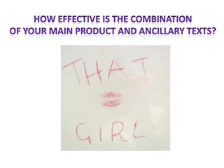
3. • My four panes of digipack had to establish the group
so creating ideas and sketches was demanding. Each
picture I felt had to complement each other because
I wanted to keep the identity of the girl a secret
which tied in nicely with the single ‘That Girl’ to
question who she really is. I originally in creating the
pictures used a cartoon effect in PowerPoint to
enhance the look, but becoming too creative can
lose the group’s genre.
4. • I feel it complements the music video because
the female protagonist is struggling with her
identity as this is stereotypical for a teenager
as they are still figuring out where they fit into
society.
5. • For my magazine advert, I organised a photo shoot so the
pictures would look professional and I could be more creative
in front of the camera to try out ideas for the advert. I used a
tabloid heading for the track title because I wanted a
proficient look. She is still dressed in clothes that represent
her social group and perpetrates the mainstream
representation. For example, converse which are an iconic
brand and shows a ‘cool and casual’ look.
6. • My music video shows a strong positive
representation of teenagers and enables the
audience to quickly establish the narrative. I feel like
the main product and ancillary tasks have a strong
link between them that connects with the theme of
identity. However, if I could make the connection
stronger, I would have used brighter colours in my
magazine advert. This is to highlight the fun pop
genre and positive representation.