Presentation creation design, typography rules, research skills & canva tutorial
•
2 gefällt mir•717 views

Presentation Principles: Recipes provides the steps for creating a powerful research project presentation. Rules or concepts presented include: color principles, typography rules, design presentation guidelines. The presentation also covers information on APA style citations, documentation, and research hyperlinks to the Big 6 Research Website.

Empfohlen
Weitere ähnliche Inhalte
Was ist angesagt?
Was ist angesagt? (16)
Ähnlich wie Presentation creation design, typography rules, research skills & canva tutorial
Ähnlich wie Presentation creation design, typography rules, research skills & canva tutorial (20)
Kürzlich hochgeladen
Kürzlich hochgeladen (20)
Presentation creation design, typography rules, research skills & canva tutorial
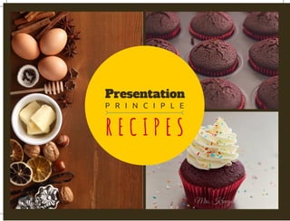
- 1. Presentation P R I N C I P L E R E C I P E S Mrs. Krueger
- 2. PRINCIPLE Can you find it? A A A CONTRAST of design elements throughout a presentation leave the impression of strength and unity. Take note as you read. Contrast adds visual interest. Examples include design elements, text, lines, colors, etc. which are found frequently again and again. Contrast is one of the most important elements. Be bold. Be dramatic. Use size, color, weight, form, direction and structure. Interactive: click on words and pictures abc abc abc Design contrast
- 3. PRINCIPLE Can you find it? A A A REPETITION of design elements throughout a presentation leave the impression of strength and unity. Take note as you read. Repetition adds visual interest. Examples include design elements, text, lines, colors, etc. which are found frequently again and again. Avoid overwhelming the presentation with design. Too much may become annoying as in a third page of this slide. ABC ABC ABC REPETITION Design Interactive: click on words and pictures
- 4. PRINCIPLE Alignment Can you find it? Design B BALIGNMENT of design elements have purpose for placement. All items must have a relationship to the story told on the page. When there is an order found on the page the message is stronger than if there are items placed to fill space on the page. Alignment to the left or right sends a stronger message than centering the information. Locate the path created by the cupcake design. Aa Aa Aa Interactive: click on words and pictures
- 5. PRINCIPLE Can you find it? Design B B B PROXIMITY of design elements occurs when items are close to each other and become one grouping vs several separate items. Empty space helps to give a clean look to the project. Need to adjust size or weight of graphics and text for an organized results. When looking at the graphics what direction does your eye take? There should be a path to follow. Do anything look too crowded? Bb Bb Bb PROXIMITY Interactive: click on words and pictures
- 6. PRINCIPLE Can you find it? C o l o r COLOR RELATIONSHIPS are easiest to remember if you think of clothing color combinations which look good together. Complementary colors are opposite color combinations which work because one is an accent and the other main color. Analogous colors have same basic undertone and create a peaceful palate. Notice any funky combos while looking at these slides? Cc Cc Cc relations Interactive: click on words and pictures
- 7. PRINCIPLE S & T Can you find it? C o l o r SHADES & TINTS are like looking at lighter and darker versions of the same color which are altered by adding color. The original color is the hue. When black is added it is called a color shade. If you add white it is called the color tint. See example. Monochromatic colors are a combination of one hue with additional added shades and tints added to refine the color. Dd Dd Dd Interactive: click on words and pictures
- 8. PRINCIPLE TONES Can you find it? C o l o r TONES are too similar in deepness or hue of a color. There is not enough contrast and the colors get lost as they are similar in strength. Care must be taken to avoid use of two tones which are similar. Another example of why contrast is so important to a good project. It is good practice to select your color palette before starting a project to keep consistent and avoid color principle bloopers. Ee Ee Ee Interactive: click on words and pictures
- 9. PRINCIPLE WARM Can you find it? C o l o r B B B WARM COLORS are colors which come forward and stand out. Use red as an accessory. Too much is overwhelming and confusing. Red or yellow can be added to a color to make it warmer. They are bold colors and can provide a great amount of contrast and interest. I hope you have noticed that the font box had turned green a few slides ago. Go back. Which color is warmer? Hint: it attracts your eyes. Ff Ff Ff Interactive: click on words and pictures
- 10. PRINCIPLE C O O L Can you find it? C o l o r COOL COLORS are colors with blue in them. It is a color which recedes into the background and does not stand out easily. It takes a large amount of the cool colors to provide enough interest for color contrast. Look at bottom right. One pink flower stands out. The slide features cool cupcake icing colors. Do they make you feel warm or make you think of a chilly fall or winter day…frosting? Gg Gg Gg Interactive: click on words and pictures Mrs. Krueger
- 11. PRINCIPLE CONCORD Can you find it? Typing Concord text selection is the use of text without contrast. It may be the selection of one font of various font sizes. It looks boring. Which font provided in the yellow shapes are very different? Similar? To use contrast it must be a very different font to be successful. Use contrast to provide the visual differences that are appealing: size, weight, structure, form, direction, and color. See the difference? Hh Hh Hh Interactive: click on words and pictures
- 12. PRINCIPLE CONFLICT Can you find it? Typing CONFLICT text selection is the use of text without contrast. It may be the selection of fonts which are too similar. This should be avoided! Which font provided in the yellow circle is very different? Similar? To use contrast it must be a very different font to be successful. Use contrast to provide the visual differences that are appealing: size, weight, structure, form, direction, and color. See the difference? Ii Ii Ii Interactive: click on words and pictures
- 13. PRINCIPLE CONTRAST Can you find it? Typing CONTRAST text selection is the use of visual differences that are appealing: size, weight, structure, form, direction, and color. Most effective use is a combo of the six methods to create contrast and use them… Have fun! Make… Bake… Decorate. Look at this slide. How many of the different visual differences are used on just this slide alone? Compare to the Concord slide. Jj Jj Jj Interactive: click on words and pictures
- 14. PRINCIPLE Oldstyle Can you find it? Typing OLD STYLE font selections use slanted serifs. Letters are both thick and thin. The lettering looks very old, formal and fancy. Easy to read. Great style to use with body of information. The font you are reading has slanted serif on the letters. Looks like it is handwritten. Go to Font Squirrel for free fonts... Old Style Examples: Bell, Garamond, Goudy, Palantino, Sabon, Times, etc. Kk Kk Kk Interactive: click on words and pictures…see Kk
- 15. PRINCIPLE MODERN Can you find it? Typing MODERN font selections use horizontal thin serifs. The letters are both thick and thin with dramatic contrast. Looks cold and elegant. Great style to use as the title. The green font in the yellow font box represents a modern font type. Do not use for body copy. Go to Font Squirrel for free fonts… Modern Style Examples: Bodoni, Didot, Walbaum, Modern No. 20 etc. Ll Ll Ll Interactive: click on words and pictures…see Ll
- 16. PRINCIPLE SLABSERIF Can you find it? Typing SLAB SERIF font selections use thick serifs. There is little to none thick to thin transformation or contrast. Lettering is horizontal. Great style to use in the body of a presentation. Very easy to read. This style is used in children's books. Look carefully for example. Go to Font Squirrel for free fonts… Slab Serif Style Examples: Clarendon, Diverda Light, Memphis, New Century, etc. Mm Mm Mm Interactive: click on words and pictures…see Mm
- 17. PRINCIPLE SANSSERIF Can you find it? Typing SANS SERIF font selections do not use serifs. The word "sans" means "without" in the French language. No hats or little feet on lettering. Letters have little or no transition in formation. They are the same thickness throughout. Ubuntu is my favorite Sans Serif font. Go to Font Squirrel for free fonts… Sans Serif Style Examples: Bailey Sans, Brandon Grotesque, Folio, Modernica Light, etc. Nn Nn Nn Interactive: click on words and pictures…see Nn
- 18. PRINCIPLE Script Can you find it? Typing SCRIPT font selections use lettering that looks handwritten by a calligraphy pen or brush. Some scripts connect and other do not. Use sparsely as they can be too much when used to write long passages. They are artistic. Enlarge the letters for a grand effect. Go to Font Squirrel for free fonts… Script Style Examples: Adorn, Bookeyed, Bouquet, Emily Austin, Peony, Thirsty Rough Light Oo Oo Oo Interactive: click on words and pictures…see Oo Mrs. Krueger
- 19. PRINCIPLE decorative Can you find it? Typing DECORATIVE font selections are fun and easy to identify. Limits need to be used as to how much to use them. Great for titles. The decorative fonts portray feelings and emotions, they can be fun, formal, silly, spooky, frilly, expressive, etc. Go to Font Squirrel for free fonts… Decorative Style Examples: Flyswim, Horst, Matchwood, Scarlett, Sybil Green, The Wall, etc. Pp Pp Pp Interactive: click on words and pictures…see Pp
- 20. PRINCIPLE S I Z E Can you find it? Typing SIZE of font selections enhance the organization and main focus points of the presentation. Large and small font draw the readers eye. Use size in combination with weight, structure, form, direction, and color to make the most of using contrast in projects. Do not be afraid to use drastic contrast in font size. The more of a difference the better the ability to get your point across. Qq Qq Qq Interactive: click on words and pictures…see Qq
- 21. PRINCIPLE WEIGHT Can you find it? Typing Weight of font selection uses extreme differences in width or thickness. Use a thin and thick font together for contrast. Use weight in combination with size, structure, form, direction, and color to make the most of using contrast in projects. Go to Font Squirrel for free fonts… Decorative Style Examples: Brandon Grotesque font family, Silicia and Warnock families. Rr Rr Rr Interactive: click on words and pictures…see Rr
- 22. PRINCIPLE STRUCTURE Can you find it? Typing STRUCTURE of font selections takes a look at how the letters are constructed or formed. The letters may have serifs or not. The letters may be built without any changes in monoweight or thickness. If thick/thin transitions are present the letters contrast. Choose two or more faces from two or more categories. Use series, san serifs, thick/thin lettering, mono widths. Make sure they contrast. Ss Ss Ss Interactive: click on words and pictures…see Ss
- 23. PRINCIPLE F O R M Can you find it? Typing FORM of font selections is the concept that using all capital letters has a square shape when read. We recognize letter shapes to read. Using all capital letters can be difficult to read. Use of italics as a gentle reminder can notify reader of repeating concepts. When using fonts, remember to use fonts with addition of other contrasts so they do not confuse the eye with too much similarity. Tt Tt Tt Interactive: click on words and pictures…see Tt
- 24. PRINCIPLE DIRECTION Can you find it? Typing DIRECTION of font selections discusses whether the lettering is horizontal, vertical, slanted up or down, which send messages. An upward slant creates a happy feeling. A downward slant has a negative feeling. Please never use script lettering in corners. Sometimes a change in direction can provide a nice contrast. Use sparingly. Long lines create feelings different from tall columns. Uu Uu Uu Interactive: click on words and pictures…see Uu
- 25. PRINCIPLE COLOR Can you find i? Typing COLOR of font selections can make a text standout or retreat. Warm colors appear to come forward while cool colors sink into background. Our eyes are attracted to the warm colors on a presentation. Do not use too much or it will cause confusion. Cool colors provide contrast. Use black or white type to provide the greatest amount of contrast when creating your presentations. Experiment to see which works best. Vv Vv Vv Interactive: click on words and pictures
- 26. P R I N C I P L E MIXING Can you find it? Typing MIXING the following principles into the presentation will help make the presentation stand out. Be bold. Be creative. Have fun. Follow recipe. Color, direction, form, structure, weight and size should be used with the rules kept in mind. Use but do not abuse and use too much. Add at least two different font styles and keep a close eye on the contrast, repetition, proximity and alignment. Secret recipe…shh... Ww Ww Ww Interactive: click on words and pictures
- 27. PRINCIPLE Rules Can you find it? Typing RULES OF TYPOGRAPHY: Click on the word Typing in the title circle for extensive detailed list of rules. A review of fonts is listed below. Font choice is like the icing on the cupcake. Some have serifs which are like fancy hats and shoes on the letters which give a dressy look. Click on the different Xx hyperlinks for examples of the six different font styles for creating your custom look. CONTRAST! Xx Xx Xx Interactive: click on words and pictures
- 28. PRINCIPLE R ule s Can you find it? Typing RULES OF TYPING: Make sure you are sitting in a well lit room. Check your posture. Check to make sure your feet are flat on the floor. Angle the compter screen so you can see without leaning toward the screen. Arms are parallel to the floor. Fingers on the home row. Keep your eyes focused on the screen or notes as you type. Work at a comfortable pace to avoid making mistakes as you type. Yy Yy Yy Interactive: click on words and pictures
- 29. D I D Y O U LEARN... Can you find it? W h a t Zz Zz Zz Interactive: click on words and pictures You are finished. Congratulations! You learned quite a bit of information. Please keep this as a handy reference tool so you can review the information as needed. Now go out there and use this recipe to create a beautiful presentation. I can;'t wait to see your final pressntation! Mrs. Krueger
- 30. Presentation P R I N C I P L E T h e e n d Mrs. Krueger