SlideShare ist ein Scribd-Unternehmen logo
1 von 24
Create a course
1. Log in to your account and access your dashboard. Click on the Create Course.
2. You will be now prompted with a new screen. There are 3 key areas to focus
1 – Course Title: You need to enter a title for your course
2 – Select Theme: You need to select a theme from the theming options provided to
you.
3 – Create: Click the button to create the course.
3. Now you will be prompted with a course structure inside a page called “Course
Builder”.
4. It is recommended to setup your course first before you start developing a course.
5. We should first setup the appearance of the course. This is important, since this is the
way your course is going to look like in the future. Click on the appearance tab. [A]
6. You will be now prompted with a screen with lots of different themes to select from.
NOTE: There are 2 types of themes. [B]
1 – Themes which is being shipped by default from Evolve. [1]
2 – Themes built customly to be edited and modified. This will have and Edit option.
[2]
7. You could also create a new theme if you like. In case if you need to create a new
theme, simply click on the New Theme button.
NOTE: You can only build a custom new theme, basing on one of the themes
currently exists. [C]
8. You will be prompted with a new theme creation screen.
1 - Simply give a new name for the theme [1]
2 select a theme from the drop-down menu and the following screen. [2]
3 Click create [3]
9. Your newly created theme will be displayed as the last theme in the list.
[Insert 2 screen and compare]
10. Now you can Edit your theme. To edit the theme, simply click on the Edit button. [A]
11. Now it’s time to set the Extensions for your course. In this part, not only it allows you
to add extensions to your course, but it also gives the options to create a menu for
your course.
12. When you enter the Extensions page, you will be prompted with a screen with 2
sections.
1 – Couse Menu: Select style of menu for your course and topic menus
2 – Course Extensions: Enable extensions for extra functionality for your course
13. To choose a menu, all you need to do is just select a theme by clicking on the radio
button next to the theme.
14. In the “Course Extensions”, when you select a extension, a self-introduction about
each extension is provided. To enable an extension, simply click on the switch next to
it to be turned on.
15. Once you enable the extension, you need to edit it to the way you need it behave.
Simply click on the Edit button next to each extension.
16. Once you click to edit an extension, it gives you options for that particular extension.
Each extension gives you multiple categories [A] and subcategory of options [B].
Each section contains a self-explanation instruction what needs to be done.
17. Now you are ready to get started to build your course. To get started building the
course, simply click on the “Content” menu option.
18. Now you will be navigated back to the page builder page.
19. You will notice a page structure. Let’s observe each component.
1 – The menu page of the course.
2 – Where we create a new page for the course directly.
3 – You can create a topic as a section and build corresponding pages to have a
structured hierarchy for your course.
20. To get started of creating a structure, as stated above; click on “Add Topic” [3]
button.
21. Now you will see new section created under the menu page.
22. If you need to create a subtopic, simply click on the “Add Topic” button directly
under your topic group. [2]
23. Now we need to give a name for our topic. To give a name, simply click on the “Edit
Topic” [1]
24. Now you will be in a different page with options to set your topic header.
25. Even though there are so many configuration sections, we only need to focus on very
few.
40- Title: The name of the to be identified when using in development.
41- Display Title: This is the name which you could see as a title. Basically, the name
of the topic of the section.
42- Display Title Settings: This the display formatting. The size of the font &
alignment. There is also a button to clear the formatting.
43- Description: This is a page descriptor. You could add a description for
identification. You could use this to enter any comments for identification and
used in further development.
44- Aria Label: This is an alternative text to be read by a screen reader. You could use
the same title as the “Display Title”.
45- Tags: Identification tags to be used in search. Once it is tagged, you could type in
the universal search feature in your course and it will be picked up in the search
results. This would be useful when you have too many information in your course
but you are in a hurry to find what to you need quickly.
26. If you need to delete the section/topic, simply click on the “Delete Topic” button.
27. Now lets add a page to the main menu. Simply click on the “Add Page” button. [A]
28. Now you could see the page is appearing as the second page next to the topic/section.
The Learning Development Platform Evolve, understands a section as a page when
creating the hierarchy. [B]
29. If you like to add a page under the topic/section, simply click on the “Add Page”
button located under the section header.[1]
30. Any page under the topic/section will create under that topic/header in a hierarchy
manner. [2]
31. Now let’s build the page. To get started, click on the page you want to build. It will be
selected with a blue box around it.
32. First, we need to give a title for the page. Click on the icon with a pencil to bring up
the page setup dialog box. [1]
33. When you click on it, you will be prompted with a dialog box. There are 3 key areas
we need to focus on when setting up the page.
1- Title: The title of the page. Give it a good name. This will the name to identify the
page.
2- Description: Give a meaningful description to understand what this page is about.
You could also put any comments about the page for further development. When
you page is searched and found, under the page name, the description will appear.
So, it is very important to give a good description.
3- All Edit Options: This brings the complete editing features related to the page.
34. Once you enter the title and the description, it will be displayed automatically in the
full editing options page. [1]
35. As discussed earlier (please refer to step 25), we only focus on the 6 areas. You need
to repeat the “steps 25” and fill in the details as you required for this page section.
NOTE: This is the common setup for every page and section/topic you create.
36. Now we focus on the specific unique setup area when developing a page.
A – Page Header: This is the area you can setup your page header section. Instruction
and each feature in this section is explained in the system next to each heading.
B – Page Hero Image: This is basically a cover page you see in Facebook and
Youtube Channel page. Likewise, instructions and each feature in this section is
explained in the system next to each heading.
C – Page Background image: This is where you can set a background relating to the
content. Simply the way you do PowerPoint presentations.
D – Content Locking: This option is only available if you have the “Content
Blocking” extension is turned on when you setup your course. You can setup
navigation restrictions. This is very important if you want to avoid your learners
skipping through content and want to follow a strict content. In case if you turn the
extension on, you do not have to enable it for your pages right away. You can
implement it at any stage you like. Instruction and each feature in this section is
explained in the system next to each heading.
E – Status: You can specify the status of your page. By doing so, if someone accesses
the learning systems and wants to know what the status of the course is; this indicates
the status of the page. Then whoever wants to modify will reverse their action or do
something else. You can select the action from the drop-down list. [E1]
F – Comments: You can add any comments when developing the page. If you want
someone else to work on the page, you could enter the comments as instructions for
the person.
37. After finishing setting up press the “Page Builder” at the top left, to setup the page.
[G]
38. A page in Evolve Author is built in a hierarchy structured system.
1. Articles - articles sit within pages, they are typically used to separate out
chunks of content (e.g. introduction/knowledge check). Blocks and
components sit within articles.
1. Selecting the edit icon will allow you to add an article title and body
text along with background images.
2. Blocks - blocks sit within articles and they allow you to add components
to your page.
1. You can add as many blocks to an article as you want but you can only
add up to 2 components per block.
3. Components - components are added within blocks. You can add up to 2
components per block.
1. If you need to add more components, simply add more blocks within
the article.
2. Components can sit full width or half width, two thirds left or two thirds
right.
3. They can be aligned to the top, center or bottom (when there are 2
components).
Article & Blocks – These are arrangement placeholders. This is where you can group
them to organise. These becomes handy when you apply theme styles for your pages;
using the themes you selected when you setup your course (discussed in a further
topic under ‘Themes’ in the quick reference guide “New Course”).
Components – This is where your course content interactions happen. This is used to
display how you want your learner to see the content.
39. You are now displayed with a page building interface.
1 – Hero Image: This is the cover page image you already imported when setting up
the page.
2 – Article block: The main container used to group. Comes handy when applying
styles setup in your theme (discussed further under the heading ‘Themes’ in the
“New Course” quick reference guide).
3 – Block: The container holding components. This allows to re-arrange
components easily within the page.
4 Article Style: This is the area the specific style assigned in themes could be
applied. Simply select the style from the drop-down menu and select it.
5 Hidden: This allows you to hide the article item being displayed. This is useful
when using Logic (discussed further under the topic ‘Logic’ in the “New Course”
quick reference guide) to restrict the progress of content being displayed.
6 Tags: You could create tags or specify tags to categorize.
7 Edit Article: This is where you can setup the title and arrange how the components
inside the article would appear. Once you click on the edit symbol, you will be
navigated into a different page. The page consists of key areas.
1 – General: This consists of general information about the block title with key
important areas.
• Article Title [1A] : This is the name given to identify the component in
development. NOTE: Always if it has “Title”, no matter if it is an
Article, Page, Block, Component; this means it’s a name for the
identification purpose. Comes very handy in using Logic and grouping.
Need to give a meaningful name.
• Article Display Title[1B]: This is the title which display to the user.
This could be a heading name. You must give it a meaningful title.
NOTE: Always if it has “Display Title” , no matter if it is an Article,
Page, Block, Component; this means it displays to the learner.
• Display Title Settings [1B]: This is the area you need to specify the
size of the font and the alignment of the font.
• Aria Label[1C]: This is used as an alternative title for the screen
readers. You must use the same title you used in B1. NOTE: Always
when it has “Aria Label”, it refers to an alternative title for the screen
readers. You must use the same title you used for “Display Title” as
the Aria Label.
2 – Appearance: This is how your article is going to appear when you publish the
course. There are few key areas you need focus in this section.
• Article Style[2A]: This is where you define a style for your article. The
style needs to be created when you setup the theme for your learning
course. You could also use the same method when you in the page
building setup; discussed earlier [4].
• Enable Scroll action button[2B]: A self-explanatory instructions are
given in the interface itself. Please refer to that.
3 – Background: This is where you set a specific background image for your
article block. Just only 2 key areas to focus on this section.
• Background Image[3A]: This is where you upload and set up your
background image.
• Background Image Position[3B]: This is where you set the alignment
of the image.
NOTE: Mobile Background Image is the same as the normal image but
a different small size. This section is not compulsory, but good to have.
4– Divider Before: This is where you add a separator to separate between articles.
The separator will appear before the article displayed. Only 2 key areas to focus.
• Display Divider Before Article[4A]: Just enable this to add a divider
before this article appears.
• Divider Before Aria Label[4B]: This allows you to add a separator for
the content to appear on screen readers. This is not compulsory, but
good to have. Further instructions on what to do is displayed in the
theme page itself under the topic name.
5 - Divider After: This is where you add a separator to separate between articles.
The separator will appear after the article displayed. Only 2 key areas to focus.
• Display Divider After Article[5A]: Just enable this to add a divider
after this article appears.
• Divider After Aria Label[5B]: This allows you to add a separator for
the content to appear on screen readers. This is not compulsory, but
good to have. Further instructions on what to do is displayed in the
theme page itself under the topic name.
6-Animations: This is the area you can set the animations how the content should
appear when the content is published. Key areas to focus.
• Slide in Horizontally [6A]: Slide the article content horizontally. Just
enable the feature to turn it on. Self-explanatory instructions provided
on the setup page itself.
• Slide in Vertically [6A]: Slide the article content vertically. Just enable
the feature to turn it on. Self-explanatory instructions provided on the
setup page itself.
• Fade In[6B]: You can set the content appearing with a Fade In effect.
Just click on the switch to enable.
• Animation Delay[6C]: This is the area you set the time for the
animation to appear on the page. To set the timing, simply drag the
scaler.
If you need to smooth the animation appearance with a pre-set, simply
click on the drop-down menu and select the pre-set [6C]
7- Content Locking: This allows you to lock the content and let you retrieve in
a progressing manner. This setting is only available if you have added the “Content
Locking” extension when you setup the course.
8 - Progress: This is the area where you can track the progress of your learners,
to understand where they are at with the course. Only a single key area to focus on.
• Include article in progress[8A]: Simply click on the switch to turn it
on. Self-explanatory instructions is given under the menu option itself.
8 Hidden & Tags: You could create tags or specify tags to categorize. Also if you
press the switch to on next to “Hidden” the article disappears from the learner’s
screen. This is very useful when you use “Logic” (explained in the “New Course”
quick reference guide under the topic ‘Logic’).
9 Click to edit the Block setup. You will be navigated to a different page. There are
key areas you need to focus on this setup page.
1 – General: This consists of general information about the block title with key
important areas.
• Block Title[1A]: This is where you set the identifier. It’s a good idea to
give a topic name for this section for easy identification.
• Block Display Title[1B]: This is where you set the topic header to
appear on the published content for the learner. You can set the size
and the alignment by using the options provided in “Display Title
Settings”[1B].
• Aria Lebel[1C]: This is the alternative text for the screen readers. It’s a
good idea to give the same title as “Block Display Title”[1B].
2 – Appearance: This is how the block would appear on the final published screen.
The key features included is explained by the self-explanatory instructions
provided on the development platform itself. Simply follow the instructions.
3 - Animations: This is where you can set the animations appearing for the block
of content. Any component under this block will inherit the animation
automatically. There is a self-explanatory instruction provided on the development
platform itself for the only feature related to the animations. Simply click on the
switch to enable the animation.
10 Click to add a component to the block. There are 45 components available in
Evolve Author. Here is a list of components available for you:
• Accordion
o Great for presenting pieces of content that are related and need grouping
together as a distinct unit.
• Action Button
– Easily add a button to Reset assessments, restart the course, scroll to the top
of the page or close the course (if using with Bloom LMS)
• Attachment
o Let learners upload their own documents onto a course. Ideal for learners
who need to submit documents as part of a course.
• Audio
o Play audio items to learners; encourage active listening.
• Branching
o Displays content to the learner based on decisions made.
• Capture
-component to test and assess a users ability from within an application/tool.
• Checklist
o Easily display a list of tasks, learning points, events or process steps to
learners for completion. Display as columns.
• Confidence slider
o Test learner confidence against a predefined scale and give feedback
based on ranges.
• Confidence Chart -
– The confidence chart displays the results of a number of confidence sliders in a
graph format.
• Dialog beta
o Display a dialog between people in a messaging app style.
• Drag and drop
o Create draggable items and corresponding areas to receive them. Great
for building more complex test interactions.
• Flip card
o Setup flippable ‘cards’ with editable text and background images on the
front and back of each item. Great for small pieces of learning content
that needs to be remembered.
• Flow chart
o Ideal for describing processes, workflows or timelines.
• Game
o Create Multiplayer and ranking game types. Set timers, powerups. 4
question types.
• Gallery beta
o Display a collection of images. Useful for display images of a product.
• Gif
o Present GIF image sequences.
• Graphic multiple choice question
o Multiple choice questions with added images.
• Graphic
o Display images or diagrams, providing context for other course
information.
• Hint
o This component presents buttons that open a dialog with additional text
• Hot graphic
o Ideal for creating diagrams with clickable areas that reveal additional
content.
• Iframe
o Embed iFrame content from anywhere inside your course.
• Interactive video
o Create branching video content; present video scenarios that allow
multiple outcomes and branches your learners can explore.
• Linked confidence slider
o Link multiple confidence sliders together and test learner confidence over
a range of topics.
• Links
o Excellent for linking to relevant external materials or allow learners to
jump quickly to a piece of content elsewhere on an Evolve course.
• Matching
o Test whether your learners can match the word to the phrase. Or the
image to the description. Great for testing scenarios with multiple
outcomes.
• Multiple choice question
o A classic. One question. Many choices.
• Media
o Add a video to your course. Display videos on a course from external
sources or your own Evolve instance.
• Media Grid
-Display multiple media items inc image/video and GIF’s in a configurable grid.
• Media Carousel
-Display multiple media items inc image/video and GIF’s in a configurable
carousel.
• Narrative
o Text and images in a slide format. Useful for giving topic overviews or
breaking up complex information.
• Open input
o Let learners enter short sentences in response to a question. Handy for
building sequences of short question and answer segments.
• Ordering
o Present learners with items and test their ability to arrange the items in a
predefined order.
• Question result beta
o Display feedback based on the number of questions answered correctly.
• Single flip card
o Setup a singular flippable card with editable text and a background image
on the front and back. This is great for small pieces of learning content
that needs to be remembered.
• Slider
o Simple sliding scale component with the ability to set a question and link
the answer to the slide. Great for questions with numbers.
• Sorting
o A sorting question
• Survey experimental
o Displays a survey form for submitting learner feedback. Learner feedback
is only saved if using the storage extension.
• Tabs beta
o Present information to learners in a tabbed format.
• Table
– Layout responsive data tables. Configurable column and row headers.
• Text
o Present text content.
• Text and graphic beta
o Easily group text and image content.
• Text input
o Setup multiple questions and users can type short responses. Great for
missing words in a sentence.
• Text narrative
o Text blocks that users can navigate through in sequence. Great for
sequences of information, describing company history or technical
processes.
• Text reveal
o Present users with a clickable image. Additional content revealed when
the image is clicked. Similar to the Flip Cards component but allows more
feedback text.
• Video stream
o Add streaming video from You Tube and embedded it into your course.
Simply click on the “ADD COMPONENT” to add a component. For the
demonstration purposes, we will be using an ‘Accordion’ to show how it is done.
1 – Select the component from the list and click on it to add.
2 – You will now be prompted an alignment location where it needs to be placed,
simply choose one. To pick an alignment, click on the corresponding button next
to each position. We are using “ADD RIGHT”.
NOTE: Each component has the same alignment features and steps.
To make your component use the full width of the page, we need to move it. [1]
To move it to a different position, firstly click on the three dots [A].
Now you will be prompted with a drop-down menu. Click on “Resize on Full
Width”[C] to move it to fullwidth.
Now you can see your component has taken the full width of the page [3]
To setup your component, simply click on the edit button[B]
NOTE: Each component has its own setup. There is a self-explanatory instruction
written under each topic to help you configure it.
11 To add a block to your page, simply click on the “ADD BLOCK”. A blank block
will be added; with ready to add a component.
12 To add a new Article to your page, simply click on the “ADD ARTICLE”. A
blank article will be added; with ready to add a component inside an already
created block component.
Rearranging Blocks/Articles/Components
If you need to re-arrange Blocks or Articles or Components, simply click on the
three dots [A] next to the preview button.
A drop-down menu will be visible to you. Select “Reorder Block” and click on it.
[B]
Now you can move to any location you want. Movable empty spaces are listed in
purple colour with a button “MOVE BLOCK HERE” [C]. Click on it to complete
moving. If you want to cancel moving, simply click on the “CANCEL” button.
13 If you want to hide the page from not appearing, simply click on the switch to turn
it on. This is a good to keep on editing without publishing and publish later when
the page is ready.
14 You could create tags or specify tags to categorize.
15 You can specify the status of your page. By doing so, if someone accesses the
learning systems and wants to know what the status of the course is; this indicates
the status of the page. Then whoever wants to modify will reverse their action or
do something else. You can select the action from the drop-down list.
16 You can add any comments when developing the page. If you want someone else
to work on the page, you could enter the comments as instructions for the person.
17 After you build your page, when you want to have a look how it appears after it’s
published; simply click on the “Live Preview” to see a preview of your page.
40- After finished building the page, simply click on “Course Builder” to get back to
the course builder page.
41- If you want to directly build the page first and then set it up as you go, simply
click on the “Build Page” button to start building the page.

Weitere ähnliche Inhalte

Ähnlich wie Create a Course in 4 Easy Steps

Lets Blog Edublogs Inset 18 01 10
Lets Blog Edublogs Inset 18 01 10Lets Blog Edublogs Inset 18 01 10
Lets Blog Edublogs Inset 18 01 10Sarah Ferretti
 
A2WPress Cloriato Theme Documentation
A2WPress Cloriato Theme DocumentationA2WPress Cloriato Theme Documentation
A2WPress Cloriato Theme DocumentationA2WPress
 
A2WPress Andrina Theme Documentation
A2WPress Andrina Theme DocumentationA2WPress Andrina Theme Documentation
A2WPress Andrina Theme DocumentationA2WPress
 
A2WPress Blogstrend Theme Documentation
A2WPress Blogstrend Theme DocumentationA2WPress Blogstrend Theme Documentation
A2WPress Blogstrend Theme DocumentationA2WPress
 
A2WPress Squirrel Theme Documentation
A2WPress Squirrel Theme DocumentationA2WPress Squirrel Theme Documentation
A2WPress Squirrel Theme DocumentationA2WPress
 
A2WPress Themia Documentation
A2WPress Themia DocumentationA2WPress Themia Documentation
A2WPress Themia DocumentationA2WPress
 
A2WPress Woodberry Theme Documentation
A2WPress Woodberry Theme DocumentationA2WPress Woodberry Theme Documentation
A2WPress Woodberry Theme DocumentationA2WPress
 
A2 w press coveradocs
A2 w press coveradocsA2 w press coveradocs
A2 w press coveradocsA2WPress
 
A2WPress Rethink Theme Documentation
A2WPress Rethink Theme DocumentationA2WPress Rethink Theme Documentation
A2WPress Rethink Theme DocumentationA2WPress
 
CA-9.6-Lab on Drupal CMS.pdf
CA-9.6-Lab on Drupal CMS.pdfCA-9.6-Lab on Drupal CMS.pdf
CA-9.6-Lab on Drupal CMS.pdfSwapnilGujar10
 
A2WPress Appointway Theme Documentation
A2WPress Appointway Theme DocumentationA2WPress Appointway Theme Documentation
A2WPress Appointway Theme DocumentationA2WPress
 
A2WPress Dzonia Theme Documentation
A2WPress Dzonia Theme DocumentationA2WPress Dzonia Theme Documentation
A2WPress Dzonia Theme DocumentationA2WPress
 
A2 w presseliteprodocs
A2 w presseliteprodocsA2 w presseliteprodocs
A2 w presseliteprodocsA2WPress
 
A2WPress Toomorel Theme Documentation
A2WPress Toomorel Theme DocumentationA2WPress Toomorel Theme Documentation
A2WPress Toomorel Theme DocumentationA2WPress
 
Mondo Guide V02 - WORD
Mondo Guide V02 - WORDMondo Guide V02 - WORD
Mondo Guide V02 - WORDMondoexplorer
 

Ähnlich wie Create a Course in 4 Easy Steps (20)

Lets Blog Edublogs Inset 18 01 10
Lets Blog Edublogs Inset 18 01 10Lets Blog Edublogs Inset 18 01 10
Lets Blog Edublogs Inset 18 01 10
 
A2WPress Cloriato Theme Documentation
A2WPress Cloriato Theme DocumentationA2WPress Cloriato Theme Documentation
A2WPress Cloriato Theme Documentation
 
A2WPress Andrina Theme Documentation
A2WPress Andrina Theme DocumentationA2WPress Andrina Theme Documentation
A2WPress Andrina Theme Documentation
 
A2WPress Blogstrend Theme Documentation
A2WPress Blogstrend Theme DocumentationA2WPress Blogstrend Theme Documentation
A2WPress Blogstrend Theme Documentation
 
A2WPress Squirrel Theme Documentation
A2WPress Squirrel Theme DocumentationA2WPress Squirrel Theme Documentation
A2WPress Squirrel Theme Documentation
 
A2WPress Themia Documentation
A2WPress Themia DocumentationA2WPress Themia Documentation
A2WPress Themia Documentation
 
Creating a web page
Creating a web pageCreating a web page
Creating a web page
 
2 MS Word PPT.pptx
2 MS Word PPT.pptx2 MS Word PPT.pptx
2 MS Word PPT.pptx
 
A2WPress Woodberry Theme Documentation
A2WPress Woodberry Theme DocumentationA2WPress Woodberry Theme Documentation
A2WPress Woodberry Theme Documentation
 
A2 w press coveradocs
A2 w press coveradocsA2 w press coveradocs
A2 w press coveradocs
 
A2WPress Rethink Theme Documentation
A2WPress Rethink Theme DocumentationA2WPress Rethink Theme Documentation
A2WPress Rethink Theme Documentation
 
CA-9.6-Lab on Drupal CMS.pdf
CA-9.6-Lab on Drupal CMS.pdfCA-9.6-Lab on Drupal CMS.pdf
CA-9.6-Lab on Drupal CMS.pdf
 
A2WPress Appointway Theme Documentation
A2WPress Appointway Theme DocumentationA2WPress Appointway Theme Documentation
A2WPress Appointway Theme Documentation
 
A2WPress Dzonia Theme Documentation
A2WPress Dzonia Theme DocumentationA2WPress Dzonia Theme Documentation
A2WPress Dzonia Theme Documentation
 
A2 w presseliteprodocs
A2 w presseliteprodocsA2 w presseliteprodocs
A2 w presseliteprodocs
 
Tutorial rubedo cms, content layouts
Tutorial rubedo cms, content layoutsTutorial rubedo cms, content layouts
Tutorial rubedo cms, content layouts
 
A2WPress Toomorel Theme Documentation
A2WPress Toomorel Theme DocumentationA2WPress Toomorel Theme Documentation
A2WPress Toomorel Theme Documentation
 
Blog Instructions
Blog InstructionsBlog Instructions
Blog Instructions
 
Mondo Guide V02 - WORD
Mondo Guide V02 - WORDMondo Guide V02 - WORD
Mondo Guide V02 - WORD
 
Computer Science.pptx
Computer Science.pptxComputer Science.pptx
Computer Science.pptx
 

Mehr von HasseyWijetunge

C4 Teaser Storyboard Full.pdf
C4 Teaser Storyboard Full.pdfC4 Teaser Storyboard Full.pdf
C4 Teaser Storyboard Full.pdfHasseyWijetunge
 
Learni g Path for C41.pdf
Learni g Path for C41.pdfLearni g Path for C41.pdf
Learni g Path for C41.pdfHasseyWijetunge
 
Storyboard-for-Coffee-Brewing-Methods.pdf
Storyboard-for-Coffee-Brewing-Methods.pdfStoryboard-for-Coffee-Brewing-Methods.pdf
Storyboard-for-Coffee-Brewing-Methods.pdfHasseyWijetunge
 
IPPS Marketing Storyboard Rev 1b-test.pdf
IPPS Marketing Storyboard Rev 1b-test.pdfIPPS Marketing Storyboard Rev 1b-test.pdf
IPPS Marketing Storyboard Rev 1b-test.pdfHasseyWijetunge
 
EVOLVE-storyboard-for-IBIS-Fundamentals.pdf
EVOLVE-storyboard-for-IBIS-Fundamentals.pdfEVOLVE-storyboard-for-IBIS-Fundamentals.pdf
EVOLVE-storyboard-for-IBIS-Fundamentals.pdfHasseyWijetunge
 
ICT4018_ICTICT418-Learning-Material.pdf
ICT4018_ICTICT418-Learning-Material.pdfICT4018_ICTICT418-Learning-Material.pdf
ICT4018_ICTICT418-Learning-Material.pdfHasseyWijetunge
 
HLT33115_CHCCCS020-Learning-Material.pdf
HLT33115_CHCCCS020-Learning-Material.pdfHLT33115_CHCCCS020-Learning-Material.pdf
HLT33115_CHCCCS020-Learning-Material.pdfHasseyWijetunge
 
ebook-Business-Unit-display-sample.pdf
ebook-Business-Unit-display-sample.pdfebook-Business-Unit-display-sample.pdf
ebook-Business-Unit-display-sample.pdfHasseyWijetunge
 
QRG - How to show hidden content using a button.pdf
QRG - How to show hidden content using a button.pdfQRG - How to show hidden content using a button.pdf
QRG - How to show hidden content using a button.pdfHasseyWijetunge
 
Guide-to-the-best-road-trips-in-Australia1.pdf
Guide-to-the-best-road-trips-in-Australia1.pdfGuide-to-the-best-road-trips-in-Australia1.pdf
Guide-to-the-best-road-trips-in-Australia1.pdfHasseyWijetunge
 
Day to day use of Logical Triggers.pdf
Day to day use of Logical Triggers.pdfDay to day use of Logical Triggers.pdf
Day to day use of Logical Triggers.pdfHasseyWijetunge
 
Experience-Interface-Interaction.pdf
Experience-Interface-Interaction.pdfExperience-Interface-Interaction.pdf
Experience-Interface-Interaction.pdfHasseyWijetunge
 
C4 Experience Learning Plan.pdf
C4 Experience Learning Plan.pdfC4 Experience Learning Plan.pdf
C4 Experience Learning Plan.pdfHasseyWijetunge
 

Mehr von HasseyWijetunge (16)

C4 Teaser Storyboard Full.pdf
C4 Teaser Storyboard Full.pdfC4 Teaser Storyboard Full.pdf
C4 Teaser Storyboard Full.pdf
 
Learni g Path for C41.pdf
Learni g Path for C41.pdfLearni g Path for C41.pdf
Learni g Path for C41.pdf
 
Storyboard-for-Coffee-Brewing-Methods.pdf
Storyboard-for-Coffee-Brewing-Methods.pdfStoryboard-for-Coffee-Brewing-Methods.pdf
Storyboard-for-Coffee-Brewing-Methods.pdf
 
IPPS Marketing Storyboard Rev 1b-test.pdf
IPPS Marketing Storyboard Rev 1b-test.pdfIPPS Marketing Storyboard Rev 1b-test.pdf
IPPS Marketing Storyboard Rev 1b-test.pdf
 
EVOLVE-storyboard-for-IBIS-Fundamentals.pdf
EVOLVE-storyboard-for-IBIS-Fundamentals.pdfEVOLVE-storyboard-for-IBIS-Fundamentals.pdf
EVOLVE-storyboard-for-IBIS-Fundamentals.pdf
 
Easy-Explanation.pdf
Easy-Explanation.pdfEasy-Explanation.pdf
Easy-Explanation.pdf
 
ICT4018_ICTICT418-Learning-Material.pdf
ICT4018_ICTICT418-Learning-Material.pdfICT4018_ICTICT418-Learning-Material.pdf
ICT4018_ICTICT418-Learning-Material.pdf
 
HLT33115_CHCCCS020-Learning-Material.pdf
HLT33115_CHCCCS020-Learning-Material.pdfHLT33115_CHCCCS020-Learning-Material.pdf
HLT33115_CHCCCS020-Learning-Material.pdf
 
ebook-Business-Unit-display-sample.pdf
ebook-Business-Unit-display-sample.pdfebook-Business-Unit-display-sample.pdf
ebook-Business-Unit-display-sample.pdf
 
QRG - How to show hidden content using a button.pdf
QRG - How to show hidden content using a button.pdfQRG - How to show hidden content using a button.pdf
QRG - How to show hidden content using a button.pdf
 
New Course QRG1.pdf
New Course QRG1.pdfNew Course QRG1.pdf
New Course QRG1.pdf
 
Infographics Rev2.pdf
Infographics Rev2.pdfInfographics Rev2.pdf
Infographics Rev2.pdf
 
Guide-to-the-best-road-trips-in-Australia1.pdf
Guide-to-the-best-road-trips-in-Australia1.pdfGuide-to-the-best-road-trips-in-Australia1.pdf
Guide-to-the-best-road-trips-in-Australia1.pdf
 
Day to day use of Logical Triggers.pdf
Day to day use of Logical Triggers.pdfDay to day use of Logical Triggers.pdf
Day to day use of Logical Triggers.pdf
 
Experience-Interface-Interaction.pdf
Experience-Interface-Interaction.pdfExperience-Interface-Interaction.pdf
Experience-Interface-Interaction.pdf
 
C4 Experience Learning Plan.pdf
C4 Experience Learning Plan.pdfC4 Experience Learning Plan.pdf
C4 Experience Learning Plan.pdf
 

Kürzlich hochgeladen

Accessible design: Minimum effort, maximum impact
Accessible design: Minimum effort, maximum impactAccessible design: Minimum effort, maximum impact
Accessible design: Minimum effort, maximum impactdawncurless
 
Introduction to Nonprofit Accounting: The Basics
Introduction to Nonprofit Accounting: The BasicsIntroduction to Nonprofit Accounting: The Basics
Introduction to Nonprofit Accounting: The BasicsTechSoup
 
Sanyam Choudhary Chemistry practical.pdf
Sanyam Choudhary Chemistry practical.pdfSanyam Choudhary Chemistry practical.pdf
Sanyam Choudhary Chemistry practical.pdfsanyamsingh5019
 
APM Welcome, APM North West Network Conference, Synergies Across Sectors
APM Welcome, APM North West Network Conference, Synergies Across SectorsAPM Welcome, APM North West Network Conference, Synergies Across Sectors
APM Welcome, APM North West Network Conference, Synergies Across SectorsAssociation for Project Management
 
Advanced Views - Calendar View in Odoo 17
Advanced Views - Calendar View in Odoo 17Advanced Views - Calendar View in Odoo 17
Advanced Views - Calendar View in Odoo 17Celine George
 
Unit-IV- Pharma. Marketing Channels.pptx
Unit-IV- Pharma. Marketing Channels.pptxUnit-IV- Pharma. Marketing Channels.pptx
Unit-IV- Pharma. Marketing Channels.pptxVishalSingh1417
 
The Most Excellent Way | 1 Corinthians 13
The Most Excellent Way | 1 Corinthians 13The Most Excellent Way | 1 Corinthians 13
The Most Excellent Way | 1 Corinthians 13Steve Thomason
 
General AI for Medical Educators April 2024
General AI for Medical Educators April 2024General AI for Medical Educators April 2024
General AI for Medical Educators April 2024Janet Corral
 
BAG TECHNIQUE Bag technique-a tool making use of public health bag through wh...
BAG TECHNIQUE Bag technique-a tool making use of public health bag through wh...BAG TECHNIQUE Bag technique-a tool making use of public health bag through wh...
BAG TECHNIQUE Bag technique-a tool making use of public health bag through wh...Sapna Thakur
 
1029 - Danh muc Sach Giao Khoa 10 . pdf
1029 -  Danh muc Sach Giao Khoa 10 . pdf1029 -  Danh muc Sach Giao Khoa 10 . pdf
1029 - Danh muc Sach Giao Khoa 10 . pdfQucHHunhnh
 
Holdier Curriculum Vitae (April 2024).pdf
Holdier Curriculum Vitae (April 2024).pdfHoldier Curriculum Vitae (April 2024).pdf
Holdier Curriculum Vitae (April 2024).pdfagholdier
 
Key note speaker Neum_Admir Softic_ENG.pdf
Key note speaker Neum_Admir Softic_ENG.pdfKey note speaker Neum_Admir Softic_ENG.pdf
Key note speaker Neum_Admir Softic_ENG.pdfAdmir Softic
 
BASLIQ CURRENT LOOKBOOK LOOKBOOK(1) (1).pdf
BASLIQ CURRENT LOOKBOOK  LOOKBOOK(1) (1).pdfBASLIQ CURRENT LOOKBOOK  LOOKBOOK(1) (1).pdf
BASLIQ CURRENT LOOKBOOK LOOKBOOK(1) (1).pdfSoniaTolstoy
 
Measures of Dispersion and Variability: Range, QD, AD and SD
Measures of Dispersion and Variability: Range, QD, AD and SDMeasures of Dispersion and Variability: Range, QD, AD and SD
Measures of Dispersion and Variability: Range, QD, AD and SDThiyagu K
 
Activity 01 - Artificial Culture (1).pdf
Activity 01 - Artificial Culture (1).pdfActivity 01 - Artificial Culture (1).pdf
Activity 01 - Artificial Culture (1).pdfciinovamais
 
Presentation by Andreas Schleicher Tackling the School Absenteeism Crisis 30 ...
Presentation by Andreas Schleicher Tackling the School Absenteeism Crisis 30 ...Presentation by Andreas Schleicher Tackling the School Absenteeism Crisis 30 ...
Presentation by Andreas Schleicher Tackling the School Absenteeism Crisis 30 ...EduSkills OECD
 
Call Girls in Dwarka Mor Delhi Contact Us 9654467111
Call Girls in Dwarka Mor Delhi Contact Us 9654467111Call Girls in Dwarka Mor Delhi Contact Us 9654467111
Call Girls in Dwarka Mor Delhi Contact Us 9654467111Sapana Sha
 
Student login on Anyboli platform.helpin
Student login on Anyboli platform.helpinStudent login on Anyboli platform.helpin
Student login on Anyboli platform.helpinRaunakKeshri1
 
SOCIAL AND HISTORICAL CONTEXT - LFTVD.pptx
SOCIAL AND HISTORICAL CONTEXT - LFTVD.pptxSOCIAL AND HISTORICAL CONTEXT - LFTVD.pptx
SOCIAL AND HISTORICAL CONTEXT - LFTVD.pptxiammrhaywood
 

Kürzlich hochgeladen (20)

Accessible design: Minimum effort, maximum impact
Accessible design: Minimum effort, maximum impactAccessible design: Minimum effort, maximum impact
Accessible design: Minimum effort, maximum impact
 
Introduction to Nonprofit Accounting: The Basics
Introduction to Nonprofit Accounting: The BasicsIntroduction to Nonprofit Accounting: The Basics
Introduction to Nonprofit Accounting: The Basics
 
Sanyam Choudhary Chemistry practical.pdf
Sanyam Choudhary Chemistry practical.pdfSanyam Choudhary Chemistry practical.pdf
Sanyam Choudhary Chemistry practical.pdf
 
APM Welcome, APM North West Network Conference, Synergies Across Sectors
APM Welcome, APM North West Network Conference, Synergies Across SectorsAPM Welcome, APM North West Network Conference, Synergies Across Sectors
APM Welcome, APM North West Network Conference, Synergies Across Sectors
 
Advanced Views - Calendar View in Odoo 17
Advanced Views - Calendar View in Odoo 17Advanced Views - Calendar View in Odoo 17
Advanced Views - Calendar View in Odoo 17
 
Unit-IV- Pharma. Marketing Channels.pptx
Unit-IV- Pharma. Marketing Channels.pptxUnit-IV- Pharma. Marketing Channels.pptx
Unit-IV- Pharma. Marketing Channels.pptx
 
The Most Excellent Way | 1 Corinthians 13
The Most Excellent Way | 1 Corinthians 13The Most Excellent Way | 1 Corinthians 13
The Most Excellent Way | 1 Corinthians 13
 
General AI for Medical Educators April 2024
General AI for Medical Educators April 2024General AI for Medical Educators April 2024
General AI for Medical Educators April 2024
 
BAG TECHNIQUE Bag technique-a tool making use of public health bag through wh...
BAG TECHNIQUE Bag technique-a tool making use of public health bag through wh...BAG TECHNIQUE Bag technique-a tool making use of public health bag through wh...
BAG TECHNIQUE Bag technique-a tool making use of public health bag through wh...
 
1029 - Danh muc Sach Giao Khoa 10 . pdf
1029 -  Danh muc Sach Giao Khoa 10 . pdf1029 -  Danh muc Sach Giao Khoa 10 . pdf
1029 - Danh muc Sach Giao Khoa 10 . pdf
 
Holdier Curriculum Vitae (April 2024).pdf
Holdier Curriculum Vitae (April 2024).pdfHoldier Curriculum Vitae (April 2024).pdf
Holdier Curriculum Vitae (April 2024).pdf
 
Key note speaker Neum_Admir Softic_ENG.pdf
Key note speaker Neum_Admir Softic_ENG.pdfKey note speaker Neum_Admir Softic_ENG.pdf
Key note speaker Neum_Admir Softic_ENG.pdf
 
BASLIQ CURRENT LOOKBOOK LOOKBOOK(1) (1).pdf
BASLIQ CURRENT LOOKBOOK  LOOKBOOK(1) (1).pdfBASLIQ CURRENT LOOKBOOK  LOOKBOOK(1) (1).pdf
BASLIQ CURRENT LOOKBOOK LOOKBOOK(1) (1).pdf
 
Measures of Dispersion and Variability: Range, QD, AD and SD
Measures of Dispersion and Variability: Range, QD, AD and SDMeasures of Dispersion and Variability: Range, QD, AD and SD
Measures of Dispersion and Variability: Range, QD, AD and SD
 
Activity 01 - Artificial Culture (1).pdf
Activity 01 - Artificial Culture (1).pdfActivity 01 - Artificial Culture (1).pdf
Activity 01 - Artificial Culture (1).pdf
 
Presentation by Andreas Schleicher Tackling the School Absenteeism Crisis 30 ...
Presentation by Andreas Schleicher Tackling the School Absenteeism Crisis 30 ...Presentation by Andreas Schleicher Tackling the School Absenteeism Crisis 30 ...
Presentation by Andreas Schleicher Tackling the School Absenteeism Crisis 30 ...
 
Código Creativo y Arte de Software | Unidad 1
Código Creativo y Arte de Software | Unidad 1Código Creativo y Arte de Software | Unidad 1
Código Creativo y Arte de Software | Unidad 1
 
Call Girls in Dwarka Mor Delhi Contact Us 9654467111
Call Girls in Dwarka Mor Delhi Contact Us 9654467111Call Girls in Dwarka Mor Delhi Contact Us 9654467111
Call Girls in Dwarka Mor Delhi Contact Us 9654467111
 
Student login on Anyboli platform.helpin
Student login on Anyboli platform.helpinStudent login on Anyboli platform.helpin
Student login on Anyboli platform.helpin
 
SOCIAL AND HISTORICAL CONTEXT - LFTVD.pptx
SOCIAL AND HISTORICAL CONTEXT - LFTVD.pptxSOCIAL AND HISTORICAL CONTEXT - LFTVD.pptx
SOCIAL AND HISTORICAL CONTEXT - LFTVD.pptx
 

Create a Course in 4 Easy Steps

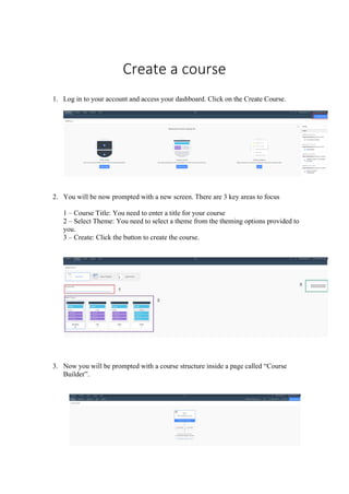
  • 1. Create a course 1. Log in to your account and access your dashboard. Click on the Create Course. 2. You will be now prompted with a new screen. There are 3 key areas to focus 1 – Course Title: You need to enter a title for your course 2 – Select Theme: You need to select a theme from the theming options provided to you. 3 – Create: Click the button to create the course. 3. Now you will be prompted with a course structure inside a page called “Course Builder”.
  • 2. 4. It is recommended to setup your course first before you start developing a course. 5. We should first setup the appearance of the course. This is important, since this is the way your course is going to look like in the future. Click on the appearance tab. [A] 6. You will be now prompted with a screen with lots of different themes to select from. NOTE: There are 2 types of themes. [B] 1 – Themes which is being shipped by default from Evolve. [1] 2 – Themes built customly to be edited and modified. This will have and Edit option. [2] 7. You could also create a new theme if you like. In case if you need to create a new theme, simply click on the New Theme button. NOTE: You can only build a custom new theme, basing on one of the themes currently exists. [C] 8. You will be prompted with a new theme creation screen. 1 - Simply give a new name for the theme [1] 2 select a theme from the drop-down menu and the following screen. [2] 3 Click create [3]
  • 3. 9. Your newly created theme will be displayed as the last theme in the list. [Insert 2 screen and compare] 10. Now you can Edit your theme. To edit the theme, simply click on the Edit button. [A] 11. Now it’s time to set the Extensions for your course. In this part, not only it allows you to add extensions to your course, but it also gives the options to create a menu for your course.
  • 4. 12. When you enter the Extensions page, you will be prompted with a screen with 2 sections. 1 – Couse Menu: Select style of menu for your course and topic menus 2 – Course Extensions: Enable extensions for extra functionality for your course 13. To choose a menu, all you need to do is just select a theme by clicking on the radio button next to the theme. 14. In the “Course Extensions”, when you select a extension, a self-introduction about each extension is provided. To enable an extension, simply click on the switch next to it to be turned on. 15. Once you enable the extension, you need to edit it to the way you need it behave. Simply click on the Edit button next to each extension.
  • 5. 16. Once you click to edit an extension, it gives you options for that particular extension. Each extension gives you multiple categories [A] and subcategory of options [B]. Each section contains a self-explanation instruction what needs to be done.
  • 6. 17. Now you are ready to get started to build your course. To get started building the course, simply click on the “Content” menu option.
  • 7. 18. Now you will be navigated back to the page builder page.
  • 8. 19. You will notice a page structure. Let’s observe each component. 1 – The menu page of the course. 2 – Where we create a new page for the course directly. 3 – You can create a topic as a section and build corresponding pages to have a structured hierarchy for your course. 20. To get started of creating a structure, as stated above; click on “Add Topic” [3] button. 21. Now you will see new section created under the menu page. 22. If you need to create a subtopic, simply click on the “Add Topic” button directly under your topic group. [2]
  • 9. 23. Now we need to give a name for our topic. To give a name, simply click on the “Edit Topic” [1] 24. Now you will be in a different page with options to set your topic header. 25. Even though there are so many configuration sections, we only need to focus on very few. 40- Title: The name of the to be identified when using in development. 41- Display Title: This is the name which you could see as a title. Basically, the name of the topic of the section. 42- Display Title Settings: This the display formatting. The size of the font & alignment. There is also a button to clear the formatting. 43- Description: This is a page descriptor. You could add a description for identification. You could use this to enter any comments for identification and used in further development. 44- Aria Label: This is an alternative text to be read by a screen reader. You could use the same title as the “Display Title”. 45- Tags: Identification tags to be used in search. Once it is tagged, you could type in the universal search feature in your course and it will be picked up in the search results. This would be useful when you have too many information in your course but you are in a hurry to find what to you need quickly.
  • 10. 26. If you need to delete the section/topic, simply click on the “Delete Topic” button. 27. Now lets add a page to the main menu. Simply click on the “Add Page” button. [A] 28. Now you could see the page is appearing as the second page next to the topic/section. The Learning Development Platform Evolve, understands a section as a page when creating the hierarchy. [B] 29. If you like to add a page under the topic/section, simply click on the “Add Page” button located under the section header.[1]
  • 11. 30. Any page under the topic/section will create under that topic/header in a hierarchy manner. [2] 31. Now let’s build the page. To get started, click on the page you want to build. It will be selected with a blue box around it. 32. First, we need to give a title for the page. Click on the icon with a pencil to bring up the page setup dialog box. [1] 33. When you click on it, you will be prompted with a dialog box. There are 3 key areas we need to focus on when setting up the page.
  • 12. 1- Title: The title of the page. Give it a good name. This will the name to identify the page. 2- Description: Give a meaningful description to understand what this page is about. You could also put any comments about the page for further development. When you page is searched and found, under the page name, the description will appear. So, it is very important to give a good description. 3- All Edit Options: This brings the complete editing features related to the page. 34. Once you enter the title and the description, it will be displayed automatically in the full editing options page. [1] 35. As discussed earlier (please refer to step 25), we only focus on the 6 areas. You need to repeat the “steps 25” and fill in the details as you required for this page section. NOTE: This is the common setup for every page and section/topic you create. 36. Now we focus on the specific unique setup area when developing a page. A – Page Header: This is the area you can setup your page header section. Instruction and each feature in this section is explained in the system next to each heading. B – Page Hero Image: This is basically a cover page you see in Facebook and Youtube Channel page. Likewise, instructions and each feature in this section is explained in the system next to each heading. C – Page Background image: This is where you can set a background relating to the content. Simply the way you do PowerPoint presentations. D – Content Locking: This option is only available if you have the “Content Blocking” extension is turned on when you setup your course. You can setup navigation restrictions. This is very important if you want to avoid your learners skipping through content and want to follow a strict content. In case if you turn the extension on, you do not have to enable it for your pages right away. You can implement it at any stage you like. Instruction and each feature in this section is explained in the system next to each heading. E – Status: You can specify the status of your page. By doing so, if someone accesses the learning systems and wants to know what the status of the course is; this indicates
  • 13. the status of the page. Then whoever wants to modify will reverse their action or do something else. You can select the action from the drop-down list. [E1] F – Comments: You can add any comments when developing the page. If you want someone else to work on the page, you could enter the comments as instructions for the person. 37. After finishing setting up press the “Page Builder” at the top left, to setup the page. [G] 38. A page in Evolve Author is built in a hierarchy structured system. 1. Articles - articles sit within pages, they are typically used to separate out chunks of content (e.g. introduction/knowledge check). Blocks and components sit within articles. 1. Selecting the edit icon will allow you to add an article title and body text along with background images. 2. Blocks - blocks sit within articles and they allow you to add components to your page. 1. You can add as many blocks to an article as you want but you can only add up to 2 components per block. 3. Components - components are added within blocks. You can add up to 2 components per block. 1. If you need to add more components, simply add more blocks within the article. 2. Components can sit full width or half width, two thirds left or two thirds right. 3. They can be aligned to the top, center or bottom (when there are 2 components). Article & Blocks – These are arrangement placeholders. This is where you can group them to organise. These becomes handy when you apply theme styles for your pages; using the themes you selected when you setup your course (discussed in a further topic under ‘Themes’ in the quick reference guide “New Course”). Components – This is where your course content interactions happen. This is used to display how you want your learner to see the content.
  • 14. 39. You are now displayed with a page building interface. 1 – Hero Image: This is the cover page image you already imported when setting up the page. 2 – Article block: The main container used to group. Comes handy when applying styles setup in your theme (discussed further under the heading ‘Themes’ in the “New Course” quick reference guide). 3 – Block: The container holding components. This allows to re-arrange components easily within the page. 4 Article Style: This is the area the specific style assigned in themes could be applied. Simply select the style from the drop-down menu and select it. 5 Hidden: This allows you to hide the article item being displayed. This is useful when using Logic (discussed further under the topic ‘Logic’ in the “New Course” quick reference guide) to restrict the progress of content being displayed. 6 Tags: You could create tags or specify tags to categorize. 7 Edit Article: This is where you can setup the title and arrange how the components inside the article would appear. Once you click on the edit symbol, you will be navigated into a different page. The page consists of key areas.
  • 15. 1 – General: This consists of general information about the block title with key important areas. • Article Title [1A] : This is the name given to identify the component in development. NOTE: Always if it has “Title”, no matter if it is an Article, Page, Block, Component; this means it’s a name for the identification purpose. Comes very handy in using Logic and grouping. Need to give a meaningful name. • Article Display Title[1B]: This is the title which display to the user. This could be a heading name. You must give it a meaningful title. NOTE: Always if it has “Display Title” , no matter if it is an Article, Page, Block, Component; this means it displays to the learner. • Display Title Settings [1B]: This is the area you need to specify the size of the font and the alignment of the font. • Aria Label[1C]: This is used as an alternative title for the screen readers. You must use the same title you used in B1. NOTE: Always when it has “Aria Label”, it refers to an alternative title for the screen readers. You must use the same title you used for “Display Title” as the Aria Label. 2 – Appearance: This is how your article is going to appear when you publish the course. There are few key areas you need focus in this section. • Article Style[2A]: This is where you define a style for your article. The style needs to be created when you setup the theme for your learning course. You could also use the same method when you in the page building setup; discussed earlier [4]. • Enable Scroll action button[2B]: A self-explanatory instructions are given in the interface itself. Please refer to that. 3 – Background: This is where you set a specific background image for your article block. Just only 2 key areas to focus on this section. • Background Image[3A]: This is where you upload and set up your background image.
  • 16. • Background Image Position[3B]: This is where you set the alignment of the image. NOTE: Mobile Background Image is the same as the normal image but a different small size. This section is not compulsory, but good to have. 4– Divider Before: This is where you add a separator to separate between articles. The separator will appear before the article displayed. Only 2 key areas to focus. • Display Divider Before Article[4A]: Just enable this to add a divider before this article appears. • Divider Before Aria Label[4B]: This allows you to add a separator for the content to appear on screen readers. This is not compulsory, but good to have. Further instructions on what to do is displayed in the theme page itself under the topic name. 5 - Divider After: This is where you add a separator to separate between articles. The separator will appear after the article displayed. Only 2 key areas to focus. • Display Divider After Article[5A]: Just enable this to add a divider after this article appears. • Divider After Aria Label[5B]: This allows you to add a separator for the content to appear on screen readers. This is not compulsory, but good to have. Further instructions on what to do is displayed in the theme page itself under the topic name.
  • 17. 6-Animations: This is the area you can set the animations how the content should appear when the content is published. Key areas to focus. • Slide in Horizontally [6A]: Slide the article content horizontally. Just enable the feature to turn it on. Self-explanatory instructions provided on the setup page itself. • Slide in Vertically [6A]: Slide the article content vertically. Just enable the feature to turn it on. Self-explanatory instructions provided on the setup page itself. • Fade In[6B]: You can set the content appearing with a Fade In effect. Just click on the switch to enable. • Animation Delay[6C]: This is the area you set the time for the animation to appear on the page. To set the timing, simply drag the scaler. If you need to smooth the animation appearance with a pre-set, simply click on the drop-down menu and select the pre-set [6C] 7- Content Locking: This allows you to lock the content and let you retrieve in a progressing manner. This setting is only available if you have added the “Content Locking” extension when you setup the course. 8 - Progress: This is the area where you can track the progress of your learners, to understand where they are at with the course. Only a single key area to focus on. • Include article in progress[8A]: Simply click on the switch to turn it on. Self-explanatory instructions is given under the menu option itself. 8 Hidden & Tags: You could create tags or specify tags to categorize. Also if you press the switch to on next to “Hidden” the article disappears from the learner’s screen. This is very useful when you use “Logic” (explained in the “New Course” quick reference guide under the topic ‘Logic’). 9 Click to edit the Block setup. You will be navigated to a different page. There are key areas you need to focus on this setup page.
  • 18. 1 – General: This consists of general information about the block title with key important areas. • Block Title[1A]: This is where you set the identifier. It’s a good idea to give a topic name for this section for easy identification. • Block Display Title[1B]: This is where you set the topic header to appear on the published content for the learner. You can set the size and the alignment by using the options provided in “Display Title Settings”[1B]. • Aria Lebel[1C]: This is the alternative text for the screen readers. It’s a good idea to give the same title as “Block Display Title”[1B]. 2 – Appearance: This is how the block would appear on the final published screen. The key features included is explained by the self-explanatory instructions provided on the development platform itself. Simply follow the instructions. 3 - Animations: This is where you can set the animations appearing for the block of content. Any component under this block will inherit the animation automatically. There is a self-explanatory instruction provided on the development platform itself for the only feature related to the animations. Simply click on the switch to enable the animation. 10 Click to add a component to the block. There are 45 components available in Evolve Author. Here is a list of components available for you: • Accordion o Great for presenting pieces of content that are related and need grouping together as a distinct unit. • Action Button – Easily add a button to Reset assessments, restart the course, scroll to the top of the page or close the course (if using with Bloom LMS) • Attachment
  • 19. o Let learners upload their own documents onto a course. Ideal for learners who need to submit documents as part of a course. • Audio o Play audio items to learners; encourage active listening. • Branching o Displays content to the learner based on decisions made. • Capture -component to test and assess a users ability from within an application/tool. • Checklist o Easily display a list of tasks, learning points, events or process steps to learners for completion. Display as columns. • Confidence slider o Test learner confidence against a predefined scale and give feedback based on ranges. • Confidence Chart - – The confidence chart displays the results of a number of confidence sliders in a graph format. • Dialog beta o Display a dialog between people in a messaging app style. • Drag and drop o Create draggable items and corresponding areas to receive them. Great for building more complex test interactions. • Flip card o Setup flippable ‘cards’ with editable text and background images on the front and back of each item. Great for small pieces of learning content that needs to be remembered. • Flow chart o Ideal for describing processes, workflows or timelines. • Game o Create Multiplayer and ranking game types. Set timers, powerups. 4 question types. • Gallery beta o Display a collection of images. Useful for display images of a product. • Gif o Present GIF image sequences. • Graphic multiple choice question o Multiple choice questions with added images. • Graphic o Display images or diagrams, providing context for other course information. • Hint o This component presents buttons that open a dialog with additional text • Hot graphic o Ideal for creating diagrams with clickable areas that reveal additional content. • Iframe o Embed iFrame content from anywhere inside your course. • Interactive video o Create branching video content; present video scenarios that allow multiple outcomes and branches your learners can explore.
  • 20. • Linked confidence slider o Link multiple confidence sliders together and test learner confidence over a range of topics. • Links o Excellent for linking to relevant external materials or allow learners to jump quickly to a piece of content elsewhere on an Evolve course. • Matching o Test whether your learners can match the word to the phrase. Or the image to the description. Great for testing scenarios with multiple outcomes. • Multiple choice question o A classic. One question. Many choices. • Media o Add a video to your course. Display videos on a course from external sources or your own Evolve instance. • Media Grid -Display multiple media items inc image/video and GIF’s in a configurable grid. • Media Carousel -Display multiple media items inc image/video and GIF’s in a configurable carousel. • Narrative o Text and images in a slide format. Useful for giving topic overviews or breaking up complex information. • Open input o Let learners enter short sentences in response to a question. Handy for building sequences of short question and answer segments. • Ordering o Present learners with items and test their ability to arrange the items in a predefined order. • Question result beta o Display feedback based on the number of questions answered correctly. • Single flip card o Setup a singular flippable card with editable text and a background image on the front and back. This is great for small pieces of learning content that needs to be remembered. • Slider o Simple sliding scale component with the ability to set a question and link the answer to the slide. Great for questions with numbers. • Sorting o A sorting question • Survey experimental o Displays a survey form for submitting learner feedback. Learner feedback is only saved if using the storage extension. • Tabs beta o Present information to learners in a tabbed format. • Table – Layout responsive data tables. Configurable column and row headers. • Text o Present text content. • Text and graphic beta
  • 21. o Easily group text and image content. • Text input o Setup multiple questions and users can type short responses. Great for missing words in a sentence. • Text narrative o Text blocks that users can navigate through in sequence. Great for sequences of information, describing company history or technical processes. • Text reveal o Present users with a clickable image. Additional content revealed when the image is clicked. Similar to the Flip Cards component but allows more feedback text. • Video stream o Add streaming video from You Tube and embedded it into your course. Simply click on the “ADD COMPONENT” to add a component. For the demonstration purposes, we will be using an ‘Accordion’ to show how it is done. 1 – Select the component from the list and click on it to add. 2 – You will now be prompted an alignment location where it needs to be placed, simply choose one. To pick an alignment, click on the corresponding button next to each position. We are using “ADD RIGHT”. NOTE: Each component has the same alignment features and steps.
  • 22. To make your component use the full width of the page, we need to move it. [1] To move it to a different position, firstly click on the three dots [A]. Now you will be prompted with a drop-down menu. Click on “Resize on Full Width”[C] to move it to fullwidth. Now you can see your component has taken the full width of the page [3] To setup your component, simply click on the edit button[B] NOTE: Each component has its own setup. There is a self-explanatory instruction written under each topic to help you configure it. 11 To add a block to your page, simply click on the “ADD BLOCK”. A blank block will be added; with ready to add a component. 12 To add a new Article to your page, simply click on the “ADD ARTICLE”. A blank article will be added; with ready to add a component inside an already created block component.
  • 23. Rearranging Blocks/Articles/Components If you need to re-arrange Blocks or Articles or Components, simply click on the three dots [A] next to the preview button. A drop-down menu will be visible to you. Select “Reorder Block” and click on it. [B] Now you can move to any location you want. Movable empty spaces are listed in purple colour with a button “MOVE BLOCK HERE” [C]. Click on it to complete moving. If you want to cancel moving, simply click on the “CANCEL” button.
  • 24. 13 If you want to hide the page from not appearing, simply click on the switch to turn it on. This is a good to keep on editing without publishing and publish later when the page is ready. 14 You could create tags or specify tags to categorize. 15 You can specify the status of your page. By doing so, if someone accesses the learning systems and wants to know what the status of the course is; this indicates the status of the page. Then whoever wants to modify will reverse their action or do something else. You can select the action from the drop-down list. 16 You can add any comments when developing the page. If you want someone else to work on the page, you could enter the comments as instructions for the person. 17 After you build your page, when you want to have a look how it appears after it’s published; simply click on the “Live Preview” to see a preview of your page. 40- After finished building the page, simply click on “Course Builder” to get back to the course builder page. 41- If you want to directly build the page first and then set it up as you go, simply click on the “Build Page” button to start building the page.