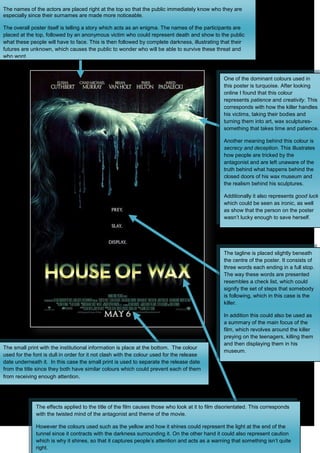
1. The names of the actors are placed right at the top so that the public immediately know who they are
especially since their surnames are made more noticeable.
The overall poster itself is telling a story which acts as an enigma. The names of the participants are
placed at the top, followed by an anonymous victim who could represent death and show to the public
what these people will have to face. This is then followed by complete darkness, illustrating that their
futures are unknown, which causes the public to wonder who will be able to survive these threat and
who wont.
One of the dominant colours used in
this poster is turquoise. After looking
online I found that this colour
represents patience and creativity. This
corresponds with how the killer handles
his victims, taking their bodies and
turning them into art, wax sculptures-
something that takes time and patience.
Another meaning behind this colour is
secrecy and deception. This illustrates
how people are tricked by the
antagonist and are left unaware of the
truth behind what happens behind the
closed doors of his wax museum and
the realism behind his sculptures.
Additionally it also represents good luck
which could be seen as ironic, as well
as show that the person on the poster
wasn’t lucky enough to save herself.
The tagline is placed slightly beneath
the centre of the poster. It consists of
three words each ending in a full stop.
The way these words are presented
resembles a check list, which could
signify the set of steps that somebody
is following, which in this case is the
killer.
In addition this could also be used as
a summary of the main focus of the
film, which revolves around the killer
preying on the teenagers, killing them
and then displaying them in his
The small print with the institutional information is place at the bottom. The colour
museum.
used for the font is dull in order for it not clash with the colour used for the release
date underneath it. In this case the small print is used to separate the release date
from the title since they both have similar colours which could prevent each of them
from receiving enough attention.
The effects applied to the title of the film causes those who look at it to film disorientated. This corresponds
with the twisted mind of the antagonist and theme of the movie.
However the colours used such as the yellow and how it shines could represent the light at the end of the
tunnel since it contracts with the darkness surrounding it. On the other hand it could also represent caution
which is why it shines, so that it captures people’s attention and acts as a warning that something isn’t quite
right.