
Empfohlen
Weitere ähnliche Inhalte
Was ist angesagt?
Was ist angesagt? (20)
Ähnlich wie Q1
Ähnlich wie Q1 (20)
Mehr von Giordano Boscarelli
Kürzlich hochgeladen
Kürzlich hochgeladen (20)
Q1
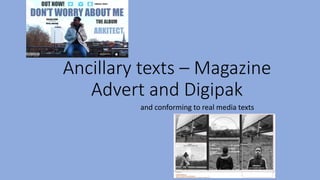
- 1. Ancillary texts – Magazine Advert and Digipak and conforming to real media texts
- 2. Digipak’s that I had researched
- 3. Like grime music videos, a convention that is seen in many of the digipaks/album covers that I had analysed and researched, is the focus on the artist. It is important for the audience to be able to recognise the artist in order to promote them and their music. Therefore, the main images in my digipak include images of Morgan (supposedly the artist of the album ‘Don’t worry about me’). This is very common in real media texts, especially in the digipaks. This is because it causes people to be drawn to the digipak if they recognise the artist. The front cover mainly focuses on the artist and it is vital to grab the attention of the audience to promote them. Therefore, it is essential to have the artist name be the biggest and boldest piece of text seen. All the images in the digipak have been edited using Photoshop to create filtered effect look. I find that this finish really conforms to the grime genre, the black and white effect runs throughout the entire digipak to make it as continuous and fluent as possible. It is important for all the print products to follow the same appearance and formats as this is also a convention seen in many of the digipaks that I had researched. For example, here with ASAP Rocky’s digipak, all of the images are from the same photo shoot with the artist wearing the same clothing, props and the same location. This continuity and consistency within the products help create that synergistic element making it as professional and real as possible Real Media product Digipak
- 4. Digipak Again to add that synergistic element that is seen in most digipaks of any genre, I wanted to connect my print products with my music video therefore I used a screen grab of a location shot also seen in my music video for the back cover. I found that using a location shot as my inside cover image really enhanced the text making it clearer and more visible to read. My front cover can be compared to a real media text, Skepta’s front cover of his digipak for the album ‘Community payback’. The text is very clear as the background image is not as sharp, similar to my own. The focus of the front cover is on the Artists name and the albums name also what the album contains. Therefore I wanted to keep the main artist image for the front cover as it focuses more on the artist there.
- 5. Magazine adverts that I had researched
- 6. Design When it comes to magazine adverts the Grime genre can be very versatile. Some artists decide to make their adverts vibrant and eye catching whereas other decide to stay simple and make their posters have a similar feel to their music videos that follow the grime conventions. Therefore, I wanted mine to be big, bold and eye-catching to the viewer. Therefore, I decided to go for a landscape design that would initially be placed into magazine. Similar to mine, artists like Skepta and Wiley, also have magazine adverts designed in the same layout and I find that this helped catch my attention also through the use of the vibrant colours, bold fonts and appealing images. So I also tried incorporating this in my own layout.
- 7. Production company logo: Another convention of real existing print products. Album name: The font is clear and easy to read similar to the features of the album. It is placed above the artist name and in the centre of the entire advert to make it clear that this is the album name. Artist name: The biggest and most visible piece of text on the magazine advert. This self promotes the artist as it is placed in the centre of the advert and at a big sized font. The variety of platform that the album will be able to be bought and streamed. This is very helpful for the audience. Reviews are extremely helpful of albums that have just been released as it notifies the audience on weather it is worth to purchase/listen to the album.