(NEHA) Call Girls Mumbai Call Now 8250077686 Mumbai Escorts 24x7
research
1. George Boatfield, Creative Media Production
Graphic Narrative Research
The Bad-Tempered Ladybird:
Visual Style:
The initial impression of the book’s art style makes it seem like a paper craft
design. However, upon closer inspection, it looks to have a more intricate form of
construction. Images are created through primarily a base of block colours made
with wide brush strokes. Then, depending on requirements of the scene, some
detail is added (such as with the whale’s baleen) with pencil strokes of a similar
colour. Finally, elements of each scene are rotoscoped (or cut out using scissors,
craft knife etc.) to create clean lines between sections. The overall effect of this
creates a much more sophisticated version of a paper craft image, with neater
lines and a more refined colour palate.
Layout of text and images:
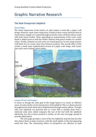
It seems as though the main goal of the image layout is to create an effective
sense of scale and the correct perspective of the ladybird. This is a theme present
throughout the whole book and is implemented through various effects. To begin
with, two ladybirds are pictured next to a leaf. This is initially done from a
relatively wide shot, which compares the size of the leaf with the ladybirds
effectively, but this is them zoomed in further on the next two-page spread to
provide added detail.
The next page provides a view of the two ladybirds atop the leaf, but this
time shows them as large creatures, with the small aphids on the leaf appearing
small this time. The contrasting effects of perspective are effective in both
2. George Boatfield, Creative Media Production
providing different framings for scenes, but also in introducing children to this
concept.
Another technique involving perspective follows this, where the size of
the ladybird is compared to various animals through the use of several smaller
pages that gradually increase in size according to the animals that appear on
them. This shows children both a wide range of animals and their sizes, whilst
also keeps them engaged through the interesting presentation of multiple images
across multiple small pages.
3. George Boatfield, Creative Media Production
In terms of how text layout is handled throughout the book, it generally
sticks to a placement within the white spaces just outside of the main content of
an image. This only changes when the whale is introduced to the story, as there
is little to no white space left on the pages across the eight pages that it features
on. Instead, it is mostly placed in the blue spray surrounding the whale. The
standardisation of text being placed in white spaces throughout the book being
broken by this scene is another implementation of perspective in the story, as it
empasises how much space the whale takes up.
Fonts and text per page:
Only one font is used throughout the entirety of the book’s narrative, and it
constantly varies its size and spacing. Again, it seems as though the size and
spacing commonly juxtaposes the size of the animal pictured. However, this is
not always the case, as when there is no white space available on the page when
the whale is shown, the text returns to being fairly small. This could be to
empasise the size of the whale, as the text is very large on the previous page
when only the whale’s head is visible.
4. George Boatfield, Creative Media Production
Author, illustrator and publisher:
The author and illustrator of The Bad-Tempered Ladybird is Eric Carle, while it
was published by the Penguin Group.
Eric Carle is writer of children's books, and is most famous for The Very
Hungry Caterpillar, a picture book with few words that has been translated into
more than 62 languages and sold more than 41 million copies. Since it was
published in 1969 he has illustrated more than 70 books, most of which he also
wrote, and more than 132 million copies of his books have been sold around the
world. He won the biennial Laura Ingalls Wilder Award for his career
contribution to American children's literature in 2003.
The Penguin Group is a trade book publisher, part of Penguin Random
House. It is owned by Pearson PLC, the global education and publishing
company, and Bertelsmann, the German media conglomerate. Established in
1935, the company has divisions in the United States, Ireland, New Zealand,
India, Australia, Canada, China, and South Africa along with their headquarters in
the United Kingdom.
Number of pages and page size:
40 pages, 25.9cm by 26.3 cm
The Gruffalo:
Visual Style:
The Gruffalo opts for a primarily hand-drawn aesthetic created through the use
of coloured pencils. However, each of these illustrations have been noticeably
airbrushed before being placed in the book. The resulting effect of this is very
bright, colourful images that have very sharp and clean design whilst still
retaining a familiar hand-drawn look.
5. George Boatfield, Creative Media Production
Layout of text and images:
Images are often used with various forms of framing, spacing and size to break
up sections of text. The main use for this throughout the book surfaces when the
mouse is explaining different parts of the Gruffalo to other animals.
This method of presentation not only spaces out both images and text nicely, but
also illustrates specific areas with text saying what they are. This helps children
to learn new words and familiarize themselves with them, although admittedly
in an unrealistic scenario. Furthermore, the images juxtapose both what the
characters in the book are building up the Gruffalo to be, and also what children
are thinking it might be when their parents are describing it (if they are the ones
reading the book while the child just looks at the accompanying photos).
Fonts and text per page:
Font remains the same size and type throughout the story, although all speech
apart from that of the mouse is presented in italics. It is likely that this is used in
order to make it easier for parents/carers reading the story to children to know
when a change of voice or character is necessary. Indeed, it could also be helpful
for making speech stand out for children if they are reading along also.
Text per page is often limited by the size of the image on a page.
Generally, pages with more illustration throughout the book tend to carry less
text. That said, the page below shows one example of a double-page illustration
within the book carrying significant amounts of text. While the ending of the
book offers a similar double-page scene, very small amounts of text is used.
However, in this the text seems to have a prominent role in directing the reader’s
eyes across the page. Specifically, it is presented in a way which causes the
reader to follow the path down to the Gruffalo. Now, of course this techniques
does not stop people looking at the Gruffalo as soon as they turn the page. What
it does do, however, is make sure they experience a lead up to the encounter
(from the Mouse’s perspective) with correct pacing and encounter it with the
line of “Oh help! Oh no! It’s a gruffalo!”
6. George Boatfield, Creative Media Production
Author, illustrator and publisher:
The writer of The Gruffalo is Julia Donaldson, while illustration was handled by
Axel Scheffler. Macmillan Children’s Books published in 1999.
Number of pages and page size:
26 pages, 21.5cm by 27cm
I Want A Friend:
Visual Style:
This book’s illustrations really look like they are done with a pen or pencil (even
more than in The Gruffalo). In all, it seems as though the illustrator is imitating
old cartoons such as Mr Benn for the art within I Want A Friend. Such a
throwback to older methods of cartoon production may be completely
intentional for a number of reasons. The illustrator could have simply used it as
inspiration, or it had the intention of reminding parents of their childhood and
encouraging them to buy and read the book with their children. Another
possibility is that, as this art style is more down to earth in terms of ambition and
arguably less ‘perfect’ than most modern children’s books, the illustrator may be
attempting to tune into something that will make children think that they could
make stories that look like that. While it may be a tried and tested form of
illustration, another key intention may be to inspire people, in all manner of
ways, so that they will be more interested in the book.
7. George Boatfield, Creative Media Production
Layout of text and images:
Much like the illustrations within the book, the layout of text and images is very
straightforward. The book rigidly sticks to having an illustration in the centre of
the page which is surrounded by a thick white border. Within the bottom band of
the white border is where the text appears on each page. Although it lacks
complexity, this may be a good thing as parents and children alike would always
know where to find each part of the book – no text is at risk of being overlooked
due to some far off placement in the top left corner of the page, well away from
the rest of it.
Fonts and text per page:
The book averages at around one or two lines of text per page, with the most
appearing being four. Font remains the same throughout the book, though
emphasis is placed on some words through the use of capitalisation and
exclamation marks.
8. George Boatfield, Creative Media Production
Author, illustrator and publisher:
The book is written and illustrated by Tony Ross and was published by Harper
Collins Children's Books in February 2007.
Number of pages and page size:
32 pages, 22cm by 26.3cm