Social Inequalities
•
3 gefällt mir•2,570 views

Social Inequalities Big Data, Small Area symposium to celebrate 30 years of the Small Area Health Statistics Unit (SAHSU) Danny Dorling November 15th 2017

Empfohlen
Empfohlen
Weitere ähnliche Inhalte
Was ist angesagt?
Was ist angesagt? (20)
Ähnlich wie Social Inequalities
Ähnlich wie Social Inequalities (20)
Mehr von Danny Dorling
Mehr von Danny Dorling (20)
Kürzlich hochgeladen
Kürzlich hochgeladen (20)
Social Inequalities
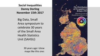
- 1. Social Inequalities Danny Dorling November 15th 2017 Big Data, Small Area symposium to celebrate 30 years of the Small Area Health Statistics Unit (SAHSU) 30 years ago I drew maps like this one:
- 2. I was trying to understand a country that in the late 1980s felt very divided and that even 1981 census data showed to be dividing with counter-urbanisation favouring rural areas. All that changed by Brexit time, the summer of 2016 and we got a very different map:
- 3. Change over time In hindsight, as the country voted to join the European Community in the mid 1970s it was also already beginning to spatially polarize. Outer London surburbs were turning more blue.
- 4. Today across Europe this map of cross-border migration in 2014 showed most of Britain to have more in common with Eastern Europe.
- 5. The antecedents to the vote: the rapid decline in living standards after 2010, failing health and rapidly rising mortality due to austerity – recorded in part of the ‘happiness’ index. Source: understanding society – note there was one change to method of recording at one point – Figures published in JRSS(A) 2016.
- 6. International comparisons are increasingly important
- 7. 1997 1998 19992000 20012002 2003 2004 2005 2006 2007 2008 2009 2010 2011 2012 2013 2014 2015 2016 2017 0.0 2.0 4.0 6.0 8.0 10.0 12.0 14.0 16.0 -3.0 -2.0 -1.0 0.0 1.0 2.0 3.0 4.0 5.0 6.0 In the UK populist votes after the era of the National Front were purchased. First in 1997 by the Referendum party. There is not a settled populist opinion. The vote was driven up in 1999, 2004, 2009 and 2014, the dates of each EU wide election. Newspaper ownership to direct target marketing to 52:48 spending. The rise in Labour popularity is a very different much faster change – not purchased. We now have bigpolling data – on average a poll a day since 2010 We can track public opinion to see how populism is whipped up in the UK
- 8. The largest ‘swing’ since 1945 and the fastest rise in the polls ever recorded for a major party.
- 9. Comparisons of life expectancy 1993-2015 (UK no rise 2011-2015) 2015 2014 20132012 2011 2010 2009 2008 2007 2006 2005 2004 2003 20022001 2000 1999 1998 1997 1996 1995 1994 1993 75 76 77 78 79 80 81 82 83 84 -0.3 -0.2 -0.1 0 0.1 0.2 0.3 0.4 0.5 0.6 0.7 LifeExpectancyintheUK,years, smoothed,1993-2015 United Kingdom 2015 2014 2013 2012 2011 2010 2009 2008 2007 2006 2005 2004 2003 2002 2001 2000 1999 1998 1997 1996 1995 1994 1993 75 76 77 78 79 80 81 82 83 84 -0.3 -0.2 -0.1 0 0.1 0.2 0.3 0.4 0.5 0.6 0.7 LifeExpectancFinland,years,smoothed, 1993-2015 Finland
- 10. But Germany also not good, Norway doing well 2015 2014 201320122011201020092008 2007 2006 2005 2004 2003 20022001 2000 1999 1998 1997 1996 1995 1994 1993 75 76 77 78 79 80 81 82 83 84 -0.3 -0.2 -0.1 0 0.1 0.2 0.3 0.4 0.5 0.6 0.7 LifeExpectancyinGermany,years, smoothed,1993-2015 Germany 2015 2014 2013 2012 2011 2010 2009 200820072006 2005 2004 2003 2002 2001 2000 199919981997 1996 1995 1994 1993 75 76 77 78 79 80 81 82 83 84 -0.3 -0.2 -0.1 0 0.1 0.2 0.3 0.4 0.5 0.6 0.7 LifeExpectancyNorway,years, smoothed,1993-2015 Norway
- 11. Spain poor, Sweden OK (just) Inequality does not explain the change over time – but the broad contrasts between countries tend to show the more equitable country as more robust 2015 2014 2013 20122011 2010 2009 2008 2007 2006 2005 2004 20032002 2001 2000 19991998 1997 1996 19951994 1993 75 76 77 78 79 80 81 82 83 84 -0.3 -0.2 -0.1 0 0.1 0.2 0.3 0.4 0.5 0.6 0.7 LifeExpectancySpain,years,smoothed, 1993-2015 Spain 2015 2014 2013201220112010200920082007200620052004 2003 20022001200019991998199719961995 1994 1993 75 76 77 78 79 80 81 82 83 84 -0.3 -0.2 -0.1 0 0.1 0.2 0.3 0.4 0.5 0.6 0.7LifeExpectancSweden,years,smoothed, 1993-2015 Sweden
- 12. France poor outlook, Denmark OK but smoking gains over? 2015 2014 2013 20122011 2010 20092008 2007 2006 2005 2004 2003 20022001 2000 1999 1998 75 76 77 78 79 80 81 82 83 84 -0.3 -0.2 -0.1 0 0.1 0.2 0.3 0.4 0.5 0.6 0.7 LifeExpectancyinFrance,years, smoothed,1998-2015 France 2015 2014 2013201220112010 2009 2008 2007 2006 2005 2004 2003 200220012000199919981997 1996 1995 1994 1993 75 76 77 78 79 80 81 82 83 84 -0.3 -0.2 -0.1 0 0.1 0.2 0.3 0.4 0.5 0.6 0.7LifeExpectancDenmark,years,smoothed, 1993-2015 Denmark
- 13. Italy, not so good, the Netherlands, better… 2015 2014 2013 2012 2011 2010 200920082007 2006 2005 2004 20032002 2001 2000 1999 1998 1997 1996 1995 1994 1993 75 76 77 78 79 80 81 82 83 84 -0.3 -0.2 -0.1 0 0.1 0.2 0.3 0.4 0.5 0.6 0.7 LifeExpectancyItaly,years,smoothed, 1993-2015 Italy 2015 2014 2013 20122011 2010 2009 2008 2007 2006 2005 2004 2003 20022001 200019991998 1997 19961995 1994 1993 75 76 77 78 79 80 81 82 83 84 -0.3 -0.2 -0.1 0 0.1 0.2 0.3 0.4 0.5 0.6 0.7 LifeExpectancTheNetherlands,years, smoothed,1993-2015 The Netherlands
- 14. We’re back to 1936 in terms of what lies behind these trends. But isn’t this happening everywhere – it’s just the ‘global race’ isn’t it?
- 15. The very long term picture: The Netherlands today is as equitable as the 13 American colonies were in 1775. (and the UK maxed on equity around 1968) Source: Lindert, P. H. and Williamson, J. G. (2016) Unequal Gains: American growth and inequality since 1700, Princeton: Princeton University Press, figure 5.4. Reproduced with permission from Peter
- 16. Many are not aware of the extent of inequality How much more do the best-off tenth get a year as compared to the worst? I published this table of inequality in the richest large 25 countries in the world in 2010
- 17. Some people in some countries tolerate far greater inequalities than others This is the middle of the table and by this measure the Netherlands is in the middle of the table
- 18. And in some the differences have become so great that people find it hard to see each other as people (of equal worth)
- 19. What happens if we update the inequality data from 2010 to 2015? Country by 2015 (real 90:10 ratio) Income Inequality United States 20.3 Singapore 18.5 Israel 17.4 United Kingdom 17.4 Canada 14.5 Spain 13.6 Greece 12.7 Italy 11.3 Ireland 11.1 Germany 10.4 Portugal 10.1 South Korea 10.1 Finland 9.2 Australia 8.8 Netherlands 8.6 New Zealand 8.2 France 7.4 Japan 7.3 Austria 7.0 Switzerland 6.7 Sweden 6.3 Norway 6.2 Belgium 5.9 Slovenia 5.5 Denmark 5.2 The small print The richest 25 countries in the world in 2009 with populations over 1 million. According to the IMF's World Economic Outlook Database, April 2015, this category would now include Kuwait, UAE, Hong Kong and Qatar in place of Slovenia, Greece, Portugal and Spain. Luxembourg, Iceland and San Marino are not included given populations below 1 million. Income is now disposable household income: income from wages, self-employment and capital, plus social transfers, minus direct taxes paid. Household income is adjusted (‘equivalised’) to take account of the amount of scale economies that different sizes of households can achieve. [In chart one it is more crude]. Both the New York Times Income Distribution Database and OECD Income Database divide all income components by the square root of the number of household members.
- 20. Inequality for 90% of people in the UK had been falling since 1990. For 99% since about 2001. Among the 99.5% since (possibly) 2012. But overall it rose…
- 21. Possibly until by mid 2017? (note: this is income inequality not wealth inequality) On Thursday 3rd August 2017 the High Pay Centre reported that the 100 CEOs of the UK’s highest valued public companies had, on average, seen their pay reduced by 17 per cent in the year to 2016. Now, instead of (again on average) receiving £5.4 million a year they each only took home £4.5 million, or 129 times average pay rather than 145 times. We may be at a turning point.
- 22. UK Finland Japan Ireland Singapore Germany Italy Sweden Australia Portugal Korea Netherlands Denmark Switzerland Spain France Norway New Zealand Alabama California Hawaii Utah Oklahoma Mississippi Arkansas Louisiana Florida Wisconsin Texas Pennsylvania Washington Massachusetts New York New Jersey Connecticut Iowa Colorado Minnesota Oregon Nebraska N Dakota Nevada S Dakota Virginia Alaska Wyoming Kansas Missouri S Carolina Illinois Tennessee (D of) Columbia Maryland Michigan Idaho Montana New Mexico W Virginia Kentucky Rhode Island Vermont New Hampshire Georgia N Carolina Indiana Ohio Maine Delaware Arizona 3 4 5 6 7 8 9 10 11 12 13 14 15 The take of the 1% in each country and US state in 1983 (%) 0.01 0.10 1.00 10.00 IntellectualPropertyRightsregistered2006-2015(per10,000people) Note: Canada is not included as it is not a member of the Madrid Agreement Concerning the International Registration of Marks. Source: World Wealth and Income database accessed December 2016, and patent data from the US Patent and Trademark Office and the WIPO statistics database. Last updated December 2016 Figure 8.1: The take of the 1% in 1983 and patents per person in 2006-2015 (log scale) Add the States of the USA to see a fuller picture of, say pollution, or creativity (patents). WHY INEQUALITY MATTERS
- 23. World Bank (2015) UN Inter-agency Group for Child Mortality Estimation Singapore United States New Zealand Japan United Kingdom 2 3 4 5 6 7 8 0 5 10 15 20 25 InfantMortalityRate Income Inequality (Decile Group 10:1 Ra o) Income inequality against infant mortality rates 2015 Canada Switzerland Israel Spain Portugal Finland Slovenia Singapore United States Australia New Zealand Ireland France Greece Italy Canada Japan United Kingdom Norway Denmark Netherlands Germany South Korea Austria Belgium
- 24. UK Finland Japan Ireland Singapore Germany Italy Sweden Australia Canada Portugal Korea Netherlands Denmark Switzerland Spain France Norway New Zealand Hawaii Alabama California Utah Oklahoma Mississippi Arkansas Louisiana Florida Wisconsin Texas Pennsylvania Washington Massachusetts New York New Jersey Connecticut Iowa Colorado Minnesota Oregon Nebraska N Dakota Nevada S Dakota Virginia Alaska Wyoming Kansas Missouri S Carolina Illinois Tennessee (D of) Columbia Maryland Michigan Idaho Montana New Mexico W Virginia Kentucky Rhode Island Vermont New Hampshire Georgia N Carolina Indiana Ohio Maine Delaware Arizona 3 4 5 6 7 8 9 10 11 12 13 14 15 The take of the 1% in each country and US state in 1983 (%) 75 78 82 85 Lifeexpectancy2015fromvarioussources(WHOandUSA) 76 77 79 80 81 83 84 Source: World Wealth and Income database accessed December 2016, and life expectancy data from the ‘Measure of America’ and the World Health Organisation (as of January 2017). Figure 5.2: The take of the 1% and life expectancy in 19 countries and all US states
- 25. Inequality effects us all • As it rises we trust each other less • We understand each other less • We learn less well and compete more • Exam results become ever more important • Over and above actually learning • Take ability in mathematics as an example • And test whether we are really learning well
- 26. Singapore Japan United Kingdom Sweden Greece South Korea United States 440 460 480 500 520 540 560 580 600 0 5 10 15 20 25 MathsAbility(MeanPISAScore) Income Inequality (Decile Group 10:1 Ra o) Income inequality and 15 year-olds' maths ability 2012 Singapore Japan Netherlands Canada Germany Australia Slovenia New Zealand United Kingdom Portugal Spain Sweden Greece South Korea Switzerland Finland Belgium Austria Ireland Denmark France Norway Italy United States Israel OECD Pisa 2012 Results
- 27. Japan United Kingdom France United States 230 240 250 260 270 280 290 300 0 5 10 15 20 25 MathsAbilityat16-24years(MeanScore) Income Inequality (Decile Group 10:1 Ra o) Income inequality and 16-24 year-olds' maths ability 2012 Japan Netherlands Canada Germany Australia United Kingdom Spain Sweden South Korea Finland Austria Ireland Denmark France Norway Italy United States Data missing for Israel, Greece, Portugal, Slovenia, Belgium, New Zealand, Switzerland and Singapore OECD Skills Outlook (2013) Survey of Adult Skills (PIAAC)
- 28. To begin to conclude (1 of 3) Inequality is about context The great irony in talking about social inequality at a conference about “Big Data” and “Small Areas” is that the key evidence that inequality matters comes from small datasets about very big areas (whole countries). People in affluent countries with wide economic and especially income inequalities suffer much more often from a range of social problems as compared to other affluent countries. The initial range was identified in the 2009 book ‘The Spirit Level’. Today the range is far wider, including educational and environmental effects.
- 29. It is not just scientific skepticism and very small datasets that are the problem Criticism of a concern with economic inequality has come from a small group of people including those sponsored by tobacco companies and working with far-right political organizations. Again, ironically, there now appears to be a relationship even between such political attitudes and inequality. This lecture has shown some examples of the wider range of social and health harms that appear to be associated with inequality as well as touching on the idea that living under prolonged high levels of inequality damages how we think.
- 30. If you don’t understand inequality you will blame the victims For those interested in outcomes at a neighbourhood level, or in harnessing the power of very large datasets, knowledge of the potential importance of national context is crucial to avoid ‘blame the victim’ errors. This talk is partly based on a new book ‘Do We Need Economic Inequality? As you might guess the answer is, not at the levels We have recently ‘enjoyed’. But no one knows the optimal Level of equality / inequality.
Hinweis der Redaktion
- Source: World Bank Database [Online].World Development Indicators. Accessed July 2015. Accessible: http://wdi.worldbank.org/table/2.21#. Original source: Estimates developed by the UN Inter-agency Group for Child Mortality Estimation (UNICEF, WHO, World Bank, UN DESA Population Division) at www.childmortality.org. Indicator: Infant mortality rate is the number of infants dying before reaching one year of age, per 1,000 live births in a given year.
- Source: OECD Pisa 2012 Results (2012) [Online]. Accessible from: http://www.oecd.org/pisa/keyfindings/pisa-2012-results-overview.pdf Indicator: Mean PISA score for Mathematics in 2012 survey. PISA (Programme for International Student Assessment) is the world's global metric for quality, equity and efficiency in school education. It assesses the extent to which 15 year old students have acquired key knowledge and skills in mathematics that are essential for full participation in modern societies. Around 510000 students completed the assessment in 2012 representing about 28 million 15 year olds in the schools of the 65 participating countires and economies (all 34 OECD member countries and 31 partner economies).
- Source: OECD Skills Outlook (2013) Table A2.7 [Online] Accessible from: http://www.oecd.org/site/piaac/Skills%20volume%201%20(eng)--full%20v12--eBook%20(04%2011%202013).pdf Original Source: Survey of Adult Skills (PIAAC) (2012) Data missing for Israel, Greece, Portugal, New Zealand, Belgium, Switzerland and Singapore. Indicator: Adjusted mean proficiency in numeracy among 16-24 year olds - the adjusted mean includes adults who were not able to provide background information because of language difficulties, or learning or mental disabilities (literacy-related non-response). They are attributed a very low score (85 points), which represents a lower bound for the mean score in each country.