Dynamic Web Development Report by Frederico Costa
•
6 gefällt mir•3,043 views

Dynamic Web Development Report about bad procedures on real websites in terms of accessibility; SEO; Search Engine Optimization by Frederico Costa

Empfohlen
Empfohlen
Weitere ähnliche Inhalte
Was ist angesagt?
Was ist angesagt? (20)
Andere mochten auch
Andere mochten auch (13)
Ähnlich wie Dynamic Web Development Report by Frederico Costa
Ähnlich wie Dynamic Web Development Report by Frederico Costa (20)
Mehr von Frederico Costa
Mehr von Frederico Costa (9)
Kürzlich hochgeladen
Kürzlich hochgeladen (20)
Dynamic Web Development Report by Frederico Costa
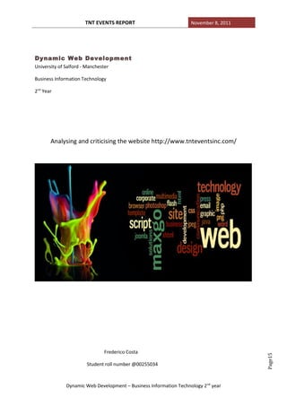
- 1. TNT EVENTS REPORT November 8, 2011 Dynamic Web Development University of Salford - Manchester Business Information Technology 2nd Year Analysing and criticising the website http://www.tnteventsinc.com/ Frederico Costa Page15 Student roll number @00255034 Dynamic Web Development – Business Information Technology 2 nd year
- 2. TNT EVENTS REPORT November 8, 2011 Contents 1. Introduction ………………………………………………………………………………………………………… p.3 2. Problems 2.1 Structure……………………………………………………………………………………………………… p.3, 4 2.2 Graphics & Colour………………………………………………………………………………………… p.4, 5 2.3 Content ……………………………………………………………………………………………………………p.5, 6 2.4Readability …………………………………………………………………………………………………………….p.6 2.4.1 Sequence ………………………………………………………………………………………………………p.6, 7 2.4.2 Attractiveness……………………………………………………………………………………………… p.7, 8 2.5 Page Layout ………………………….………………………………………………………………………….p.8, 9 2.6 Hyperlinks&Navigatio………………………………………………………………………………. ……………….p.9 2.7 Promotion …………………………………………………………………………………………………………..p.9, 10 2.8 Strengths …………………………………………………………………………………………………p.10 3. Recommendations 3.1 Structure …………………………………………………………………………………………………………….p.11 3.2 Graphics & Colour ……………………………………………………………………………….p.11, 12 3.3 Content ………………………………………………………………………………………………….p.12 3.4 Readability …………………………………………………………………………………………….p.12 3.5 Page Layout …………………………………………………..………………………………………………….p.12 3.5.1 Story Board …………………………………………………………………………………………………p.12, 13 3.6 Hyperlinks ………………………………………………………………………………………………………….p.14 3.7 Promotion………………………………………………………………………………………………………….p.14 4. Conclusion…………………………………………………………………………………………………….p.14. 5. References …………………………………………………………………………………………………….p.15 Page15 Dynamic Web Development – Business Information Technology 2 nd year
- 3. TNT EVENTS REPORT November 8, 2011 1. Introduction On this report i will be analysing a website about the Evolution and the nature of science institutes, where i will be criticizing following the website structure and then explain some of the recommendations in order to improve the accessibility, navigation and how to make it more attractive to visitors. This analyse will be divided in two parts. The first part as explained will have the responsibility to criticise and redevelop the website. Here the user will have the opportunity of explain the errors and what to change in order to make it look better. The second part has the purpose of rebuild, or change the structure and layout of the web site. Here the user will need to make the reasons showed before work in a static prototype demonstration. 2. Problems 2.1 Structure On this report the structure will be the first part being analysed and consequently criticised. • A website FrontPage page should have a clear message of the contents and the purpose of the actual page; • Not all the pages keep the same background; (http://www.tnteventsinc.com/page10.html) • Not all the pages keep the same colour; (http://www.tnteventsinc.com/page10.html • It is written in “times new roman” font and should be on “SanSerif”; • There isn’t a standard page structure; Page15 Dynamic Web Development – Business Information Technology 2 nd year
- 4. TNT EVENTS REPORT November 8, 2011 • Most contents are unreadable; • Layout is not easy to understand • It is impossible of differentiating the most important information from the less important; • The design is poor; • It is difficult for the user to navigate the web site; • The controllers are not used properly; • There is too much information in the home page • Bad organisation when filling it. Page15 Dynamic Web Development – Business Information Technology 2 nd year
- 5. TNT EVENTS REPORT November 8, 2011 (page on top has a different background from the page on bottom) 2.2 Graphics & Colour When using the graphics, the website does not follow the good principles of graphic usability. There are the main reasons that make me get this opinion. • Website is poor in terms of graphics it loses all of his usability (e.g contains loads of information) • Pictures cover paragraphs when displayed or just pass the mouse • The website shows poor and big images, not attractive at all; • Excessive useless information; • The colours are unpleasant and make the user confused when exploring the website. • The website is full of useless information and more attractive images and relevant links are needed to captivate the user’s attention; Page15 Dynamic Web Development – Business Information Technology 2 nd year
- 6. TNT EVENTS REPORT November 8, 2011 Paragraphs covered with image Paragraph not covered by image (same page) 2.3 Content “Web users have become more and less patients when it comes to content accessibility” (Jacob Nielsen, “Why You Only Need to Test With Five Users", March 19, 2000). There is a need to know if the information disposed on the website is relevant, or if the content is valuable in some way that can lead the user to gain something from there, if the website is still correct and updated or even if it can offer a good style so the user can have fun while browsing. Indeed, the information on the website is almost irrelevant since it is an event and promoter website. Instead, it should be more specific about what TNT EVENTS can offer with a better style, better text and it should give to the user a good feeling when exploring it in order to hire their services. Page15 There are more specific reasons to constructively criticise its content which are: Dynamic Web Development – Business Information Technology 2 nd year
- 7. TNT EVENTS REPORT November 8, 2011 • Wrong information on some pages ( TNT family, and then it comes out a new event information) • Some e-mail addresses are linked to Outlook and some aren’t. • No proportion of content at all. Instead it is spread around the pages. • No content organisation like a menu or history section. • There is not a clear definition of links • The website should have had a better structured navigation to don’t keep the user frustrated by not finding relevant information (2 clicks away of any important information said by Steve Krug) • The user will not feel attracted within the unorganised content • Attractive images should be used so the user can get some fun during the navigation but instead it can be found personal pictures covering information and the heading “Home of the Dynamite Art” has a lame animation. • The home page looks like any other unorganised page with a really uninterested language. Therefore the users do not keep any interest about the content. 2.4 Readability There are the factors identified to recognise that this is a good example of poor readability. • The website does not run in all the web browsers (e.g. Goggle Chrome) • High contrast irritates the reader and some text is in white colour and some are in black colour • Too many headings for non-topic text. Page15 Dynamic Web Development – Business Information Technology 2 nd year
- 8. TNT EVENTS REPORT November 8, 2011 • The fonts are not always readable, needing to pass the mouse onto it to read the text This page shows too many Headings ( the white rectangular boxes says “heading” to identify the large amount of unorganised headings at the home page) 2.4.1 Sequence • The “home” link is located on the top/right with no other classes dividing content • No sequence on information. Therefore the user can not track the information that he/her needs. • The pages have no logical sequence and are not linked properly. Page15 Dynamic Web Development – Business Information Technology 2 nd year
- 9. TNT EVENTS REPORT November 8, 2011 The image shows unorganised content and the “home” link at the top right. 2.4.2 Attractiveness • Lacking organisation; • Users will not understand the website main purpose when browsing. • The graphics completely retract the readability. Again, some pictures prevent the user from reading some paragraphs and some text is only visible if the user passes the mouse over it. • Wrong use of symbols – the symbol “stop” shouldn’t be used to tell what is new. Page15 The symbol “stop” shouldn’t be used to advertise what is new. Dynamic Web Development – Business Information Technology 2 nd year
- 10. TNT EVENTS REPORT November 8, 2011 2.5 Page layout • The pages are not consistent on its background • The user can not expect a continuous good use of the website since the links are not rigorous on its content and the e-mail addresses are in some cases linked to Outlook and sometimes aren’t. • Home page does not fit to screen (The blank column and the scroll shows that the website does not fit to screen) 2.6 Hyperlinks • Easy to spot but not always linked • The links are wrongly explained or wrongly linked • Too much use of internal links Page15 Dynamic Web Development – Business Information Technology 2 nd year
- 11. TNT EVENTS REPORT November 8, 2011 • No sitemap. 2.7 Promotion • No Meta tags on code so it probably isn’t advertised on the internet • <Title> is “Index”, should have been TNT EVENTS • The site is not found on Delorie search engine but found on the first page on Google.com when search for TNT events • There’s no users prioritisation on their needs but an archive where the past events and the upcoming events are not separated Page15 Dynamic Web Development – Business Information Technology 2 nd year
- 12. TNT EVENTS REPORT November 8, 2011 Page title is shown as index. Also on the source code it can be proved. 2.8 Strengths The website seems to be updated since there’s events for 2012 announced The website is found on the first page from Google search engine. There’s a link on the application rules where the PDF file can be downloaded 3. Recommendations 3.1 Structure • The structure must be changed due to readability and accessibility issues; I will change the introduction page, because soon as a user comes to visit the web page he/her will find too much information leading him to get the wrong idea of the website. Relevant information such hyperlinks or contacts should be organised each one in different places making it easier for users to link to different web pages or get the information that they need. Page15 Dynamic Web Development – Business Information Technology 2 nd year
- 13. TNT EVENTS REPORT November 8, 2011 • There must be created a structure “from scratch” with a “home” link, “main events”, “history” to explain the company’s history, “Past events” to check last events and I would also give the opportunity to the owner to implement pictures or records from those events, “Contacts” with all the contact information not dispersed, a “Sitemap” to help the user to navigate the website and a “About us” to give current information about the company. • I would also block information in smaller paragraphs with an informal but professional approach so the user won’t get lost and that prevent the user from getting the wrong idea about the website. 3.2 Graphics & Colours • With graphics, first of all I will change the images positioning such as the website title because that will be in top left corner. Macromedia flash will be used to create some animation. • I would change the images positioning and moreover would avoid personal pictures, especially on the home page. • The Logo will be re-designed and the title will be at the centre. The background colours will be different ones, not affecting colour blind users and the standard (diagonal division of colours) background will be also changed. • Changing the graphic design will improve the website’s appeal and attractive and blocking the information by theme and standardise the text colour will turn the website more appellative. • Black on white is the default choice. White or Yellow or other light colours work on black or any other dark colour background. But, Yellow, Green or grey on white can’t be used together and red/green and blue/yellow can’t be used as well. • The use of consistent colours will be my choice and colours must be uniformed in the whole website. • Also I will make sure that all hyperlinks will be compatible for all web browsers (Safari, Mozilla, Google Chrome, Internet Explorer etc.). • I will change the size for the pictures/links on home page making it readable and functional for blind users. Page15 Dynamic Web Development – Business Information Technology 2 nd year
- 14. TNT EVENTS REPORT November 8, 2011 3.3 Content • I will focus on the services available and the customer’s needs, showing more services and with that connect the user to the content and turn him into a potential customer. • Targeting the right keywords in order to relate the customer’s perspective for a service advertised on the internet • Developing a fitting tone will make the content more compelling and more pleasant to read. 3.4 Readability • In order to be easier to read I will give good use for the contrast colours but change the current ones • Bullet pointing or the use of more paragraphs (<p> on code) will be useful to synthesize the huge amount of text that each paragraph has at the moment and then the information will be more accurate from the user’s perspective. • Creation of a sitemap 3.5 Page Layout • Consistent background • Standardised links (e.g. or all the e-mails are linked to redirect to Outlook or not) Page15 • Fit page to screen Dynamic Web Development – Business Information Technology 2 nd year
- 15. TNT EVENTS REPORT November 8, 2011 3.5.1 Story Board Web site Logo Web site title Menus/ Navigation Content bar Page15 Dynamic Web Development – Business Information Technology 2 nd year
- 16. TNT EVENTS REPORT November 8, 2011 This will be my layout choice. • Different structure, new Logo, title at the centre. • On top left implement a logo and at the centre put the name. • On the Browser tab the title will change from “index” to “TNT EVENTS”. • The content will be at the centre and will have shorter paragraphs and the pictures will be re-dimensioned. • With all this the website will be more organised, attractive and efficient. • Consistent background • Standardised links (e.g. or all the e-mails are linked to redirect to Outlook or not) • Fit page to screen 3.6 Hyperlink & Navigation • More accurate links but it will be bypassed with a new structure (I know that internal links are used to avoid scroll page but too many links makes the user lose him on the website). Page15 3.7 Promotion Dynamic Web Development – Business Information Technology 2 nd year
- 17. TNT EVENTS REPORT November 8, 2011 • Creation of meta tags (meta name “content” and “description content” ) • Make sure that all the browsers can open the website and all the search engines find it. 4. Conclusion In general the TNT EVENTS website does not follow at all the principles of good structure, graphics, colour, content, readability, page layout, linking and promotion to create a good website, failing in several points. Organising it will be the major challenge and also the lack of good content allied with no connection from me to the client so I could ask “what is TNT EVENTS and what is the aim of your website” are also challenging me to do it the way a services website should be. For that it will be needed to do from scratch a new website organisation, choose better graphics and follow the good procedures in order to have a good website. It is also essential to focus on customer’s needs and good advertisement. 5. References http://www.useit.com/ J. Nielsen Designing Web Usability New Riders 2000 J. Nielsen, “Why You Only Need to Test with Five Users", 2000 J.Johnson “Web Bloopers: 60 Common Web Design Mistakes and How to Avoid Them”, 2003 S.Krug “Don't Make Me Think!: A Common Sense Approach to Web Usability”, Second Edition 2006 Dynamic Web Development Lecture 4, Web design, Usability and Content. Page15 Dynamic Web Development – Business Information Technology 2 nd year
- 18. TNT EVENTS REPORT November 8, 2011 Page15 Dynamic Web Development – Business Information Technology 2 nd year