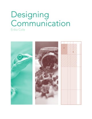
2. Home
1
“Design is the fundamental soul of a human-
made creation that ends up expressing itself in
successive outer layers of the product or service.”
-Steve Jobs
10. Home
9
Frank Chimero
Designer
In 2010, Frank Chimero received
the Art Directors Club Young Guns
award. That same year, he was
selected by Print Magazine for its
annual New Visual Artists issue,
highlighting twenty designers under
the age of thirty. As a teacher, he
has worked with undergraduates at
Portland State and Missouri State
University teaching typography,
design systems, information design,
and thesis courses. He has also taught
graduate students at SVA’s Masters
of Interaction Design department.
He believes great design comes from
sharp thinking and reflective practice,
that some things are truly diminished
when simplified, and every solution
creates unexpected problems.
1 The Shape of Design is a meditation on
the design process. Its interior is black and
warm red, and its typeset is Quadrat.The cover
was designed to scale well, so it’d be legible at
small sizes on tablets.
3 Interactive design.
2 “Boredom is Extinct.” Each year,
The Atlantic runs their “Ideas Issue.” In
2010, Frank was asked to illustrate each
of the proposed ideas. “The job was a
conceptual illustrator’s wet dream,” he
says.
4 Poster for Chronicle Books’ Indie
Rock Poster Book based on The National
song, So Far Around the Bend. Royalties
go to the host of admirable charities
supported by Yellow Bird Project.
1
4
3
2
11. Home
10
Work
Photoshop Outcome
Craft is what makes a good idea successful or a failure, appealing or
repulsing, a work of art or mediocre. Craft is the glue that brings the piece
together and convinces the viewer of its worth. If the artwork lacked craft,
the viewer could be turned off by the design. Even if the idea is good, the
work still needs to look clean and beautiful.
For the CRAFT project I was given
repitles as my theme, and chose to use
lizards in particular for their versatility,
shape, and to use the branches which
are in their evironment. I went with a
serif typeface since reptiles have spikes,
nails, etc for the serif and also that serifs
can be hard and cold much like reptiles.
Above you will see my process of manip-
ulating the reptiles and finally arriving at
the final outcome. This was probably the
hardest project for me, and definitley not
my best work, but I feel like I learned a
lot about typography and the maniplua-
tion of pictures with photoshop.
12. Home
11
“He painted hundreds and hundreds of
paintings...I look at that kind of insanity and
kind of obsessiveness and all of a sudden I’m
like, well, I guess this is what I’m doing too.”
-Mike Perry
14. Home
13
Born in Missouri, he started
drawing at the age of four. As a
designer and artist working in
a variety of mediums, including
books, magazines, newspapers,
clothing, drawing, painting,
and illustration, Mike Perry is
compelled by the ways in which the
hand-drawn informs and deepens
contemporary visual culture. Perry
works regularly for a number of
editorial and commercial clients
including Apple, The New York
Times, Dwell, Target, Urban
Outfitters, eMusic, and Nike. Perry
has also published extensively; his
first book, Hand Job, which focuses
specifically on the relevance and
beauty of hand-drawn type in the
digital age. Some of his favorite
things to use when he’s working
are astrobright colored paper and
fat-weight pencils. Most days,
Perry can be found working away
in his studio, ceaselessly mixing
colors, pulling prints, building
sculptures and exercising his belief
in the transformative power of
making things.
Mike Perry
Illustrator
1
4
3
2
1 Made for HIGHMATH a group show
curated by Arkitip & Wood Wood in Berlin,
Germany. It is a 3-color screen print with
dimensions of 18 x 24 inches.
3 “An Open Door to Extraordinary
Worlds” was a campaign illustration created
for the 92nd Street Y.
2 Dwell asked Arkitip to curate a series
of 10 original screen-prints based on their
10 favorite houses. This one is from the
American House 08 by William Massie.
4 “Let’s go beyond;” pencil on paper,
made in 2012, dimensions: 13.25 x 22in.
15. Home
14
Work
Illustrator Outcomes
Design is process.You will never reach the point in your work where it is
perfect and doesn’t need iterating, but chances are your last idea is better
than your first.
For this project my object assigned to
me was a thumbtack and the illustrator
for this inspiration was Ben Newman. I
incorporated a similar color scheme, and a
3-D effect with the overlapping of shapes.
My next illustration was inspired by Mike
Perry, which I attempted to imitate through
the use of a hand-drawn background that
contrast with a saturated object in the
foreground as well as incoporating patterns.
For this piece my inspiration was
StrawberryLuna and I created a
thumbtack bumblebee in order to mimic
the picture of using animals as things, as
well as show texture and flat colors.
16. Home
15
“I’m a great believer that any tool that enhances
communication has profound effects in terms
of how people can learn from each other, and
how they can achieve the kind of freedoms that
they’re interested in.”
-Bill Gates
19. Home
18
Picture icon, Enlarged
first name as Header
with last name as the
subhead
Interactive icons that
represent the subject
Gutter
Thresholds in between
sections divided in
columns (gutter within
sections)
20. Home
19
Systems Dissection
Publication Design
Bolded Header
Light Subhead
Bolded subtitle spanning
over two columns.
Body Copy in a 3-col-
umn grid structure.
Image spanning over two
columns with text wrap
around it.
First letter of the sentence
bolded and enlarged with
text wrap around it.
21. Home
Images in a 3-column
grid structure.
Smaller body copy or
possible caption creating a
two-column grid within a
3-column grid.
Page Spread
20
Flow line
Gutter
22. Home
21
Microsoft is a multinational
computer technology corporation.
The history of Microsoft began on
April 4, 1975, when it was founded
by Bill Gates and Paul Allen in
Albuquerque.[1] Its current best-
selling products are the Microsoft
Windows operating system and
the Microsoft Office suite of
productivity software. In 1980,
Microsoft formed a partnership
with IBM that allowed them to
bundle Microsoft’s operating
system with IBM computers,
paying Microsoft a royalty for every
sale. Originally titled “Multi-Tool
Word”, Microsoft Word became
notable for its concept of “What
You See Is What You Get”, or
WYSIWYG. Word was also the first
application with such features as
the ability to display bold text.
It was first released in the spring
of 1983, and free demonstration
copies of the application were
bundled with the November 1983
issue of PC World, making it the
first program to be distributed on-
disk with a magazine.
Microsoft
Interactive Designer
1
4
3
2
1 Microsoft logo.
3 Windows 8 start screen with inter-
active iconic buttons.
2 Windows 8 phone also with interac-
tive iconic buttons.
4 Microsoft logo.
Design is not simply thrown together, but when multiple
pieces are together, a system is used to unite the pieces. Unity,
variety, and consistency are key to systems of design.
24. Erika Cole
A note from the author:
Thank you for exploring my first book, Designing
Communication, and all my works throughout
my first semester in the Communication Design
program at the University of North Texas. It was
truly a growing experience.
“Design is in everything; only designers are really
conscious of this. Everything has a purpose, is
meant to evoke a response out of you, or is made to
serve you.”