
Empfohlen
Empfohlen
Weitere ähnliche Inhalte
Was ist angesagt?
Was ist angesagt? (20)
Ähnlich wie Log book
Ähnlich wie Log book (20)
Kürzlich hochgeladen
Kürzlich hochgeladen (20)
Log book
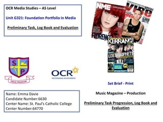
- 1. OCR Media Studies – AS Level Unit G321: Foundation Portfolio in Media Preliminary Task, Log Book and Evaluation Name: Emma Davie Candidate Number:6630 Center Name: St. Paul’s Catholic College Center Number:64770 Set Brief - Print Music Magazine – Production Preliminary Task Progression, Log Book and Evaluation
- 2. Preliminary Task Progression– Evidence Front Cover Step-by-step Step 1: Step 2: Step 3: First of all, I placed the blue lines onto my template so I knew where certain aspects of my front cover were going to go. I then added the mast head to the front cover and colour schemed it to match the St Paul’s logo. I placed the St Paul’s logo next to the masthead and deleted the background by using the magic wand tool. I then added more blue lines to my template after seeing where other aspects of the front cover needed to be added and where I would like them to be. I had inspiration from ‘Billboard’ magazine and I used this to help me place certain things around the page. After I had added the blue lines I then started to make up the cover stories that I would include on my front cover. I hadn’t made my cover stories up before so they took me a while to think up. I then lined them up with the template that I had created and made sure that they were all level with one another. I made the writing the same as the masthead because I wanted the writing to be similar with all of the other writing on the front cover. My magazine was supposed to have convergence so I included the web address for my magazine at the bottom and included the social networking sites beside it. This would then allow readers to get more information about the magazine and get more stories. I also then added a read box behind it so then the convergence stood out over the rest and this would mean that it would stand out to readers when looking at the front cover.
- 3. Step 4: Step 5: Step 6: Step 4 was that I added the barcode onto the front and placed it into the corner like the magazines that I had looked at for inspiration. I then added my main headline into the front cover and made it the same colour as the mast head. I added a black outline to the writing so it stood out more than when there wasn’t a black outline. This would make readers notice the writing more as the writing stands out more than if the writing had no outline around it. I placed the main headline at the bottom so then I could later on add the main image above so then it is clear to understand and see from the readers view. When I was adding the picture I made sure that the background was gone and I did this by using the magic wand tool. When I was taking the picture I took the picture in front of a plain background so then it would be easier to edit out. The main image had to be a mid-shot of the person so I took a full length shot and then cropped it to the size I wanted it to be. I put the main headline in front of the main image because this is what magazines did in the previous issues that I looked at, the magazines of inspiration helped with me sorting out where everything would go. Step 6 was when I added puff onto the front cover to promote to readers something that they had the chance of winning. I also added a picture of the school in the background but I then thought of changing it because it looked too much for the overall look of the front cover. I then added the school’s mission statement at the top of the front cover so readers remind themselves of it and I used the same font as the cover stories so then it was the same colour scheme and look.
- 4. Step 7: Step 8: I changed the background from the picture of the school to the two colours that I had put onto my contents page. I thought this would look better because the writing would then be easier to read as it is on a plain background. I used the same colours as the contents page because then this would be sticking to the colour scheme that I was using. The colours that I used for the backgrounds were the colours on the school badge but I made them lighter so reading the writing on the cover would also be easier to see. When I had changed the colour of the background there was a gap in the middle of the page so I made the picture bigger and moved the puff so then the gap wouldn’t be as big. I also moved the cover stories so they were aligned with the blue lines that I had added to the template before adding everything on. This gap was too big on the front cover so I move aspects of my front cover so then the gap wouldn’t be as big as it was before. I chose to do this because I thought that the gap was off putting and made the magazine look unfinished, which it wasn’t.
- 5. Preliminary Task Progression– Evidence Contents Page Step-by-step Step 1: Step 2: Step 3: The first thing I did for my contents page was that I included the blue lines onto my template so I knew where aspects of my contents pages where going to go. The code and conventions were going to be the same as other magazines that I had looked at. I added the heading of the contents page and I used the same font as I did on the front cover so it was ‘repeated’ (Steve Neale). The cover stories were copied from the front cover but I had to create new ones so there were more than four in the magazine. Step 2 was adding the school logo onto the contents page and like the front cover I added the logo next to the heading. As I used a coloured background the background of the logo can be seen so I needed to edit this out. I added a heading for the cover stories and added a box around it to make it stand out more. This was so then it would catch readers attention and the colours where from the school logo but lightened a bit as I was sticking to my colour scheme. I added page numbers next to the cover stories. In the right hand corner I then added the convergence for my magazine which included a web address for my magazine, twitter page and Facebook page. This was so then readers could get more information about the magazine and get more stories than others who don’t subscribe to the magazine. I put the addresses to the different convergence in a different colour to make them stand out more.
- 6. Step 4: Step 5: I added the editorial to the left hand corner so then it was next to the convergence and subscription. The picture that I took of myself needed to be a mid-shot. I took a long-shot and then cropped it to the size that I wanted so then I could change it if I didn’t think it looked right. I did put a box around the editorial but when I had done this I didn’t like the way it looked so I kept it simple. I didn’t think the colours went well with the overall look of the contents page so I took away the box and kept the colour of the background for the whole page instead. I took a picture of some sixth formers working in the sixth form Centre so then this would be relatable to the cover stories and then added the title ‘Sixth Form Centre’ to it so readers knew which one it was relevant to. I moved the cover stories around a bit so then they were in line a bit more as they weren’t all aligned with one another so this wouldn’t look professional to the readers. I added another cover story picture so then this would make the stories clearer to the readers of the magazine. This is because they would get an idea of what the article would be on and may draw them to reading that story. I used the same writing as the other cover story picture and also added a outline around the pictures to make them stand out more. I used the same coloured writing than the colour on the school logo so then I knew I was sticking to my colour scheme.
- 7. Section 1) – Log Book
- 8. Main Image Main Headline Mast Head Cover Stories Bar code Cover Stories Star Appeal (Richard Dyer) This magazine needs: -Strapline Puff/Promotion
- 9. Mast Head Cover Stories Main Headline Strapline Cover Stories Star Appeal (Richard Dyer) Puff/Promotion Main Image This magazine needs: - Bar code - Date - Issue - Price
- 10. Mast Head Strapline Puff/Promotion Cover Stories Main Image Bar code Issue Date Star Appeal (Richard Dyer) Main Headline Cover Stories
- 11. Cover Lines (secondary stories) Masthead Star Appeal (Richard Dyer) Date Barcode Main Headline Convergence: web address This magazine front cover needs: Strapline: this should be included as it emphasises the originality of the magazine. Examples of this are “the world’s greatest music magazine”. Puff: this should be included so then people are inclined to buy the magazine.
- 12. I chose ‘Billboard’ magazine as my magazine of inspiration because I thought that the codes and conventions related to my genre of magazine more than the others. Also I thought that the colour scheme and the cover stories suited the pop genre more than the other magazines that I had looked at before choosing. With ‘Billboard’ I thought that the colours were bright which would then catch the target audiences attention and I thought that the bright colours would fit perfectly with the pop genre. The way that the magazine was set out also helped me in choosing this magazine as my inspirational magazine because everything was clear and easy to read unlike the ‘Kerrang!’ magazine where there was a lot on the page which then made it appealing, however I thought that ‘Billboard’ magazine and ‘Top of the Pops’ was presented better than the other two magazines. With the cover stars on the front cover of ‘Billboard’ I thought that they were better linked to pop so this made me want to look at this magazine for inspiration it was better linked to my genre. Established Magazine for my Research When looking at different examples of their magazines, I noticed that the way they laid out their codes and conventions changed and this is what attracted me to the magazine.
- 13. Billboard Magazine – Genre research Billboard magazine is an American magazine and is generally based on pop music but can also include other genres. Billboard magazine is owned by Prometheus Global Media. The genre and target audience for the magazine varies because it depends on what is in the charts at that time. It is aimed at both genders but can normally be decided by the cover star. The age range for the target audience is 25- 54 year olds (Katz). Billboard magazine is the most influential music media brand and is famous all round the world. The Billboard brand is built on its exclusive charts and unrivaled reporting on the latest news, issues and trends across all genres of music. The front covers all have star appeal and this encourages the customers to buy the magazine. The secondary stories being advertised on the front of the magazine also makes the target audience want to buy the magazine as they would want to find out what there favorite star has been up to. Also by including puff/promotion onto the front cover this would appeal to the target audience if the star (Richard Dyer) is linked to the pop genre. If the target audience are fans of the star then the target audience would want to buy the magazine.
- 14. Target Audience – Katz, Maslow, Hartley and/or socio-economic needs The target audience for Billboard magazine can be denoted as being aimed at young adults. This is because the magazine is colourful. In addition, the star appeal used on the front covers of the magazines are generally the pop stars that are at the top end of the music charts. This would make people want to buy the magazine if they are fans of those particular people or like the look of them. Also with Katz theory the audience would be seen as ‘inform and educate’ as consumers would be able to learn from reading the magazine. Billboards primary target audience would be seen as ‘social climbers’ and ‘explorers’ (Maslow) as fans are being inspired by their favourite artists to become more like them. What is the USP of this magazine? From the research completed into this media product, I think the USP is ‘Star Appeal’ (Richard Dyer) as the main images are celebrities that have been chosen to represent that issue. This would make people want to buy the magazine especially if they like the star on the cover of that issue. The main image is the first thing the audience are going to see so by having star appeal it makes consumers attention to be caught straight away. By changing the star appeal every week it makes the target audience want to subscribe so then be able to see what would be on the next issue.
- 15. Publisher research Billboard Publications became a major trade magazine publisher, acquiring The Hollywood Reporter, Kirkus Reviews, Adweek and Mediaweek. It was acquired by Dutch publisher VNU which was then later renamed Nielsen Company in 1933. This was then sold in 2009 along with other Nielsen Business Media properties to a new company called e5 Global Media. This was then later renamed in 2010 to Prometheus Global Media. Billboard magazine is intended for music professionals which includes: record label executives, artists, music retailers and some radio DJ’s. It can be found in many consumer bookstores and magazine stands even though it is considered to be a business-to-business magazine. Billboard magazine can be found particularly in cities that are known for a large music industry such as New York, Los Angeles, Nashville, Austin and Miami.