
Empfohlen
Weitere ähnliche Inhalte
Was ist angesagt?
Was ist angesagt? (19)
Ähnlich wie Describe the design of the title.docx
Ähnlich wie Describe the design of the title.docx (20)
Mehr von ElizabethAdeoye23
Mehr von ElizabethAdeoye23 (20)
Kürzlich hochgeladen
Kürzlich hochgeladen (20)
Describe the design of the title.docx
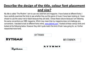
- 1. Describe the design of the title, colour font placement and size? My title is called „The Rhythm‟ I aim to use very bold font and magazine. I have looked at different fonts; I have carefully examined the fonts to see whether they suit the genre of music I have been looking at. I have chosen to use the colour red or black because they are bold, I chose these colours because I am following the same conventions as VIBE magazine. Which may mean that my magazine does not challenge any conventions. I decided to look at different fonts online, www.dafonts.com. I looked at these various fonts and looked at the following below. However they didn‟t quite match the kind of look I was going for, so I further researched more fonts.
- 2. What is the name of the magazine? The name of the magazine is ‘The Rhythm’, I have chosen rhythm because I wanted to incorporate the genre of music within the title and I believe by the way I have done it exemplifies this. What is the magazine going to be about? The magazine is going to be about an upcoming artist who slowly began to get involved with drugs; it is going to have an article about what’s in the fashion world. Also it is going to have an advertisement of all the new albums which have been created by new artists. The magazine will also aim to teach the wider audience in how to create your own RnB look from home.
- 3. How I intend to place the masthead • I intend to place the masthead, behind the main image. I want the main image to be the forefront of the magazine. The masthead will still be place What is the dominant image be and why? • My main image will be an image of „Ebonie‟ who is the artist who is featured in the main article of my magazine. I choose this image because I wanted to have a relationship between the image and the articles, I thought the way I chose to do this will allow this to do so. The images I have placed below, are what I aspire my front cover to look like however, I will like to incorporate an instrument in my front cover, to allow my reader to know what kind of music magazine they are reading. I did this so that the magazine isn‟t too generic.
- 4. What does the image tell your potential target audience? • My image will tell my target audience that this magazine is here to promote the upcoming artist. The image will tell my target audience that women are beautiful in all shapes and sizes. Would you be including any other image on the front cover? • I will include images of „sneak peaks‟ of what will be included inside of the magazine. I have also thought about adding images of upcoming artist for other issues of the magazine. I have decided to add single images of musical instruments which are used in this genre of music. How do these articles relate to the title of the music magazine? • These articles will relate to the title of the music magazine because „Rhythm‟ is the pattern of musical movement through time, this will be found in my
- 5. Will your target audience find your front page appealing and why? Why not? • My target audience will find my front page appealing because it will display beautiful woman and an instrument. The colours I have chosen to use are very bold. They will stand out and will aim to represent the genre. The colours I have considered in my main image are red, black and yellow. I have chosen red because this colour is very alarming and will draw attention to the magazine, it represents passion in which most females posses, I have chosen this as another to target my target audience. I have chosen black, to aim to neutralise the cover, so it will not be too overpowering. I have also considered yellow, I might use this colour, I don‟t want the main image to look messy that‟s why I will see what the main image looks like before I add any more colour to it. I have also considered going for a different colour scheme. I have considered using gold. I have considered this colour because it will add class to my magazine. I would my magazine to resemble a porno magazine too much, that‟s why I have considered using other colour schemes. Such as pink, blue and other pastoral colours. I have looked at the way in which VIBE has used colours, and through my research I found out that they stick to really simple colours, which are apparent in my examples below. The colours always compliment the main image which is something I aspire to do for my front cover.
- 6. What articles will be found in my magazine? The articles which will be found in my magazine: • How to create your own “diva” look. I have chosen this as an article in my magazine because my target audience will want to create their own RnB star look at home, so this will potentially draw the audience straight away into my magazine. • Top 10 upcoming bangers of this year- I will aim to use this as an advert for the upcoming artists, also I will use this to showcase the genre of music I have chosen. • Celebrity gossip, I will use this article as a way of connecting the reader to celebrities personal life. The music behind RnB, here I will aim to give my audience a lesson about where the music they listen to has generated from. It will act a history lesson for my readers. Will your target audience find this appealing? Why? • My target audience will find this appealing because it fits in with the genre of music I am trying to represent. It will emulate the VIBE magazine which completely showcases the genre of music I am trying to represent. Will your chosen font, depict the genre of the music magazine? • The chosen font will depict the genre of the music magazine because I aim at making the magazine very sensual. I believe that the RnB genre is a sensual, relaxed kind of genre; I hope to make my font very relaxed and informal. I want the font to be bold, but not bold in the sense that it will resemble heavy metal genre. I have chosen Vibe which I have analysed, I like the way the magazine has been designed, the bold colours something that I will be aiming to follow.
- 7. • How many different fonts am I going to use, what colour and what size and style? • Initially when I was thinking of fonts to use, I decided with Viner Hand ITC in gold; I have chose this font because I believe that it will represent my genre very well. However when I looked at VIBE magazine and aim to use this as a guideline for my own magazine. I liked the way in which the colour is bold, but still subtle. I would like my own magazine to have this same type of effect. The font will be very large, so it can stand out against my background. It also uses a strapline and a masthead, whereby the strapline is placed above the masthead, I like the way in which this looks, and aim to use this for my own magazine. through research I went onto the website dafont.com and looked at fonts. I liked the northern territory and decided to use this for my magazine. I decided to only use three fonts with three colours. I decided to use red, black and navy blue. Also like the vibe magazine I have also decided to use the colour red because I like the contrast in the colours. The colour red paired with another font from dafont.com in black will make the magazine stand out but not too overbearing. Finally I have again chosen another font from the same website and decided to use it in navy blue, to allow there to be a range of colours.