Interactive Dashboards
•
0 gefällt mir•846 views

Summary of advantages of interactive dashboards, with a focus on construction.

Empfohlen
Empfohlen
Weitere ähnliche Inhalte
Was ist angesagt?
Was ist angesagt? (20)
Andere mochten auch
Andere mochten auch (19)
Ähnlich wie Interactive Dashboards
Ähnlich wie Interactive Dashboards (20)
Mehr von Dr Rupert Booth
Mehr von Dr Rupert Booth (7)
Kürzlich hochgeladen
Kürzlich hochgeladen (20)
Interactive Dashboards
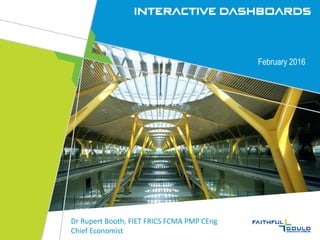
- 1. Interactive Dashboards February 2016 Dr Rupert Booth, FIET FRICS FCMA PMP CEng Chief Economist
- 2. Agenda • Interactive dashboards: what & why • Business Intelligence basics • Case study • Work done • Lessons learned • Choosing a platform • Other applications: • Olympics • Asset/Facilities management • Smart Cities • Geographic • Operational and Analysis Dashboards • Summary for RICS Members
- 3. Definition of Interactive Dashboards Simple dashboard is adequate for: • Limited information • Readers with similar skills and information needs Typically delivered in an Excel workbook with up to a dozen sheets User-interaction adds: • Navigation • Drill-down • Threshold control for exception reporting • Filter control (e.g. sliders) • Choice of display formats for naïve or expert users Excel offers limited interaction but database solution offers more potential
- 4. Potential of Data Visualisation Use of a database increases potential of visualisation: • Handles large volumes of data • Increased productivity • Gain new insights that were not obvious before • Common vision – do you see what I see? • Increased user interaction:
- 5. Need for Automation Hand-crated ‘executive scorecards’ impractical with large data volumes Essential to design data flow. • Data source, usually Line-of-Business systems • Staging area, for receipt and cleansing of data • Data warehouse for storage • Data extraction to answer queries • Data visualizing for user, often by the user, i.e. self-service Data flow is typically web-enabled, and independent of the Systems-of-Record
- 6. Initial Scoping Demand-side: Who are the stakeholders and what do they want? • Organisational goals and objectives • Personal ‘wins’ Supply –side: What data is available? • Inventory of systems, applications and data What technical infrastructure is available? • Communication and storage options Gap analysis Initial dashboards Key performance indicators
- 7. First step: Identify & Classify the stakeholders
- 8. What are the other ingredients for success?
- 9. Dashboard & System Design Base around ‘Use Cases’ (Story-boards) • Who are the user groups • What type of dashboard: Operational, Strategic, Analytical • Group data logically • Make data relevant to users • Avoid data overload – rely on navigation • Avoid visual clutter • Consider reporting cycle and decision-making cycle
- 10. Case Study: Monitoring the National Porfolio “Developing a national level Programs/Projects Monitoring Dashboards on a recent project was a true challenge for Malomatia’s Analytics team, from standardising the data structure through Service Level Agreement governed data feeds, to having a User Interface that is intuitive, interactive and easy to use. Developing a business-oriented dashboard & story-board, and aligning it with a highly creative User Interface, allowed us to report very sophisticated project data in fast and user- friendly ways, catering for the needs of country leaders, agency heads, project and budget analysts, and project managers“. Khalil Khalil, Head of Analytics, Malomatia.
- 14. Program level screen shot
- 15. Project level screen shot
- 16. Choosing a Platform: Range of Features (Gartner) Enable • Business User Data Mashup & Modelling • Internal Platform integration • BI Platform Administration • Meta-data management • Cloud Deployment • Development and Integration Consume • Mobile • Collaboration and Social Integration • Embedded BI Produce • Free-form Interactive Exploration • Analytics Dashboards and Content • IT-Developed Reporting and Dashboards • Traditional styles of analysis
- 17. Gartner ‘Magic Quadrant’ Described as Gold Standard by Gartner Two products, QlikSense & QlikView Traditional Business Intelligence tools
- 18. Beware: Not Big Data Large volume of data does not equate to ‘big data’ Most dashboards based upon: • Relational data based management system • Structured data and Structured Query Language • Record all past transactions In contrast, Big Data: • Typically based on Hadoop • Not based upon data schemas • Flexible mapping • Pass-through data However this traditional contrast is beginning to blur
- 20. Facility Management Dashboards Typical Typical graphical output: • Inter site comparisons (left) • Service cost trends (below) Typical choice of metrics: http://dashboardspy.com/dashboards-for-facility-managers/
- 21. Smart City Engagement http://data.london.gov.uk/
- 23. Operational Dashboard – Real Estate http://www.raveis.com/it_dashboard.asp
- 24. Analysis Dashboard – Transport Planning
- 25. Possibilities for RICS members? Improve the usability of a construction dashboard Design a dashboard from scratch Manage a dashboard implementation Corporate performance measurement Web-enabled lifecycle management
- 26. The End…