
Empfohlen
Weitere ähnliche Inhalte
Was ist angesagt?
Was ist angesagt? (16)
Andere mochten auch
Andere mochten auch (15)
Ähnlich wie G321 Magazine Flat Plan
Ähnlich wie G321 Magazine Flat Plan (20)
Kürzlich hochgeladen
Kürzlich hochgeladen (20)
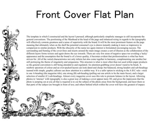
G321 Magazine Flat Plan
- 1. Front Cover Flat Plan The template in which I constructed and the layout I pursued, although particularly simplistic manages to still incorporate the general conventions. The positioning of the Masthead at the head of the page and enhanced sizing in regards to the typography will effectively connote greatness and a sense of superiority with the brand. It will be the most prominent feature on the page meaning that ultimately when on the shelf the potential consumer's eye is drawn instantly making it more so impressive in comparison to similar products. With the obscurity of the name too again interest is formulated encouraging success. The surrounding and framing of the cover-lines and inserts around the main image creates a sort of illusion as the collaboration of the different layers forms texture and again draws the eye inwards. There are very few areas of negative space too avoiding a 'tacky' appearance and the assumption that the brand is of a lower quality, it becomes evident that professionalism is what has been striven for. All of the varied characteristics not only inform but also come together in harmony, complimenting one another but still portraying the theme of singularity and uniqueness. This structure is what is most often than not used within paper products so the general convention is still being attended to and regulated. An attention-grabbing cover doesn’t need to be brash. A rainbow spectrum of colour and an over-packed layout can look dated and cheap; but balanced, strong headers and sub-headings teamed with simple, graphic callouts can draw attention in a subtler way. It is a safer option to sticking to the A B C rule—stick to one A-heading (the magazine title), one strong (B) sub-heading (pulling out one article to be the main focus), and a larger selection of smaller (C) sub-headings. Almost every magazine cover uses this rule to promote balance in the layout. Allowing photos to ‘interact’ with typography is also a great way of making a cover appear more 3D, and gives the impression that the photo is jumping out at you all that is required is to cut the subject of the photo away from the background, and layer them so that parts of the subject are brought in front of text, and others behind which within the cover will have the greatest of impact.
- 3. Contents Page Flat Plan The appearance of this plan again has taken a rather condensed approach but the alteration in font types used will support a more finalised finish. The uniformity of listing the page numbers along with a brief description creates a clean cut look in spite of the fonts used so there is a sense of differentiation provided appealing to more people as a result. In relation to the composition of the images, the area outlined will consist of three or so images and not just a solid image pasted on the page which otherwise may look rather bland in relation to the characterised contemporary finish of the rest of the page. They will be from the same shoot to retain consistency though so the contents page shall not be deemed perhaps mismatched or messy. I will have a firm grip upon creative control but the maintenance of the according theme will look generally satisfactory. In order to integrate the conventions of the average contents page I have written up a brief list of what they shall include and progressively tick them off when achieved. In spite of this approach I will attempt to make the product exclusive to my personal preferences and what I feel as an individual will convey the personality of the artist within reason. For example a simple colour scheme is often used in which I will too include within my own, however will inspect the tone of the artist and combine in this particular colour. Mable as a result of her experiences (as elaborated upon within the interview) may be referred to as quite active, cheerful and optimistic. These traits parallel the colour red which I understand sounds partially obscure but hopefully heightened will be the emotional connotations of the artist which is not an obvious connection for the reader to make but scientifically it is suggested that this is the case. So behind the overall exciting appearance of the page is a deeper and more influential impact making the reader more likely to read on. The conventions as referenced earlier include: •Arranged in columns, usually 3 or 4. •One main picture relating to a feature article. •Other smaller images. •They have page numbers on the pictures which anchors them to the written contents. •Name of the magazine is at the top, issue date and the word contents. •Subscription and contact information. •Sometimes an editors letter. •Contents divided into categories and headings used to identify each category. •Image of the front cover of the magazine. •Simple colour scheme. •Contents are written in the same way- First Line- page number- one or two words which could be artist name or ambiguous text to intrigue the reader in bold type, often capital letters (average 12-13pt). Sub Line- Gives you more specific detail about what the articles about in smaller font and roman (no bigger than 11pt). •Photography is credited for the front cover. •Interesting and varied photographs. •Features and regulars - main category headings •Bottom has page number followed by title and issue date, really small font, often followed by a web address. •Usually one or two pages, no more. All great contents spreads will be structured on some sort of grid layout, but it certainly doesn’t need to be restrictive or dull. Restricting the number of articles you highlight in each row or column of your grid can support in giving more breathing space to each item and help maximize white space in your
- 4. Page Number and Description Main Image Page Number and Description Page Number and Description Page Number and Description Sonder Review
- 5. Double Page Spread Flat Plan Through the template presented of the main article it is apparent that provided is a sense of balance because both halves of the page consist of the same proportional areas when previewing the actual content (the text boxes are positioned diagonally as well as the images following such trend with the intention on effectively filling all negative space). Balance is the principal of design that places elements on the printed page or website so that text and graphic elements are evenly distributed. In layouts with an even balance, the graphics don't overpower the text, and the page doesn't seem to tilt to one side or the other. On the eye the layout is flattering because nothing appears exceptionally sharp and everything seems to flow. Contradicting this however is the intensity of the heading in comparison to the diluted, pale background (the height and thickness of the font used) and the framing of the images being quite sharp. Balance is however achieved not only by the distribution of text and images but by the distribution of white space. Closely related to balance is the concept of the rule of thirds, the visual centre and the use of grids. The rule of thirds says that most designs can be made more interesting by visually dividing the page into thirds vertically and/or horizontally and placing the most important elements within those thirds. Even if you’re formatting a text-heavy article, it is worth trying to experiment with adding callouts and quotes set in infographic-style shapes and borders. I for example may begin to introduce arrows and dividers to direct the flow of the article and hold the reader’s attention for longer.
- 6. Image of Artist Text (Embedded Q & A) Text (Embedded Q & A) Text (Embedded Q & A) Quotation Article Title Image of Artist Text (Embedded Q & A) Text (Embedded Q & A) Text (Embedded Q & A)