
Empfohlen
Empfohlen
Weitere ähnliche Inhalte
Was ist angesagt?
Was ist angesagt? (20)
Ähnlich wie Product Teardown - Car Rental Apps
Ähnlich wie Product Teardown - Car Rental Apps (20)
Kürzlich hochgeladen
Kürzlich hochgeladen (20)
Product Teardown - Car Rental Apps
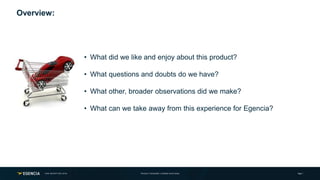
- 1. Page 1CAR INCEPTION 2018 PRODUCT DESIGNER: CORINNE DIGIOVANNI • What did we like and enjoy about this product? • What questions and doubts do we have? • What other, broader observations did we make? • What can we take away from this experience for Egencia? Overview:
- 2. Page 2CAR INCEPTION 2018 Teardown 1: Enterprise Rent-A-Car Overview: • Booking: Car path only • Search: Via location, map or car class • Filter: Selective criteria • Shopping: Results by car class • Navigation: Same for both OS’s OVERALL CVR TBA PRODUCT DESIGNER: CORINNE DIGIOVANNI
- 3. Page 3CAR INCEPTION 2018 Observations: Onboarding OVERALL CVR TBAPros: • Graphics: Simple and on brand • Animation: Intriguing and interactive • Language: Clear and concise • Direction: Clear CTA’s for multiple sign in options Cons: • Length: 4 screens when 2 would have sufficed • Content: No real examples of what the app does Takeaway: • First impressions matter. Our recommendation is to introduce our customers to an onboarding experience with the launch of Car. PRODUCT DESIGNER: CORINNE DIGIOVANNI
- 4. Page 4CAR INCEPTION 2018 Observations: Navigation Pros: • Flow: Consistent navigation and user experience on both OS’s • Menu: Nonessentials stored in “hamburger” icon • Assistance: Icon easily available with one tap. • Categories: Easily understand for secondary functions • Quick access to get back to the home screen from anywhere Cons: • Advertising: Obtrusive display within the menu space Takeaway: • Our recommendation is to unify the navigation experience on both OS’s and utilize the side drawer menu for secondary functions. OVERALL CVR TBA PRODUCT DESIGNER: CORINNE DIGIOVANNI
- 5. Page 5CAR INCEPTION 2018 Observations: Dashboard Pros: • Sign In: Ability to sign in without leaving the dashboard. • Entry Point: Soft entrance by landing here before searching. Cons: • Space: 50% of the screen is taken up by a picture with no actions. • CTA: To start a reservation you have to use location. • Text: “QUICK START” is misleading as it does not start a booking. Takeaway: • Our recommendation is to incorporate a dashboard with purposeful and relevant interactions and messaging. OVERALL CVR TBA PRODUCT DESIGNER: CORINNE DIGIOVANNI
- 6. Page 6CAR INCEPTION 2018 Observations: Shopping Pros: • Information: Clear hierarchy established with the font and space • Images: Hi-Resolution cars set in clean white backgrounds • Main CTA: Actionable steps linked total cost of the trip with • Secondary CTA: Icon, color and text to indicate click-ability • Spacing: Breathable space in-between each selection • Transitions: Different transitions for each selection Cons: • White Space: Customers love it, but the business sees emptiness Takeaway: • Cards are here to stay! Our recommendation is to lean into a clear and concise card shopping experience. OVERALL CVR TBA PRODUCT DESIGNER: CORINNE DIGIOVANNI
- 7. Page 7CAR INCEPTION 2018 PRODUCT DESIGNER: CORINNE DIGIOVANNI Takeaways: • They really hit the nail on the head with their shopping experience • There is consistent brand awareness on both platforms as well as the desktop experience • The transitions are delightful as well as meaningful • High resolution images and car information is front and center • They have a simple color palette and they use it successfully throughout the app
- 8. Page 8CAR INCEPTION 2018 Teardown 2: Southwest Airlines OVERALL CVR TBA PRODUCT DESIGNER: CORINNE DIGIOVANNI Overview: • Booking: Flight, Hotel and Car path • Images: No images of cars, anywhere • Filter: Exposed filter on results page • Shopping: Results by supplier • Navigation: Top and bottom navigation
- 9. Page 9CAR INCEPTION 2018 Observations: Navigation Pros: • Flow: Consistent navigation and user experience on both OS’s • Navigation: Top and bottom navigation • Alert: Travel advisories located at the top of the screen • Categories: Expandable secondary functions within the menu • Points: When signed in, your total points are listed on the top Cons: • Menu: Overwhelming amount of fonts and actions Takeaway: • We recommend both top and bottom navigation for both OS’s * OVERALL CVR TBA PRODUCT DESIGNER: CORINNE DIGIOVANNI *For Android the lower nav would be present on the dashboard only
- 10. Page 10CAR INCEPTION 2018 Observations: Dashboard Pros: • Lower Nav: Booking path located near the bottom • Trips: My booked trip is at the top if the list • Images: The images and graphics are eye catching Cons: • Advertising: Huge images used for ads vs. my actual booked trip • Messaging: Asking me to sign up for something I already have Takeaway: • We recommend eye catching relevant images and contextual layout of information on the dashboard. OVERALL CVR TBA PRODUCT DESIGNER: CORINNE DIGIOVANNI
- 11. Page 11CAR INCEPTION 2018 Observations: Booking OVERALL CVR TBA PRODUCT DESIGNER: CORINNE DIGIOVANNI Pros: • Forms: Nice big form fields and clear text • Simplicity: There are only 3 sections to fill out • CTA: Clear next steps with big button • Calendar: Full screen length allows for multi month view Cons: • Recommendations: Recent searches is hidden Takeaways: • Our recommendation would be to utilize big form fields for booking and date selection, but surface recent searches.
- 12. Page 12CAR INCEPTION 2018 Observations: Search Results OVERALL CVR TBA PRODUCT DESIGNER: CORINNE DIGIOVANNI Pros: • Filtering: Exposed filters on results page Cons: • Branding: The results page clashes with all of the car brands • Color: Readability is diminished with the multi colors • Spacing: Small overwhelming compromise decision-making time Takeaways: • Our recommendation would be to utilize exposed filter options if they do not interrupt the user flow.
- 13. Page 13CAR INCEPTION 2018 PRODUCT DESIGNER: CORINNE DIGIOVANNI Takeaways: • As a distributer of multi fleet suppliers, Southwest has focused on the rewards and points a traveler would accumulate by booking rather than the actual car itself. • There is not a single picture of a car anywhere in the app • The car information is limited and it seems to lack transparency around the choices • This app has a similar user flow to what we might see in Egnecia but is a little clunky
Hinweis der Redaktion
- NOTES: One thing to note about this app is, though used by business travelers, it is not solely reliant on them. Some of the other users that we do not cater at Egencia that use Enterprise could be (but not limited to): Hourly use for moving Hourly use for daily tasks because you do not own a car Leisure travel Renting a car for enjoyment purpose (i.e. renting a sport car or convertible for fun) Car booking path only This app is not tied down by other booking paths and can focus sole on this one thing well. Though we are not in the single line of business like Enterprise, I think it is important for us to focus on what they do well (and what the miss the mark on) as a guiding light to how we can better deliver the car booking path to our users. Search via location or car class Currently none of our LOBs allow for map view searching right off the bat. Hotel is the closet example, but you still need to fill out date range and location before the map results appear. In this app and many other car rental companies, searching by “car class” is the standard. This is of course because they are the sole distributors of their fleet so why would they need to display companies for their shoppers? I bring this up as something to keep in mind. Our customers may be looking for this well know behavior when renting cars in other capacities. Limited filter criteria With having only their own fleet of cars to pull from, the filter options are very limiting, allowing only 4 car types/passenger seating and transmission This simplified filter options can be a positive for users, as to not clog up the booking path with to many options right off the bat. One thing to consider is the limited fleet provided in this app and how will filtering work when multiple companies are availble for rental? Clean and simple shopping experience Here is where this app really shines. There simple, straight forward use of cards and text really allow the user to make quick educated choices. I will break down the cards later on, but if anything is to be taken from this experience, this would be it. Same navigation and user experience for both OS’s Something to note is that the exact design and user flow is the same on both iOS and Android. I believe their app might be built in React. The simplified navigation works well with their brand and the one booking path that they cater to.
- Right off the bat I noticed this fun and interactive onboarding experience. If we think about the car rental experience, most repeat customers are maybe shopping twice/ 3 times a year, just like many of our customers. Having this friendly reminder of the benefits of the app was both helpful and delightful. A well designed onboarding experience can educate and drive conversion. Simple branded graphics This is important because it creates brand awareness during the education processes and continues throughout the entire app experience This same design language is also present on their website Intriguing interactive animation This little taste of interactive and intriguing transitions is present throughout the app This is important because we hold our phones in our hands and have the swiping function inherently part of our daily behavior Clear and concise language NO need for long rambling copy. They get to the point of each screen with 1 sentence. The conversational language continues throughout the app so that it doesn’t feel stuffy or robotic. Clear CTA’s for multiple sign in options They handled multiple sign in options nice and spaced out with clear copy to indicate what you should click on.
- Consistent navigation and user flow on both OS’s It is unclear if these are native apps or a PWA (Progressive Web App) Note that there is no lower navigation which is common among iOS apps, Secondary functionalities stored in “hamburger” menu iOS apps are starting to utilize “Android” style navigation (material design) like the hamburger button The booking path is still accessible from the side drawer No essential functions are “hidden” away to keep the booking path clean Easy access to the “AssestMe” function Since there is a simplified top navigation, the call for assistance icon is easily accessible Easily understandable categories for secondary functions Within the menu the functions are sectioned into like items. This helps decision making fast and glanceable. Quick access to get back to the home screen/dashboard from anywhere The user can always go home without having to dial back. Obtrusive utilization of the menu space for advertising I am not sure of their testing around placing their advertising inside the menu side drawer, but I felt it was obtrusive to my user path. That top area should have been real estate used to get the user back to the booking path to move them forward in a purchase Maybe it would have been more appropriate to have a section that states “DEALS”.
- Notes: I really think they missed the mark with their attempt to soften the entry point to the app with a dashboard. Sign In: Ability to sign in without leaving the dashboard. If a user skipped the onboarding without signing in, they still have the ability to book. Which is great. They also have a quick link to get them signed in and start accumulating points if they forgot. More than half the screen is taken up by a picture of places the user isn’t even located in. That huge picture is just another promotional ad letting people know where Enterprise is located. There are no actionable steps for the user and it does not add to their experience This real estate could have been used much more effectively The CTA to start a reservation is clear, but there is no “NEXT” or clear indication to move forward. I actually overlooked the “Enter Location” field because I was expecting a button or next step The “QUICK START” text is misleading, The text color and the arrow make it seem like I should click this as my next step on this page it is located where most CTAs would be (at the bottom of the screen easy access to a thumb) But when you click it, the screen pulls up to display secondary information that has nothing to do with booking.
- Their shopping experience is probably the best part of this app. It is clean, interactive, informative all while giving me the feeling that I am making an informed smart choice. Clear hierarchy of information with the use of font This app sorts and shops via car class, so that is the largest font on the card The price is the only white bold font set in the dark Enterprise green You know what you are paying for without having to go in another level Hi-Resolution images of cars set in clean white backgrounds The overall design esthetic for this app is heavily reliant on images They are consistent with the style and quality of photography This photos give the user the ability to make a quick buying decision without having to read to much. Main call out to the total cost of the trip with actionable steps Within each Card the main CTA is the TOTAL Price This is nice because I don’t have to do math (ie $27.56/day) This aligns with the design principles of transparency and confidence Secondary information still labeled clearly within the card The more details CTA is small, but it uses both the branded green color, and icon and capitol letters to indicate a clicking action Breathable space in-between each selection The small sliver of space between each card is important as it allows the users eyes to quickly differentiate between the buying options Thoughtful transitions when cards are selected Each transition is meant to move the user forward in the booking process When the price is clicked, the green actually moves down to the bottom of the screen and then becomes the booking CTA
- Knowing that this company caters to customers outside of our scope, it is still a great north star. Especially for the shopping experience
- Overview: Flight and Car booking path Top and bottom navigation Search filter by car type and company Search results by rental company Same navigation and user flow for both OS’s
- Consistent navigation and user flow on both OS’s This entire layout is the same on both iOS and Android Note that there is a lower navigation, but only on this “Dashboard” screen This lower navigation/ “quick links” is also on Android Secondary functionalities stored in “hamburger” menu Just as Enterprise did, Southwest is utilizing a side drawer for storage of all their features The booking path is still accessible from the side drawer Easy access to the ”Travel Alert” notifications When traveling, peace of mind and safety is important for all travelers. The “!” icon lets travelers see all travel alerts regardless of where their trips are scheduled Expandable categories for secondary functions The title of each section is expandable leading to more functions under them Some of the social media CTAs are branded with icons (like facebook/twitter) Points on the home screen/dashboard from anywhere Many road warriors utilize points when traveling, and it is nice to have that displayed. I was expecting the Name and the points to be clickable, but they are not. It is the one thing on the top navigation that is not clickable Huge use of space for advertising Even though I am logged into the app, they are still pushing their cards and their deals right off the bat My actual “Orlando” trip is seemingly lost among the ads I am curious to see if closer to my departure if the cards change and more trip related actions surface They could have used that space to sell me a car rental for my Orlando trip…just saying
- Lower Nav: Booking path located near the bottom This location is a prime click area located near a users’ thumb My booked trip is at the top if the list It was nice to see that my booked trip to Orlando was located right at the top and I could click it and go to the itinerary Images: The images and graphics are eye catching They have a better use of space with their images/cards on this dashboard, compared to Enterprise, but they still aren’t adding anything to my experience Advertising: Huge images used for ads vs. my actual booked trip The title of each section is expandable leading to more functions under them Some of the social media CTAs are branded with icons (like facebook/twitter) Messaging: Asking me to sign up for something I already have I already purchased “EarlyBird Checkin” for my trip, why is there an add for it? We already have a SW Credit Card, now there is an add for another one. Why is there no logic to what my actual account has?
- This app