Curious maps
•Als ODP, PDF herunterladen•
1 gefällt mir•4,442 views

the curious similarity of many diseases and their distributiion

Empfohlen
Empfohlen
Weitere ähnliche Inhalte
Ähnlich wie Curious maps
Ähnlich wie Curious maps (20)
Mehr von Chris Yukna
Mehr von Chris Yukna (20)
Kürzlich hochgeladen
Kürzlich hochgeladen (20)
Curious maps
- 1. Curiously Similar Maps Chris Yukna http://www.emse.fr/
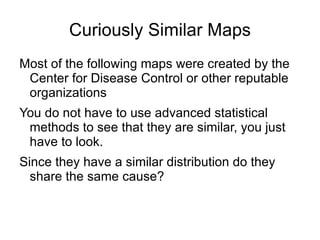
- 2. Curiously Similar Maps ● Most of the following maps were created by the Center for Disease Control or other reputable organizations ● You do not have to use advanced statistical methods to see that they are similar, you just have to look. ● Since they have a similar distribution do they share the same cause?
- 3. Origin ● The first hint of something strange going on was a wonderful animated presentation on obesity in the United States by the CDC. http://www.cdc.gov/obesity/data/adult.html More than one-third of U.S. adults (35.7%) are obese.
- 4. Next ● In the wonderful RSA Animate - Changing Education Paradigms based on a talk by Sir Ken Robinson
- 5. Then ● By randomly asking for maps of the States or selecting the google image of the CDC obesity map and asking for similar images this collection was formed
- 7. Obesity
- 8. Diabetes
- 9. Lung Cancer (white males)
- 10. Overall Cancer Rates Cancer mortality rates by county (age-adjusted 1970 U.S. population). Cervix Uteri: All Races, Females, 1970-1998. (Freeman, H. P., B. K. Wingrove. Excess Cervical Cancer Mortality: A Marker for Low Access to Health Care in Poor Communities. Rockville, MD: National Cancer Institute, Center to Reduce Cancer Health Disparities, May 2005. NIH Pub. No. 05-5282.)
- 11. Heart Disease see also the cdc interactive stroke and heart maps
- 12. Arthritis
- 13. Antibiotics Use
- 14. Strokes
- 16. Mental Health
- 17. HIV Map Interactive Google Map
- 18. Alzheimer's Deaths by State
- 19. Could it be Genetic?
- 20. The answer seems No
- 24. Thank You Are there any questions? By Christopher Yukna yuknachris(at)yahoo.com Science General: http://yukna.free.fr/science/general.php Ecole des Mines Saint Etienne France http://www.emse.fr/
Hinweis der Redaktion
- By Christopher Yukna yuknachris ( at )yahoo.com Science General: http://yukna.free.fr/science/general.php Ecole des Mines Saint Etienne France http://www.emse.fr/
- More than one-third of U.S. adults (35.7%) are obese. What is worse is the cdc seems to focus on differences in race. Saying it is higher non hispanic blacks than hispanics, etc Ignoring basic science which suggest that any racial difference is hokum.
- While the two maps are not that similar it did set me thinking of looking at maps of diseases and other medical condidtions with startling results. http://www.youtube.com/watch?v=zDZFcDGpL4U
- There are many more diseases and maps I have yet to seek but these techniques appear to produces results.
- Here is a more detailed map on obesity based on CDC data from 2008 http://www.npr.org/blogs/health/2011/07/19/138513138/latest-figures-on-obesity-paint-an-uglier-picture?ft=1&f=103537970
- http://www.americanobesity.org/obesityInAmerica.htm
- The first result the came up similar to obesity was diabetes and even when searching for obesity Google images presents early on maps of diabetes. What is strange is that while many obese people become diabetic many diabetic paitients have never been overweight
- The exixtance of two belts of diabetes and obesity running parallel in Appalachia and along the coast in the American South is widely cited in articles This is for lung cancer in white males but eeriely follows the same pattern as the other maps. It is true that many other cancers show different patterns
- An image from a course at MIT suggests that this pattern for cancer overall is disturbing http://dspace.mit.edu/bitstream/handle/1721.1/65193/hst-950j-fall-2005/contents/index.htm
- http://apps.nccd.cdc.gov/DHDSPAtlas/ Again the areas covered is strikingly similar
- http://www.cdc.gov/arthritis/data_statistics/state.htm
- http://www.cdc.gov/getsmart/healthcare/learn-from-others/factsheets/antibiotics.html
- http://www.cdc.gov/stroke/maps_statistics.htm
- http://www.cdc.gov/mmwr/preview/mmwrhtml/su6003a1.htm
- This is truely amazing since cesarean birth is not considered as an illness.
- This map shows a somewhat different picture to what Sir Ken Robinson alluded to. BTW sugar is suggested as the culpret http://www.adhdawareness.com/adhd-statistics-stats-on-adhd.html#.UGM9YKO71xU
- http://www.womeningovernment.org/bone/resources/prevalence This is some what science fiction since this is projected for the year 2020.
- Thank You Are there any questions?