
Empfohlen
Weitere ähnliche Inhalte
Was ist angesagt?
Was ist angesagt? (15)
Andere mochten auch
Andere mochten auch (12)
Ähnlich wie Luke qu1
Ähnlich wie Luke qu1 (20)
Mehr von Charis Creber
Mehr von Charis Creber (20)
Luke qu1
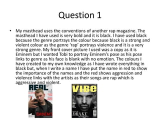
- 1. Question 1 • My masthead uses the conventions of another rap magazine. The masthead I have used is very bold and it is black. I have used black because the genre portrays the colour because black is a strong and violent colour as the genre ‘rap’ portrays violence and it is a very strong genre. My front cover picture I used was a copy as it is Eminem but I wanted Tobi to portray Eminem’s pose as his pose links to genre as his face is blank with no emotion. The colours I have created to my own knowledge as I have wrote everything in black but, when I write a name I have put the name in red to show the importance of the names and the red shows aggression and violence links with the artists as their songs are rap which is aggressive and violent.
- 2. • On my contents page, my subtitles use the conventions of another rap magazine as I have used a decorative font to show the topics of what are going to be in my magazine and the writing is to make it eye-catching. The names I have wrote are bold and colourful as they’re noticeable and show the important part of the article and the conventions are shown in another rap magazine. I used the conventions of Vibe magazine but, added more pictures and text as I think it makes the contents page more informative.
- 3. • My double page spread conventions which are used from another rap magazine is the layout where I have layered a picture on one of the pages and the other page I have got the writing as it takes up the first page on one page and has an equal share of writing and a picture. The pull quote I have created without any conventions from another magazine and I have created the first line in a smaller font as it is not as important as they second line because double page spread is about Eminem and the second line includes Eminem.