

Empfohlen
Weitere ähnliche Inhalte
Was ist angesagt?
Was ist angesagt? (19)
Andere mochten auch
Ähnlich wie Ancillary Task Conclusion
Ähnlich wie Ancillary Task Conclusion (20)
Mehr von Brett Tinnion
Mehr von Brett Tinnion (20)
Ancillary Task Conclusion
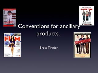
- 1. Conventions for ancillary products. Brett Tinnion
- 2. Professional Poster ‘From the people who bought you’ to draw people in. The main title of the film. Sans serif font and bright colours. Long shot of the main characters. Conventional movie credits. sans serif to make it easy to read. ‘Coming Soon’ to tell you to keep a look out because the film will be out soon. Logo of the production company and other logos.
- 3. How my poster is conventional. A quote from a newspaper is conventional, I decided to use the New York Times because The main title of the film it is a well respected newspaper and will is the biggest text on therefore make people want to go and watch it. the poster to make it It is in sans serif font to make it easy to read. stand out. It is in sans serif font to make it easy to read and is Long shot of the main bright red to make it stand out. characters, this is to show clearly to the audience that they are nerds as they are wearing stereotypical nerdy clothing. In every poster there is a picture of the main characters. The slogan for our film here. It is a mysterious and makes the I have chosen for the actors to be holding audience want to know what different props. Two of the three nerds are there mission is. It will make holding nerdy items like a lightsaber and school people want to go and see it. books whereas one is holding a crate of beer. This Sans serif font to make it easy to gives a bit of the storyline and this is conventional read and the black furthermore for the image to give away a bit of the plot. makes it easy to read. Film credits at the bottom of the page Coming soon to show to show the production company when the film is coming etc. Sans serif font to make it easy to read. out. This is used in the poster Credits make the poster look a lot more because people want to know conventional because they are used in when they can come and see every poster. the film. It is conventional as it is used in every film poster. Production company logo to show who made I have created a house style in my poster by the film. They use this because using consistent colours, red, black and white. people become fans of companies so they It follows conventions because it has a quote, would want to go see this image, slogan, credits and when it is coming out.
- 4. My poster is conventional because it creates a house style like the Superbad poster. It also has a long shot image of the main characters. The title scene is in sans serif font and is the biggest font on the page to make it stand out. There are also movie credit fonts at the bottom these are conventional because they are used in every film poster. Finally, the coming soon is also conventional as in every film poster there is either a release date or coming soon.
- 5. Professional Magazine Main mast head. Bold and the biggest Website, issue number text on the screen to make it stand out. and date is very conventional. Long shot of a provocatively dress girl who is in the main article of the magazine. Her hand is bleeding which makes people want to read more as Lots of coverlines they want to know why her hand to show to the audience is bleeding. that there is a lot of articles in the magazine. More coverlines More coverlines Main article pull quote, to make the reader want to read more and also Barcode and logo of company. a brief introduction to the article, which is conventional.
- 6. How my magazine is conventional. Website of the magazine, date and issue number. This is conventional as it used in all magazines. Mast head will stand out as it used red and black font colour which contrast together and will therefore stand it. It is in sans Title of the article followed serif font to make it stand out further by a brief description of what and make it easier to read. is in the article. This is conventional as many magazines have lots of coverlines. Main story of the magazine is the biggest text on the magazine except the mast head. There is also a brief description of the article, which will make people want Coverlines on the right and to read it. The text is sans serif font left of the magazine is conventional to make it easy to read. It is as it shows the reader that there is conventional for the main article lots to read in the magazine. to have a brief description as it makes people want to read the article. Barcode which is conventional for all magazines Mid shot of the person who is the main focus of the magazine. He is dressed in a suit to show that he is important and connotes fame. it will attract the audience More coverlines to the magazine as they want to know what Brett Tinnion is saying about his new film. The route of the eye format is used in this magazine. You see I have created a house style on this magazine the mast head then you see the image to the main article, front cover by using only three colours; red, black then you see some coverlines, then you see the main article and white. I have chosen these colours so it relates name and brief description and then finally another coverline to my film and therefore the audience will be and then a barcode which is conventional for magazines to able to associate the magazine with Graduation. follow this convention.
- 7. As you can see below my magazine uses a lot of conventions of similar media products. They both have developed a house style. They also have lots of coverlines to make the reader want to buy it because they have a lot of articles to read. All of the fonts used are sans serif to make them easy to read and also are bold and have bright vibrant colours to make them stand out. Both magazines have the date, issue number and website which is conventional. The images are similar because they both show who is in the main article as this is very conventional. On the main article there is a brief description to the article which is also conventional as it makes the reader want to read more.