Verified Trusted Call Girls Singaperumal Koil Chennai ✔✔7427069034 Independe...
Image Analysis
1. Bethany Parkes
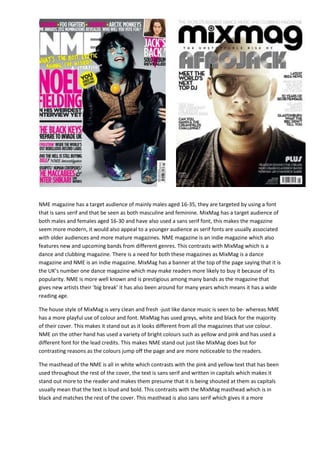
NME magazine has a target audience of mainly males aged 16-35, they are targeted by using a font
that is sans serif and that be seen as both masculine and feminine. MixMag has a target audience of
both males and females aged 16-30 and have also used a sans serif font, this makes the magazine
seem more modern, it would also appeal to a younger audience as serif fonts are usually associated
with older audiences and more mature magazines. NME magazine is an indie magazine which also
features new and upcoming bands from different genres. This contrasts with MixMag which is a
dance and clubbing magazine. There is a need for both these magazines as MixMag is a dance
magazine and NME is an indie magazine. MixMag has a banner at the top of the page saying that it is
the UK’s number one dance magazine which may make readers more likely to buy it because of its
popularity. NME is more well known and is prestigious among many bands as the magazine that
gives new artists their ‘big break’ it has also been around for many years which means it has a wide
reading age.
The house style of MixMag is very clean and fresh -just like dance music is seen to be- whereas NME
has a more playful use of colour and font. MixMag has used greys, white and black for the majority
of their cover. This makes it stand out as it looks different from all the magazines that use colour.
NME on the other hand has used a variety of bright colours such as yellow and pink and has used a
different font for the lead credits. This makes NME stand out just like MixMag does but for
contrasting reasons as the colours jump off the page and are more noticeable to the readers.
The masthead of the NME is all in white which contrasts with the pink and yellow text that has been
used throughout the rest of the cover, the text is sans serif and written in capitals which makes it
stand out more to the reader and makes them presume that it is being shouted at them as capitals
usually mean that the text is loud and bold. This contrasts with the MixMag masthead which is in
black and matches the rest of the cover. This masthead is also sans serif which gives it a more
2. Bethany Parkes
modern feel and matches the genre of the magazine. The ‘I’ in Mix looks like a deck used in DJ-ing
which adds to the feel of it being a dance magazine.
The main image on NME is of Noel fielding. He is dressing in bright shoes and painted blue to
promote his new TV show, the image has been shot on a plain grey background which makes the
cover star stand out. There is a direct mode of address which makes the image ‘jump off the page’
and makes the audience more likely to buy the magazine. There is also a direct mode of address on
the MixMag cover, although the cover star (afrojack) is wearing sunglasses which make him seem
more mysterious to the audience. MixMags has used a close-up for its cover, this makes the
audience be able to see the face of the cover star more easily and feel like the cover star is looking
up at them from the page. NME has used a wide shot to show all of its cover star, Noel is crouched
down which make him seem like he is crouching to look at the readers.
The lead article and model credits on the NME cover are written down the left hand side in an extra
large font. This means that the readers have no chance of missing who is on the cover even if they
don’t recognise the person. MixMag have also chosen an extra large font but have used a different
texture for it to make the credits stand off the page. MixMag have put their lead article above the
cover star which means that the reader would read the model credit before seeing the image. Both
these techniques have benefits to the reader but I think that MixMag’s is better thought out. Both
magazines have put the cover lines underneath the title; this will mean that the readers will see why
the model is on the cover in the first few moments of glancing at the magazine. NME have used a
quote from the interview which would help to enthral the reader and make them want to read
more. MixMag have put a comment about the model which also works to the advantage of making
the cover star seem more enticing and interesting but isn’t a direct quote from the star which makes
them less likely to be seen as addressing the audience who would be buying the magazine.
The Guttenberg design principle says that all magazine covers are composed in the same way. It says
that all covers have a primary optical area at the top left hand corner and a terminal area in the
bottom right corner. This follows the way in which we are taught to read. There is also a strong
fallow area in the top right hand corner and a weak fallow area in the bottom left hand corner.
These are the areas that the eye see’s last and usually contain smaller stories or the price. On the
NME cover the title and the lead credits are in the primary optical area along with the start of a
banner saying who is also in the magazine with the barcode and the cover stars feet in the terminal
area. The eye sweeps across the rest of the cover star and the name of the cover star whilst going
from the primary area to the terminal area. In the strong fallow area there is an image of Jack White
and text about his comeback which will help to entice the reader. In the weak fallow area there is
text saying who else is featured in the magazine, this shows that even if the readers don’t like the
cover star then they may still be interested in buying the magazine and may get more people to but
it. The MixMag cover has a lot less writing in all of the optical areas. In the primary optical area there
is the title and the cover star’s name and lead credits. In the terminal area there is the barcode and a
‘plus’ section which tells the reader what is also in the magazine. In the weak fallow area there isn’t
much text, only a side note about who is on the cover. In the strong fallow area there are more
cover stories to entice the reader. Both magazines use the Guttenberg design principle correctly and
effectively although NME has more on the cover which makes it seem more readable.