
Empfohlen
Weitere ähnliche Inhalte
Was ist angesagt?
Andere mochten auch
Andere mochten auch (20)
Ähnlich wie Hci ag part4 posterslides
Ähnlich wie Hci ag part4 posterslides (20)
Hci ag part4 posterslides
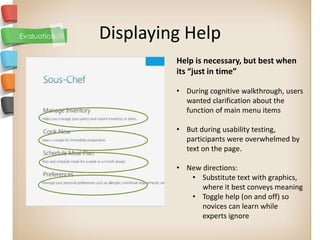
- 1. Displaying Help Help is necessary, but best when its “just in time” • During cognitive walkthrough, users wanted clarification about the function of main menu items • But during usability testing, participants were overwhelmed by text on the page. • New directions: • Substitute text with graphics, where it best conveys meaning • Toggle help (on and off) so novices can learn while experts ignore
- 2. Readiness/ hesitancy to interact Users consistently used the select icon first to add a new profile (despite the “New Profile” button to the right) But they were hesitant to hit the minus icon to remove food (this is the only option) New approaches • Redundant code: Allow users to add profiles via a dropdown selection, too • Include an undo button so users can act confidently and recover from slips
- 3. Design Evolution HOME Original design of the home screen was Modified design with descriptive text very simple. However, during the for each link allowed users to more cognitive walkthrough lot of people had readily understand the purpose of each trouble deciding the appropriate links link. for a given task.
- 4. Design Evolution RECIPE SELECTION First iteration Final Design Second iteration
- 5. Lessons Learned UNDO function • So important in a task-based application • And easily forgotten in development Develop on a cross-platform technology • Agile development • Allows for version control & more risk taking with code • Redundant responsibilities Usability testing does not have to be elaborate to be useful • Big problems of navigation and clarity emerge early • Additional participants confirm confusion • User responses exhibit a long-tail pattern of issues
- 6. Prototyping Tools Used EXPRESSION BLEND for design and layout. VISUAL STUDIO 2010 for scripting and interaction.