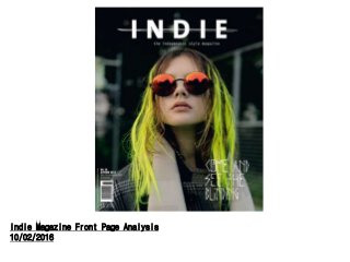
2. Indie Magazine is targeted at a female
audience (60%, 40% Male) most likely
aged 18-30.
The front cover has a very minimalistic
use of colour, rather than following a
strict house style the main photograph
takes centre stage, the colours in the
image make up the front page (Yellow,
Orange, White)
Clearly this magazine is aimed at people
who break normal conventions, the
magazine has a very alternative style
thus making it stand out from
competitors.
Indie is a very stylised magazine,
therefore it targets a niche audience and
negates mainstream conventions
Personally I am a big fan of the way Indie Magazine breaks the conventions
of a music magazine, the specific art style seemingly fits perfectly with
the target audience, I would also prefer to use a central image that
defines the issues house style rather than conforming to standardized
ideas.
3. The central image in this magazine is hugely important as it defines
the house style throughout this issues. Along with this is supports the
alternate image the magazine is going for; it has broken most
conventions of a music magazine and therefore takes an alternate
approach in attracting an audience; Being different. I am definitely
going to use this in my magazine as it makes the product standout
among competitors, personally creating a new set of cods and
conventions is definitely the way forward in producing a new, genuine
product.
The woman has an extremely arrogant facial expression, her neck is
tilted up as if she is looking down on the audience. This might
appeal to the audience as it shows she is powerful thus reading
this magazine will make you just as powerful as her.
The title is obviously very important to any magazine Indie
seems to put more importance on it as it is the only give away
to its conventions. I like this as it creates an alternative
approach to marketing again allowing it to standout on the shelf
and became must have magazine for a certain audience of
people.
Again the magazine breaks conventions by having a very small heading which is
off centred from the main image, This again follows a very minimalist
approach. This completely subverts expectations of a music magazine which
personally I like a lot, the target audience also appreciate this, as it is quite a
typical exclusive feature of a music magazine of this genre.
5. Analysis of a Front Cover- Acoustic Magazine
Acoustic magazine is clearly targeted at an older audience (18-30)this is
obvious as the colour scheme is much more mature; after looking through
other issues the colour scheme changes depending on the artist, for
instance the accent colour of James Bay’s article was red. The magazine
follows the basic codes and conventions of most music magazines, as you
can see on either side of the page are sub-headings with extra articles as
well as having a prominent main title and various other information about the
magazine and its production.
The main image is hugely important for the magazine as it gives context to
both the article and the magazine itself. I especially like the use of the
acoustic guitar within every issue. It is a very good way to approach the
target audience as they see a famous musician with their preferred
instrument and instantly fame appeal and genre has been established.
The headline is also incredibly effective in drawing the target audience in,
the white stands out against the orange, as well as this orange is
synonymous with Ed Sheeran due to the colour of his hair therefore seeing
the acoustic logo in orange suggests he will be making an appearance. I
Like the fact every issue changes up the colour dependant on the artist, this
gives the artist as well as the magazine a unique personality; i will probably
do something like this, although it subverts conventions it creates unique
variety within the market.
7. Analysis of a Front Cover - Q Magazine
Q-Magazine is arguably one of the biggest music magazines in the world
therefore it creates its own codes and conventions and is centre-piece in the
music magazine world. Here we can see again the use of subheadings
along the side of the magazine with the titles of alternative articles; we can
also see that the target audience is even more mature than the previous
magazine (25-35) suggesting that the topics within the magazine will be
more mature. Acoustic Magazine also had Ed Sheeran as a their main
image, Q decided to stick to their conventional house-style which is possible
due to influence of their magazine.
Again the use of the image is very effective as it suggests Ed Sheeran is
shocked he is appearing in a magazine of this stature, this helps suggest he
is a normal guy which supports his image as well as the appeal of the
magazine. I like this a lot as it creates a sense of normality between the
artist and the audience, I like this personal effect with the magazine
therefore I will use this in my own magazine.
The headline used by Q magazine is no where near as prominent as that of
Acoustic, therefore we can presume Acoustic magazine is using Ed
Sheeran’s fame as a selling point whereas Q doesn’t need to do this as it
sells itself due to its massive fan base. Personally I believe Q’s approach is
more effective as it sells the magazine rather than the artist; this is hugely
important as this suggests an air of importance above the rest of the
competition.
9. Analysis of a Front Cover - NME
NME has a similar target audience to Q magazine (16-25) therefore they are
constantly competing with each other within the market therefore they have
a huge influence in setting the codes and conventions of the magazine
industry. Again we see the use of side lines to organise other articles with a
prominent central image of Gerard Way to appeal to the younger target
audience
Once again we see a magazine using a smaller headline and instead
focusing on the main image. Once again I find this approach far effective, by
using the aggressive demeanour of Gerard Way it suggests the audience is
alternative or in that Teen angst phase. As this is directly the audience I am
targeting I feel using the central image is going to be a key part in engaging
and empathising with the target audience so that they will buy our magazine.
The headline is once again at the bottom of the page hidden away, the lack
of importance it has also helps suggest that is not the only unique selling
point about the magazine. I definitely want other articles in my magazine to
stand out and not put as much importance on the headline, I believe the idea
of the headline being the only eye-catching point is a long buried convention
instead the photography will persuade the audience to read.