SlideShare ist ein Scribd-Unternehmen logo
1 von 3
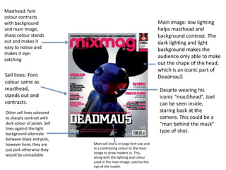
Masthead: font
colour contrasts
with background                                                          Main image: low lighting
and main image,                                                          helps masthead and
sharp colour stands                                                      background contrast. The
out and makes it                                                         dark lighting and light
easy to notice and                                                       background makes the
makes it eye-
                                                                         audience only able to make
catching
                                                                         out the shape of the head,
                                                                         which is an iconic part of
Sell lines: Font                                                         Deadmau5
colour same as
masthead,                                                                Despite wearing his
stands out and                                                           iconic “mau5head”, Joel
contrasts.                                                               can be seen inside,
Other sell lines coloured                                                staring back at the
to sharply contrast with                                                 camera. This could be a
dark colour of jacket. Sell                                              “man behind the mask”
lines against the light
background alternate
                                                                         type of shot.
between black and pink,
however here, they are        Main sell line is in large font size and
just pink otherwise they      in a contrasting colour to the main
                              image to draw readers in. This,
would be unreadable           along with the lighting and colour
                              used in the main image, catches the
                              eye of the reader.
Masthead: colour stands out
                              against background, partially    Main image of Ben Mount has low brightness
                              obscured by main image,          and low detail, so he almost becomes a
This sell line is a very      effective branding as audience   silhouette, which majorly contrasts with the
good way to grab the          will already know what the       very bright colour of the background and the
attention of the target       magazine is                      masthead, so the main image stands out and
audience, as drug abuse                                        is eye-catching
is common among those
who attend weekend-
long festivals. This can be                                                                              Mentioning of festivals
very helpful information                                                                                 and the summer
for those who may use
drugs often
                                                                                                         appeals to target
                                                                                                         audience as they tend
Including free CDs is a good
marketing strategy as this                                                                               to enjoy attending
draws in the reader to buy                                                                               festivals and concerts.
the magazine for the CDs and
maybe even the main article.                                                                             The opportunity to win
It has been well placed as it is                                                                         free tickets is also a
next to the most eye-catching
part of the magazine because
                                                                                                         good marketing
its colour does not contrast as                                                                          strategy
well as the rest of the cover
and does not stand out as                                                                                     Minor sell lines are in a small
well. Since it is next to the                                                                                 size, but still contrast with the
masthead, it has a better                                                                                     background image, this would
chance of being one of the                                                                                    cause the reader to have a
first things to be spotted on                                                                                 closer look at what else is
the cover                                                                                                     included in the magazine. If
           Sell lines in a contrasting colour,
                                                                                                              they see something that may
           but are also on top of black
                                                                                                              appeal to them, on the main
           blocks to make them stand out
                                                                                                              section of the cover or on the
           and draw the reader in. They
           are also in a rather small size
                                                  Main sell line is in a colour which contrasts               smaller sell lines, they may buy
                                                                                                              the magazine
           compared to the other sell             with the main image and the background.
           lines. This would cause the
           reader to have a closer look to        Text has a shadow effect which contrasts the
           see what else is included in the       main sell line further, similar to what is used
           magazine, similar to the minor
           sell lines                             for the other sell lines.
Masthead in bright               The main image especially stands out as
  colour, similar tone             sharp and bright colours are used to make it
                                   eye-catching. In this image, Calvin Harris has
  to the background,               quite a sinister look. He has a hint of evil in
  but still contrasts,             his eyes which stare back at the reader,
  simple font and is               enticing them into reading the cover and
  easily readable                  buying the magazine. The dark lighting used
Main sell line is well             on him adds to the malevolent look. The
placed below the                   fire/explosion behind him can be linked to
masthead, so readers               the detonation device that he is holding,
instantly know what                giving the idea that he has caused
                                   destruction, which again, adds to the
the main article is
                                   sinister feel of the image.
about

Marketing strategy stands
out from the rest of the                These sell lines also appeal to
colour scheme (red, yellow,             those who enjoy clubbing,
orange etc) as it is in a               festivals and DJs. The top sell
white box which is eye                  point especially stands out as
catching. This makes up for             it is in a unique shape and is
it not being close to the               in a contrasting colour
masthead or main sell line.
This strategy would
convince the audience to
buy the magazine for the CD
or the main article.                         These minor sell lines are in a
                                             colour which contrasts to the
                                             dark lighting used on the main
These other sell lines appeal in             image, so that it stands out.
more than one way. This issue                The “Plus” above these is used
was released around                          to let the reader know that
Halloween, which is mentioned                there is more in the magazine
on this sell line. Also, the                 than just what is mentioned in
mentioning of students appeals               the other sell lines. It is in a
to the target audience, so it                larger font and a colour that
gains a higher chance of being               stands out against the
purchased                                    background, so it catches the
                                             eye of the reader

Weitere ähnliche Inhalte

Was ist angesagt?

Magazines
MagazinesMagazines
Magazinesdapaz93
 
Existing Product Analysis
Existing Product AnalysisExisting Product Analysis
Existing Product Analysistamsinrwg
 
Magazine cover research
Magazine cover research Magazine cover research
Magazine cover research Janet Lunkusé
 
Magazine Photography Analysis and Research
Magazine Photography Analysis and Research Magazine Photography Analysis and Research
Magazine Photography Analysis and Research selinargyrou
 
Magazine cover analysis worksheet the big cheese
Magazine cover analysis worksheet  the big cheeseMagazine cover analysis worksheet  the big cheese
Magazine cover analysis worksheet the big cheeseadamtimms22
 
Deconstructing magazines
Deconstructing magazinesDeconstructing magazines
Deconstructing magazinesLauracharlotte
 
Magazine Front Cover Analysis
Magazine Front Cover AnalysisMagazine Front Cover Analysis
Magazine Front Cover AnalysisLouis1995
 
Magazine deconstruction
Magazine deconstructionMagazine deconstruction
Magazine deconstructionaq111082
 
Magazine Front Cover Analysis
Magazine Front Cover AnalysisMagazine Front Cover Analysis
Magazine Front Cover AnalysisLouis1995
 
M magazines analysis
M magazines analysisM magazines analysis
M magazines analysisLouisha26
 
Nme music magazine
Nme music magazineNme music magazine
Nme music magazineaaronb258
 
Magazine deconstruction
Magazine deconstructionMagazine deconstruction
Magazine deconstructionaq111082
 
Front cover analysis
Front cover analysisFront cover analysis
Front cover analysisTwist3dd
 
Magazines front covers
Magazines front coversMagazines front covers
Magazines front coversRachell_94
 

Was ist angesagt? (17)

Presentation1
Presentation1Presentation1
Presentation1
 
Magazines
MagazinesMagazines
Magazines
 
NME
NMENME
NME
 
Existing Product Analysis
Existing Product AnalysisExisting Product Analysis
Existing Product Analysis
 
Magazine cover research
Magazine cover research Magazine cover research
Magazine cover research
 
Magazine Photography Analysis and Research
Magazine Photography Analysis and Research Magazine Photography Analysis and Research
Magazine Photography Analysis and Research
 
Magazine cover analysis worksheet the big cheese
Magazine cover analysis worksheet  the big cheeseMagazine cover analysis worksheet  the big cheese
Magazine cover analysis worksheet the big cheese
 
Deconstructing magazines
Deconstructing magazinesDeconstructing magazines
Deconstructing magazines
 
Magazine Analysis
Magazine AnalysisMagazine Analysis
Magazine Analysis
 
Magazine Front Cover Analysis
Magazine Front Cover AnalysisMagazine Front Cover Analysis
Magazine Front Cover Analysis
 
Magazine deconstruction
Magazine deconstructionMagazine deconstruction
Magazine deconstruction
 
Magazine Front Cover Analysis
Magazine Front Cover AnalysisMagazine Front Cover Analysis
Magazine Front Cover Analysis
 
M magazines analysis
M magazines analysisM magazines analysis
M magazines analysis
 
Nme music magazine
Nme music magazineNme music magazine
Nme music magazine
 
Magazine deconstruction
Magazine deconstructionMagazine deconstruction
Magazine deconstruction
 
Front cover analysis
Front cover analysisFront cover analysis
Front cover analysis
 
Magazines front covers
Magazines front coversMagazines front covers
Magazines front covers
 

Ähnlich wie Magazine deconstruction

Front cover music magazine
Front cover  music magazineFront cover  music magazine
Front cover music magazinefatima__b
 
Covers and posters
Covers and postersCovers and posters
Covers and postersAshaPadhiar
 
Inspiration for the magazine film cover
Inspiration for the magazine film coverInspiration for the magazine film cover
Inspiration for the magazine film coverHG17
 
Genre 20 slides
Genre 20 slidesGenre 20 slides
Genre 20 slidesfatima__b
 
Front Cover Research
Front Cover ResearchFront Cover Research
Front Cover Researchjessheap
 
Analysis of professional magazine covers
Analysis of professional magazine coversAnalysis of professional magazine covers
Analysis of professional magazine coversJessikahBaard
 
Magazine cover analysis_worksheet rolling stone
Magazine cover analysis_worksheet rolling stoneMagazine cover analysis_worksheet rolling stone
Magazine cover analysis_worksheet rolling stonekruane95
 
Analysis of music magazines
Analysis of music magazinesAnalysis of music magazines
Analysis of music magazinesClaire_Smith
 
Analysing contents pages prep for blog ppt
Analysing  contents pages prep for blog pptAnalysing  contents pages prep for blog ppt
Analysing contents pages prep for blog pptasmediag12
 
Front covers
Front coversFront covers
Front coversmilliee16
 
Coldplay analysis front cover
Coldplay analysis front coverColdplay analysis front cover
Coldplay analysis front coverJessicaolds
 
Front Cover and Contents Analysis
Front Cover and Contents AnalysisFront Cover and Contents Analysis
Front Cover and Contents AnalysisJessicaolds
 
Magazine cover deconstruction
Magazine cover deconstructionMagazine cover deconstruction
Magazine cover deconstructionJoe Tobias
 
Analysis of music magazines
Analysis of music magazinesAnalysis of music magazines
Analysis of music magazines05conenlau
 
15 Magazine Analysis
15 Magazine Analysis15 Magazine Analysis
15 Magazine AnalysisJared Bajina
 
Deconstruction od magazine front covers
Deconstruction od magazine front coversDeconstruction od magazine front covers
Deconstruction od magazine front coversNiamh1996
 

Ähnlich wie Magazine deconstruction (20)

Magazine Analysis
Magazine AnalysisMagazine Analysis
Magazine Analysis
 
Magazine Analysis
Magazine AnalysisMagazine Analysis
Magazine Analysis
 
Front cover music magazine
Front cover  music magazineFront cover  music magazine
Front cover music magazine
 
Covers and posters
Covers and postersCovers and posters
Covers and posters
 
Inspiration for the magazine film cover
Inspiration for the magazine film coverInspiration for the magazine film cover
Inspiration for the magazine film cover
 
Genre 20 slides
Genre 20 slidesGenre 20 slides
Genre 20 slides
 
Front Cover Research
Front Cover ResearchFront Cover Research
Front Cover Research
 
Analysis of professional magazine covers
Analysis of professional magazine coversAnalysis of professional magazine covers
Analysis of professional magazine covers
 
Magazine cover analysis_worksheet rolling stone
Magazine cover analysis_worksheet rolling stoneMagazine cover analysis_worksheet rolling stone
Magazine cover analysis_worksheet rolling stone
 
Task 8
Task 8Task 8
Task 8
 
Analysis of music magazines
Analysis of music magazinesAnalysis of music magazines
Analysis of music magazines
 
Analysing contents pages prep for blog ppt
Analysing  contents pages prep for blog pptAnalysing  contents pages prep for blog ppt
Analysing contents pages prep for blog ppt
 
Front covers
Front coversFront covers
Front covers
 
Coldplay analysis front cover
Coldplay analysis front coverColdplay analysis front cover
Coldplay analysis front cover
 
Front Cover and Contents Analysis
Front Cover and Contents AnalysisFront Cover and Contents Analysis
Front Cover and Contents Analysis
 
Magazine cover deconstruction
Magazine cover deconstructionMagazine cover deconstruction
Magazine cover deconstruction
 
Analysis of music magazines
Analysis of music magazinesAnalysis of music magazines
Analysis of music magazines
 
Magazine analysis
Magazine analysisMagazine analysis
Magazine analysis
 
15 Magazine Analysis
15 Magazine Analysis15 Magazine Analysis
15 Magazine Analysis
 
Deconstruction od magazine front covers
Deconstruction od magazine front coversDeconstruction od magazine front covers
Deconstruction od magazine front covers
 

Magazine deconstruction

  • 1. Masthead: font colour contrasts with background Main image: low lighting and main image, helps masthead and sharp colour stands background contrast. The out and makes it dark lighting and light easy to notice and background makes the makes it eye- audience only able to make catching out the shape of the head, which is an iconic part of Sell lines: Font Deadmau5 colour same as masthead, Despite wearing his stands out and iconic “mau5head”, Joel contrasts. can be seen inside, Other sell lines coloured staring back at the to sharply contrast with camera. This could be a dark colour of jacket. Sell “man behind the mask” lines against the light background alternate type of shot. between black and pink, however here, they are Main sell line is in large font size and just pink otherwise they in a contrasting colour to the main image to draw readers in. This, would be unreadable along with the lighting and colour used in the main image, catches the eye of the reader.
  • 2. Masthead: colour stands out against background, partially Main image of Ben Mount has low brightness obscured by main image, and low detail, so he almost becomes a This sell line is a very effective branding as audience silhouette, which majorly contrasts with the good way to grab the will already know what the very bright colour of the background and the attention of the target magazine is masthead, so the main image stands out and audience, as drug abuse is eye-catching is common among those who attend weekend- long festivals. This can be Mentioning of festivals very helpful information and the summer for those who may use drugs often appeals to target audience as they tend Including free CDs is a good marketing strategy as this to enjoy attending draws in the reader to buy festivals and concerts. the magazine for the CDs and maybe even the main article. The opportunity to win It has been well placed as it is free tickets is also a next to the most eye-catching part of the magazine because good marketing its colour does not contrast as strategy well as the rest of the cover and does not stand out as Minor sell lines are in a small well. Since it is next to the size, but still contrast with the masthead, it has a better background image, this would chance of being one of the cause the reader to have a first things to be spotted on closer look at what else is the cover included in the magazine. If Sell lines in a contrasting colour, they see something that may but are also on top of black appeal to them, on the main blocks to make them stand out section of the cover or on the and draw the reader in. They are also in a rather small size Main sell line is in a colour which contrasts smaller sell lines, they may buy the magazine compared to the other sell with the main image and the background. lines. This would cause the reader to have a closer look to Text has a shadow effect which contrasts the see what else is included in the main sell line further, similar to what is used magazine, similar to the minor sell lines for the other sell lines.
  • 3. Masthead in bright The main image especially stands out as colour, similar tone sharp and bright colours are used to make it eye-catching. In this image, Calvin Harris has to the background, quite a sinister look. He has a hint of evil in but still contrasts, his eyes which stare back at the reader, simple font and is enticing them into reading the cover and easily readable buying the magazine. The dark lighting used Main sell line is well on him adds to the malevolent look. The placed below the fire/explosion behind him can be linked to masthead, so readers the detonation device that he is holding, instantly know what giving the idea that he has caused destruction, which again, adds to the the main article is sinister feel of the image. about Marketing strategy stands out from the rest of the These sell lines also appeal to colour scheme (red, yellow, those who enjoy clubbing, orange etc) as it is in a festivals and DJs. The top sell white box which is eye point especially stands out as catching. This makes up for it is in a unique shape and is it not being close to the in a contrasting colour masthead or main sell line. This strategy would convince the audience to buy the magazine for the CD or the main article. These minor sell lines are in a colour which contrasts to the dark lighting used on the main These other sell lines appeal in image, so that it stands out. more than one way. This issue The “Plus” above these is used was released around to let the reader know that Halloween, which is mentioned there is more in the magazine on this sell line. Also, the than just what is mentioned in mentioning of students appeals the other sell lines. It is in a to the target audience, so it larger font and a colour that gains a higher chance of being stands out against the purchased background, so it catches the eye of the reader