Beginners Guide to TikTok for Search - Rachel Pearson - We are Tilt __ Bright...
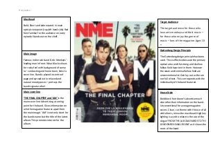
Amelia Cranstoun NME Front Cover Analysis
1. Holly walker
Masthead
Bold, Short and abbreviated. In main
optical view point (top left hand side) Red
font.Familiar for the audience on every
episode.Stands out on the shelf.
Target Audience
The target audience for those who
love artic monkeys and their music –
for those who enjoy the genre of
music – fans of the magazine. Ages 13
+
Guttenberg Design Principle
Main image
Famous indie rock band ‘Artic Monkeys’ leading man in front. Wear black colours
for rocky feel with background of sunny
la – contrasting and home town, links to
cover line. Band is placed in centre of
page and spread out in relaxed and
natural moody poses – portrays the
bands signature feel.
The Guttenbergdesign principle has been
used. This is effective because the primary
optical area and the strong and shallow
fallow field have text in them. However
the weak and terminal fallow field are
unconventional in their lay out as the are
not full of text . This corresponds with the
individuality of the band featured.
Main cover line
House Style
‘THE FINAL CHAPTER’ and ‘AM’ is the
main cover line. Advertising a turning
point for the band. Gives information on
who the magazine features apart from
the main image. ‘AM’ is not only short for
the bands name but the title of the latest
album. This promotes interest for the
album.
Bold block font doesn’t advertise much
else other than information on the band.
Unconventional for average magazine
covers. Clean, cut theme with the use of all
white fonts, minus the masthead. High key
lighting is used to relate to the use of the
slogan ‘FROM THE LA BOULEVARDS TO THI
LONDON REHEASAL ROOM’ as it shows the
roots of the band.