Multidimensional Poverty Index. Country Brief: India
•
2 gefällt mir•3,478 views

This document provides information on multidimensional poverty in India based on a 2005 national household survey. It finds that: - 53.7% of Indians are multidimensionally poor, meaning they are deprived in at least one third of ten living standards indicators. The average proportion deprived across multiple indicators (intensity) is 52.7%. - Rural areas (28.6% MPI poor) have higher multidimensional poverty than urban areas (18.1%). Nutrition and child mortality contribute most to poverty nationally and in rural areas, while education contributes most in urban areas. - Poverty varies significantly across states, from over 60% in Uttar Pradesh and Bihar to under 5% in Delhi,

Empfohlen
Empfohlen
Weitere ähnliche Inhalte
Was ist angesagt?
Was ist angesagt? (20)
Ähnlich wie Multidimensional Poverty Index. Country Brief: India
Ähnlich wie Multidimensional Poverty Index. Country Brief: India (20)
Mehr von Sadanand Patwardhan
Mehr von Sadanand Patwardhan (20)
Kürzlich hochgeladen
Kürzlich hochgeladen (20)
Multidimensional Poverty Index. Country Brief: India
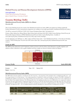
- 1. India OPHI Country Briefing 2011 Oxford Poverty and Human Development Initiative (OPHI) www.ophi.org.uk Oxford Dept of International Development, Queen Elizabeth House, University of Oxford Country Briefing: Multidimensional Poverty Index (MPI) At a Glance The MPI was constructed by OPHI for UNDP’s 2011 Human Development Report (http://hdr.undp.org/en/). Country Profile India-DHS-2005 1 Country: 3 India 43 Year: 2005 Survey: DHS Region: 1 Multidimensional Poverty Index (MPI) Survey Year DHS 2005 www.ophi.org.uk Page 1 India December 2011 This Country Briefing presents the results of the Multidimensional Poverty Index (MPI) and explains key findings graphically. Further information as well as international comparisons are available at www.ophi.org.uk/policy/multidimensional-poverty-index/. For more information on the MPI please see Alkire, Sabina and Maria Emma Santos. “Acute Multidimensional Poverty: A New Index for Developing Countries” OPHI Working Paper 38 and the latest MPI resources online: http://www.ophi.org.uk/policy/multidimensional-poverty-index/mpi- resources/. South Asia Citation: Alkire, Sabina; Jose Manuel Roche; Maria Emma Santos & Suman Seth (2011). India Country Briefing. Oxford Poverty & Human Development Initiative (OPHI) Multidimensional Poverty Index Country Briefing Series. Available at: www.ophi.org.uk/policy/multidimensional-poverty-index/mpi-country-briefings/. The MPI has three dimensions and 10 indicators, which are shown in the box below. Each dimension is equally weighted, each indicator within a dimension is also equally weighted, and these weights are shown in brackets within the diagram. Inside the MPI The MPI reflects both the incidence or headcount ratio (H) of poverty – the proportion of the population that is multidimensionally poor – and the average intensity (A) of their poverty – the average proportion of indicators in which poor people are deprived. The MPI is calculated by multiplying the incidence of poverty by the average intensity across the poor (H*A). A person is identified as poor if he or she is deprived in at least one third of the weighted indicators. The following table shows the multidimensional poverty rate (MPI) and its two components: incidence of poverty (H) and average intensity of deprivation faced by the poor (A). The first and second columns of the table report the survey and year used to generate the MPI results. Those identified as MPI poor are deprived in at least 33% of weighted indicators. Those identified as "Vulnerable to Poverty" are deprived in 20% - 33% of weighted indicators and those identified as in "Severe Poverty" are deprived in over 50%. Multidimensional Poverty Index (MPI = H×A) 0.283 Incidence of Poverty (H) 53.7% Average Intensity Across the Poor (A) 52.7% Percentage of Population Vulnerable to Poverty Percentage of Population in Severe Poverty 28.6%16.4%
- 2. India OPHI Country Briefing 2011 Comparing the MPI with Other Poverty Measures 0.283 53.7% MPI (H) US$1.25 a dayUS$2 a dayNational Poverty LineAverage Intensity of Deprivation (A) 52.7% 54% 42% 76% 37% 41.6% Percentage of Income Poor ($2.00 a day)‡ 75.6% Percentage of Poor (National Poverty Line) ̊ 37.2% 0.547 134 2005 2005 2005 2005 Medium Comparing the MPI with Other Poverty Measures 33 33 www.ophi.org.uk Page 2 Column chart A compares the poverty rate using the MPI with three other commonly used poverty measures. The height of the first column denotes the percentage of people who are MPI poor (also called the incidence or headcount ratio). The second and third columns denote the percentages of people who are poor according to the $1.25 a day income poverty line and $2.00 a day line, respectively. The final column denotes the percentage of people who are poor according to the national income poverty line. The table on the right-hand side reports various descriptive statistics for the country. The statistics shaded in khaki/olive are taken from the year closest to the year of the survey used to calculate the MPI. The year is provided below each column in chart A. Multidimensional Poverty Index Summary Percentage of Income Poor ($1.25 a day)‡ Percentage of MPI Poor (H) Human Development Index 2011* HDI rank* HDI category* Column chart B shows the percentage of people who are MPI poor (also called the incidence or headcount) in the 109 developing countries analysed. The column denoting this country is dark, with other countries shown in light grey. The dark dots denote the percentage of people who are income poor according to the $1.25 a day poverty line in each country. The graph above tells you the year this data comes from. Dots are only shown where the income data available is within three years of the MPI survey year. 53.7% 41.6% 75.6% 37.2% 0.0% 10.0% 20.0% 30.0% 40.0% 50.0% 60.0% 70.0% 80.0% MPI (H) US$1.25 a day US$2 a day National Poverty Line A. Comparative Poverty Measures Poverty Measure ProportionofPoorPeople 0% 10% 20% 30% 40% 50% 60% 70% 80% 90% 100% Niger Ethiopia Mali CentralAfricanRepublic Burundi Liberia BurkinaFaso Guinea Somalia Rwanda Mozambique Angola SierraLeone Comoros DRCongo Uganda Malawi Benin TimorLeste Senegal Madagascar Tanzania Nepal Zambia Chad Mauritania Coted'Ivoire Gambia Bangladesh Haiti Togo Nigeria India Cameroon Yemen Cambodia Pakistan Kenya Lao Swaziland RepublicofCongo Zimbabwe Namibia Gabon Lesotho SaoTomeandPrincipe Honduras Myanmar Ghana Vanuatu Djibouti Nicaragua Bhutan Guatemala Indonesia Bolivia Peru VietNam Tajikistan Mongolia Iraq Philippines Guyana SouthAfrica Paraguay China Morocco Suriname Estonia Turkey Egypt TrinidadandTobago Belize SyrianArabRepublic Colombia SriLanka Azerbaijan Maldives Kyrgyzstan DominicanRepublic Hungary Croatia Mexico CzechRepublic Argentina Tunisia Brazil Jordan Uzbekistan Ecuador Ukraine Macedonia Moldova Uruguay Thailand Latvia Montenegro OccupiedPalestinianTerritories Albania RussianFederation Armenia Serbia BosniaandHerzegovina Georgia Kazakhstan UnitedArabEmirates Belarus Slovakia Slovenia Percentage of Poor People Percentage of MPI Poor Percentage of Income Poor (living on less than $1.25 a day) B. Headcounts of MPI Poor and $1.25/day Poor ‡ The World Bank (2011). “World Development Indicators.” Washington, DC. ̊ Government of India (2011). “Press Note on Poverty Estimates”, Planning Commission. * UNDP (2011). "Human Development Report", Statistical Table 1 . New York. Note: For population figures and numbers of MPI poor people, consult the tables on OPHI’s website: http://www.ophi.org.uk/policy/multidimensional-poverty-index/.
- 3. India OPHI Country Briefing 2011 Incidence of Deprivation in Each of the MPI Indicators Composition of the MPI www.ophi.org.uk Page 3 The MPI can be broken down to see directly how much each indicator contributes to multidimensional poverty. The following figure shows the composition of the MPI using a pie chart. Each piece of the pie represents the percentage contribution of each indicator to the overall MPI of the country. The larger the slice of the pie chart, the bigger the weighted contribution of the indicator to overall poverty. The MPI uses 10 indicators to measure poverty in three dimensions: education, health and living standards. The bar chart to the left reports the proportion of the population that is poor and deprived in each indicator. We do not include the deprivation of non-poor people. The spider diagram to the right compares the proportions of the population that are poor and deprived across different indicators. At the same time it compares the performance of rural areas and urban areas with that of the national aggregate. Patterns of deprivation may differ in rural and urban areas. Years of Schooling 10% School Attendance 12% Child Mortality 13% Nutrition 23%Electricity 6% Sanitation 9% Drinking Water 2% Floor 8% Cooking Fuel 10% Assets 7% Years of Schooling School Attendance Child Mortality Nutrition Electricity Sanitation Drinking Water Floor Cooking Fuel Assets E.ContributionofIndicatorstotheMPI Education Health Living standards Assets Cooking Fuel Floor Drinking. Water Sanitation Electricity Nutrition Child Mortality School Attendance Years of Schooling 0.0% 10.0% 20.0% 30.0% 40.0% 50.0% 60.0% LivingStandardsHealthEducation Percentage of the Population who are MPI poor and deprived in each indicator 0.0% 10.0% 20.0% 30.0% 40.0% 50.0% 60.0% 70.0% Years of Schooling School Attendance Child Mortality Nutrition Electricity Sanitation Drinking Water Floor Cooking Fuel Assets National Urban Rural D. Percentage of the Population MPI Poor and DeprivedC. Deprivations in each Indicator
- 4. India OPHI Country Briefing 2011 Decomposition of MPI by Region Intensity of Multidimensional Poverty 33% 40% 50% 60% 70% 80% 90% 100% per 0.537 0.375 0.286 0.181 0.090 0.032 0.016 0.000 0.463 0.625 0.714 0.819 0.910 0.968 0.984 1.000 33%-39.9% 40%-49.9%50%-59.9%60%-69.9%70%-79.9%80%-89.9%90%-100% 0.163 0.089 0.105 0.091 0.057 0.016 0.016 www.ophi.org.uk Page 4 Recall that i) a person is considered poor if they are deprived in at least one third of the weighted indicators and ii) the intensity of poverty denotes the proportion of indicators in which they are deprived. A person who is deprived in 100% of the indicators has a greater intensity of poverty than someone deprived in 40%. The following figures show the percentage of MPI poor people who experience different intensities of poverty. The pie chart below breaks the poor population into seven groups based on the intensity of their poverty. For example, the first slice shows deprivation intensities of greater than 33% but strictly less than 40%. It shows the proportion of poor people whose intensity (the percentage of indicators in which they are deprived) falls into each group. The column chart H reports the proportion of the population in a country that is poor in that percentage of indicators or more. For example, the number over the 40% bar represents the percentage of people who are deprived in 40% or more indicators. The MPI can be decomposed by different population subgroups, then broken down by dimension, to show how the composition of poverty differs between different regions or groups. On the left-hand side of column chart F, the height of each of the three bars shows the level of MPI at the national level, for urban areas, and for rural areas, respectively. Inside each bar, different colours represent the contribution of different weighted indicators to the overall MPI. On the right-hand side of column chart F, the colours inside each bar denote the percentage contribution of each indicator to the overall MPI, and all bars add up to 100%. This enables an immediate visual comparison of the composition of poverty across regions. A A A CF CF CF F F FDW DW DW S S S E E E N N N CM CM CM SA SA SA YS YS YS 0.000 0.050 0.100 0.150 0.200 0.250 0.300 0.350 0.400 National Urban Rural MPIValue 33%-39.9% 40%-49.9% 50%-59.9% 60%-69.9% 70%- 79.9% 80%-89.9% 90%-100% 53.7% 37.5% 28.6% 18.1% 9.0% 3.2% 1.6% 0.0% 0.0% 10.0% 20.0% 30.0% 40.0% 50.0% 60.0% 33% 40% 50% 60% 70% 80% 90% 100% PercentageofMPIPoor Intensity of Poverty H. Percentage of People Deprived in X% or more of the MPI Weighted Indicators A, 7.4% A, 6.9% A, 7.4% CF, 10.0% CF, 8.7% CF, 10.2% F, 7.7% F, 4.2% F, 8.2% DW, 2.3% DW, 1.5% DW, 2.4% S, 9.5% S, 8.6% S, 9.6% E, 5.6% E, 2.6% E, 6.0% N, 22.5% N, 25.5% N, 22.0% CM, 13.3% CM, 16.8% CM, 12.8% SA, 11.5% SA, 15.5% SA, 10.9% YS, 10.3% YS, 9.6% YS, 10.4% 0% 10% 20% 30% 40% 50% 60% 70% 80% 90% 100% National Urban Rural PercentageContributiontoMPI G. Intensity of Deprivation Among MPI Poor YS = Years of Schooling SA = School Attendance CM = Child Mortality N = Nutrition E = Electricity S = Sanitation DW = Drinking Water F = Floor CF = Cooking Fuel A = Assets F. Contribution of Indicators to the MPI at the National Level, for Urban Areas, and for Rural Areas
- 5. India OPHI Country Briefing 2011 I. Multidimensional Poverty across Sub-national Regions 7.1% 0.1% 2.7% 8.0% 2.3% 1.1% 0.1% 4.9% 2.0% 0.6% 0.9% 2.7% 5.5% 2.6% 6.5% 9.3% 0.2% 0.3% 0.1% 0.1% 3.7% 2.5% 5.9% 0.1% 5.5% 0.3% 16.3% 0.8% 8.0% www.ophi.org.uk Page 5 Region Uttar Pradesh Uttaranchal West Bengal Punjab Rajasthan Sikkim Tamil Nadu Tripura Manipur Meghalaya Mizoram Nagaland Orissa Andhra Pradesh Arunachal Pradesh Assam Bihar Chhattisgarh Delhi Goa Gujarat Haryana Himachal Pradesh Jammu and Kashmir Jharkhand Karnataka Kerala Maharashtra 0.180 0.191 0.307 40.8% 56.6% 0.194 0.441 0.206 0.051 0.374Madhya Pradesh 53.5% 37.6% 3.4% 4.8% 18.5% 47.6% 16.9% 21.2% 25.7% 13.3% 13.6% 16.5% 60.3% 20.7% 11.9% 18.7% 16.0% 7.0% 16.7% 51.0% 18.7% 47.2% 58.9% 47.7% 14.7% 46.7% 54.3% 41.0% 74.8% 43.2% 12.7% 68.1% 37.9% 15.4% 33.9% 22.8% 15.4% 40.2% 54.9% 2.1% 40.5% 22.3% 14.2% 19.9% 0.125 48.9% 47.4% 41.6% 41.0% 39.3% 29.9% 0.367 0.054 0.085 69.7% 12.4% 20.0% In addition to providing data on multidimensional poverty at the national level, the MPI can also be 'decomposed' by sub-national regions to show disparities in poverty within countries. This analysis can be easily performed when the survey used for the MPI is representative at the sub-national level. The following table shows the MPI value and its two components at the sub-national level: the incidence of poverty (H) and the average intensity of deprivation faced by the poor (A). The last two columns present the percentage of the population vulnerable to multidimensional poverty and living in severe poverty, respectively. Regional population figures, in the second column, are estimated using the weighted sample share of each region and the 2008 population estimates from UNDESA, Population Division (2011), World Population. The map shows visually how the MPI varies across regions - a darker colour indicates higher MPI and therefore greater poverty. Percentage of Population in Severe Poverty 18.0% 15.3% 18.4% 10.2% 16.0% 19.5% 15.7% Multidimensional Poverty Index (MPI = H×A) 0.209 0.274 0.316 0.479 18.5% 28.9% 32.5% 0.201 0.186 46.9% 51.7% 52.6% 52.6% 43.5% 42.8% 0.130 0.269 0.369 0.185 0.304 21.0% 51.7% 63.2% 24.6% 62.8% 31.8% 30.5% 54.6% 68.1% 39.5% 57.4% 44.7% 51.1% 53.6% 45.5% 53.8% 47.0% 42.7% 49.3% 54.2% 46.7% 53.1% 19.4% 14.6% 16.5% 20.2% 18.7% 14.8% 20.2% 16.0% 0.094 0.264 0.339 0.112 0.338 0.150 Multidimensional Poverty at the Sub-national Level Percentage of Population Average Intensity Across the Poor (A) 44.5% 53.0% 60.1% 79.3% Incidence of Poverty (H) Percentage of Population Vulnerable to Poverty 15.8% 30.6% 7.0% 26.2% 34.3% 9.0% 35.6% 12.1% 8.7% 25.5% 39.3%
- 6. India OPHI Country Briefing 2011 H_hh_assets_deprH_electricity_deprH_toilet_mdg_deprH_water_mdg2_deprH_floor_2_deprH_cooking_mdg_deprH_hh_no_dead_children_deprH_hh_nutrition_deprH_hh_all_child_enrol_deprH_hh_years_edu5_depr 49% 33% 70% 16% 48% 74% 26% 48% 21% 18% Ur_H2 Ur_M02Ur_A2 Ru_H2 Ru_M02 Ru_A2 contr_Ur_H2contr_Ru_H2contr_Ur_M02contr_Ru_M02 0.25 0.12 0.47 0.67 0.36 0.54 14% 86% 13% 87% www.ophi.org.uk Page 6 J. Mapping MPI at the Sub-national Level The boundaries and names shown and the designations used on this map do not imply official endorsement or acceptance by OPHI or the University of Oxford. This map is intended for illustrative purposes only.