1. Contents:Almost content is on
the top of the magazine,this
one is no exception as
well.Over the content,there is
the date line of the
magazine,so the readers will
find it more easier.They not
only use the drop cap but
also use white colour(the
white font is only used in the
content)to stand out it.
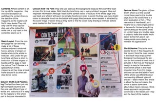
Basic Layout: From the con-tent
page we can see they
make a list of these
articles,and each article will
have a picture of singers or
bands which is the article in-troduced
.Also under the pic-ture
there will have a short in-troduction
of these singers or
bands and the page is near
the picture.The Q Review is a
special forum in this
magazine,so they drew a black
frame around it so other arti-cles
do not come.
Colours And The Font:They only use black as the background because they want the read-ers
can find it more easier. Bold black font and drop cap in every articles,it suggest titles and
important information.Although “black”is the symbol colour of rock,but if the whole page only
use black and white it will seem too simple,therefore,in order to avoid this,they use many bright
colour to decorate it(such as the bubble with page).Also,because some readers is attracted by
the cover image or cover lines,so they want to find the cover story directly,so intimate editors
were marked on the “cover story”.
Column Width And Position-ing:
The text has been put into
tight compact columns and
they are use different type of
words and colours,so it is easy
for the readers to find which
part is they are interested in.
Feature Photo:The photo of Sam
Smith which is on the low left
corner have used in the double
page,too.In the cover,there is a
short evaluation of him—“The
new voice of heartbreak”,so it
means he is a new singer,and he
is famous for his sad song.In my
opinion,they put the same photo
on content page and double page
in order to make the reader more
easier to find him,also it can
make people more clearly re-member
his appearance.
The Q Review:This is the most
special forum in this magazine.In
this forum,I think the main review
is the black keys wrap up their
European tour,because the pic-ture
on the content is used one of
pictures in their live,so this layout
design is easy let the readers
know which article is the most
important one.From this maga-zine
we can see the label in front
of the article use different colour
representing different types of
articles —black means this article
is about the live;red means this
article is about some new
album;blue means reissue .I think
these approach can provides
convinces to the reader,so it may
win the heart of the readers.