
Empfohlen
Weitere ähnliche Inhalte
Was ist angesagt?
Was ist angesagt? (19)
Ähnlich wie Double page spread analysis
Ähnlich wie Double page spread analysis (20)
Mehr von 122101361
Mehr von 122101361 (14)
Kürzlich hochgeladen
Kürzlich hochgeladen (20)
Double page spread analysis
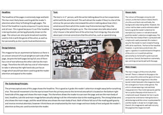
- 1. Headline: The headline of the pagesisextremelylarge andbold. Thishas most likelybeenusedtograbthe reader’s attentionwhenthey’reflickingthroughpages.The fontof the headline isquiteuniqueasit’squite messy and all over.Thisisgood because it’sasif the headline isbeingshouted,yetbeingphysicallyshownonthe page.The coloursare alsoquite broadand couldbe usedto linkinwiththe genre of the artist,as well as herpersonality asshe isquite loudandboisterous. Text: The textis in1st person,withthe writertalkingabouthisorhersexperience whilstwiththe artistherself.Thiswill attractthe readerif they’re afanof the artistas the personwhointerviewedthe artististalkingabouthow Lilly’s actedaround themwhichthe readermayfindentertainingif theylike knowingwhatthe artistgetsup to. The intervieweralsotalksaboutwhat Lilly’shouse islike whichfansof the artistmay find intriguing,theyalsotalk aboutpast criminal convictionsthatthe artisthas,such as speeddriving. House style: The coloursof thepages arequitecold colours,asthemaincolourisblack,there’s also theuseof dark red andfinally,the background colourbeingwhite. However,the colour red hasbeen used to add extradetail butalso grab thereader’sattention for exampleLily’snameisin red which would grab thereader’s attentionstraightaway.The fontof the main body of textis quiteplainand simpleand iswell presented;thismakesit easy for thereader to read instead of having difficultto read fonts.Thefontof the headline however,is quitemessy and all over,this again,isgoodasitcouldlink backto thegenre of the artist,or itcould link withher personality assheherself isquiteloud and boisterous.Overall,theheadlineisextremely eye catchingand workswell with thepage. Main Image: The main imageisof theartistLilly Allen herself.Theseis relevantto thepageas the text is aboutthisartistand her genreof music works well with themagazineas theother bands/ artists featured inthemagazineshare the samegenreor havesimilar genres.The artistisshownwearinga red and black chequered shirt.Theclichélook workswell for her as quitea fewpop artistshaveasit’s simpleand casual.However her hair isquite uniqueto her and dueto itbeingblackon a whitebackground thecolour isquitepowerful and thereader is drawn to itstraightaway. Overall,thisimageworks well with notonly the pagebutthe magazineitself. The GuttenbergPrinciple: The primaryoptical area of this page showsthe headline.Thisisgoodasit grabs the reader’sattentionstraightawaybeforeanything else. The overall movementisforthe eye totravel fromthe primaryareato the terminal areawhichislocatedon the bottomright handside of the page and showsthe mainimage.Thistherefore allowsthe readertoscanoverthe page andsee the mainbodyof text,headline,subtitle andmainimage before actuallytakinginall the informationdue tothe reading gravity. The strongfallowarea alsoshowsthe mainimage,andthe weakfallowareashowsthe mainbodyof text.Both of these fall outof the readingpathgravity and receive minimal attention,howeverIthinkthese are emphasizedbythe mainimage andmainbodyof textandgrab the reader’s attentionastheyare usedtoentertainthe reader. Designbalance: Thismagazine hasan asymmetrical balance as there is an unevenamountof visual weightoneachside of the page,despite the bothpagesbeingfull;one of them has a lotof textwhereasthe otherside hasthe main image.Therefore the leftside hasalotof information to take in whereasthe righthandside justhasan image whichwouldhave beenusedtograbthe reader attentionandappeal tothe reader.