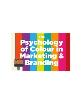
Psychology of-color-in-marketing-and-branding
•
2 gefällt mir•289 views

19-08-2016 Trimester: 162 Course ID: PSY 2217 Course Title: Introduction to Psychology

Empfohlen
Empfohlen
Weitere ähnliche Inhalte
Was ist angesagt?
Was ist angesagt? (20)
Ähnlich wie Psychology of-color-in-marketing-and-branding
Ähnlich wie Psychology of-color-in-marketing-and-branding (20)
Mehr von Sachcha Bhuiyan
Mehr von Sachcha Bhuiyan (19)
Kürzlich hochgeladen
Kürzlich hochgeladen (20)
Psychology of-color-in-marketing-and-branding
- 2. Color & Color psychology Color is, simply stated, broken down white light. This is a dissection of light at different wavelengths and each wavelength is perceived as a separate color. Objects tend to absorb or reflect these wavelengths, so when we see a yellow lemon, it is the yellow wavelength that is being reflected while all others are being absorbed. We feel color. How or what we feel about it varies from person to person. Some colors give us a sense of serenity and calm; these usually lie within the blue side of the spectrum-that consists of purple and green too, known as the cool side. Others induce rage and make us uncomfortable, or signify passion; these lie within the red spectrum- which includes orange and yellow, known as the warm side. Color perception is subjective, and certain colors have a very universal significance. This is coded into our reptilian brain, giving us that instinctive feeling of fire is being dangerous and the beach being relaxing. There is a reason why people prefer certain colors over others. This preference says volumes about our personalities, because each color has an association with a reaction our brain has when we internalize it. Color stimulates our brain, and from the ancient times has proven to be useful alternative psychotherapy. Color psychology is the study of hues as a determinant of human behavior. Color psychology is a well-known, yet less explored branch of the study of how our brain perceives what it visualizes. As far as scientific research goes, there is not much to work with. However, the impact that colors have on our brains is used to manipulate our decision making by multiple facets of society. Color psychology is a very important tool used by artists, interior decorators, and as a marketing mechanism in many industries.
- 3. Color preference & relation between color and mood Color has long been used to create feelings of coziness or spaciousness. There is evidence that color preference may depend on ambient temperature. People who are cold prefer warm colors like red and yellow while people who are hot prefer cool colors like blue and green. Some research has concluded that women and men respectively prefer "warm" and "cool" colors. A few studies have shown that cultural background has a strong influence on color preference. These studies have shown that people from the same region regardless of race will have the same color preferences. Also, one region may have different preferences than another region (i.e., a different country or a different area of the same country), regardless of race.
- 4. Children's preferences for colors they find to be pleasant and comforting can be changed and can vary, while adult color preference is usually non- malleable. Some studies find that color can affect mood. However, these studies do not agree on precisely which moods are brought out by which colors. Light, color, and surroundings Light and color can influence how people perceive the area around them. Different light sources affect how the colors of walls and other objects are seen. Specific hues of colors seen under natural sunlight may vary when seen under the light from an incandescent (tungsten) light-bulb: lighter colors may appear to be more orange or "brownish" and darker colors may appear even darker. Light and the color of an object can affect how one perceives its positioning. If light or shadow, or the color of the object, masks an object's true contour (outline of a figure) it can appear to be shaped differently from reality. Objects under a uniform light-source will promote better impression of three-dimensional shape. The color of an object may affect whether or not it seems to be in motion. In particular, the trajectories of objects under a light source whose intensity varies with space are more difficult to determine than identical objects under a uniform light source. This could possibly be interpreted as interference between motion and color perception, both of which are more difficult under variable lighting.
- 5. General model The general model of color psychology relies on six basic principles: 1) Color can carry a specific meaning. 2) Color meaning is either based in learned meaning or biologically innate meaning. 3) The perception of a color causes evaluation automatically by the person perceiving. 4) The evaluation process forces color-motivated behavior. 5) Color usually exerts its influence automatically. 6) Color meaning and effect has to do with context as well. Uses in marketing
- 6. Since color is an important factor in the visual appearance of products as well as in brand recognition, color psychology has become important to marketing. Recent work in marketing has shown that color can be used to communicate brand personality, Marketers must be aware of the application of color in different media (e.g. print vs. web), as well as the varying meanings and emotions that a particular audience can assign to color. Even though there are attempts to classify consumer response to different colors, everyone perceives color differently. The physiological and emotional effect of color in each person is influenced by several factors such as past experiences, culture, religion, natural environment, gender, race, and nationality. When making color decisions, it is important to determine the target audience in order to convey the right message. Color decisions can influence both direct messages and secondary brand values and attributes in any communication. Color should be carefully selected to align with the key message and emotions being conveyed in a piece. Research on the effects of color on product preference and marketing shows that product color could affect consumer preference and hence purchasing culture. Most results show that it is not a specific color that attracts all audiences, but that certain colors are deemed appropriate for certain products. Brand meaning Color is a very influential source of information when people are making a purchasing decision. Customers generally make an initial judgment on a product within 90 seconds of interaction with that product and about 62%-90% of that judgment is based on color. People often see the logo of a brand or company as a representation of that company. Without prior experience to a logo, we begin to associate a brand with certain characteristics based on the primary logo color. Color mapping provides a means of identifying potential logo colors for new brands and ensuring brand differentiation within a visually cluttered marketplace. A study on logo color asked participants to rate how appropriate the logo color was for fictional companies based on the products each company produced. Participants were presented with fictional products in eight different colors and had to rate the
- 7. appropriateness of the color for each product. This study showed a pattern of logo color appropriateness based on product function. If the product was considered functional, fulfills a need or solves a problem, then a functional color was seen as most appropriate. If the product was seen as sensory-social, conveys attitudes, status, or social approval, then sensory-social colors were seen as more appropriate. Companies should decide what types of products to produce and then choose a logo color that is connotative with their products' functions. Company logos can portray meaning just through the use of color. Color affects people's perceptions of a new or unknown company.
- 8. Psychological Properties of Colors There are four psychological primary colors - red, blue, yellow and green. They relate respectively to the body, the mind, the emotions and the essential balance between these three. The psychological properties of the eleven basic colors are as follows: RED: Physical Positive: Physical courage, strength, warmth, energy, basic survival, 'fight or flight', stimulation, masculinity, excitement. Negative: Defiance, aggression, visual impact, strain. Being the longest wavelength, red is a powerful color. Although not technically the most visible, it has the property of appearing to be nearer than it is and therefore it grabs our attention first. Hence its effectiveness in traffic lights the world over. Its effect is physical; it stimulates us and raises the pulse rate, giving the impression that time is passing faster than it is. It relates to the masculine principle and can activate the "fight or flight" instinct. Red is strong, and very basic. Pure red is the simplest color, with no subtlety. It is stimulating and lively, very friendly. At the same time, it can be perceived as demanding and aggressive. BLUE: Intellectual. Positive: Intelligence, communication, trust, efficiency, serenity, duty, logic, coolness, reflection, calm. Negative: Coldness, aloofness, lack of emotion, unfriendliness. Blue is the color of the mind and is essentially soothing; it affects us mentally, rather than the physical reaction we have to red. Strong blues will stimulate clear thought and lighter, soft blues will calm the mind and aid concentration. Consequently it is serene and mentally calming. It is the color of clear communication. Blue objects do not appear
- 9. to be as close to us as red ones. Time and again in research, blue is the world's favorite color. However, it can be perceived as cold, unemotional and unfriendly. YELLOW: Emotional Positive: Optimism, confidence, self-esteem, extraversion, emotional strength, friendliness, creativity. Negative: Irrationality, fear, emotional fragility, depression, anxiety, suicide. The yellow wavelength is relatively long and essentially stimulating. In this case the stimulus is emotional; therefore yellow is the strongest color, psychologically. The right yellow will lift our spirits and our self-esteem; it is the color of confidence and optimism. Too much of it, or the wrong tone in relation to the other tones in a color scheme, can cause self-esteem to plummet, giving rise to fear and anxiety. Our "yellow streak" can surface. GREEN: Balance Positive: Harmony, balance, refreshment, universal love, rest, restoration, reassurance, environmental awareness, equilibrium, peace. Negative: Boredom, stagnation, blandness, enervation. Green strikes the eye in such a way as to require no adjustment whatever and is, therefore, restful. Being in the centre of the spectrum, it is the color of balance - a more important concept than many people realize. When the world about us contains plenty of green, this indicates the presence of water, and little danger of famine, so we are
- 10. reassured by green, on a primitive level. Negatively, it can indicate stagnation and, incorrectly used, will be perceived as being too bland. VIOLET: Spiritual Positive: Spiritual awareness, containment, vision, luxury, authenticity, truth, quality. Negative: Introversion, decadence, suppression, inferiority. The shortest wavelength is violet, often described as purple. It takes awareness to a higher level of thought, even into the realms of spiritual values. It is highly introversive and encourages deep contemplation, or meditation. It has associations with royalty and usually communicates the finest possible quality. Being the last visible wavelength before the ultra-violet ray, it has associations with time and space and the cosmos. Excessive use of purple can bring about too much introspection and the wrong tone of it communicates something cheap and nasty, faster than any other color. ORANGE: Positive: Physical comfort, food, warmth, security, sensuality, passion, abundance, fun. Negative: Deprivation, frustration, frivolity, immaturity. Since it is a combination of red and yellow, orange is stimulating and reaction to it is a combination of the physical and the emotional. It focuses our minds on issues of physical comfort - food, warmth, shelter etc. - and sensuality. It is a 'fun' color. Negatively, it might focus on the exact opposite - deprivation. This is particularly likely when warm orange is used with black. Equally, too much orange suggests frivolity and a lack of serious intellectual values.
- 11. PINK: Positive: Physical tranquility, nurture, warmth, femininity, love, sexuality, survival of the species. Negative: Inhibition, emotional claustrophobia, emasculation, physical weakness. Being a tint of red, pink also affects us physically, but it soothes, rather than stimulates. (Interestingly, red is the only color that has an entirely separate name for its tints. Tints of blue, green, yellow, etc. are simply called light blue, light green etc.) Pink is a powerful color, psychologically. It represents the feminine principle, and survival of the species; it is nurturing and physically soothing. Too much pink is physically draining and can be somewhat emasculating. GREY: Positive: Psychological neutrality. Negative: Lack of confidence, dampness, depression, hibernation, lack of energy. Pure grey is the only color that has no direct psychological properties. It is, however, quite suppressive. A virtual absence of color is depressing and when the world turns grey we are instinctively conditioned to draw in and prepare for hibernation. Unless the precise tone is right, grey has a dampening effect on other colors used with it. Heavy use of grey usually indicates a lack of confidence and fear of exposure. BLACK: Positive: Sophistication, glamour, security, emotional safety, efficiency, substance. Negative: Oppression, coldness, menace, heaviness.
- 12. Black is all colors, totally absorbed. The psychological implications of that are considerable. It creates protective barriers, as it absorbs all the energy coming towards you, and it enshrouds the personality. Black is essentially an absence of light, since no wavelengths are reflected and it can, therefore be menacing; many people are afraid of the dark. Positively, it communicates absolute clarity, with no fine nuances. It communicates sophistication and uncompromising excellence and it works particularly well with white. Black creates a perception of weight and seriousness. WHITE: Positive: Hygiene, sterility, clarity, purity, cleanness, simplicity, sophistication, efficiency. Negative: Sterility, coldness, barriers, unfriendliness, elitism. Just as black is total absorption, so white is total reflection. In effect, it reflects the full force of the spectrum into our eyes. Thus it also creates barriers, but differently from black, and it is often a strain to look at. It communicates, "Touch me not!" White is purity and, like black, uncompromising; it is clean, hygienic, and sterile. The concept of sterility can also be negative. Visually, white gives a heightened perception of space. The negative effect of white on warm colors is to make them look and feel garish. BROWN: Positive: Seriousness, warmth, Nature, earthiness, reliability, support. Negative: Lack of humor, heaviness, lack of sophistication. Brown usually consists of red and yellow, with a large percentage of black. Consequently, it has much of the same seriousness as black, but is warmer and softer.
- 13. It has elements of the red and yellow properties. Brown has associations with the earth and the natural world. It is a solid, reliable color and most people find it quietly supportive - more positively than the ever-popular black, which is suppressive, rather than supportive. Combining colors Although some companies use a single color to represent their brand, many other companies use a combination of colors in their logo and can be perceived in different ways than those colors independently. When asked to rate color pair preference of preselected pairs, people generally prefer color pairs with similar hues when the two colors are both in the foreground, however, greater contrast between the figure and the background is preferred. In contrast to a strong preference for similar color combinations, some people like to accent with a highly contrasting color. Color name Although different colors can be perceived in different ways, the name of those colors matters as well. Many products and companies focus on producing a wide range of product colors to attract the largest population of consumers. But, color name, not only the actual color, can actually attract or repel buyers as well. When asked to rate either color swatches or products with generic color names, such as brown, or fancy color names, such as mocha, participants rated items with fancy names as significantly more likable than items with generic names. In fact the same paint color swatch with two different names produced different rating levels. The same effect was found when participants rated the pleasantness of towels with fancy and generic names. This shows a greater favorability for fancy names compared to generic names for exactly the same colors. Fancy names are not only liked more, but cause the product to be liked more, hence increasing purchasing intent. Jelly beans with atypical color names, such as razzmatazz, were more likely to be chosen than jelly beans with typical names such as lemon yellow. This could be due to greater interest in the atypical names and
- 14. willingness to figure out why that name was given. Purchasing intent of custom sweatshirts from an online provider also showed preferences for atypical names. Participants were asked to imagine buying sweatshirts and were provided with a variety of color options, some typical, some atypical. Colors that were atypical were selected more than colors that were typical, showing a preference to purchase items with atypical color names. Those who chose atypical colors were also more content with their choice than those who chose typical color sweatshirts. Attracting attention Color is used as a means to attract consumer attention to a product that then influences buying behavior. Consumers use color to identify for known brands or search for new alternatives. Variety seekers look for non-typical colors when selecting new brands. And attractive color packaging receives more consumer attention than unattractive color packaging, which can then influence buying behavior. A study that looked at visual color cues focused on predicted purchasing behavior for known and unknown brands. Participants were shown the same product in four different colors and brands. The results showed that people picked packages based on colors that attracted their voluntary and involuntary attention. Associations made with that color such as 'green fits menthol', also affected their decision. Based on these findings implications can be made on the best color choices for packages. New companies or new products could consider using dissimilar colors to attract attention to the brand; however, off brand companies could consider using similar colors to the leading brand to emphasize product similarity. If a company is changing the look of a product, but keeping the product the same, they consider keeping the same color scheme since people use color to identify and search for brands. Attention is captured subconsciously before people can consciously attend to something. Research looking at electroencephalography (EEGs) while people made decisions on color preference found brain activation when a favorite color is present before the participants consciously focused on it. When looking a various colors on a
- 15. screen people focus on their favorite color, or the color stands out more, before they purposefully turn their attention to it. This implies that products can capture someone's attention based on color, before the person willingly looks at the product. Store and display color Color is not only used in products to attract attention, but also in window displays and stores. When people are exposed to different colored walls and images of window displays and store interiors they tend to be drawn to some colors and not to others. Findings showed that people were physically drawn to warm colored displays; however, they rated cool colored displays as more favorable. This implies that warm colored store displays are more appropriate for spontaneous and unplanned purchases, whereas cool colored displays and store entrances may be a better fit for purchases where a lot of planning and customer deliberation occurs. This is especially relevant in shopping malls were patrons could easily walk into a store that attracts their attention without previous planning. Other research has confirmed that store color, and not just the product, influences buying behavior. When people are exposed to different store color scenarios and then surveyed on intended buying behavior store color, among various other factors, seems important for purchasing intentions. Particularly blue, a cool color, was rated as more favorable and produced higher purchasing intentions than orange, a warm color. However, all negative effects to orange were neutralized when orange store color was paired with soft lighting. This shows that store color and lighting actually interact. Lighting color could have a strong effect on perceived experience in stores and other situation. For example, time seems to pass more slowly under red lights and time seems to pass quickly under blue light. Color psychology and associations are an interesting part of the complex working system of our brain, yet with so many scientific questions about it still left unanswered , and differences in cultural attachments to colors, it can only be utilized through observation and experience of how color has influenced brains over the years.