Tasks 1, 2 and 3 (User Interface, Assets List, and my MoSCow)
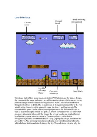
1. User
Interface
Current
Score
Current
Level
Time
Remaining
(in
seconds)
Playable
character
Character
Level
Blocks
(Mario)
Power-‐up
The
visual
style
of
this
game
is
generic
to
the
1980’s
technique
for
games
design,
the
colours
of
the
scene
and
actors
are
all
blocks
there
is
very
little
texture
in
this
pixel
art
design
as
more
details
through
colours
wasn’t
possible
at
the
time
of
this
game’s
release
in
1985.
The
colours
used
in
this
game
are
realistic
to
the
real
world,
white
clouds
in
a
blue
sky
with
green
shrubbery
and
brown
soil.
The
colours
of
this
game
can
be
related
to
the
properties
of
the
different
blocks,
as
well
as
playable
heights
within
the
game.
A
brown
surface
is
what
the
character
can
move
along
and
is
beneath
the
clouds
the
brown
blocks
can
be
at
different
heights
that
require
jumping
to
reach.
The
green
objects
either
in
the
background
(bushes)
or
in
the
character’s
way
(pipes)
are
always
just
above
the
ground
level.
And
anything
from
the
clouds
and
above
are
the
colour
of
white,
which
helps
with
the
realistic
design
of
the
sky.
This
rule
theory
is
also
why
the
2. text
showing
level
information
is
in
white,
the
colour
is
easily
visible
with
the
blue
background
and
being
in
that
position
the
colour
relates
in
a
real
world
manner.
The
font
used
in
this
game’s
heads
up
display
was
designed
to
fit
within
the
style
of
the
game’s
pixel
art
look,
set
within
a
square
and
bubbly.
Characters
Playable
Time
Lives
in
play
characters
remaining
left
Level
Score
The
visual
style
for
this
modern
day
version
of
super
Mario
brothers
is
quite
a
leap
from
the
original
version,
the
characters
and
the
world
they’re
in
are
now
in
3D,
the
designs
are
now
very
bubbly
even
the
brick
blocks
have
balloon
round
edges
the
style
of
this
game
has
almost
become
the
equivalent
of
child
safety
scissors,
sending
a
message
saying
its
impossible
to
hurt
yourself
with
this
so
use
it
and
have
lots
of
fun.
Due
to
the
new
3D
element
in
this
game
the
levels
no
also
include
shadows
corresponding
to
the
position
of
actual
light
sources
which
brings
the
real
world
elements
back
into
the
players
understanding
of
how
this
world
works.
The
heads
up
display
of
this
game
is
overly
clear
of
the
game
in
comparison
to
the
old
version
you
can
now
see
exactly
what
you
need
to
collect
in
this
game
and
how
many
you
have
(coins
57
collected,
and
stars
0/3
collected).
There
are
some
similar
aspects
in
this
later
design,
the
time
and
overall
score
are
position
above
and
bellow
one
another.
The
font
has
also
had
a
modernised
‘make
over’
the
texts
are
completely
different
from
one
another;
the
number
of
lives
font
in
quite
small
and
has
a
bubbly
quality
and
looks
formal
with
its
white
centre
and
black
casing.
The
font
for
the
coin
collection
count
is
in
the
style
of
the
coins
it
counts
straight
clear
cuts
but
fun
with
a
yellow
core
and
marmite
yellow
edge.
Then
we
have
the
text
for
the
time
and
score
similar
to
the
coin
text
it
is
also
Collectables
collected
3. very
straight
cut
yet
fun
with
its
3D
effect
of
the
centre
being
in
the
foreground.
The
grey
and
white
of
this
font
seems
very
clinical
and
strict
which
is
appropriate
as
this
is
the
only
part
of
the
game
which
has
absolute
rules
and
isn’t
included
for
pleasure
or
joy.
Assets
list
Graphics:
• Level
1
• Level
2
• Level
3
• The
alien
player
• The
FBI
enemies
• The
laser
traps
• The
Main
Menu
• The
Options
&
Controls
Menu
• Bullet
design
• The
logo
for
the
lives
the
player
has
• The
fonts
Animations:
• Opening
scene
of
the
spaceship
crash
• Level
transition
1
• Level
transition
2
• Ending
scene
spaceship
leaving
asteroid
field
• Player
movement
loops
(within
gameplay)
• Enemy
movement
loops
(within
gameplay)
• Laser
trap
(in
gameplay)
• Collectable
dissolving
(in
gameplay)
• Text
appearance
(in
gameplay)
• Loss
of
life
logo
(in
gameplay)
Sounds:
• Gun
fire
• Player
dying
• Enemy
moving
• Enemy
attacking
• Laser
trap
when
active
• Loss
of
life
SFX
• Collection
SFX
Music:
• Menu/credits
• Level
1
• Level
2
• Level
3
• Transition
music
4. MosSCow
Method
Must
Have
•
•
•
•
Should
Have
A
working
playable
game.
It
must
have
an
original
music
soundtrack.
A
working
score
system
keeping
track
of
a
person’s
score.
A
working
life
system
death
restarts
at
a
set
position,
until
all
lives
are
lost
at
which
point
the
game
must
restart
completely.
•
•
•
MoSCoW
Could
Have
•
•
•
A
pause
button,
with
a
pause
menu
that
allows
you
to
change
the
current
settings.
A
rewarded
or
‘Easter
egg’
bonus
level.
Larger
levels
with
parallax
scrolling
Sound
effects
for
the
characters
are
important
for
a
good
playing
experience.
Fluid
animations
both
in
gameplay
for
movement
and
in
the
transitional
scenes.
Collectables
that
disappear
when
collected
and
their
score
added.
Won’t
Have
•
•
•
Additives
such
as;
upgrades
in
abilities,
power-‐ups,
bonus
points.
Special
features
such
as
customisable
objects
or
character
looks.
Any
other
dangers
besides
the
traps
and
enemies.