Quality control tools (QCT)
•
3 gefällt mir•9,639 views

Quality control tools, qct,lean, six sigma, 7 qc tools, 7 quality control tools

Empfohlen
Weitere ähnliche Inhalte
Was ist angesagt?
Was ist angesagt? (20)
Andere mochten auch
Andere mochten auch (20)
Ähnlich wie Quality control tools (QCT)
Ähnlich wie Quality control tools (QCT) (20)
Mehr von Vikram Dahiya
Mehr von Vikram Dahiya (20)
Kürzlich hochgeladen
Kürzlich hochgeladen (20)
Quality control tools (QCT)
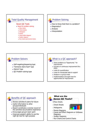
- 1. Total Quality Management Problem Solving Seven QC Tools How to Know that there is a problem? Need for problem solving Diagnostics? Flow charts Analysis Check sheets Histogram Interpretation Pareto Cause effect diagram Scatter diagram Run charts and Control charts Problem Solvers What is a QC approach? Views problems as “Opportunity “ for Self-negating/despairing type improvement “Someone else‟s fault” type Focuses on continuous improvement thru PDCA Ostrich Type Looks for quantification QC Problem solving type Looks for trends/past data to support Analysis in a group mode Implementation and again look for opportunities for improvement What are the Benefits of QC approach Seven QC Tools? Review activities & plans for future Flow Charts Useful information to other Check Sheets groups/individuals Report constitutes a concise record of Histograms the activities-accumulative experience Pareto Diagrams Encourages group‟s team spirit Cause and Effect Diagrams or Ishikawa Improves people‟s ability to use the Diagrams right QC tool for right purpose Scatter Diagrams Run Charts and Control Charts 1
- 2. Characteristics Histogram • Simple and easy to use tools What is it? • Operated at the shop floor level A Histogram is a bar graph usually used to present frequency data • Motivates quantitative orientation and How does it Work? helps in promoting “MANAGEMENT-by- Define Categories for Data Collect Data, sort them into the categories FACT and DATA” Count the Data for each category • Cast in PDCA cycle Draw the Diagram. Each category finds its place on the x-Axis. The bars will be as high as the value for the category What is its use? Histograms provide an easy way to evaluate the distribution of Data over different categories Histograms Interpretations When combined with the concept of the normal curve and the knowledge of a particular process, the histogram becomes an effective, practical working tool in the early stages of data Example: analysis. A histogram may be interpreted by asking three questions: Take the failure rate of a machine LSL USL over a period of x weeks. Now • How well is the histogram centered? The centering of the data Assign every week the number of provides information on the process aim about some mean or nominal value. failures that occurred. Draw the Histogram. Let the bar represent • How wide is the histogram? Looking at histogram width the weeks. The height of the Bar defines the variability of the process about the aim. on the y-axis is the number of • What is the shape of the histogram? Remember that the data failures that occurred during that is expected to form a normal or bell-shaped curve. Any week. significant change or anomaly usually indicates that there is something going on in the process, which is causing the quality problem. Typical Distributions Typical Distributions Normal BIMODAL • Depicted by a bell-shaped curve • Distribution appears to have two peaks • Most frequent measurement appears as center of distribution • May indicate that data from more than one process are mixed • Less frequent measurements taper gradually at both ends of together distribution o Materials may come from two separate vendors • Indicates that a process is running normally (only common causes o Samples may have come from two separate machines. are present). 2
- 3. Typical Distributions Typical Distributions CLIFF-LIKE SAW-TOOTHED • Also commonly referred to as a comb distribution, appears as an alternating jagged pattern • Appears to end sharply or abruptly at one end • Often indicates a measuring problem • Indicates possible sorting or inspection of non-conforming parts. o Improper gage readings o Gage not sensitive enough for readings. Typical Distributions Limitations of Histograms SKEWED • Histograms are limited in their use due to the random order in which samples are taken and lack of information about the state of control of the process. • Because samples are gathered without regard to order, the time-dependent or time-related trends in the process are not captured. • Appears as an uneven curve; values seem to taper to one side. • This lack of information on process control may lead to incorrect conclusions being drawn and, hence, inappropriate decisions being made. • Still, with these considerations in mind, the histogram's simplicity of construction and ease of use make it an invaluable tool in the elementary stages of data analysis. Inside diameter of metal sleeves (in mm) Sample Observations X (Five per sample) 1 50.04 50.03 50.02 50.00 49.94 Class boundaries, midpoints and frequencies 2 49.96 49.99 50.03 50.01 49.98 Class Midpoint Frequency Cumulative 3 50.01 50.01 50.01 50.00 49.92 Boundaries frequency 4 49.95 49.97 50.002 50.10 50.02 5 50.00 50.01 50.00 50.00 50.09 49.89-49.91 49.90 1 1 6 50.02 50.05 49.97 50.02 50.09 49.91-49.93 49.92 3 4 7 50.01 49.99 49.96 49.99 50.00 49.93-49.95 49.94 6 10 8 50.02 50.00 50.04 50.02 50.00 9 50.06 49.93 49.99 49.99 49.95 49.95-49.97 49.96 11 21 10 49.96 49.93 50.08 49.92 50.03 49.97-49.99 49.98 14 35 11 50.01 49.96 49.98 50.00 50.02 49.99-50.01 50.00 23 58 12 50.04 49.94 50.00 50.03 49.92 13 49.97 49.90 49.98 50.01 49.95 50.01-50.03 50.02 21 79 14 50.00 50.01 49.95 49.97 49.94 50.03-50.05 50.04 11 90 15 49.97 49.98 50.03 50.08 49.96 50.05-50.07 50.06 4 94 16 49.98 50.00 49.97 49.96 49.97 17 50.03 50.04 50.03 50.01 50.01 50.07-50.09 50.08 3 97 18 49.98 49.98 49.99 50.05 50.00 50.09-50.11 50.10 3 100 19 50.07 50.00 50.02 49.99 49.93 20 49.99 50.06 49.95 49.99 50.02 3
- 4. Check Sheet Check Sheets Creates easy-to-understand data COMPONENTS REPLACED BY LAB TIME PERIOD: 22 Feb to 27 Feb 2002 Builds, with each observation, a clearer REPAIR TECHNICIAN: Bob picture of the facts TV SET MODEL 1013 Patterns in the data become Integrated Circuits |||| obvious quickly Capacitors |||| |||| |||| |||| |||| || Resistors || Transformers |||| Commands CRT | Pareto Charts X Pareto Charts X Type Type What is it? What is its use? A Pareto Chart is a Histogram + a cumulative line Pareto Charts are used to apply the 80/20 rule of Joseph Juran which states that 80% of the problems are How does it Work? the result of 20% of the items. A Pareto Chart can be used Similar like a Histogram to identify that 20% root causes of problem. For instance, First define categories, collect Data and sort them into the 80 percent of machine breakdown come from 20 percent Categories. Count the occurrences for each category. of the machines, and 80 percent of the product defects Now rank the categories starting with highest value. come from 20 percent of the causes of defects. Draw cumulative points above all the bars and connect them into a line. Pareto Charts Pareto Charts The important few and ... Example: the many that distort the view... A certain machine has different kinds of failures that but don’t matter occur. The Maintenance department identifies these types of failures and counts their occurrence over a period of 3 Decide the collection period month. The Data is then added up. The Failures are ranked by their occurrence values starting with the most Identify the main problem causes or categories frequently occurring failure. A histogram is drawn with bars representing the types of Collect data on check sheet or tally sheet failures. Furthermore cumulative values are assigned to Tabulate the frequency of each category the failure types and drawn into the diagram. Now determine the point were the cumulative line List them in descending order crosses the 80% mark. Concentrate of the failure types that lie left of this mark. Arrange the data as in a bar chart Determine cumulative totals and % 4
- 5. Pareto Charts Pareto Charts 100% NUMBER OF CAUSE DEFECTS PERCENTAGE Poor design 80 64 % Percentages of defects found 50% Wrong part dimensions 16 13 Defective parts 12 10 Incorrect machine calibration 7 6 Operator errors 4 3 Defective material 3 2 Surface abrasions 3 2 125 100 % Types of defects Pareto Charts 70 (64) X 60 Pareto Charts Percent from each cause Type 50 In most cases, two or three categories will tower above the others. These few categories, which account for the bulk of the 40 problem, will be the high-impact points on which to focus. If in doubt, follow these guidelines: 30 Look for a break point in the cumulative percentage line. This point occurs where the slope of the line begins to 20 flatten out. The factors under the steepest part of the curve (13) are the most important. (10) 10 (6) (3) (2) (2) If there is not a fairly clear change in the slope of the line, 0 look for the factors that make up at least 80% of the problem. If the bars are all similar sizes or more than half of the categories are needed to make up the needed 80%, try a different breakdown of categories that might be more Causes of poor quality appropriate. Check Sheet The Jodhpur traffic department handed out the Infraction Tally Frequency following challan during Diwali holidays. Make a Excessive speed //// 5 check sheets and a Pareto diagram for the types of Expired inspection // 2 infraction. Improper turn /// 3 Challan Infraction Parking violation //// //// 10 Challan No. Infraction No. 1 Excessive speed 11 Expired inspection 2 Expired inspection 12 Parking violation 3 Improper turn 13 Improper turn 10 4 Excessive speed 14 Parking violation 5 Parking violation 8 15 Excessive speed 6 Parking violation 16 Parking violation 6 7 Excessive speed 17 Parking violation 4 8 Parking violation 18 Parking violation 9 Improper turn 19 Excessive speed 2 10 Parking violation 20 Parking violation 5
- 6. Within Yes Within Yes Input Process Output Input Process Output Spec? Spec? Flow Charts adjust No Flow Charts adjust No How does it Work? Determine what Process or Procedure you want What is it? to represent. Way of representing a Procedure Start at a certain point and go then step by step using flow chart symbols using simple symbols and arrows Document the elements with titles. Let it close A Flowcharts shows the activities in a process and with an ending point. the relationships between them. Operations and Decisions can be represented What is its use? A Flow chart lets a process or procedure be understood easily. It also demonstrate the relationships between the elements. Flowcharts Flowcharts The most common symbols Start - stop Diamond - A choice Where the process between two or more Input Processing Output starts and ends alternatives Box Arrow - Connects two or A symbol for more symbols. The action steps. diamond is the only symbol The action is that has more than two spelled out in arrows connected to it the box Flowchart - next level down Flowchart - one more step down Rework Input Output Operation 1 No Operation 2 Yes Dept. 1 Dept. 3 Processing Inspection Storage Dept. 1 Dept. 3 Processing in Dept. 2 6
- 7. Flow Charts Flow Charts start MRI Flowchart Example: Repair machine 1. Physician schedules MRI 7. If unsatisfactory, repeat 2. Patient taken to MRI 8. Patient taken back to room You intend to repair a certain machine. No 3. Patient signs in 9. MRI read by radiologist Check machine First you perform the repair thought to be 4. Patient is prepped 10. MRI report transferred to necessary OK? 5. Technician carries out MRI physician 6. Technician inspects film 11. Patient and physician discuss Then You check it Yes If it does not work you continue with end repairs If it works you finish 8 80% 1 2 3 4 5 6 7 11 9 10 20% Scatter Diagrams Y Scatter Diagrams X What is it? Statistical tool showing a trend in a series of values. How does it Work? Y Draw graph with value points Draw trend line: m*x+a Calculate m value Calculate a value Calculate points for trend line. What is its use? X Demonstrating correlations between values and showing trends for value changes. Scatter Diagrams Interpretations If the points cluster in a band running from lower left to upper right, there is a positive correlation (if x increases, y increases). If the points cluster in a band from upper left to lower right, there is a negative correlation (if x increases, y decreases). If it is hard to see where you would draw a line, and if the points show no significant clustering, there is probably no correlation. 7
- 8. Cause and Effect Diagrams Cause and Effect Diagrams What is it? Cause a Cause b It‟s a diagram that demonstrates What is its use? the relationship between Effects effect Enables a team to focus on the content of a problem and the categories of their causes Cause c Cause d Creates a snapshot of collective knowledge and consensus of a The Arrangement of the Diagram lets it look like a team; builds support for solutions fishbone it is therefore also called fish-bone diagram Focuses the team on causes, not symptoms How does it Work? Determine the Effect or Problem you would like to It is an effective tool that allows people to easily see the examine relationship between factors to study processes, situations, and for Categorize the possible causes planning. find subcategories Describe the possible causes Cause and Effect Diagrams Cause and Effect Diagrams Causes in a cause & effect diagram are frequently arranged into four major categories. While these categories can be anything: Manpower, methods, materials, and machinery (recommended for manufacturing) Equipment, policies, procedures, and people (recommended for administration and service). Cause and Effect Diagrams Measurement Human Machines Faulty testing equipment Poor supervision Out of adjustment Machine Man Incorrect specifications Lack of concentration Tooling problems Improper methods Inadequate training Old / worn Quality Inaccurate Problem temperature effect control Defective from vendor Poor process design Ineffective quality Not to specifications management Dust and Dirt Material- Deficiencies handling problems in product design Settings Measurement Method Environment Materials Process 8
- 9. Cause-and-Effect Diagram for Making Good Copies Salesmen Copying paper Retail shops Liquid Not enough advertising Handling Don‟t know Don‟t know Much about enough A-pen Don‟t sell hard Have never used enough Unenthusiastic an A-pen Storage period about A-pen Have strong Original Storage period preconceptions setting Level Price is wrong Newness Don‟t display them Degree of exposure Have no samples Drying Degree of near cash counter time misalignment Paper displayed Why poor sales quality Contamination Storage method In spite of good (why good copy Have never Have never heard of them quality? cannot be obtained ) used one Transparency No special displays Pencil Hand Speed of samples Paper hardness dirtiness Roll No sample quality Not enough advertising to try Sharpness condition Strength Lamp Price is wrong Writing Lamp dirtiness Local stores Table Curl pressure brightness doesn‟t carry dirtiness them Not enough funding Product is just delivered Operating available Environment Original hours Copying machine Customers Advertising and Sales Causes Effect An example of Cause-and-Effect Diagram- Causes of poor sales Bottleneck in kitchen Material Method Workers take too much time sorting (ticket stock) Procedures (printing) Policy Dishes in kitchen-less time to clear Age Workers not available Density Quality Carbon No standard training Can‟t start Speed Paper cleaning until every body has Airline ticket left Empty tables are not errors Can‟t clear cleared quickly Supervision Not enough staff Type promptly At busy times Customers drink Ability Frequency Tea endlessly Age High turnover Attention to detail Maintenance Workers don‟t care Takes long time to get to the kitchen Poor morale Personnel Tension adjustment People Kitchen is far from tables Machine Poor pay Physical environment CE Diagrams Run Charts Measurement Ishikawa described three basic uses of the CE diagrams: What is it? Time Run Charts are representing change Dispersion analysis in measurement over a sequence or time Process analysis How does it Work? Cause enumeration Gather Data Organize Data Measurements (y) must be confronted with time or sequence of the events. Chart Data Interpreting Data What is its use? Determining Cyclic Events and there average character 9
- 10. Measurement Run Charts Time Run Charts Run charts (often known as line graphs outside the quality management field) display Example Oil consumption of a specific machine over a period of process performance over time. time. Measurement Upward and downward trends, cycles, and large variations may be spotted and investigated further. Also, an average line can be added to a run chart to clarify movement of the data away Time from the average. Run Chart Run Charts Example Two ways to misinterpret run charts: •You conclude that some trend or cycle exists, when in fact you are just seeing normal process variation (and every process will show some variation). •You do not recognize a trend or cycle when it does exist. Both of these mistakes are common, but people are generally less aware that they are making the first type, and are tampering with a process, which is really behaving normally. To avoid mistakes, use the following rules of thumb for run chart interpretation: •Look at data for a long enough period of time, so that a "usual" range of variation is evident. Is the recent data within the usual range of variation? Is there a daily pattern? Weekly? Monthly? Yearly? Y Y Upper limit Upper limit Average/Spec Average/Spec Control Charts Lower limit Control Charts Lower limit X X What is it? Control Charts Run charts turn into control charts Statistical tool, showing whether a process is in control or not One of the single most effective quality control devices for How does it Work? managers and employees Define Upper limit, lower limit and Center line Draw Chart. Gather values and draw them into chart What is its use? Taking samples of a process and detect possibility of process being out of control 10
- 11. Y Y Upper limit Upper limit Average/Spec Average/Spec Control Charts Lower limit Control Charts Lower limit X X Periodic tracking of a process Constructing a control Chart Common types Decide what to measure or count X bar, R or range, p or percent nonconforming Collect the sample data Elements of a control chart Plot the samples on a control chart upper control limit (UCL), the highest value a process should produce Calculate and plot the control limits on the control central line (x bar), the average value of chart consecutive samples Determine if the data is in-control lower control limit (LCL), the lowest value a If non-random variation is present, discard the data process should produce (fix the problem) and recalculate the control limits Control Charts Control Charts Y Upper limit A Process is In Control if: 1. No sample points are outside control limits Average/Spec 2. Most points are near the process average Lower limit 3. About an equal # points are above & below the centerline X 4. Points appear randomly distributed Summary Control chart Seven Q.C. Tools Special cause Common cause Upper Benefits of Seven Q.C. Tools control limits 1- Provide Training in Thinking 2- Raise People‟s Problem Solving Confidence 3- Increase People‟s Ability to Predict Future Events Average Lower Roles of Seven Q.C. Tools control limits 1- Express verbal data diagrammatically 2- Make information visible Stable process Unstable process 3- Organize information intelligibly 4- Clarify overall picture and fine details 5- Get more people involved 11
- 12. FACTS Exercises Make a check sheet and then a Pareto diagram for the following car repair shop data. Data Ticket Work Ticket Work Ticket Work No. No. No. 1 Tires 11 Brakes 21 Lubes & oil Numerical Data Verbal Data 2 Lubes & oil 12 Lubes & oil 22 Brakes 3 Tires 13 Battery 23 Transmission Define problem after collecting numerical data 4 Battery 14 Lubes & oil 24 Brakes 5 Lubes & oil 15 Lubes & oil 25 Lube and oil Seven Tools 26 Battery 6 Lubes & oil 16 Tires 7 Lubes & oil 17 Lubes & oil 27 Lubes & oil •Analytical approach 8 Brakes 18 Brakes 28 Battery Organize 9 Lubes & oil 19 Tires 29 Battery Information 10 Tires 20 Brakes 30 Tires An Air-conditioning repair department manager has compiled data Prepare the run chart for the occurrence of defective computer on the primary reason for 41 service calls for the previous week, as monitors based on the following data, which an analyst obtained shown in the table. Using the data, make a check sheet for the for making the monitors. Workers are given break at 10:15 a.m. problem types for each customer type, and then construct Pareto and 3:15 p.m., and a lunch break at noon. What can you conclude? diagram for each type of customer Problem type Customer type N= Noisy W= Runs Warm C= Commercial Customer F= Equipment failure O= Odour R= Residential Customer Job Problem/ Job Problem/ Job Problem/ Job Problem/ Number Customer type Number Customer type Number Customer type Number Customer type Interval start Number of Interval start Number of Interval start Number of 301 F/R 312 F/C 323 F/R 334 O/C time defects time defects time defects 302 O/R 313 N/R 324 N/C 335 N/R 8:00 1 10:45 0 2:15 0 303 N/C 314 W/C 325 F/R 336 W/R 8:15 0 11:00 0 2:30 2 304 N/R 315 F/C 326 O/R 337 O/C 8:30 0 11:15 0 2:45 2 305 W/C 316 O/C 327 W/C 338 O/R 8:45 1 11:30 1 3:00 3 306 N/R 317 W/C 328 O/C 339 F/R 9:00 0 11:45 3 3:30 0 307 F/R 318 N/R 329 O/C 340 N/R 9:15 1 1:00 1 3:45 1 308 N/C 319 O/C 330 N/R 341 O/C 9:30 1 1:15 0 4:00 0 309 W/R 320 F/R 331 N/R 9:45 2 1:30 0 4:15 0 310 N/R 321 F/R 332 W/R 10:00 3 1:45 1 4:30 1 311 N/R 322 O/R 333 O/R 10:30 1 2:00 1 4:45 3 Prepare a scatter diagram for each of these data sets and then express in words the apparent relationship between the two variables. Put the first variable on the horizontal axis and the second variable on the vertical axis Prepare a flowchart that describe going to the library to study Age 24 30 22 25 33 27 36 58 37 47 54 28 42 55 for an exam. Your flowchart should include these items: finding a Absenteeism rate 6 5 7 6 4 5 4 1 3 2 2 5 3 1 place at the library to study, checking to see if you have your book, paper, highlighter, and so forth; traveling to library, and the possibility of moving to another location if the place you Temperature (F) 65 63 72 66 82 58 75 86 77 65 79 chose to study starts to get crowded. Error rate 1 2 0 0 3 3 1 5 2 1 3 Suppose that a table lamp fails to light when turned on. Prepare a simple cause-and-effect diagram to analyze possible causes. 12
- 13. Date Time Line Under Missing Spill/ Unacceptable Improperly Sealed -filled item Mixed taste 12/5/09 0900 1 √√ √ √√√ 12/5/09 1300 2 √√ √√ 13/5/09 1000 2 √ √√√ The operations manager of the firm that produces frozen dinners had 13/5/09 1345 1 √√ √√ received numerous complaints from supermarkets about the firm‟s 13/5/09 1530 2 √√ √√√ √ dinners. The manager then asked his assistant, Ram, to investigate 14/5/09 0830 1 √√√ √√√ the matter and to report his recommendations. 14/5/09 1100 2 √ √ √√ Ram‟s first task was to determine what problems were generating the complaints. The majority of the complaints centered on five defects: 14/5/09 1400 1 √ √ under filled packages, a missing item, spills/mixed items, unacceptable 15/5/09 1030 1 √√√ √√√√√ taste, and improperly sealed packages. 15/5/09 1145 2 √ √√ Next, he took sample of dinners from the two production lines and 15/5/09 1500 1 √ √ examined each sample, making note of any defects that he found. A summary of these results is shown in the table. 16/5/09 0845 2 √√ √√ The data resulted from inspecting approximately 800 frozen dinners. 16/5/09 1030 1 √√√ √ √√√ What should Ram recommend to the manager? 16/5/09 1400 1 16/5/09 1545 2 √ √√√√√ √ √ √√ Problem Solving The S-S method flowchart The common mistake after the recognition of the actual Step 1: Process Flow Analysis decision making phase often follows immediately after the actual problem. The proper appreciation of the cause of the problem is often neglected. The vital point in the Step2: Problem Definition process of problem solving is this simple rule-a problem cannot be solved unless its cause is known. The Step3: Identify the Real Cause proprietary S-S method (Ho and Cicmil, 1995) can be used to plug this loophole. S-S stands for “Short and Simple”. Step 4: Decide on and Implement Corrective Action How to use the S-S Method The S-S Method Worksheet Map and Worksheet Is the Is as The point problem? expected? of change What The should path Who Area of distinction with the real Cause that would When Start lead to X CHANGE x Where How Track back significant Problem = X-Y Possible 1 causes that 2 What was really happening Which ended up as Y y led to the 3 problem Result 4 Time 13
- 14. Case Study I: The 1990 World The rule of the World Cup Semi-final and final matches is that when it comes to a draw, the winner has to be decided by a penalty shoot-out. Therefore, teams should be prepared to master the situation when it comes up. In football, there are some Cup Semi-Final rules that every experienced football player will agree with: The 1990 World Cup Semi-Final between England (E) and West Germany Rule 1: In successful penalty shooting, the ball ends up in the goal way (W) was one of the most exciting matches in that year‟s World Cup from the goal-keeper‟s reach. The most likely positions are those along which took place in Italy. The England team came to a 1-1 draw with the the inside edges of the goal-posts, the higher the better, provided that West Germany team after 120 minutes of exciting and tough the ball does not go over the ball. The football player must target these competition. Then the match came to the penalty shoot-out. The results points. are summarized in the figure. Theoretically, in such an important match the as the world cup, the rule 1 ENGLAND WEST GERMANY must be adhered to during penalty shoot-out without recourse. This is Goal Player Result and Analysis Goal Player Result possible because there is a definite starting point (i.e. 12 yards midway from the goal) and there are no other people interfering, apart from the E1 Lineker In W1 Brehme In goal-keeper. Moreover, the football rules favour the shooter because the E2 Beardsley In W2 Matthaeus In goal-keeper is not allowed to make any move before the player touches E3 Platt In-despite being touched by the W3 Riedle In the ball. This lead to rule 2. goal-keeper Rule 2: The player should assume that there is nobody at all in the field, E4 Pearce Ball caught by the goal-keeper W4 Thon In and concentrate on shooting the ball into the position defined as the E5 Waddle Ball flew above the goal W5 WON best. Step 1: Process Flow Analysis: All player should have followed the Figure shows the appropriate positions of the nine penalty goals. rules 1 and 2(the „should‟ path) without recourse because this would Let us try to apply the principle of the S-S Method in analysing such have given the highest chance to get the ball into the goal. a low performance of the English team players. In this case, the Step 2: Problem Definition: figure shows the problem analysis missing shoots are unwanted effects, i.e., problems. Is the problem? Is as expected? The point of change Goal What Weak penalty shooting Performance during the Difference in penalty ●E5 match shooting tactics Who 2 out of 5 England players German Players The way some player shoot the ball ● E2 When After 120 min. of match During the match Penalty shoot-out took place after a long and tiring match W3* Where -At the point easily reached by the goal- At the positions near the Ball easily caught by the goal ●E3 keeper posts, inside the goal (E2 & keeper or ended up above -Above the bar E3) the bar How significant 2 failure out of 5 attempts The German team made no Very significant failure out of four attempts *W2 ●E4 Possible causes 1 Some players not following rule 1 that led to the W4* problem 2 Some players are incapable of shooting the ball at the right spot *W1 ● E1 3 Some player are affected psychologically by the presence of the goal-keeper and have forgotten about rule 2 4 lack of proper training based on rule 1 and 2 Step3 : Identification of the real cause Although the players are expected to act strictly according to the three rules (the ‟should‟ path) when performing penalty shooting, the area of distinctive change where the real cause of a failure lies is often psychology. The player usually guesses on what has been done WHAT- Lack of proper training led to the weak penalty shooting, before him, and what would be the goal-keeper‟s next guess. This mostly due to players not adhering to rules 1 and 2 disturbance could affect the decision of the player. It is usually at this critical moment that he makes the mistake-by doing something WHO- A significant number of players were making the mistake as a which is not part of his plan or simply forgetting his original plan result of insufficient training. completely. Then in most cases, the results are: either giving chance WHEN- When players are tired, the physical condition may affect their for a goal-keeper to catch the ball (because of the fear of making decision making. This is why training is important. incorrect guesses 0 or shooting the ball outside the goal (because of WHERE- More stringent training on correct shooting (rule1 ) the worry that the goal-keeper might reach the ball). HOW SIGNIFICANT- The importance of the match makes the problem As the result of the search based on the idea of the problem Map, the very significant. Therefore training must be thorough. real cause is the lack of proper training. In order to ensure that this is real cause, we should test it against the What, Who, Where, When and How Significant is the problem: 14
- 15. Step 4: Implementation of Corrective/Preventive Action- The Case study II- The 1994 World following guidelines should be considered. There must be adequate training conducted in accordance with Cup Final the rules 1 and 2. Players should be convinced that there are no better During the 1994 World Cup Final which took place in the USA, Italy almost alternatives. repeated the same mistakes the England team had made in 1990. The Italian team came to a 0-0 draw with Brazil after 120 minutes of exhaustive The possibility of penalty shoot-out for future matches should competition. Then the match came to the penalty shoot-out. The results are be analyzed. summarized in figure. Preventive actions should be taken to fully understand the ITALY BRAZIL psychological effect due to the presence of the goal-keeper. Goal Player Result and Analysis Goal Player Result From this analysis, the Coach must train the players so that they I1 Baresi Ball flew above goal B1 Santos Ball caught- too low and are at the peak of the performance. One very important not far enough responsibility of the coach is to train his team for the World Cup I2 Albertini In B2 Romario In again on rules 1 and 2, by putting a dummy goal-keeper at the centre of the goal. This sounds simple but it does work! I3 Evani In B3 Branco In I4 Massaro Ball caught by the goal-keeper B4 Dunga In –too low and not far enough I5 Baggio Ball flew above goal W5 WON ●I4 ●I5 Goal On the other hand, as shown in the figure , brazil missed ●E5 the first penalty due to having disobeyed rule 1, but other ●I3 team member quickly realized the cause of the failure, ●I2 implemented corrective action and gave no chance for the *B2 mistake to recur. The difference between a winning team B4* and a defeated team is that winning team (Brazil) could discover the cause quickly and move back to the planned B3* course of action immediately. This difference means *B1 ●I4 success, and is a reulst of proper training. The S-S Method and the Seven QC Tools The Seven Quality Control Tools S-S Problem Process Check Sheet Graphs Pareto Fishbone Scatter Control Solving Flow Diagram Diagram Diagram Charts Method ● ● ● ● Process Flow Analysis ● ● ● ● ● ● Problem Definition Identify Real Cause ● ● Corrective Action 15