1. Anti Aircraft Gun for World War II Frigates
Sandeep Makam 1
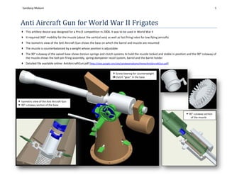
This artillery device was designed for a Pro|E competition in 2006. It was to be used in World War II
It required 360° mobility for the muzzle (about the vertical axis) as well as fast firing rates for low flying aircrafts
The isometric view of the Anti Aircraft Gun shows the base on which the barrel and muzzle are mounted
The muzzle is counterbalanced by a weight whose position is adjustable
The 90° cutaway of the swivel base shows torsion springs and clutch systems to hold the muzzle locked and stable in position and the 90° cutaway of
the muzzle shows the bolt-pin firing assembly, spring-dampener recoil system, barrel and the barrel holder
Detailed file available online: AntiAircraftGun.pdf (http://sites.google.com/site/sandeepmakams/Home/AntiAircraftGun.pdf)
Screw bearing for counterweight
Clutch “gear” in the base
Isometric view of the Anti Aircraft Gun
90° cutaway section of the base
90° cutaway section
of the muzzle
2. Futuristic Computer & Tower
Sandeep Makam 2
This set of computer hardware was designed in Pro|E for a competition in 2006. It was required that the computer and its peripherals looked
futuristic
The emphasis was on aesthetics, ergonomics and visual appeal
The ease in manufacturing and assembly of this device was another important factor considered in this modular, compact design
Detailed file available online: Computer.pdf (http://sites.google.com/site/sandeepmakams/Home/Computer.pdf)
Computer tower, monitor and wireless peripherals
Fan on computer tower Wireless speaker
Wireless stackable keyboard
3. DUIBot – Real Time Library Cataloguing Robot
Sandeep Makam 3
The objective was to design a system which can update the library book list in real time so that the precise location of the book at that moment is
known by keying in the Call number of the book. This was part of a course in 2007
A complete consumer survey and market survey was completed and analyzed for the customer needs & setting design targets
Number of ideas were generated for each of the design requirements and then we chose the best combination of them all using a Design Decision
Matrix by assigning weights to different needs and the corresponding feature addressing it
The algorithms for reading the optical bar codes were developed and implemented in MATLAB® and the control system was implemented using PIC
16F84A microcontrollers
Detailed file available online: DUIBotDocumentation.pdf (http://sites.google.com/site/sandeepmakams/Home/DUIBotDocumentation.pdf)
Close-up view of the scanner system
mounted on the horizontal rack
Isometric view of the horizontal &
vertical rack systems (lead screw)
for maneuvering the scanner pod
4. DUIBot – Real Time Library Cataloguing Robot
Sandeep Makam 4
Design Decision Matrix for the various designs that we generated:
5. DUIBot – Real Time Library Cataloguing Robot
Sandeep Makam 5
FAST Analysis for the DUIBot:
6. DUIBot – Real Time Library Cataloguing Robot
Sandeep Makam 6
Product Architecture of the DUIBot:
7. Linear Geneva Cam
Sandeep Makam 7
This kinematic mechanism was designed for a course project in 2006. The 3D model of the mechanism was done on Pro|E
The kinematics of the mechanism for the required speed and size were calculated and simulated on Working Model 2D (a proprietary software for
simulating kinematic linkages and cams). A video of the simulation was generated
The mechanism translates continuous rotational motion to intermittent translational motion. The pin on the rotating cam reaches into a slot on the
driven bar and advances it by twice the radius of rotation of the pin
Detailed file available online: LinearGenevaCam.avi (http://sites.google.com/site/sandeepmakams/Home/LinearGenevaCam.avi)
Isometric view of the Linear Geneva
Cam mechanism showing the pin on
the cam, the handle to rotate it and
the slots on the slider
Representative screen shots from the
video of the simulation, showing the
working of the mechanism
Final foam & straw model of the
mechanism
8. Gearbox for 4:1 Reduction
Sandeep Makam 8
A gearbox with a 4:1 reduction ratio for a 1kW power usage was designed for a course project in 2007. Designed life span was for 10 years. A design
constraint was that only 5 pieces of this gearbox were required
The gearbox was modeled in Pro|E and the calculations were done in MATLABs
DFM and DFA (part handling and part assembly) analysis were completed for the gearbox
The emphasis was on selection of materials, choice of manufacturing methods and the assembly considerations
Detailed file available online: Gearbox.pdf (http://sites.google.com/site/sandeepmakams/Home/Gearbox.pdf)
Isometric view of the Gearbox showing the two-piece housing which requires
only two fasteners
Side view of the Gearbox showing the bearings, oil sump and oil level indicator
9. Stove for Military Purposes
Sandeep Makam 9
This was done for a course project (ME 682 – Fundamentals of Product Design, Prof. Blaine Lilly) in 2009
An existing alcohol camping stove was the starting point in our design. We (team of 3) thought of potential alternate uses for the stove and
worked on making it useful for military personnel
It was designed to be small, robust and light-weight; possibly collapsible
It was required to function at varying altitudes and remain undetected; hence required oxygen-fuel ratio adjustment
We came up with 5 alternative designs, evaluated them using a weighted decision matrix and finally manufactured the best among them
Functional prototype of the final design: Fuel storage compartment, Oxygen-Fuel
ratio adjustment, storage of matches, striker, LED torch
The fuel storage and match-stick compartment along with the LED torch
The fuel burning compartment
Fuel – Oxygen ratio controller which slides up and down and covers the holes in
the fuel burning compartment
10. Stove for Military Purposes
Sandeep Makam 10
Comparison of the various designs
11. Wine-o-Drying Tower
Sandeep Makam 11
This was done for a course project (ME 682 – Fundamentals of Product Design, Prof. Blaine Lilly) in 2009
The objective was to pick out a profession, conduct informational interviews, figure out bottlenecks or problem areas and address them
My team (of 3) chose the Bartending profession. We interviewed 2 bartenders to figure out potential product design opportunities
We worked on a glass management system which dried & circulated glass, prevented dripping, compact, modular, aesthetic & time saving. It could
be used with multiple types of glasses as well.
It worked as a diffused light source too
The product could be used in multiple ways: Hung from the ceiling, On the table and stacked as a tower
The tower with wine glasses in them, being dried. Due to the
sector-shaped groves at the top, the tower can hold glasses
of any size and shape – cocktail glasses, champagne glasses,
highball glasses etc.
The tower can be hung from the ceiling for overhead access,
or kept at the center of a restaurant table or stacked up on
a bar – three tiered, the lowest at the waist level
12. System Evaluation
iPhone
Sandeep Makam
Apple Inc.’s iPhone has been well appreciated for its user
interface. This report however, finds the problems in the
interface from a Human Factors engineering and usability
perspective. The problems are critiqued and better design
solutions are proposed.
Sandeep Makam
makam.3@osu.edu
614-556-1770
10/23/2009
13. 1 System Evaluation - iPhone
ISE 770 - System Evaluation – iPhone
The iPhone, released in 2007 is an internet and multimedia
2007,
enabled smartphone designed and marketed by Apple Inc. Its
minimal hardware interface lacks a physical keyboard, and so,
the multi-touch screen renders a virtual keyboard when necessary.
The iPhone features a camera, a portable media player and an
internet client along with the basic phone functionalities of placing
and receiving calls and messages.
Ever since it was released, the iPhone has received rave reviews about its ground breaking user
interface. I agree that the UI is leaps ahead of the competition but as a Cognitive Human Factors
competition
student, I can still spot quite a few issues with the design. I have elucidated my ideas in the
following pages with pictures and diagrams.
Home Screen: With more than 21 million iPhones sold, the App Store has seen more than 2
billion downloads. That averages to about 100 apps per iPhone. The iPhone home screen can
show up to 16 apps in one page. Assuming a retention rate of even 75% (i.e. you delete one in
four apps), users will have at least 5 pages to scroll through to launch the required app. The lack
of Organizational grouping violates Wicken’s 8th law of display designs of minimizing
information access cost. Since the primary visual area is limited, if the iPhone allowed users to
group apps which were related in function or type, hierarchically such as a drill down menu, it
would help observe the proximity compatibility principle. Also, if the apps are not constrained to
proximity-compatibility
have a logo of the same shape (squares with rounded corners), different designs for the logo
shape
shape would help discover and differentiate the required apps sooner because of higher visibility.
differentiate
Easier to notice
an app with a
triangular logo
14. 2 System Evaluation - iPhone
Typing: Since the iPhone was the first ‘major’ touch screen phone, a vast majority of the
iPhone users were using a phone with keypad (either a normal layout or a qwerty layout) before
switching. Apple suggests a one-week learning curve to get up to speed, and that may hold true.
However, the most important time in the product's life, from the point of view of Apple, is the
ten or 15 minutes a potential customer spends in the store playing with the product. This poses a
problem because when users type, they end up typing gibberish as they do not know/realize
when a key has been pressed. The keys being too small and close to each other in the “portrait
version” of the keyboard only increases the typing time according to Fitt’s law.
An auditory or tactile feedback would provide the user with instant knowledge that the key has
been ‘pressed’. The iPhone’s inbuilt vibrator has 12 levels of vibration that can be taken
advantage of to provide the required proprioceptive feedback.
Hovering: An inherent problem with all touch screens is that the finger, by definition, must
obscure the object being touched (unless one has a giant screen with giant buttons). Apple has
actually come up with a clever way to display the button pressed while typing: As the user
presses down on the "I" key, for example, a bigger image of the "I" key in a dialog balloon, as in
a comic, appears just above the finger. If users are hovering over the wrong key, they can slide
their finger left or right while still maintaining contact until the desired key appears.
It's standard computer logic to thus use the release
event, rather than the touch event, to trigger the final
action. The problem is, it is not standard human logic.
Many customers will assume that, once they touch, it is
over, that the balloon is only appearing to announce
errors, rather than prevent them.
The iPhone could make good use of a two-level touch-
sensing system. That would allow the user to make
gentle contact with the keyboard to cause the dialog
balloons to appear, then press harder as they confirm
that the correct letter is displayed. This method would be more discoverable than having to figure
out that, to the machine, key presses are actually key releases and would also reduce the existing
Gulf of Execution.
15. 3 System Evaluation - iPhone
Keyboard Layout: While on the topic of typing and keyboards, a mention of the placement of
different keys is required. Apple did a decent job of virtually building a standard QWERTY
keyboard on the screen. However, in doing so, they have placed
the ‘Backspace’ and ‘Return’ keys beside each other. This
would lead to numerous ‘mistypes’ and errors. Such action
items which cause substantial actions must be clearly spaced
out from the data entry items to provide lesser room for error.
URL Bar: The placement of the ‘Cancel’ button as well as the ‘Erase’ button near the URL bar
is again a placement issue. The two buttons perform different actions but are confusingly placed
next to each other. This creates a Gulf of Evaluation. Not only that, but the is pretty
confusing in terms of function. Users of a desktop web browser could associate it with the “Go”
button on many older browsers because of the similarity in location.
Others could possibly confuse it to mean ‘Stop loading the page’. However, the function of the
button in reality is to clear the text field. This design is pictorial realism gone bad. It violates
Wicken’s 13th Principle of Consistency (in function wrt desktop
browsers). The button is not meaningful, cannot be discriminated
(wrt function) easily from the neighboring ‘Cancel’ button and its
location is very inappropriate. Instead of a circle with a cross within, a better symbol there would
be that of the ‘Backspace’ button seen on the keyboard.
Browser Search function: The ‘lens’ symbol at the top left of the URL bar is again a case of
bad pictorial realism. The symbol is a population stereotype for the zooming function because it
is a magnifying glass. It could also be associated, but with lesser probability, with the search
function – like the typical Sherlock Holmes picture that one would see. Since zooming into a
web page is one of the most common tasks to do once a page has loaded, (even though the well
advertised ‘pinching’ feature may exist), a separate zoom in/out button may be required with a
more precise symbol. Moreover, the location of the button
is confusing. In all desktop applications and websites, the
search feature is located in the top right corner and not the
top left.
16. 4 System Evaluation - iPhone
iPhone headset button: The iPhone headset does not provide any affordances that a button
exists to control the actions of the phone. The black hole indicates a microphone but there is no
other visual indication – a change in shape/color/texture to indicate a different zone to imply a
button. Unless the user reads the manual, he wouldn’t know of the existence of the button i.e.
there is no knowledge in the world to make the user aware of the button.
Google Maps on iPhone: Though this is a separate application, I am speaking of this here
because it is a standard and very popular application. Users who have used the web browser
version of the Google Maps would be lost when trying to use the iPhone app for the first few
times because of the apparent lack of controls/buttons. The controls are well hidden in a ‘page’
behind the maps so as to provide maximum real estate for the actual map itself. Though this
design is in good intention, I find that it is hard to find this hidden page because this is the only
app with such a behavior. To make the hidden page more apparent, the designers could have
instead made the whole page look ‘flippable’ instead of just a button which shows a ‘flippable
page’. This kind of a design is done in Google Chrome, the web browser where the hidden page
leads the user to a list of themes that can be installed.
17. 5 System Evaluation - iPhone
Global Buttons: The iPhone being a touch screen phone, by definition, you need to touch the
screen for any action. However, by taking this definition to extremes definitely affects the
usability. There is only one global action button.
Now, to perform even the most basic function of receiving a call,
the user, irrespective of what he is currently doing, has to touch a
specific portion of the screen to answer. At many times, if the
user is performing tasks where his attention cannot be diverted
for long, where even milliseconds would make a difference, such
as driving – that extra time required for locating and pressing the
‘Answer’ button on the screen is precious. Moreover, the user
cannot not look at the screen to do it, even if he is an experienced
user, because there is no feedback once the ‘Answer’ button has
been pressed. Since the phone is already either producing a
sound (ring tone) or vibrating or both to indicate that there is an
incoming call, the iPhone has no real way of providing feedback
to the user that the call has been answered. This alone, I think, is a sufficient argument for
adding at least 2 more global buttons – one each for answering and ending a phone call.
In conclusion, the iPhone user interface though among the best designed ones, still has scope for
improvement. The lack of a proprioceptive feedback for user actions is the most damaging point
against iPhone. If this sort of a feedback is provided and the UI maintains consistency across
apps, it would most certainly be the best smart phone in the world.
References:
1. Donald Norman, “The Design of Everyday Things”
2. Christopher Wickens et.al., “An Introduction to Human Factors Engineering”
3. Bill Westerman, Create with Context, “How people really use the iPhone”,
4. Jasper Van Kuijk, http://www.uselog.com
5. Bruce Tognazzini, http://www.asktog.com