
Empfohlen
Weitere ähnliche Inhalte
Was ist angesagt?
Was ist angesagt? (18)
Andere mochten auch
Andere mochten auch (20)
Ähnlich wie Media 6
Ähnlich wie Media 6 (20)
Mehr von rebecca-paterson
Mehr von rebecca-paterson (20)
Kürzlich hochgeladen
Kürzlich hochgeladen (20)
Media 6
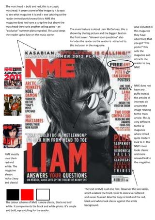
- 1. The mast head is bold and red, this is a classic masthead. It covers some of the image so it is easy to see what magazine it is and is eye catching so the reader immediately knows this is NME the magazine does not have a strap line but above the mast head they have another selling point – an Also included in The main feature is about Liam McCartney, this is “exclusive” summer plans revealed. This also keeps this magazine shown by the big picture and the biggest text on the reader up to date on the music scene. they have the front cover. “Answer your questions” also advertised that includes the reader so the reader is attracted to you get “free this inclusion in the magazine. poster” this sells the magazine and attracts the reader to buy NME NME does not have any puffs instead the articles of interests sit around the image relating to the main article. This is very different to the Q magazine where it had quite modern look to it. The NME cover looks classic NME mostly and more uses black relaxed feel to red and the magazine. white. The magazine always looks classy and classic! The text in NME is all one font. However the size varies, which enables the front cover to look less cluttered and easier to read. Also the copy is bold and the red, The colour scheme of NME is more classic, black red and black and white look classic against the white white. It complements the black and white photo. It’s simple background. and bold, eye catching for the reader.