
Empfohlen
Empfohlen
Weitere ähnliche Inhalte
Ähnlich wie Presentation Literacy: Skills for Effective Communication
Ähnlich wie Presentation Literacy: Skills for Effective Communication (20)
Mehr von oiisdp2010
Mehr von oiisdp2010 (13)
Kürzlich hochgeladen
Kürzlich hochgeladen (20)
Presentation Literacy: Skills for Effective Communication
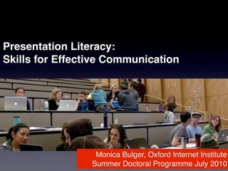
- 1. Presentation Literacy: Skills for Effective Communication Monica Bulger, Oxford Internet Institute Summer Doctoral Programme July 2010
- 2. Presentations are not about perfection, theyʼre about communication
- 3. “ This is not the time to be perfect. Be brave.” -- Vicki Nash
- 4. Be interesting, compelling, provocative
- 6. why are we here?
- 7. what do you hope to gain from listening to the presentations over the next two weeks?
- 8. what do you hope to gain from presenting?
- 9. advocate clarify test confirm challenge question experiment practice Purpose
- 10. persuade inform advocate clarify test confirm Purpose challenge question experiment practice
- 11. BIG idea
- 12. if you only had one sentence to say the main idea of your research, what is it?
- 13. understand your topic yet?
- 14. next, find your message
- 16. What surprised you in your discussions?
- 17. Get to know your audience
- 18. why are they here? what are they passionate about? what do they hope to gain? adapted from Duarte’s slide:ology
- 19. how can you address their needs?
- 20. clearly explain your purpose/rationale define your scope provide context use vivid examples and, most importantly...
- 21. the toughest challenge of interdisciplinary dialogue...
- 22. address the so what? of your research
- 23. how?
- 24. Consider your role in information delivery: what unique expertise and experience do you contribute? adapted from Duarte’s slide:ology
- 25. what is your purpose for communicating information? adapted from Duarte’s slide:ology
- 26. Identify desired outcomes adapted from Duarte’s slide:ology
- 27. before they leave the room... what do you want your audience to know?
- 29. talking at vs. talking to
- 31. move audience from point A to point B
- 32. not a dump of what you know, but why itʼs important
- 33. so what?
- 34. find the story in your data
- 35. think visually
- 36. Sample student data visualizations --images from “Pathway to Self-Funding,” “Cumulative Impacts of Large-Scale Renewable Energy Development in the West Mojave,” “Management Recommendations for Piute Ponds, EAB,” and “Post-Fire Sedimentation and Flood Risk Potential in the Mission Creek Watershed of Santa Barbara,” available at http://www.bren.ucsb.edu/research/gp2009.htm
- 37. Think differently: not what the data has to say, but what you have to say about the data
- 38. Acknowledgment: from this point on, the beautiful, well-designed slides were either created or co-designed by Aaron Sobel, my colleague at the Bren School of Environmental Science and Management
- 39. Think visually --image from visualcomplexity.com
- 40. What is your data story? --image from Design & the Elastic Mind exhibition, “The Million Dollar Blocks Project” available at http://www.moma.org
- 41. “Data slides arenʼt really about data. They are about the meaning of data.” --Duarte (2008)
- 42. Barack Obama Personal Visits by State Jan 2007 - Feb 2008 --Image created by graduate students in UCSBʼs Geography Department using data from IGERT “Issue Browser” project (2009)
- 43. 3-D allows for visualizing complex data -- Time Magazine http://www.time.com/time/covers/20061030/where_we_live/
- 44. Visualizing the distance to the nearest McDonaldʼs --Image from infosthetics, available at http://www.infosthetics.com
- 45. turn your attention --->
- 46. What does the pie chart tell us? What information is important? --Adlerman, D., Maciejowski, N., Randall, J., Shirley, R. (2009). Management Recommendations for Piute Ponds Edwards Air Force Base, California (Project Poster). Bren School of Environmental Science and Management, University of California, Santa Barbara. Available at http://www.bren.ucsb.edu/research/ gp2009.htm
- 48. Draw the viewerʼs attention
- 49. Focus on key points -- image from Duarteʼs (2008) slide:ology, p. 69
- 51. Find the best fit for representing your data visually
- 52. Pie charts vs. bar graphs proportion comparison -- image from Dutton, W.J. & Helsper, E.J. (2007). Oxford Internet Survey 2007 Report: The Internet in Britain. Oxford Internet Institute, UK.
- 53. tips for slide design
- 54. Purpose of the Methodology • Tracking key environmental issues across their product supply chains. • Provide Patagonia decision-makers with a condensed metric that indicates impact of product water use through a rigorous, repeatable, and transparent process. • Product water footprints are influenced by the production methods, production locations and water productivities of the supply chain.
- 55. Tracking key environmental issues across their product supply chains. PROJECT PURPOSE OF THE METHODOLOGY DATE CLIENT MAY 19, 2009 PATAGONIA
- 56. Tracking key environmental issues across their product supply chains. Product water footprints are influenced by the production methods, production locations and water productivities of the supply chain. PROJECT PURPOSE OF THE METHODOLOGY DATE CLIENT MAY 19, 2009 PATAGONIA
- 57. Tracking key environmental issues across their product Provide Patagonia decision-makers with a supply chains. condensed metric that indicates impact of product water use through a rigorous, repeatable, and transparent process. Product water footprints are influenced by the production methods, production locations and water productivities of the supply chain. PROJECT PURPOSE OF THE METHODOLOGY DATE CLIENT MAY 19, 2009 PATAGONIA
- 59. Know your presentation constraints and equipment
- 60. Know your presentation constraints and equipment Avoid cheesy clipart
- 62. CONTRAST
- 64. YELLOW BLUE
- 65. COLOR WHEEL Complementary Colors Analogous Colors
- 67. Draw the viewer’s -- Presentation Zen http://www.presentationzen.com
- 68. Draw the viewer’s attention -- Presentation Zen http://www.presentationzen.com
- 69. -- Presentation Zen http://www.presentationzen.com
- 70. -- Presentation Zen http://www.presentationzen.com
- 71. -- Presentation Zen http://www.presentationzen.com
- 72. why is this better? -- Presentation Zen http://www.presentationzen.com
- 73. Split complex ideas across slides
- 74. Images are absorbed easier than text -- Architecture 2030: http://www.architecture2030.org
- 75. Forms of Energy Types: • Energy of motion (translation, rotation, vibration, oscillation) • Energy of position (in force fields) 1 Mechanical Energy: a) Gravitational potential energy b) Kinetic energy 2 Internal Energy (Heat) 3 Electromagnetic Energy: a) Electricity b) Electromagnetic radiation 4 Chemical potential energy (molecular bonds) 5 Nuclear potential energy (nuclear bonds) Energy, Technology & the Environment – Winter 2010 – Session 1
- 76. -- Architecture 2030: http://www.architecture2030.org
- 77. -- Yes! A Journal of Positive Future, Summer 2006, p. 39
- 78. The Forms of Energy mechanical energy internal energy electromagnetic energy chemical potential energy nuclear potential energy
- 80. Use Your Photos
- 81. Use Your Photos Consider a Theme (think simple™)
- 83. OPACITY
- 84. OPACITY
- 87. Sketch Your Presentation Spell Check
- 88. Sketch Your Presentation Spell Check Print a copy with notes
- 89. TED Commandments Rehearse, but act spontaneous Provide revelations Show vulnerability Donʼt be tedious Change the world Donʼt use bullet points
- 90. have a plan for what to do if youʼre nervous or forget
- 91. sustaining attention: the importance of spare words & blank screens
- 92. STAR moment
- 93. what is the purpose of a Q&A?
- 94. words to remember: -- thank you -- I donʼt know
- 96. additional tips: ask a colleague to take notes of questions asked during Q & A
Hinweis der Redaktion
- beyond a line item on your CV, take a moment to write down what you hope to gain from listening to the presentations over the next two weeks
- take a moment to write down what you hope to gain from listening to the presentations over the next two weeks
- jot down a few goals you have for your presentation. feel free to borrow from this list or create your own.
- people like Steve Jobs believe your main idea should fit on a napkin, others, a post-it
- please take the next 3-5 minutes to brainstorm your main idea. can you distill it into a single sentence?
- turn to someone next to you and share what you think your big idea is. be prepared for them not to understand. spend a few minutes discussing your ideas and pay attention to the questions they ask.
- take a few moments to jot down ideas.
- who is your primary audience? what do you share in common, how are they different from you?
- why does it matter? why should it matter? the toughest part of interdisciplinary dialogue
- what do they wear? where do they live? where do they shop? how much do you really know about your audience? (more than you think) Really, what is a day like for them? What drives them? What are they passionate about -- is it the topic of your letter/report/presentation? Should be.
- returning to the list from earlier, what idea, action, question, do you hope your audience will walk away with?
- When we create visuals that are intended to be read, offering the viewer enough contrast between the background (paper or screen) and the text is important. Text presentations ideally offer at least an 80% contrast between figure and ground. (Black text on a white background is ideal.) If there is not enough contrast between figure and ground, a viewer will squint to view the text, causing eye fatigue.
- When we create visuals that are intended to be read, offering the viewer enough contrast between the background (paper or screen) and the text is important. Text presentations ideally offer at least an 80% contrast between figure and ground. (Black text on a white background is ideal.) If there is not enough contrast between figure and ground, a viewer will squint to view the text, causing eye fatigue.
- Yellow text on a white background or blue text on a black background, are difficult to read due to the low level of contrast between figure and ground.
- Yellow text on a white background or blue text on a black background, are difficult to read due to the low level of contrast between figure and ground.
- When choosing complementary colors, fully saturated colors will offer the highest level of contrast.
- 3 last tips
- 3 last tips
- 3 last tips
- 3 last tips
- 3 last tips
- acknowledge the contribution of question, plan ahead: what questions may be asked and try to address them in your presentation.