
Recommended
Recommended
More Related Content
Recently uploaded
Recently uploaded (20)
Featured
Featured (20)
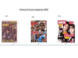
History of the music magazine NME
- 1. History of music magazines NME
- 2. In 1990 NME went with the colour scheme of red, white and yellow which are colours that stand out, but they have used very small font clustered at the top of the page making it hard for readers to see from a distance and therefore have to go up to the magazine, but if they see the artists as the main image on the front of the cover then they have no reason to go up to the magazine and read the featured artists in the magazine just because they’re unable to see the names from far away. The main image is of the band REM and their facial expressions and body language are serious which is typical of this genre. In comparison with MME copies produced since 2005 there is limited editing and photographic skill.
- 3. The colour scheme for the 2005 issue of MNE red, white, blue and orange which are neutral colour’s for both genders, the colour red is also part of the signature look for MNE and features on every colour. The main image for the cover is Oasis, and they were very popular in 2005, the camera angle they have chosen to use is a close up shot which is a typical convention for a rock magazine. In regards to their facial expressions they look serious and “cool” with an air of arrogance this again suits the genre. There id another image which is a live action shot of a gig, this would appeal to the audience. There is also a circular sticker used to make a feature stand out.
- 4. The main colour scheme for the 2014 MNE cover is red, yellow and white. The signature color red is used in this magazine again like in the magazines before. The main image is of the band The Strokes which is a popular band in the USA. The main image is a close up and both men are looking into the camera, to make eye contact with the potential buyers. They’re making silly faces to make them not look like serious people and makes it look like they have fun. They have used slang on the front cover “gotcha!”, this appeals to the older teenagers in their target audience range by using slang because most teens use slang, so it feels like the people have a connection with the magazine. They have got their typical codes and conventions, the barcode in the left hand corner and the issue date in the right hand corner next to the logo.