SlideShare ist ein Scribd-Unternehmen logo
1 von 3
Downloaden Sie, um offline zu lesen
The weightwatchers logo is places on the         The colour scheme is very simple and plain, it is
top left hand side of the screen. The            very similar to Jamie Oliver colours scheme of
colours are plain and simple and easy to         blue pink and grey. The grey links and
remember as it is predominantly blue with        navigation bar make it look neat and easy to
a little bit of green. The logo is simply the    use, however the use of colour on the image
website name, which works well as it             and other links creates a more interesting look,
means people do not forget the website           and brightens up the page. They have also used
and can access it with ease. Although it is      blue and pink which could be because they
quite small the use of bold font and capital     wanted men to feel like they could try this diet
W’s works well to create a more effective        aswell as pink and blue usually connote
logo.                                            genders.


                                                   The image on the website straight away
   The layout is very basic and has some
                                                   shows the companies target audience. It is
   conventional parts and other non
                                                   clearly a predominantly women based
   conventional parts. The logo is on the top
                                                   website as it is for dieting and with a target
   left hand side with the navigation bar
                                                   age of twenties and above. This is shown
   underneath, which is typical of a website
                                                   with the three women in the image. The
   as people expect this and therefore find it
                                                   image itself is also very persuasive with the
   easy to use. However, there is only one
                                                   use of lighting on the girls and also how
   column underneath the navigation bar on
                                                   they look once they’ve had their make up
   the right hand side and then a large image
                                                   done, therefore making this almost like a
   in the left and centre of the page. This
                                                   piece of advertising. They have also been
   makes the website very visual and helpful
                                                   clever in choosing what the girls are
   for the also makes the links stand out so
                                                   wearing as they fit in with the colour
   that people can access wherever they need
                                                   scheme of the website, making the image
   to go on the website with ease.
                                                   look more effective.
The NHS logo is on the top left hand side of
                                                 The colour scheme of this webpage consist of blue
the screen as most other websites. The           green and some orange. The three together I feel look
logo, although not very interesting, is very     quite messy, particularly as there is alot going on, on
well known because of the two colours and        the page. The green stands out the most as it is clearly
the thick font. The simplicity of this logo is   the main colour scheme for this page. In some ways
what make people recognise it at first           this helps the viewer of the website understand what is
glance, making this an effective logo in a       meant for this webpage and what are links. Most things
sense.                                           that are important on this page are highlighted in green
                                                 making it slightly more helpful.


The images on this webpage make the                        The layout of this website is very
overall look too busy I think. The main                    conventional, it follows the conventions of
image in the centre of the page is at a                    the row at the top and then three columns
crooked angle which straight away makes                    underneath. This in a sense makes the
the page look busy. However, they have                     website more simplistic as viewers expect
stuck to the colour scheme in the image,                   this when they look at a website, which
which means that the image isn’t too                       makes it easier for the viewer to use.
much. On the other hand, the image of the                  However, because they have used so much
sunflower on the right hand side, is too                   on the page it still looks very busy and
much and too bright for the page, it is also               therefore takes away from the simplistic
very distracting because of this.                          side of the website.
The British Heart Foundation’s logo is at              Although the logo has a colour scheme and red
the top left hand side of the screen. It is a
          v                                            and white are often used throughout the
well known logo for the red and white, and             website, there isn’t actually a strict colour
the white creation a heart on the black.               scheme. There are a variety of colours used on
Although this is a simple logo, it is also             the links and around the website. This is perhaps
quite an effective on and also very                    to break up the severity of the red and white
impacting on the audience because of                   significance in the website so that people can
what it represents.                                    look at it for research or find things out without
                                                       the cause of more stress.


 The layout of this main page is quite                       There is little text on the home page which means that
 unconventional in the sense that there are no               there is alot of space that needed to be filled. As you
 columns to be seen at all. Not only this but the            can see they have decided to use an image of Vinnie
 navigation bar is on the same level as the logo and         Jones as the main base of the hompage. Because the
 donate button. This keeps the viewers eyeline at            image is so big it has quite an impact on the page and
 the logo making sure that they keep their interest.         therefore on the reader. The use of the image makes
 Underneath is one large image that again is in a            the viewers want to read the text next to it more to
 row format, this making the website very eye                understand the image more, and then once reading
 catching and unique as most websites have a lot of          the words, you can see the real impact that the image
 text to look at, whereas this website you have to           is meant to have on the audience. This making it a
 look for the text to read it.                               great attraction as it captures the viewers full
                                                             attention straight away.

Weitere ähnliche Inhalte

Mehr von laurensj12

Preliminary logo
Preliminary logoPreliminary logo
Preliminary logolaurensj12
 
Website designs preliminary
Website designs preliminaryWebsite designs preliminary
Website designs preliminarylaurensj12
 
School website analyisis
School website analyisisSchool website analyisis
School website analyisislaurensj12
 
Advertisements
AdvertisementsAdvertisements
Advertisementslaurensj12
 
Media final evaluation
Media final evaluationMedia final evaluation
Media final evaluationlaurensj12
 
Media evaluation first draft
Media evaluation first draftMedia evaluation first draft
Media evaluation first draftlaurensj12
 
Photoshop images
Photoshop imagesPhotoshop images
Photoshop imageslaurensj12
 
Website in progress
Website in progress Website in progress
Website in progress laurensj12
 
Rough video plan
Rough video planRough video plan
Rough video planlaurensj12
 
Film posters analysis
Film posters analysisFilm posters analysis
Film posters analysislaurensj12
 
Film posters analysis
Film posters analysisFilm posters analysis
Film posters analysislaurensj12
 
Analysing six stills from the film Bon Voyage
Analysing six stills from the film Bon VoyageAnalysing six stills from the film Bon Voyage
Analysing six stills from the film Bon Voyagelaurensj12
 

Mehr von laurensj12 (20)

Edited images
Edited imagesEdited images
Edited images
 
Shotlist
ShotlistShotlist
Shotlist
 
Preliminary logo
Preliminary logoPreliminary logo
Preliminary logo
 
Website designs preliminary
Website designs preliminaryWebsite designs preliminary
Website designs preliminary
 
Design brief
Design briefDesign brief
Design brief
 
School website analyisis
School website analyisisSchool website analyisis
School website analyisis
 
Advertisements
AdvertisementsAdvertisements
Advertisements
 
Images
ImagesImages
Images
 
Pictures
PicturesPictures
Pictures
 
Media final evaluation
Media final evaluationMedia final evaluation
Media final evaluation
 
Media evaluation first draft
Media evaluation first draftMedia evaluation first draft
Media evaluation first draft
 
Photoshop images
Photoshop imagesPhotoshop images
Photoshop images
 
Logo
LogoLogo
Logo
 
Website in progress
Website in progress Website in progress
Website in progress
 
Rough video plan
Rough video planRough video plan
Rough video plan
 
Web icons
Web iconsWeb icons
Web icons
 
Film posters analysis
Film posters analysisFilm posters analysis
Film posters analysis
 
Film posters analysis
Film posters analysisFilm posters analysis
Film posters analysis
 
Analysing six stills from the film Bon Voyage
Analysing six stills from the film Bon VoyageAnalysing six stills from the film Bon Voyage
Analysing six stills from the film Bon Voyage
 
Film script
Film scriptFilm script
Film script
 

Kürzlich hochgeladen

Strategize a Smooth Tenant-to-tenant Migration and Copilot Takeoff
Strategize a Smooth Tenant-to-tenant Migration and Copilot TakeoffStrategize a Smooth Tenant-to-tenant Migration and Copilot Takeoff
Strategize a Smooth Tenant-to-tenant Migration and Copilot Takeoffsammart93
 
TrustArc Webinar - Unlock the Power of AI-Driven Data Discovery
TrustArc Webinar - Unlock the Power of AI-Driven Data DiscoveryTrustArc Webinar - Unlock the Power of AI-Driven Data Discovery
TrustArc Webinar - Unlock the Power of AI-Driven Data DiscoveryTrustArc
 
[BuildWithAI] Introduction to Gemini.pdf
[BuildWithAI] Introduction to Gemini.pdf[BuildWithAI] Introduction to Gemini.pdf
[BuildWithAI] Introduction to Gemini.pdfSandro Moreira
 
Apidays New York 2024 - APIs in 2030: The Risk of Technological Sleepwalk by ...
Apidays New York 2024 - APIs in 2030: The Risk of Technological Sleepwalk by ...Apidays New York 2024 - APIs in 2030: The Risk of Technological Sleepwalk by ...
Apidays New York 2024 - APIs in 2030: The Risk of Technological Sleepwalk by ...apidays
 
Apidays New York 2024 - Scaling API-first by Ian Reasor and Radu Cotescu, Adobe
Apidays New York 2024 - Scaling API-first by Ian Reasor and Radu Cotescu, AdobeApidays New York 2024 - Scaling API-first by Ian Reasor and Radu Cotescu, Adobe
Apidays New York 2024 - Scaling API-first by Ian Reasor and Radu Cotescu, Adobeapidays
 
Cloud Frontiers: A Deep Dive into Serverless Spatial Data and FME
Cloud Frontiers:  A Deep Dive into Serverless Spatial Data and FMECloud Frontiers:  A Deep Dive into Serverless Spatial Data and FME
Cloud Frontiers: A Deep Dive into Serverless Spatial Data and FMESafe Software
 
Six Myths about Ontologies: The Basics of Formal Ontology
Six Myths about Ontologies: The Basics of Formal OntologySix Myths about Ontologies: The Basics of Formal Ontology
Six Myths about Ontologies: The Basics of Formal Ontologyjohnbeverley2021
 
Artificial Intelligence Chap.5 : Uncertainty
Artificial Intelligence Chap.5 : UncertaintyArtificial Intelligence Chap.5 : Uncertainty
Artificial Intelligence Chap.5 : UncertaintyKhushali Kathiriya
 
Biography Of Angeliki Cooney | Senior Vice President Life Sciences | Albany, ...
Biography Of Angeliki Cooney | Senior Vice President Life Sciences | Albany, ...Biography Of Angeliki Cooney | Senior Vice President Life Sciences | Albany, ...
Biography Of Angeliki Cooney | Senior Vice President Life Sciences | Albany, ...Angeliki Cooney
 
Exploring Multimodal Embeddings with Milvus
Exploring Multimodal Embeddings with MilvusExploring Multimodal Embeddings with Milvus
Exploring Multimodal Embeddings with MilvusZilliz
 
Apidays New York 2024 - Accelerating FinTech Innovation by Vasa Krishnan, Fin...
Apidays New York 2024 - Accelerating FinTech Innovation by Vasa Krishnan, Fin...Apidays New York 2024 - Accelerating FinTech Innovation by Vasa Krishnan, Fin...
Apidays New York 2024 - Accelerating FinTech Innovation by Vasa Krishnan, Fin...apidays
 
CNIC Information System with Pakdata Cf In Pakistan
CNIC Information System with Pakdata Cf In PakistanCNIC Information System with Pakdata Cf In Pakistan
CNIC Information System with Pakdata Cf In Pakistandanishmna97
 
Corporate and higher education May webinar.pptx
Corporate and higher education May webinar.pptxCorporate and higher education May webinar.pptx
Corporate and higher education May webinar.pptxRustici Software
 
Boost Fertility New Invention Ups Success Rates.pdf
Boost Fertility New Invention Ups Success Rates.pdfBoost Fertility New Invention Ups Success Rates.pdf
Boost Fertility New Invention Ups Success Rates.pdfsudhanshuwaghmare1
 
Mcleodganj Call Girls 🥰 8617370543 Service Offer VIP Hot Model
Mcleodganj Call Girls 🥰 8617370543 Service Offer VIP Hot ModelMcleodganj Call Girls 🥰 8617370543 Service Offer VIP Hot Model
Mcleodganj Call Girls 🥰 8617370543 Service Offer VIP Hot ModelDeepika Singh
 
AWS Community Day CPH - Three problems of Terraform
AWS Community Day CPH - Three problems of TerraformAWS Community Day CPH - Three problems of Terraform
AWS Community Day CPH - Three problems of TerraformAndrey Devyatkin
 
DEV meet-up UiPath Document Understanding May 7 2024 Amsterdam
DEV meet-up UiPath Document Understanding May 7 2024 AmsterdamDEV meet-up UiPath Document Understanding May 7 2024 Amsterdam
DEV meet-up UiPath Document Understanding May 7 2024 AmsterdamUiPathCommunity
 
Repurposing LNG terminals for Hydrogen Ammonia: Feasibility and Cost Saving
Repurposing LNG terminals for Hydrogen Ammonia: Feasibility and Cost SavingRepurposing LNG terminals for Hydrogen Ammonia: Feasibility and Cost Saving
Repurposing LNG terminals for Hydrogen Ammonia: Feasibility and Cost SavingEdi Saputra
 
Cloud Frontiers: A Deep Dive into Serverless Spatial Data and FME
Cloud Frontiers:  A Deep Dive into Serverless Spatial Data and FMECloud Frontiers:  A Deep Dive into Serverless Spatial Data and FME
Cloud Frontiers: A Deep Dive into Serverless Spatial Data and FMESafe Software
 
ICT role in 21st century education and its challenges
ICT role in 21st century education and its challengesICT role in 21st century education and its challenges
ICT role in 21st century education and its challengesrafiqahmad00786416
 

Kürzlich hochgeladen (20)

Strategize a Smooth Tenant-to-tenant Migration and Copilot Takeoff
Strategize a Smooth Tenant-to-tenant Migration and Copilot TakeoffStrategize a Smooth Tenant-to-tenant Migration and Copilot Takeoff
Strategize a Smooth Tenant-to-tenant Migration and Copilot Takeoff
 
TrustArc Webinar - Unlock the Power of AI-Driven Data Discovery
TrustArc Webinar - Unlock the Power of AI-Driven Data DiscoveryTrustArc Webinar - Unlock the Power of AI-Driven Data Discovery
TrustArc Webinar - Unlock the Power of AI-Driven Data Discovery
 
[BuildWithAI] Introduction to Gemini.pdf
[BuildWithAI] Introduction to Gemini.pdf[BuildWithAI] Introduction to Gemini.pdf
[BuildWithAI] Introduction to Gemini.pdf
 
Apidays New York 2024 - APIs in 2030: The Risk of Technological Sleepwalk by ...
Apidays New York 2024 - APIs in 2030: The Risk of Technological Sleepwalk by ...Apidays New York 2024 - APIs in 2030: The Risk of Technological Sleepwalk by ...
Apidays New York 2024 - APIs in 2030: The Risk of Technological Sleepwalk by ...
 
Apidays New York 2024 - Scaling API-first by Ian Reasor and Radu Cotescu, Adobe
Apidays New York 2024 - Scaling API-first by Ian Reasor and Radu Cotescu, AdobeApidays New York 2024 - Scaling API-first by Ian Reasor and Radu Cotescu, Adobe
Apidays New York 2024 - Scaling API-first by Ian Reasor and Radu Cotescu, Adobe
 
Cloud Frontiers: A Deep Dive into Serverless Spatial Data and FME
Cloud Frontiers:  A Deep Dive into Serverless Spatial Data and FMECloud Frontiers:  A Deep Dive into Serverless Spatial Data and FME
Cloud Frontiers: A Deep Dive into Serverless Spatial Data and FME
 
Six Myths about Ontologies: The Basics of Formal Ontology
Six Myths about Ontologies: The Basics of Formal OntologySix Myths about Ontologies: The Basics of Formal Ontology
Six Myths about Ontologies: The Basics of Formal Ontology
 
Artificial Intelligence Chap.5 : Uncertainty
Artificial Intelligence Chap.5 : UncertaintyArtificial Intelligence Chap.5 : Uncertainty
Artificial Intelligence Chap.5 : Uncertainty
 
Biography Of Angeliki Cooney | Senior Vice President Life Sciences | Albany, ...
Biography Of Angeliki Cooney | Senior Vice President Life Sciences | Albany, ...Biography Of Angeliki Cooney | Senior Vice President Life Sciences | Albany, ...
Biography Of Angeliki Cooney | Senior Vice President Life Sciences | Albany, ...
 
Exploring Multimodal Embeddings with Milvus
Exploring Multimodal Embeddings with MilvusExploring Multimodal Embeddings with Milvus
Exploring Multimodal Embeddings with Milvus
 
Apidays New York 2024 - Accelerating FinTech Innovation by Vasa Krishnan, Fin...
Apidays New York 2024 - Accelerating FinTech Innovation by Vasa Krishnan, Fin...Apidays New York 2024 - Accelerating FinTech Innovation by Vasa Krishnan, Fin...
Apidays New York 2024 - Accelerating FinTech Innovation by Vasa Krishnan, Fin...
 
CNIC Information System with Pakdata Cf In Pakistan
CNIC Information System with Pakdata Cf In PakistanCNIC Information System with Pakdata Cf In Pakistan
CNIC Information System with Pakdata Cf In Pakistan
 
Corporate and higher education May webinar.pptx
Corporate and higher education May webinar.pptxCorporate and higher education May webinar.pptx
Corporate and higher education May webinar.pptx
 
Boost Fertility New Invention Ups Success Rates.pdf
Boost Fertility New Invention Ups Success Rates.pdfBoost Fertility New Invention Ups Success Rates.pdf
Boost Fertility New Invention Ups Success Rates.pdf
 
Mcleodganj Call Girls 🥰 8617370543 Service Offer VIP Hot Model
Mcleodganj Call Girls 🥰 8617370543 Service Offer VIP Hot ModelMcleodganj Call Girls 🥰 8617370543 Service Offer VIP Hot Model
Mcleodganj Call Girls 🥰 8617370543 Service Offer VIP Hot Model
 
AWS Community Day CPH - Three problems of Terraform
AWS Community Day CPH - Three problems of TerraformAWS Community Day CPH - Three problems of Terraform
AWS Community Day CPH - Three problems of Terraform
 
DEV meet-up UiPath Document Understanding May 7 2024 Amsterdam
DEV meet-up UiPath Document Understanding May 7 2024 AmsterdamDEV meet-up UiPath Document Understanding May 7 2024 Amsterdam
DEV meet-up UiPath Document Understanding May 7 2024 Amsterdam
 
Repurposing LNG terminals for Hydrogen Ammonia: Feasibility and Cost Saving
Repurposing LNG terminals for Hydrogen Ammonia: Feasibility and Cost SavingRepurposing LNG terminals for Hydrogen Ammonia: Feasibility and Cost Saving
Repurposing LNG terminals for Hydrogen Ammonia: Feasibility and Cost Saving
 
Cloud Frontiers: A Deep Dive into Serverless Spatial Data and FME
Cloud Frontiers:  A Deep Dive into Serverless Spatial Data and FMECloud Frontiers:  A Deep Dive into Serverless Spatial Data and FME
Cloud Frontiers: A Deep Dive into Serverless Spatial Data and FME
 
ICT role in 21st century education and its challenges
ICT role in 21st century education and its challengesICT role in 21st century education and its challenges
ICT role in 21st century education and its challenges
 

Website annotations 2

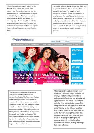
  • 1. The weightwatchers logo is places on the The colour scheme is very simple and plain, it is top left hand side of the screen. The very similar to Jamie Oliver colours scheme of colours are plain and simple and easy to blue pink and grey. The grey links and remember as it is predominantly blue with navigation bar make it look neat and easy to a little bit of green. The logo is simply the use, however the use of colour on the image website name, which works well as it and other links creates a more interesting look, means people do not forget the website and brightens up the page. They have also used and can access it with ease. Although it is blue and pink which could be because they quite small the use of bold font and capital wanted men to feel like they could try this diet W’s works well to create a more effective aswell as pink and blue usually connote logo. genders. The image on the website straight away The layout is very basic and has some shows the companies target audience. It is conventional parts and other non clearly a predominantly women based conventional parts. The logo is on the top website as it is for dieting and with a target left hand side with the navigation bar age of twenties and above. This is shown underneath, which is typical of a website with the three women in the image. The as people expect this and therefore find it image itself is also very persuasive with the easy to use. However, there is only one use of lighting on the girls and also how column underneath the navigation bar on they look once they’ve had their make up the right hand side and then a large image done, therefore making this almost like a in the left and centre of the page. This piece of advertising. They have also been makes the website very visual and helpful clever in choosing what the girls are for the also makes the links stand out so wearing as they fit in with the colour that people can access wherever they need scheme of the website, making the image to go on the website with ease. look more effective.
  • 2. The NHS logo is on the top left hand side of The colour scheme of this webpage consist of blue the screen as most other websites. The green and some orange. The three together I feel look logo, although not very interesting, is very quite messy, particularly as there is alot going on, on well known because of the two colours and the page. The green stands out the most as it is clearly the thick font. The simplicity of this logo is the main colour scheme for this page. In some ways what make people recognise it at first this helps the viewer of the website understand what is glance, making this an effective logo in a meant for this webpage and what are links. Most things sense. that are important on this page are highlighted in green making it slightly more helpful. The images on this webpage make the The layout of this website is very overall look too busy I think. The main conventional, it follows the conventions of image in the centre of the page is at a the row at the top and then three columns crooked angle which straight away makes underneath. This in a sense makes the the page look busy. However, they have website more simplistic as viewers expect stuck to the colour scheme in the image, this when they look at a website, which which means that the image isn’t too makes it easier for the viewer to use. much. On the other hand, the image of the However, because they have used so much sunflower on the right hand side, is too on the page it still looks very busy and much and too bright for the page, it is also therefore takes away from the simplistic very distracting because of this. side of the website.
  • 3. The British Heart Foundation’s logo is at Although the logo has a colour scheme and red the top left hand side of the screen. It is a v and white are often used throughout the well known logo for the red and white, and website, there isn’t actually a strict colour the white creation a heart on the black. scheme. There are a variety of colours used on Although this is a simple logo, it is also the links and around the website. This is perhaps quite an effective on and also very to break up the severity of the red and white impacting on the audience because of significance in the website so that people can what it represents. look at it for research or find things out without the cause of more stress. The layout of this main page is quite There is little text on the home page which means that unconventional in the sense that there are no there is alot of space that needed to be filled. As you columns to be seen at all. Not only this but the can see they have decided to use an image of Vinnie navigation bar is on the same level as the logo and Jones as the main base of the hompage. Because the donate button. This keeps the viewers eyeline at image is so big it has quite an impact on the page and the logo making sure that they keep their interest. therefore on the reader. The use of the image makes Underneath is one large image that again is in a the viewers want to read the text next to it more to row format, this making the website very eye understand the image more, and then once reading catching and unique as most websites have a lot of the words, you can see the real impact that the image text to look at, whereas this website you have to is meant to have on the audience. This making it a look for the text to read it. great attraction as it captures the viewers full attention straight away.