

Empfohlen
Weitere ähnliche Inhalte
Ähnlich wie Business Card - Client Interaction
Ähnlich wie Business Card - Client Interaction (20)
Mehr von Webmaster
Mehr von Webmaster (20)
Kürzlich hochgeladen
Kürzlich hochgeladen (20)
Business Card - Client Interaction
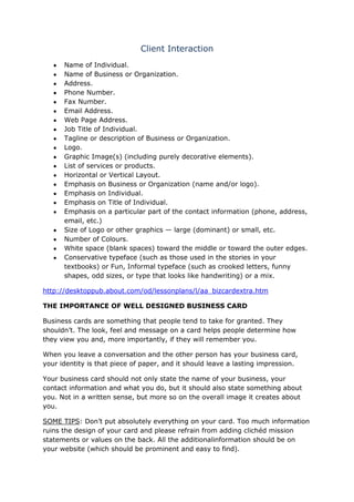
- 1. Client Interaction Name of Individual. Name of Business or Organization. Address. Phone Number. Fax Number. Email Address. Web Page Address. Job Title of Individual. Tagline or description of Business or Organization. Logo. Graphic Image(s) (including purely decorative elements). List of services or products. Horizontal or Vertical Layout. Emphasis on Business or Organization (name and/or logo). Emphasis on Individual. Emphasis on Title of Individual. Emphasis on a particular part of the contact information (phone, address, email, etc.) Size of Logo or other graphics — large (dominant) or small, etc. Number of Colours. White space (blank spaces) toward the middle or toward the outer edges. Conservative typeface (such as those used in the stories in your textbooks) or Fun, Informal typeface (such as crooked letters, funny shapes, odd sizes, or type that looks like handwriting) or a mix. http://desktoppub.about.com/od/lessonplans/l/aa_bizcardextra.htm THE IMPORTANCE OF WELL DESIGNED BUSINESS CARD Business cards are something that people tend to take for granted. They shouldn’t. The look, feel and message on a card helps people determine how they view you and, more importantly, if they will remember you. When you leave a conversation and the other person has your business card, your identity is that piece of paper, and it should leave a lasting impression. Your business card should not only state the name of your business, your contact information and what you do, but it should also state something about you. Not in a written sense, but more so on the overall image it creates about you. SOME TIPS: Don’t put absolutely everything on your card. Too much information ruins the design of your card and please refrain from adding clichéd mission statements or values on the back. All the additionalinformation should be on your website (which should be prominent and easy to find).
- 2. A good business card is one of the best marketing tools you’ll ever invest in, and should be considered as such an investment. http://www.askbizdex.com/ABD%20Business%20Card%20Design%20Checklist. pdf Questions to ask the Client: What is your budget for the business card? What design ideas have you in mind such as font, graphic shapes, images and colours for the business card? What is the target market or audience? What is the timeframe expected to complete the business card. How many cards do you want? Do you have a colour palette? What type of layout do you require? Do you have your own images or would you like me to handle that? Have you got your own logo or one can be designed for you? What type of card (stock) will it be printed on? Business Card Design: 7 Essentials to Consider 1. The Issue of Size and Colour Decide on a business card printer before you begin the design process. You can find out the size of their cards (and whether it is what you are looking for) and their supported file types. The most common card size is 84 mm x 55 mm, so the best document size to work on is 1039 x 697 pixels; remember that you need to take Bleed (more on this after the break) into account. Ensure any images you use are at least 300dpi for a high quality result. It’s a good idea to work in CMYK colour mode as opposed to RGB. CMYK stands for Cyan, Magenta,Yellow and Black (Black is known as Key), and is used in colour printing. CMYK is a subtractive colour model, which works by masking colours on a light or white background, reducing the amount and colour of the light that is reflected by the paper. 2. Prepare the Bleed Area Unless your design background colour is white you need to prepare the Bleed area for your carddesign. Preparing the Bleed (yes, it sounds like a heavy metal band) involves highlighting an area surrounding the document, usually 3 mm thick (this may vary depending on the printing company) with the same colour as the background colour of your card design. This prevents any ugly border strips from turning up on the edge of the cards. 3. Avoid Using Borders
- 3. In fact, it’s best to try to avoid using borders on your business card designs at all. They may look good, but when the cards are cut, you will most likely have some ‘lop-sided’ edges. All printers have a margin of error for cutting your cards, which can be as much as a few millimetres, so expect some variance in the area where the blade falls. 4. Use Complimentary Colours Choose colours that are aesthetically pleasing. A mish-mash of bright and bold colours may make your card stand out in a stack of 50, but it could be for the wrong reasons. It’s also worthwhile to think beyond your business cards: try to keep your colour scheme consistent throughout your media (website, twitter, email signature) to develop a professional image of yourself. There are plenty of tools available on the Web to help you create the perfect scheme.COLOURlovers is a community-driven website where people can create colour palettes and allow others to vote and comment on them. It’s a great source of inspiration, with some impressive tools to boot. 5. Ensure Your Text Is Readable This is a pretty vital (sometimes overlooked) element in business card design. You wouldn’t want your clients to have to strain their eyes to read your website address or email. Make sure your text is at least 8 pt., in a clear readable font and in bold colour. Anything smaller than 8 pt. may look fine on your monitor, but may be printed as a fuzzy, smudged-out line. You could also try to accentuate your name or important contact information by making it slightly bigger or bolder than the rest of your information. 6. Include Important Information Make sure you include all the information on the back of your card that you think the client would find useful. We’ve provided a quick checklist, but you may have other things you want to throw in as well. Your name – Put the name your contacts know you by. What you do – Remember to include what you do or what defines your job scope. Include the organization you are currently attached to if you wish. Contact information – Phone number, e-mail, work address, social media profiles etc. QR Code – QR codes are a great way to visually present web addresses, phone numbers or vCards. There are plenty of free QR code generators on the Web to help you with this. 7. Saving Your Design
- 4. This is also an important part of the process, as you want to make sure all your hard work shows in the final product. Make sure all text is embedded or outlined Don’t forget to remove any guidelines or colour scheme blocks For best results, save your design as a vector based PDF, to ensure crisp lines and high print quality Saving them in JPEG or PNG may result in fuzziness around edges and text http://www.hongkiat.com/blog/business-card-design-tips/ Printing Terms - Before we begin, printing has an unusual terminology that is attached to it. Below is a small list of terms you will run into when talking with your printer. Although not totally complete, the terms listed below will get you well on your way to understanding your printer and the language that they use. Bleed - A bleed occurs when your colour or image extends off of the printed piece, typically bleeds are created when the printed piece is trimmed. CMYK - Cyan, Magenta, Yellow and Black are the colours used in 4 colour process printing. On the printing press they are run in a specific order. Black, Cyan, Magenta and Yellow, the most transparent of the four and containing the most varnish in the formula is yellow and is laid down last. The most opaque colour, black, is laid down first. Following this sequence allows for brighter imaging and better control of colour. Colour Densitometer - A piece of equipment used by press personnel to determine the density of the ink colour being laid down on the printed sheet. It has a numerical digital read out and the higher the readout on the densitometer, the greater the amount of ink that is being laid down on the sheet. While there is a wide variance in the numbers used, the average range is: Cyan and Magenta reading around 135 to 145......... Yellow around 105 and Black anywhere from 175 to 210.............. This is only a generalization and the densities that are run should be left up to the press personnel. Colour Density - The amount of ink printed on the sheet. CTP - Computer to Plate. A process that bypasses the use of film when creating the image that is receptive to ink on the printing plate. Emboss - Impressing an image by forming the paper using a die that is cast in the shape of the image you want to create. When pressure is applied, the paper takes the form of the die.
- 5. Film - A sheet of material that is processed with the image on it. This material will be placed over the printing plate and with the use of light, burning the image into the printing plate, determining the ink receptive areas of the plate. Halftone - The screening of a continuous tone image, converting the image into different sized, yet, equally spaced dots. Impression - Each time the sheet passes through the press and is printed, it is an impression. The terminology is useful in production scheduling and estimating because it determines the quantity of the run and the efficiency and speed of the press and the operator. Large Format - A term that describes the printing of large sized substrates. Printed pieces would include large posters, POP (Point of Purchase) signage and banners. The printers that are used are typically inkjet or IRIS printers. This is an evolutionary segment of the print world and the technology, chemistries and equipment are constantly changing. Moiré - A pattern that is created from incorrect screen angles seen in the CMYK printing process Offset - The printing process that uses a blanket to receive the ink from the plate and then impresses it onto a sheet of paper as the paper passes between the blanket and a hard steel cylinder called an Impression Cylinder. Perfect Bind - A type of binding that combines the cover and the inside pages on the spine with glue. Magazine examples that are perfect bound are Photoshop User, Mac Design, Graphic Arts Monthly and Communication Arts. Registration - The alignment of dots in relation to each other. When the cyan, magenta, yellow and black plates are aligned and brought into focus, the printed piece is considered to be in register. RIP - Raster Image processing............ a computer language that arranges the dots, solids, lines and type in a particular pattern concerning densities and angles. The function of the RIP is to send instructions to the film processor, telling the processor where to place each item and what angle each item is to be placed in relation to the other items on the film or combination of films used in creating the image. Saddle Stitch - The binding of a book using wire staples on the binding edge to hold the book together. Some magazine and flyer examples are PC Connection, Micro Warehouse and the Java Developers Journal. Score - A crease that is impressed into the paper. Scoring will allow for exact folding on heavier stocks and helps to eliminate the cracking of some substrates. Separations - In four colour process printing you have a continuous tone image that is separated into four different colours, CMYK, enabling it to be printed. The process begins with scanning an image. The scanned image is then separated
- 6. into the four process colours. These are processed on film flats with each flat representing a separation. Sheet Fed Press - A printing press that prints individual sheets of paper as opposed to rolls. Signature - A parent sheet that consists of 4, 8 or 16 pages depending on the size of the montage that is built for the press it is scheduled to run on. The signature is then folded, collated (depending on how many pages are needed to complete the project), glued or stitched and then trimmed. Spot Colour-PMS-Pantone - Colours that are mixed in batches and are identified by a number. The number can be followed by a C (Coated) or U (Uncoated). The formula is designed for the type of substrate it is to be printed on taking into consideration the porosity of the paper. Trapping - The overlay or over printing of dots in relation to each other to compensate for miss-registration on the printing press creating an illusion of tight register. Web Press - A printing press that prints rolls of paper. CHOOSING YOUR PRINTER This is the biggest decision you will make when it comes to the overall success of your project. Once your files are in the printer's hands your control has been minimized and you are at their mercy. There needs to be a level of trust developed, from the handling of your files, to completing your project on time. They can make you look like a hero or a villain and they can cause you to empty the shelves of Excedrin. You have to believe what they are telling you is true and you cannot leave any room for doubt. It is important to build a relationship with your printer, a relationship that evolves into trust and even friendship. They are your partner and there are several things to look for when choosing one. It is rare to find a printer that can fulfil all of your print needs. Since you could be developing projects that range from a business card to an annual report let’s review the different types of printers and what they are suited to produce. Turnaround time, price and quality will be estimated on a scale of 1-10. Ten being the highest price and quality and the quickest turn around. Please keep in mind we are covering printers that are the most common for print designers to deal with and that some printers out there offer a wide range of services and may include one or more of the types of printing we will review. We'll start with the instant print guy on the corner. They are probably a franchise or a family run outfit. The services they offer will include copy work, colour and black and white. The quality will be good, but since they are set up for fast turnaround, don't expect them to offer a lot of specialized services. They have a niche and they don't like to deviate from that. They have their set
- 7. inventory of copy and bond papers and PMS inks. Sizes of paper will be limited to the size of the presses they run. Typically this will be 11.5 by 17.5. Even though you could have a finished piece of 11 by 17 with bleeds this is not the print shop to get this done in. They will offer a limited Pantone colour choice as they attempt to keep inventory at a minimum. They like to accept hard copy for artwork and you will find little support in the electronic file arena. So don't be disappointed if you walk in with your latest upgrade or newest program and find they don't support it. Not to say that they won't accept electronic files, just ask for a list of what they do support, first. Pricing will be very competitive and the atmosphere friendly. They are used to dealing with the average citizen. The person down the street that is designing a Christmas card to send to the relatives or the new business owner that is saving money by having the secretary designing their business card and letterhead. The equipment they run will be small offset presses, colour copiers, B&W copiers, table top folders suited for half folds and tri-folds, drills and small format laminators. The types of work they are suited for will be business cards, letterheads, short run brochures with a low degree of difficulty, black and white copies, transparencies, 3 hole drill copies, coil bound books up to 125 pages, etc. Typical job quantities will run from 500 to 5,000. Pricing ranges from 4 - 6, turnaround time a 9 and quality a 6. Next, we'll examine the colour copy and large format shop. They are a specialty shop that finds its niche in short run colour, big and small. So if your designing trade show graphics or you have a presentation to prepare for a client and you only need 1 or 20 or 50 pieces, then this is the shop to look for. Typical equipment will be laser colour copiers, large format inkjet printers supported by laminating and mounting machines. Typically, colour copy sizes will range up to 11" by 17". Large format inkjets will run in sizes from 13" in width to 72" in width. Since they run roll material as opposed to sheeted material they can run almost any length. Most rolls come in 150' lengths. Although impractical, with the right RIP and software, extreme lengths can be achieved. Usually they support a well-rounded choice of programs and since they deal with images they like vector programs and .eps or .tiff files The types of work they are suited for are posters, POP (point of purchase) displays, colour copies or transparencies, banners or short run colour brochures or letterheads. I want to add the sign shop in this section. With the development of new inks and substrates large format ink jets are being introduced into the outdoor and trade show signage arena with success. Pricing ranges from 6 to 9, turnaround time a 7 and quality has a wide range due to the variables involved which would give them a rating of 4 to 9.
- 8. Mid-Size sheet fed offset printing shops are the most popular with the average designer. They are suited for booklets with low page counts........ 8, 16 or 24 pages that would be saddle stitched with a finished size of 8.5" by 11" and a flat or open size of 11" by 17", brochures, small posters, low volume annual reports, corporate identity packages, etc. They offer complete prepress services supporting a wide range of design software including, InDesign, Quark, PageMaker, FreeHand, Photoshop......... you get the picture. The prepress area is equipped with several work stations on a network, high end scanners with a separate RIP station. Various proofing options would include a continuous tone print, either with laser, inkjet or a Fuji Pictro, bluelines and matchprints with a strip-up (film assembly) department. Some offer design services, which is invaluable if you're a distance away and there are some minor changes that need to be made. You did give them the native application file with fonts and images, didn't you? The equipment in the pressroom can vary. The largest press would be a 20" by 28" offset press ranging from 2 to 6 printing units usually with a coater attached. There is probably a 2 colour unit there for 1 and 2 colour jobs. All presses may be equipped with perfecting capabilities allowing for the printing of both sides of the sheet in one pass. There is also a small press department on site to handle business card imprints, letterheads, small quantity forms, etc. You can look for this shop to have a DI or Digital Imaging printing press on the floor. These press runs DTP (direct to plate technology) with no film process included in the preliminary set up. The computer on board reads your files and burns the images onto silicon based plates that reside on the printing cylinder. It is designed for quick, short-run colour work with quantities that range from 500 to 5,000 where sizes typically do not exceed 11.5" by 17.5". DTP printing has come a long way and gains ground every day. At this point, it is not for colour critical work and proofing remains a hurdle. The latter is my opinion; several printers out there will disagree. This is all supported by a bindery department equipped with a cutter for the trimming of parent sheets, folders, booklet machinery and a shipping department. You will probably deal with a customer service representative or sales representative depending on the quantity/size of the job or the volume of work you do with the company. The pricing can range from 6 to 9 with the turnaround time at a 6 and quality anywhere from 7 to 9. Full Size sheet fed offset printing shops are much the same as the Mid-Size shops except for the volume they are designed to handle and the size of the presses that are on the production floor. The printing presses in this type of shop run a 16 page signature as opposed to an 8 page layout. The typical parent
- 9. sheet size is 26" by 40". They can run large size posters and they are designed for runs of 10,000 impressions or more. The next step in volume would be the web press, so this puts the full size shop at a pinnacle of competitiveness in the offset world. At the designed quantity they are the most efficient while producing a high quality printed piece. The types of work they are set up to handle would include full colour catalogues with page counts of 16 to 64 pages, brochure runs of 25,000 to 150,000, annual reports, maps, POP (Point of Purchase) and trade show graphics. The pricing will range from 7 -10 with the turnaround time a 6 and quality From 8 - 10. There is a large group of printers that fall into the Full Size category; however the trend in the industry shows that the move is toward mid-size equipment. Web Printing is in an arena that the average freelance designer will not find themselves using. They are for extremely large runs and the degree of difficulty in putting a layout together means that you are working in a large group and any decisions made will be made by your art director or production manager. Web presses include everything from black and white to full colour. They may be running standard offset technology or it may be gravure or flexography. You will be dealing with a CSR (customer service representative) or sales representative and may meet with the production manager of the shop. The types of work would include large volume catalogues, newspapers, magazines and Sunday newspaper inserts. Pricing will range between 7 - 10 with turnaround time 5 - 10 and quality at 3 (newsprint) - 10 (National Geographic) I have given you a very general run down on the types of offset printers that most designers will use, their abilities coupled with a price range and acceptable quality rating for the particular type or category that they fall into. There are many types of shops that include all of the services listed above and it is recommended that you visit and tour your prospective printers shop and determine the core competency of the printer. You do not want a printer that specializes in business cards and letterheads to be printing your 48 page full colour annual report. It is not a good fit quality and price wise. Location is the final consideration I will include and probably the most important. With the internet there are a lot of printers offering their services online. Although this is convenient, it is a practice I would not recommend unless you are a seasoned professional that understands the printing process and knows the particular printers core competency.
- 10. No matter how convenient, there is no replacement for actually meeting with your printer and touring their plant. It gives you the opportunity for onsite press proofs and if you run into any problems with your files or media you're only minutes away from your studio, making it easy to correct whatever problem you have incurred, burn another CD and get it back to your printer. When you are under a tight deadline the day or two that you lose in the mail can make a huge difference. This is not to say that you cannot work with online printers and do it successfully, as many professional designers are. It is a matter of choice, but it is something that needs to be given careful consideration. Information for your Printer Your printer is going to need some very specific details and the more information you provide, the more success you're going to have in completing your project without problems. Listed below are specifics that you will need to include with your files. Please keep in mind this is only a guideline and it would be to your advantage to communicate your needs to your specific printer and follow the guidelines they give you. 1 Complete billing address and phone number with a personal contact 2 Sales tax resellers ID number. It is recommended that you obtain one if you currently are not registered with your state 3 P.O. number. This is important for your own records. 4 Give your job a name and or a form number 5 Arrangements for payment with a signed contract that includes pricing/ deadline/ any additional charges that you may incur / *In the printing industry it is a standard 10% over or under the quantity specified and you are responsible for payment of the overrun up to 10% 6 Type of artwork supplied - Electronic Files / Camera Ready Art - 6a a colour proof to show layout, colour breaks and what the finished product will look like 7 Content of files - fonts, images, bleeds, trapping..... Also include the estimated amount of ink coverage 8 Type of job and quantity needed- example; booklet (# of pages and type of binding), brochure, business card, etc. Include with that the finished flat size and the finished size 8a Type of stock or paper/substrate
- 11. 9 Number of ink colours and whether it prints one side or two 10 Finishing aspects - saddle stitch, perfect bind, fold and type of fold, emboss, stamp, etc. 11 Packaging instructions 12 Shipping Instructions complete with address, contact name and phone # 13 Deadline/Schedule - Date you are to deliver artwork, time of first proof and date of job completion Out of your hands and into the printers Once you have decided on a printer, received and accepted an estimate and agreed upon a deadline, you deliver your files with a hard copy colour proof and mock up. Your printer will take in the materials and a customer service rep will write up a job ticket. This ticket will be numbered and contain all of the information that is critical to your project. Once your job has been put into the system it will move from the customer service area and into the prepress department. Prepress The first thing they will do is scan your disk for viruses, pre-flight your files to ensure that all of the files are workable and contain all of the images and fonts needed to print the job. There are three ways that your job can be prepared for print depending on the type of artwork you supply and the press it is going to be printed on. Your files can be arranged and setup to run on a digital press, Ripped to be output to film, or your hard copy can be prepared for a small press using a paper plate. Once that decision is made, a proof will be prepared for you to review and approve. If your file is going to a DI (Digital press) the typical proof will be a continuous tone proof. Pictro is an example and is a Fuji process print that is a very close, but not exact colour proof of your files. With the advancements in inkjet technology you may receive an inkjet proof. Both are created with a CMYK output which is what the printing press uses for offset colour. If it is going to film you will receive two proofs, a blue line proof which looks like a blueprint and represents the layout and finished size of your job. It is created with the film that is output from your files which is the same film that will be used to burn the plates that will be mounted on the printing press. The blue line insures that the layout works and that all pages, folds and bleeds work correctly. You will then receive a match print or colourmatch proof that is the colour built
- 12. from your separate film flats (CMYK). This colour proof is what is going to be used by the press personnel to match colour off of the printing press. If you have PMS or pantone colours in your job, typically they will be built out of the CMYK process film flats and are a very close resemblance to your pantone colour. If your work is colour critical it is recommended that you build your files and specify your pantone colour as a separate flat using the pantone ink number. This requires an additional printing unit or a separate run if it is run on a 4 colour press (a printing press with 4 printing units). Many printers have or are installing 5 and 6 or even 8 colour presses enabling the printer to print the pantone colour separately without a second pass on the sheet. Beware; there is not an exact way to proof a pantone colour without doing an ink rub. This entails taking the actual PMS ink and smearing or printing it on the paper to be used in the manufacture of your product. Some printers offer on-site press proofs. This is where the designer or art director works with the press personnel in determining the level of ink densities and registration. This is usually an extra charge but if your work is colour critical and the cost of the job is high it is worth the money spent. This ensures that you see and approve exactly what your end product will look like. If your job is going on a digital press the process is called CTP or computer to plate. The files are sent to an on board computer to the press and then the images are burned into a special silicon plate that is on the press unit. For conventional offset printing, once you have approved the blue line and colour print the film is then stripped up on a flat of material that holds the film in place. Then the flat is placed onto a plate burning machine. Each film flat is punched so that the position of the film in relation to the plate is exact. The plate has an aluminium base with a coating that is sensitive to light and water. The plate is then burned with the film which determines the amount of light that is passed through the film and onto the plate. This in turn, determines the image that will be receptive to ink when it is on the press, which is the image that will be printed on the sheet of paper or substrate. Ink is not the only thing that can be printed on your substrate or paper. You can spot varnish or overall coat your sheet with the use of a printing plate. Spot varnish is a popular technique that enters into the design of a printed piece of artwork. In the Pressroom The plates are placed into a large job folder. When your job reaches the end of the queue and your job is ready to print, the press personnel will take each plate and mount them onto the printing units with respect to the colour they represent. The Sheet begins at the front of the press (the feeder area) and it is passed through the printing units moving between an impression cylinder and
- 13. blanket. Each colour is printed onto the sheet and ends up at the delivery end of the press with the printed colour image. Due to the variables involved the complexity of the process and the wide variety of equipment that is used in printing I will not get into any more detail. If you are interested in the actual printing process or have specific questions about the printing process and the different types of printing presses, contact me and I will give you the resources that will explain it in as much detail as you need. The Finishing Area Once your sheet has the printed image on it, it is time for the finishing of your product. There are many different techniques that can be used to finish your piece but the typical processes include trimming or cutting your job to size, folding your piece into a brochure or booklet signature, collating, stitching, perfect binding, coil binding, scoring, embossing, etc. The finishing area is important because the job has been printed and if the wrong information reaches the bindery or finishing department it can cause the job to be scratched due to incorrect assembly. Distribution After your work has been completed it is time to package it and either store or ships the materials. There are several options available depending on the type of job. Your materials are sensitive to the environmental conditions that surround it so you need to be very clear in what you want to do with your work and how you want to do it. After Burn - The Job is done and it is time to clean up Always ask for at least 10 samples. Eight of the samples should be of the finished piece and two should be press sheets with the colour bars and registration marks viewable. Ask for them to be pulled at different intervals of the run. The samples can be used as a future reference to your job, a backup, (in case your files get damaged you have a viewable reference) and samples are very useful for your portfolio. The reason for asking for a flat sheet with colour bars and registration marks on it is that it is more impressive when showing a potential client your work. Anyone can pull a brochure or booklet off of a shelf and say they designed it, but if you have the press sheet, it is pretty clear that you were involved in the creation of that work. While you're asking for your samples, be sure to ask for your artwork and/or files to be returned. The film is your property. Yours or your customers, that is. Let your printer store them in case you have a re-run, just make sure there is an understanding between you and your printer that you "own" the film. This is a touchy subject so be careful how you approach it.
- 14. I would also like to recommend that you write up some sort of general contract to be signed by you and your printer. A rule of thumb as to how you're going to do business. One thing you need to include is a confidentiality agreement. Your customer is your customer and you don't want your customer or your printer doing an end run, by-passing you on any future work or re-run. Conclusion In a few words I made an attempt at explaining how to choose a printer, information that is important for your printer to give you a quote and manufacture your job, what happens to your files once you have accepted a contract on your manufacturing and a little on the manufacturing process itself. One point I want to make very clear is that your view while designing was representative of a "light source" made up of Red, Green and Blue. Your printed piece will be viewed with the "reflection of light", using the printed colours Cyan, Magenta, Yellow and Black. The printing process uses three incompatible materials, oil- based ink, water and paper. Keep this in mind when developing your expectations of colour match and quality. It never is and never will be an exact match to what you view on your monitor. Colour match across viewing and manufacturing platforms is one of the biggest; if not "the biggest" challenges designers and printers face today. This only skims the surface of the variables and technology involved in the creation and manufacturing of your printed artwork. While this may be a guide that gets you started in finding and building a relationship with a printer, there is no replacement for communicating with your printer. Ask questions about every aspect of your job. Know the limitations of your printer and ask for the expectations they have of you. Most of the printers out there are very knowledgeable and helpful. They don't want to make your life a living hell. They want your printed product to look as great as you do. They want your customer as happy as you do. Believe it! They are on your side. Finding the right printer for the right job is the most important advice I can give. Ask for samples and a tour. Find your printers core competency and use it as a guide. Usually you will want to find three types of printers to use. The fast, small printing outfit for business cards, letterheads and 1 or 2 colour short run brochures, the offset printer that is capable of high quality work at a reasonable price and reasonable deadlines, and of course, the large format colour copy shop that can provide you with short run colour lasers and large colour posters and signage. http://www.photoshopcafe.com/tutorials/printing/printing.htm Tools for creating a business card would include: Adobe Photoshop
- 15. Adobe Illustrator Adobe InDesign Microsoft Word Sketch book Digital Camera Pencils Printer Ink (Online printing an option) 8 Ideas for Unique and Affordable Business Cards 1. Rounded Corners Having all or some of the corners on your business card rounded can make a huge difference in the overall look and feel of your cards. 2. Magnets It’s not a new idea, but making magnets out of your business cards is a way to create a useful product with your contact information. And they are more likely to be stuck on the fridge and less likely to be tossed in the trash. 3. Folded Folded cards let you stand them up like a table tent on an exhibit or display, and you can make them mini brochures with additional information about your company or services. 4. Mini Cards Mini cards are business cards that are smaller than the standard size. This can make the cards stand out, yet those receiving them can still stick them in their pocket or stack them with other business cards. 5. Die Cut Just like mini cards, business cards in a different shape can be especially memorable. You can try something as simple as a circular card or create a custom shape. 6. Rip Cards Rip cards are traditionally used as door hangers or rack cards with a tear-off piece at the bottom that can be a coupon or business card. But you can create your own rip cards in business card size. Use it for a tear-off basic HTML cheat sheet, a hex code colour table, or even a list of resource sites for your clients. You can do this by using the back of your cards, too. 7. Plastic
- 16. For a stand-out card, try a clear plastic design. Not only are they creative and different than most other cards, but they are extremely durable. 8. Recycled Recycled cards are a great way to lessen your carbon footprint while creating a unique image for your business. There are a lot of options out there from recycled paper, to soy-based ink, to reused paper and materials. http://www.sitepoint.com/unique-business-card-ideas/