Julian Garfield Branding bible
•
1 gefällt mir•483 views

Julian is a 14 zears old SCCA racer from the United States. With his carreer taking off early, he needed a professional visual apperance and the early steps into the world of marketing, how it really works. He turned to me for advice.

Empfohlen
Empfohlen
Weitere ähnliche Inhalte
Ähnlich wie Julian Garfield Branding bible
Ähnlich wie Julian Garfield Branding bible (20)
Kürzlich hochgeladen
Kürzlich hochgeladen (20)
Julian Garfield Branding bible
- 2. BRANDING BIBLE FOR JULIAN The purpose of this document... ...is to be the first step for you to build a brand around your name. Succesful and great brands have enire strategies how to do it. This is the foundation. It guides you through the most important thoughts, which help you create a professional, authentic and badass representation of you to the world. You will read about many things, which all have their purpose in the big puzzle. Breaking it into pieces gives you a detailed explanation of each one of them. Enjoy.
- 3. CONTENTS 01 Vision, Mission, Values 02 Brand Voice & The Real Deal 03 The Logo 04 „The Breathing Room“ 05 Legibility 06 Colors 07 Fonts 08 Big No-Nos 09 A Couple More Things 10 The Golden Rule
- 4. Some Things To Define First... WHAT DO I STAND FOR? This is a part, which helps you define who you are and what you stand for. Summarizing these points will help you connecting with your audience, and sending a clear, authentic message with everything you communicate. VISION MISSION Vision is s long-term goal you have set for yourself, This one defines your „fundamental purpose“ and strive to achieve. succinctly describing why you do what you do to achieve the vision. It outlines what you want to be. It is a long-term view and concentrates on the future. It can be a source For Example: To inspire others out there, sharing of inspiration also. the same passion for racing to pursue their dreams and to make it happen. For Example: To become a professional (F1) racer one day. VALUES Values are the beliefs driving you through your carreer. They give you a framework for your decisions you make along the way. These can be whatever you feel are the most important things, influencing you. For Example: discipline, loyalty, sacrifice, creativity, innovation, etc.
- 5. Some Things To Define First... WHAT DO I STAND FOR? BRAND VOICE & TONALITY Brand Voice, or Tonality means in what way you communicate with the outside world. It defines the language and tone you hit in videos, pictures, online presence, eveything. With that, people will have a strong, defined sense for the identity of Julian Garfield. Capture your attitude. Are you a fighter, who never gives up? Are you the leader? Are you the underdog amongst the adults? With that, you will find your VOICE. The way you want to talk to the world. Is it bold, daring, or polite and reserved? Edgy and innovative or conservative and safe? THE REAL DEAL. When going through these questions, the most important thing is: YOU. Your personality should be the ultimate foundation for everything, instead of any kind of created or staged image. Do not think about what other people would like to see or hear. Be you, and live it. Communicate it. Authenticity is the key for succesful brands. Putting out the real You will attract loyal and dedicated fans and partners who are just like you.
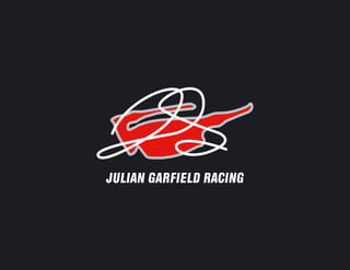
- 6. THE LOGO Your introduction to the world is through this logo. It is the visual representation of who you are and what you stand for. It is not to be altered or modified in any way. Changing it would break the consistency and unity of the visual apperance and it would damage the value of your brand. JULIAN GARFIELD RACING INSPIRED BY... Make sure that people will know about its inspiration and the connection to help brand recignition in the long run.
- 7. SPACE Make sure that the logo has always room to „breathe„. This guide here should help you, what is the minimun space you should leave when designing a layout on any surface. It is important to keep it legible, clean and recognizable. At least the size of the „J„ should be left on each side, which is scaled with the logo itself. (If you make it bigger, or smaller, the „J„ gets bigger or smaller with it.) J J JULIAN GARFIELD RACING J J J
- 8. JULIAN GARFIELD RACING JULIAN GARFIELD RACING LEGIBILITY You will notice that sometimes different backgrounds will challenge your logo‘s visibility. The set of your brand colors JULIAN GARFIELD RACING JULIAN GARFIELD RACING gives you a range to make sure that the logo can be adjusted to the given surface. As long as there is sufficient contrast, you are good. This depends on your personal judgement whether the black or the white text and signature renders the highest contrast. Here are some examples to show you how it works. JULIAN GARFIELD RACING JULIAN GARFIELD RACING JULIAN GARFIELD RACING JULIAN GARFIELD RACING
- 9. COLORS HSV 1 92 89 HSV 167 4 100 HSV 250 17 14 HSV 228 3 76 HSV 355 61 88 RGB 226 23 19 RGB 246 255 253 RGB 30 29 35 RGB 188 189 193 RGB 224 88 100 CMYK 0 90 92 11 CMYK 4 0 1 0 CMYK 14 17 0 86 CMYK 3 2 0 24 CMYK 0 61 55 12 LAB 48 71 56 LAB 99 -3 8 LAB 11 2 -4 LAB 77 0 -2 LAB 56 54 21 HEX E21713 HEX F6FFFD HEX 1E1D23 HEX BCBDC1 HEX E05864 Proper color application is essential to maintain your consistency in branding. These are your brand colors. It is a family of colors, they are in harmony in every combination you want to use them. It also helps you to reproduce them on different materials or surfaces. The numbers are color codes, which refer to different output methods you can come across. These codes make sure that every time your branding is reproduced, you get the same colors and the same look. The two most important ones are RGB and CMYK. The difference is: RGB is used mostly on electronic screens. Meaning websites, e-mail signatures, photo watermarks, etc. CMYK is typically used in printing. Either a flyer, appering in the newspaper, prnted stickers, etc. Screens and printing methods can be very different though. HSV, LAB and HEX are less used standards, but somettimes they are specifically asked for. They are here in case you need them.
- 10. FONTS HELVETICA INSERAT BQ REGULAR The Helvetica font family is the basis of your branding. The main type, HELVETICA INSERAT BQ REGULAR - which also 1234567890 appears in your logo - symbolizes speed, youth and the masculin sport of racing. abcdefghijklmnopqrstuvwxyz It is great for headlines or to communicate ABCDEFGHIJKLMNOPQRSTUVWXYZ important messages, and get the attantion. HELVETICA REGULAR Many times you will need text body for longer paragraphs, or a secondary line after the 1234567890 main message. The HELVETICA REGULAR abcdefghijklmnopqrstuvwxyz is a good, matching font, from the same family. It gets less attention, is not that bold, ABCDEFGHIJKLMNOPQRSTUVWXYZ but sometimes this is what you need. HELVETICA CE BOLD A third option is HELVETICA CE BOLD. Use it to highlight important details, or 1234567890 differentiate headlines from your logo font when necessary. It will still get the attention abcdefghijklmnopqrstuvwxyz without the boldness of the the main font. ABCDEFGHIJKLMNOPQRSTUVWXYZ
- 11. WHAT NOT TO DO WITH YOUR LOGO To ensure consistency and long-term brand recognition, do not alter or modify your logo. Here are some common ways, the logo can get „mistreated.„ DO NOT ALTER THE COLOR DO NOT ANGLE THE LOGO DO NOT MAKE THE BRAND SUBTLE RAC I NG JULIAN GARFIELD RACING GA R FI E LD JULIAN GARFIELD RACING J U LIAN DO NOT STROKE THE LOGO DO NOT SEPARATE THE TEXT DO NOT DISTORT THE LOGO JULIAN GARFIELD RACING JULIAN GARFIELD RACING JULIAN GARFIELD RACING DO NOT FILL WITH A GRADIENT DO NOT FILL WITH JUST ANY COLOR DO NOT SCALE SEPARATE LOGO ELEMENTS JULIAN GARFIELD RACING JULIAN GARFIELD RACING JULIAN GARFIELD RACING
- 12. A Couple More Things PHOTOGRAPHY When communicating with images, make sure that PHOTOGRAPHY CHECKLIST the quality is always there. This mean clear and high definition photos, capturing you in an authentic way. Did you or your team take the photo? If not, Personality is part of the image, let it come through in a do you have the permission and/or copyright way that you feel comfortable with. to use it? Photos are great tools to tell stories with. Make sure to Are third party trademarks visible? Do you live and breathe your story, which is easy when it has want them to be visible? (Sponsors vs. your such an authentic and natural one like yours. competitors) Stay true to it and let the photos and videos emphasize Have the people in the photo approved it for it for you. commercial use? KNOW YOUR AUDIENCE Before putting a communication material together, always think about who you want to engage. Sponsors, fans or other professionals in the industry require different details and tone to get engaged. Make sure that you use a language and insights they unterstand, while still staying true to your personality.
- 13. The Golden Rule... STAY CONSISTENT Consistency is key. Once you have adapted the colors, fonts and message, try to stick with them. A unified and consistent brand apperance is strong and burns into the audience‘s mind quickly.
- 14. es Eszter Sütő +1 443 220 8430 eszter.suto@hotmail.com www.esztersuto.com