datenwerk Cookbook: webdesign trends 2014 (en)
•
3 gefällt mir•1,068 views

What are the Trends in web design for 2014? The first edition of the "datenwerk cookbook" gives you an insight to basic trends in web design.

Empfohlen
Empfohlen
Weitere ähnliche Inhalte
Was ist angesagt?
Was ist angesagt? (10)
Andere mochten auch
Andere mochten auch (20)
Ähnlich wie datenwerk Cookbook: webdesign trends 2014 (en)
Ähnlich wie datenwerk Cookbook: webdesign trends 2014 (en) (20)
Mehr von datenwerk innovationsagentur
Kürzlich hochgeladen
Kürzlich hochgeladen (20)
datenwerk Cookbook: webdesign trends 2014 (en)
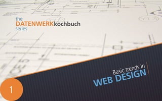
- 1. Basic trends in WEB DESIGN the DATENWERKkochbuch series 1
- 2. about DATENWERK We are a web and communication agency that believes in making things simple for you. We’ve been around since 2000 and currently have a staff of 15 web superheroes. Keeping your web presence up-to-date and awesome is what we do.
- 4. flatUI WHAT IS Flat UI? A design philosophy / style that is trending in web and user interface design today. It is often called minimalism with a difference. It keeps the clean, open spaces and compact content of minimalism but adds bright, bold colours and improved usability cues. WHAT ELEMENTS define Flat UI? Crisp edges Bright solid colours 2D illustrations and Iconography Lots of breathing room Clearly marked interaction and navigation elements
- 5. flatUI It is compatible with responsive and mobile use. The simplified layouts are easy to optimize for all your users with all their differently sized devices. With Skeumorphism no longer required for our tech increasingly tech savvy world, flat UI is a style relevant to our times and where we are at right now with technology use. 68% of web professionals say that flat design is here to stay. 500 million Apple devices with flat design interface were sold as of January 2013. Flat interface was expected to be on roughly 1 Billion Android devices by end of 2013. skeuomorphicDESIGN Not too long ago, computers were a new and alien thing to most people. Enter Skeuomorphism. The idea is simple: to create metaphors. Take unfamiliar technical concepts and give them familliar names and faces. Making a bunch of code look like a real life folder is skeuomorphism. Creating a copy of a real life object where it doesn’t belong for the purpose of creating familiarity. Web users today are a lot more tech savvy than the newbies of 20 years ago. It is no longer necessary to mimic the detailed information of real life objects.
- 6. gizmodo.com perhaps3D? Exciting things are happening with the combination of Flat user interface with 3D or video elements. Can this be a strong emerging trend for the coming year? “A�ter radical �latness, we’ll probably see designers carefully reintroduce dimensionality where it’s really needed.” Check out the 3D WebGL Spacewalk for a stunning 3D experience Elegant flat interface with incredible video interactions gravitymovie.warnerbros.com keecker.com
- 7. responsiveTYPOGRAPHYWHAT IS responsive typography? WHY is it important? With minimization of content, the little that you have becomes even more important for proper display. Responsive typography can be of 2 types: Adaptive and Liquid Responsive typography is not just about resizing a container and having the text reflow inside it automatically. You’re only doing half the job unless you achieve readable font sizes, line heights and line lengths for various screen sizes.
- 8. jqueryPLUGINS Best results Full liquid responsiveness CSSVIEWPORTunits theUNITS CSS Viewport Units define text size in viewport percentage. This means that the size of the font is relative to the size of the containing block (browser window). When the block changes, so does the font size. Liquid responsiveness Needs a manual or JQuery refresh with change in browser size. A solution more for the near future than right now. Browser compatibility for CSS vu is not great yet but quite likely to improve soon. Stay informed. 1vw = 1% of the width of the containing block 1vh = 1% of the height of the containing block 1vmin = whichever is smaller of 1vw and 1vh 1vmax = whichever is larger of 1vw and 1vh For general text fixes: simplefocus.com/flowtype FLOWTYPE For important full width headlines: SLABTEXT freqdec.github.io/slabText caniuse.com/viewport-units 1 2
- 9. mediaQUERIES Currently, the most common method of achieving responsiveness Only adaptive responsiveness possible. This means that you can define font sizes for fixed screen sizes. The font size will only change at these particular sizes or manually defined breakpoints. While media queries work just fine for now, we still see the importance of liquid responsiveness over adaptive. At the moment, there might only be a handful of screen sizes to set breakpoints for but as our digital devices get more varied and more screen sizes come into play, it might not be practical anymore to only design for a few. 3 webdesign.maratz.com /lab/responsivetypography
- 10. mobileFOCUS what’sAPPEARING? There is an increasing focus on responsive and mobile websites, as you might have noticed. It is leading to some general trends in web design that you should keep in mind: Lightboxes, overlays, expanding/repositioned tiles, infinite scrolling etc: Anything that makes the most of limited space. Designed with limited mobile screen space and the swipe motion in mind. Integration with social media: Like buttons, sharing functionalities, link to apps, email subscriptions - you name it, it’s there. mcfunley.com /design-for-continuous-experimentation 1 Video or infographic content: Why read what you can watch? Simple, compact and easy to view.3 2
- 11. A fixed navigation bar with a difference: ryanscherf.net Why be boring? what’sDISAPPEARING? Long, solid sections of text1 Sidebars2 what’sAPPEARING? Fixed position content: All these new levels of content on a long scrolling page can really disorient a user, which is why it’s good to provide an anchor. Fixed navigation bars are a sensible trend to follow. 4
- 12. COLOURS THE 5 MINUTE FIX! Need a quick & dirty colour picker that still keeps your design looking fresh and modern? flatuicolors.com Confused about what colours to use? Flat UI brings with it the use of simple, bright colours. Use a bold, mixed palette or keep it minimalistic with a monochromatic scheme. Emerald Trended heavily through 2013 and into 2014 Pantone Colour of the Year 2013 Radiant Orchid Pantone Colour of the Year 2014. A trend waiting to happen?
- 13. Still using sliders? Consider a large hero area instead. Use the space that gets the most attention on your website to get the most important point across. MAKE A STATEMENT INTRODUCE YOUR BRAND ENCOURAGE INTERACTION GET INFORMATION baystreetbiergarten.com realtii.com Hero AREAS
- 14. MicroUX How can you use it? There are a host of easy effects that can make simple acts like scrolling, hover effects, sliding open boxes or ticking a checkbox more engaging for the user. Use with subtlety. The easiest way to start with microinteractions can be with CSS 3 transitions. Why is it important? With minimalisim and simplicity being the trend now, design can get a little bit boring. Use Micro UX to liven up user experience, improve usability and make your website a memorable experience. What is microinteraction? In terms of web design, it is every tiny action a user takes on your website, hovering over a link for example. cssdeck.com/labs/animated-check-inputs
- 15. contactSHEET WOLFGANG ZEGLOVITS wolfgang.zeglovits@datenwerk.at 01 585 60 71 1418 Magdalenenstraße 33, 1060 Wien www.datenwerk.at www.opiniontracker.net What web trends are you following? Get in touch and let us know. We’d love to hear from you.