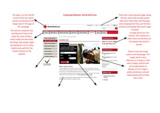
1. The logo is on the top left Evaluating Websites- British Red Cross They have a few separate pages along
corner of the site, which the top, which will provide people
stands out because of the with even more help, and that goes
image used in the logo of onto showing that they care for their
the campaign donators and people who want to get
They have a telephone
The tabs are along the top, involved
number present too,
and they also have scroll through which you can
down for some of them, donate. This is great as it
which really narrows down offers more convenience to
the things that people might the people who want to
be looking for, so it’s really donate.
helpful and useful for the
readers that go on the There is only one image
website used on the homepage. This
image alone is very
effective, as it shows a child
who’s happy, and this will
encourage people to
donate, as this image is
pretty emotional, and will
make people want to help
even more
2. There are some tabs along the left There is a lot of text on the homepage, which I There is a place on which you can either make a regular/singular
hand side, on which there are a lot personally am not a really big fan of. I don’t think donation. Like the Water aid site, this also has certain amount of
of different things. This again helps there should be so much text on the homepage as it money that you can donate, but it does have box which you can’t
people to get to where they want just looks really boring, and I think all the information tick for any other amount, which I think is really good, as it gives
to go quicker. This mostly helps should be kept to be put on the other pages, not the people more choice, so they can make as little or as much of a
you with how you can make a homepage. donation as they like.
donation, and how your donations
will help, and that’s something that
the donator’s will want to know, as
they will want to know how their
money will help other.